Affiliate links on Android Authority may earn us a commission. Learn more.
Google's Clock app gets a darker theme and new icon [Diving into Android O]
Published onJune 8, 2017

Google’s Clock app has seen several redesigns over the years, and the trend continues with Android O as Google looks to have revamped one of the more useful apps on your Android phone.
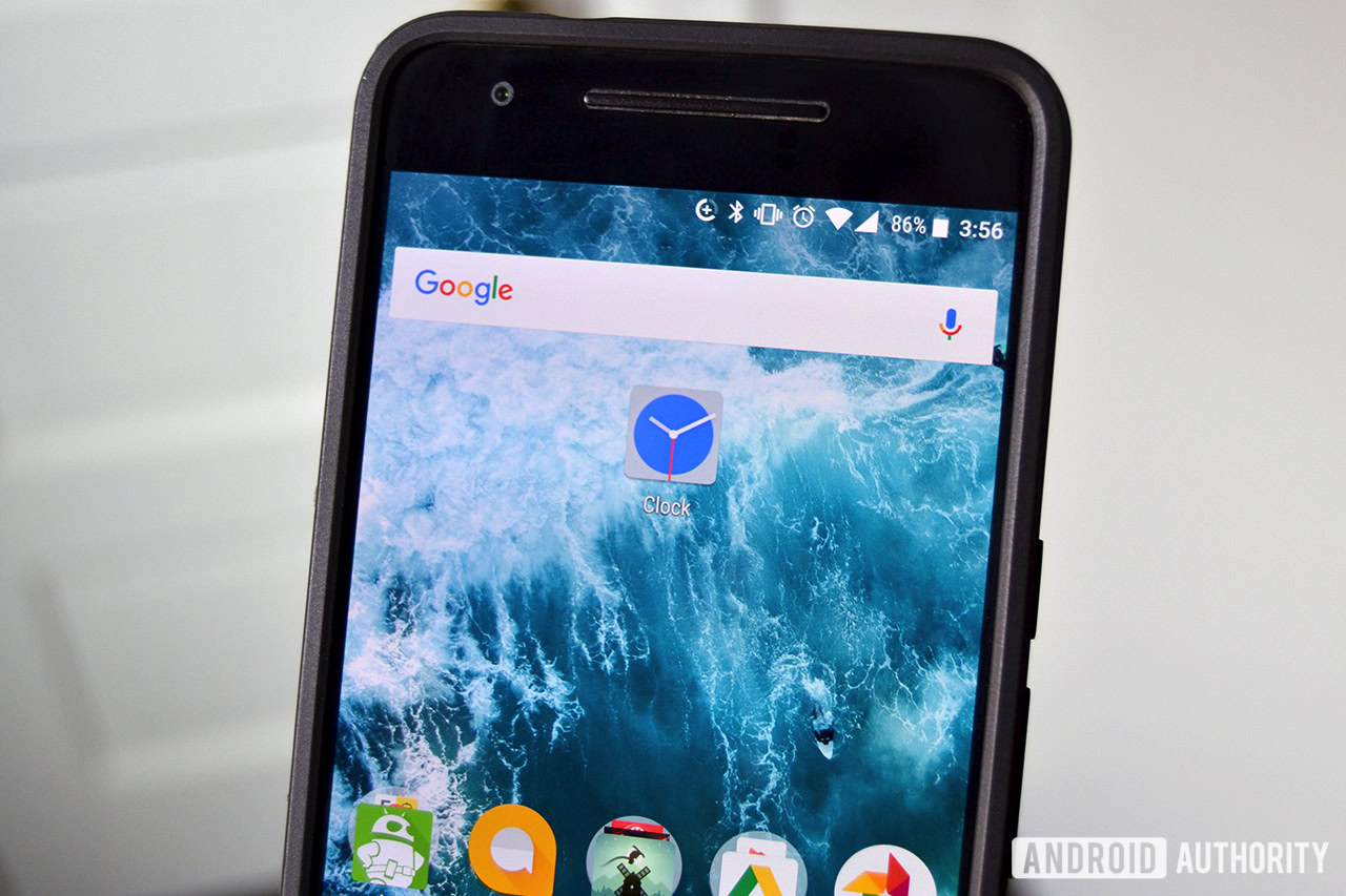
The first thing you will notice is the redesigned icon – compared to the current icon, which is just an image of a circular clock, the new icon is a blue clock in a gray square. Given how Google has redesigned other icons to feature either a circular motif or the removal of a square background, this is an intriguing change.
Delving into the app itself, the only change we can see is the darker theme, which should be a welcome change for those who want something different from the blue theme of the current Clock app. We would not call it black – it appears more like a dark, milky gray – but it is significantly darker than before.
Finally, the Clock app is now up to version 5.1, a leap from the current 5.0.1 release.
Overall, the changes made to the new Clock app appear purely superficial, but we will let you know if that changes as we get closer to Android O’s release. Until then, stay tuned as we continue to delve deeper into Android O.
