Affiliate links on Android Authority may earn us a commission. Learn more.
Google Drive on the web is getting a Gmail-like redesign
Published onMay 10, 2018

- Google announced a redesign to the web version of Google Drive.
- The redesign includes several visual tweaks, a shift to a brighter interface, and elements of “Material Refresh.”
- The redesigned Drive should be available for everyone within the next two weeks.
Last month’s Gmail revamp was a much-needed visual overhaul to Google’s email service. The search giant does not plan to stop there, however, as it announced a similar revamp to Google Drive on the web.
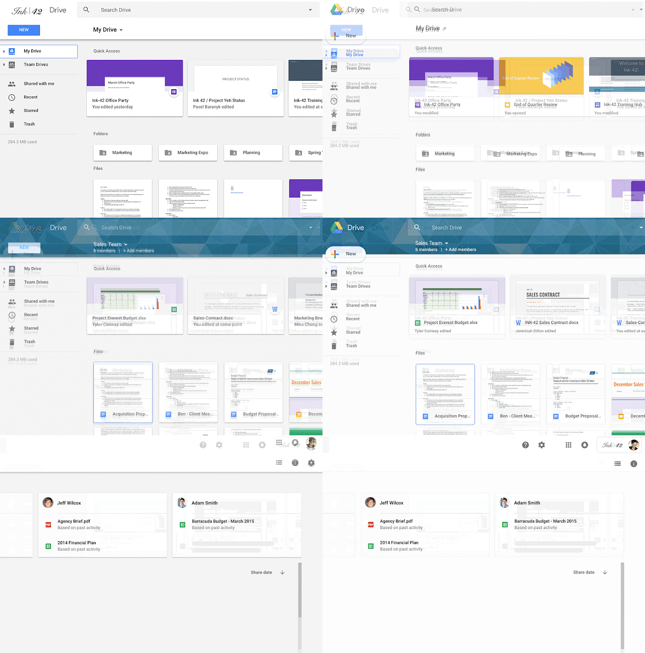
Similar to Gmail’s new looks, Drive goes for a brighter interface with rounded elements. The shadows prevalent in the current Drive design were not entirely eliminated, but there are fewer of them. Instead, there is a combination of lines and subtler shadows that help elements stand out from the brighter interface.

Google also called out specific changes, which include the following:
- The logo in the top left was changed to the Drive logo.
- Custom company logos now appear on the top right.
- The Settings and Help Center icons are now in line with the search bar.
- The page background is now white, not gray.
These changes, along with the transition to Product Sans font and the rounded “New” button, bring Drive on the web much closer to the redesigned Gmail in the design department. Google noted that the visual overhaul does not include changes to functionality, so Drive should work just like it did before.

This so-called “Material Refresh” popped up in the Google I/O and News apps, and it is likely that Google’s other apps will eventually get similar aesthetics.
As for the Drive redesign, Google said it started to roll out and should be available for everyone within the next two weeks. You might even see the redesign now, if you are lucky.