Affiliate links on Android Authority may earn us a commission. Learn more.
New Google App feed rolling out with round UI elements, more buttons
Published onNovember 1, 2017

It was speculated earlier this month that Google was working on a redesign of the feed found in the Google App. Based on APK teardowns at the time, it looked like this might introduce a new navigation bar and rounded UI objects. Those design changes are unlikely to please everyone, but it looks like Google is nonetheless rolling them out.

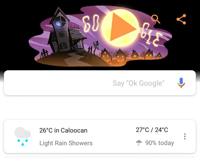
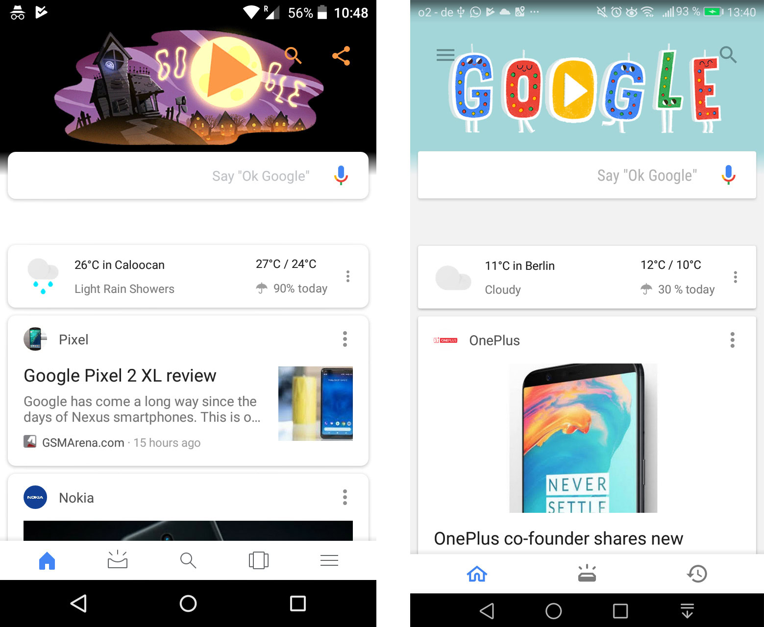
A Reddit user was first to spot the rollout of the new design, which seems to be arrive with version 7.15 of the Google App (others report that they don’t have it yet, so it could be a server-side change.) They also uploaded a helpful screenshot of the new interface, which you can check out below, left, with the previous design seen on the right.

It’s a nice looking update, rounded cards look a bit more playful, while the bottom navigation bar has been redesigned and now holds five icons. The hamburger menu, previously found at the top left of the Google feed, has now migrated south.
I still find the “upcoming” icon to be unclear, though, as I did in the last iteration; it has kind of changed from a brick that’s just had a bright idea to a to a shallow half-pipe that’s just had a bright idea. One of you folks will probably tell me what I’m missing, there. Further, it seems like a bad idea having two identical search icons on the same page (seen bottom center and top right of the screenshot on the left) — I’m sure this isn’t the last change to the Google Feed we’re going to see.
What do you guys think about the new design? Let us know in the comments below.