Affiliate links on Android Authority may earn us a commission. Learn more.
The Google Home app on the Pixel Watch is a good start, but I want more
Published onNovember 4, 2022

The new Google Home app on Wear OS garnered a lot of interest before it launched on the new Pixel Watch and then made its way to other smartwatches in the Android ecosystem. For now, Google is clear about the app’s scope: A “Preview” notice is prominently displayed, just to ease you into the potential bugs and missing features. But preview or stable, we like dissecting Android-related novelties, so that’s what we’re going to do.
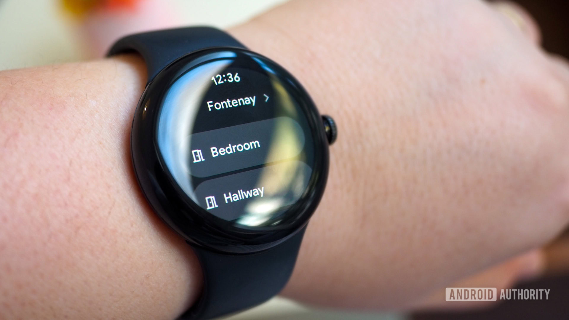
In its current form, this new wrist-bound Google Home app feels very basic. A three-level navigation structure lets you pick the home you want to control, then a list of different rooms in that home, and finally all the devices in that room.
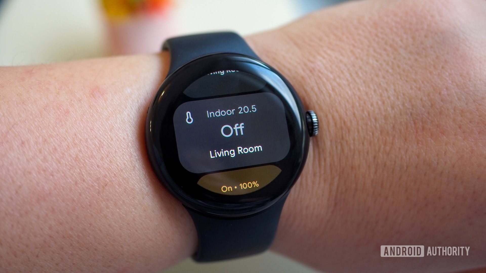
I haven’t installed a lot of smart home products in my current rental, but the few that I own display their current state in the app. Smart lights, thermostats, two smart speakers and one display, two TVs and one Chromecast, one fan, and one robot vacuum — all of these show whether they’re on or off. Some also display extra information: current or set temperature for thermostats, brightness level for lights, sound volume for speakers, and so on.
Tapping on some devices turns them on and off. I can quickly run my robot vacuum or light up my living room with one tap. A bit of granular control is also available with lights and speakers: Sliding my finger across their tile raises or lowers the brightness and volume, respectively. For thermostats, plus and minus icons on each side of the tile let me move the temperature in 0.5°C increments.
And, well, that’s all there is to it.
The app works well, but it limits itself to some very basic smart home controls.
The app works well within these very limited constraints. It lets me control some aspects of my smart devices without using my voice and waking up my husband, and without talking and hoping Google Assistant understands what I meant. Plus, I can do it from the watch I always carry on my wrist, instead of trying to find my phone around the apartment. I haven’t seen any serious lag or issues, but as I said at the top, I wish there was more to it.

For one, I’d like to organize my smart devices just like in Android’s Quick Settings panel. Why does one room show my lights first while another starts with the thermostat? Why is my robot vacuum at the very bottom of my hallway, below the grouped lights and individual light tiles? And why are the TV and the Chromecast above the living room’s thermostat and speaker? If there’s any rhyme or reason behind this organization, I can’t see it or get used to it.
Each time I open the app, I have to pay attention to what I’m scrolling past on the tiny smartwatch display until I find the device I’m looking for. Organizing these according to my own priority system would be amazing.
Organizing devices would allow me to reach the ones I use the most faster.
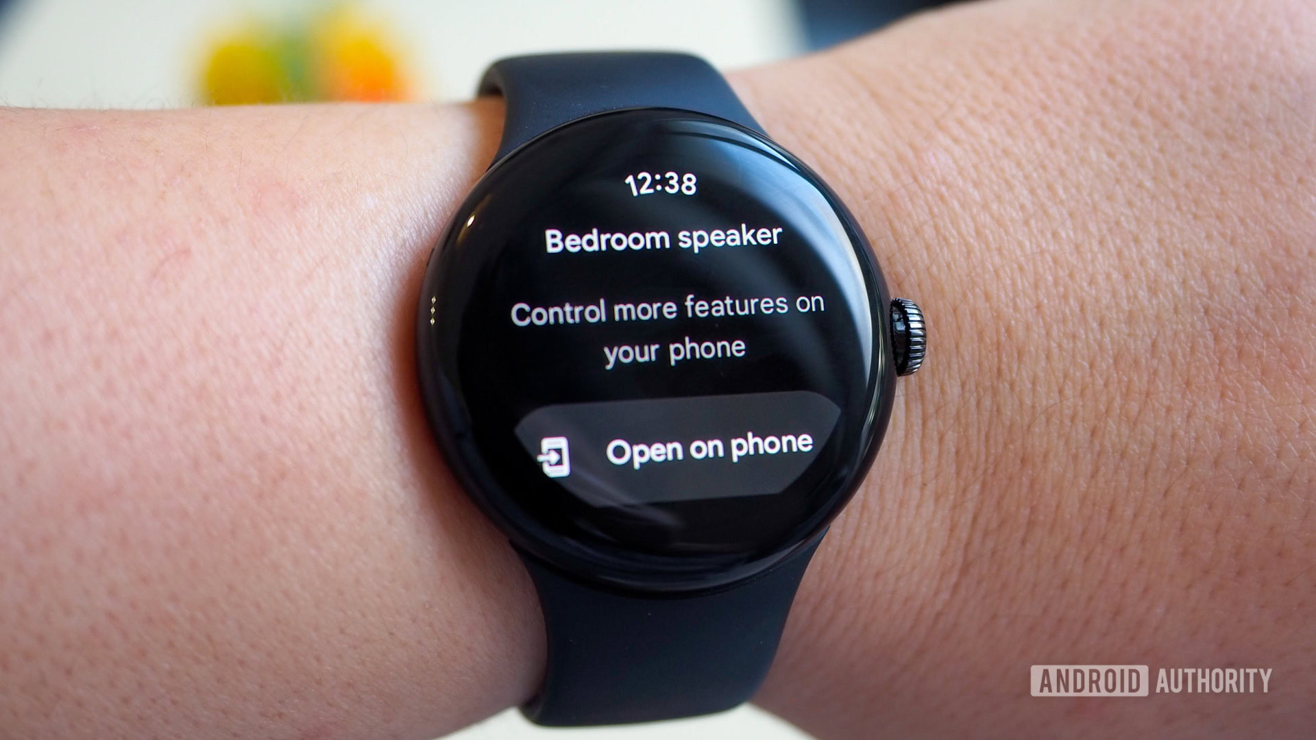
For two, there’s an annoying inconsistency in what a tap or slide on a product’s tile does. A tap turns on/off lights and robot vacuums, but not thermostats or TVs. Tapping on a speaker that’s playing some music doesn’t stop it. And more often than not, all you get when you tap on a product is this generic message to open the Google Home app on the phone to do more.

Plenty of smart home controls you can execute in the app are also missing. You can’t change lights’ colors, switch a thermostat’s mode, start music playback on a speaker, or do anything that “advanced.” For those, you’ll have to speak to Google Assistant on the watch.
Start and stop controls aren't available for all devices and the app hides a lot of simple commands.
This brings me back to a similar complaint I have with the Google Home app on phones: There’s no exhaustive list of voice commands and a lot of the commands don’t show visual elements in the Home app. Basically, a lot of the features are invisible, undiscoverable, and impossible to guess for a newcomer. The same thing is now perpetuated on our wrists: Assistant can do a lot more than what we see in the Home app — we just need to somehow know those commands.
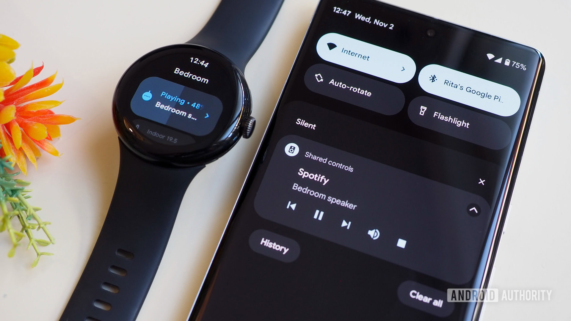
Perhaps my biggest annoyance is that none of the smart speaker controls are available on the watch. They don’t show up through this Google Home app nor can I figure out a way to make the phone’s cast notification appear on the watch. (The phone notification comes from Google Play Services, which can’t be shared with the watch.) If I’m playing music on a speaker, I can’t see the convenient skip, pause, rewind, or stop buttons on my watch. All I can do is control the volume from the Home app or, again, resort to Assistant commands.

With this app still being a preview, and the Google Home app getting a massive refresh soon, I can hope that Google is working on fixing some of these limitations in the Wear OS version of the Home app. I don’t need to rename rooms or manage speaker settings, but a bit of order, consistency, and some extra controls would be more than welcome to make this a fantastic controller for any smart home.