Affiliate links on Android Authority may earn us a commission. Learn more.
I've already ditched the new Google Home widget and watch tile
July 15, 2024

There’s an Arabic saying that goes something like, “You fasted and fasted, only to break your fast on an onion.” English doesn’t have a real equivalent to this, though “much ado about nothing” comes close. But I prefer the Arabic version because it really describes the current state of Google Home’s new home screen widget on Android and its Wear OS shortcuts tile.
The two features were announced with the May Feature Drop after many years of requests, wishlists, and support threads, but are still unconvincing to use for a relatively simple smart home build. So much so that I’d still rather open the full Google Home app or the app of each of my smart home elements to control them.
Are you using the new Google Home widget or watch tile?
Google Home widget: Good looks can be deceiving
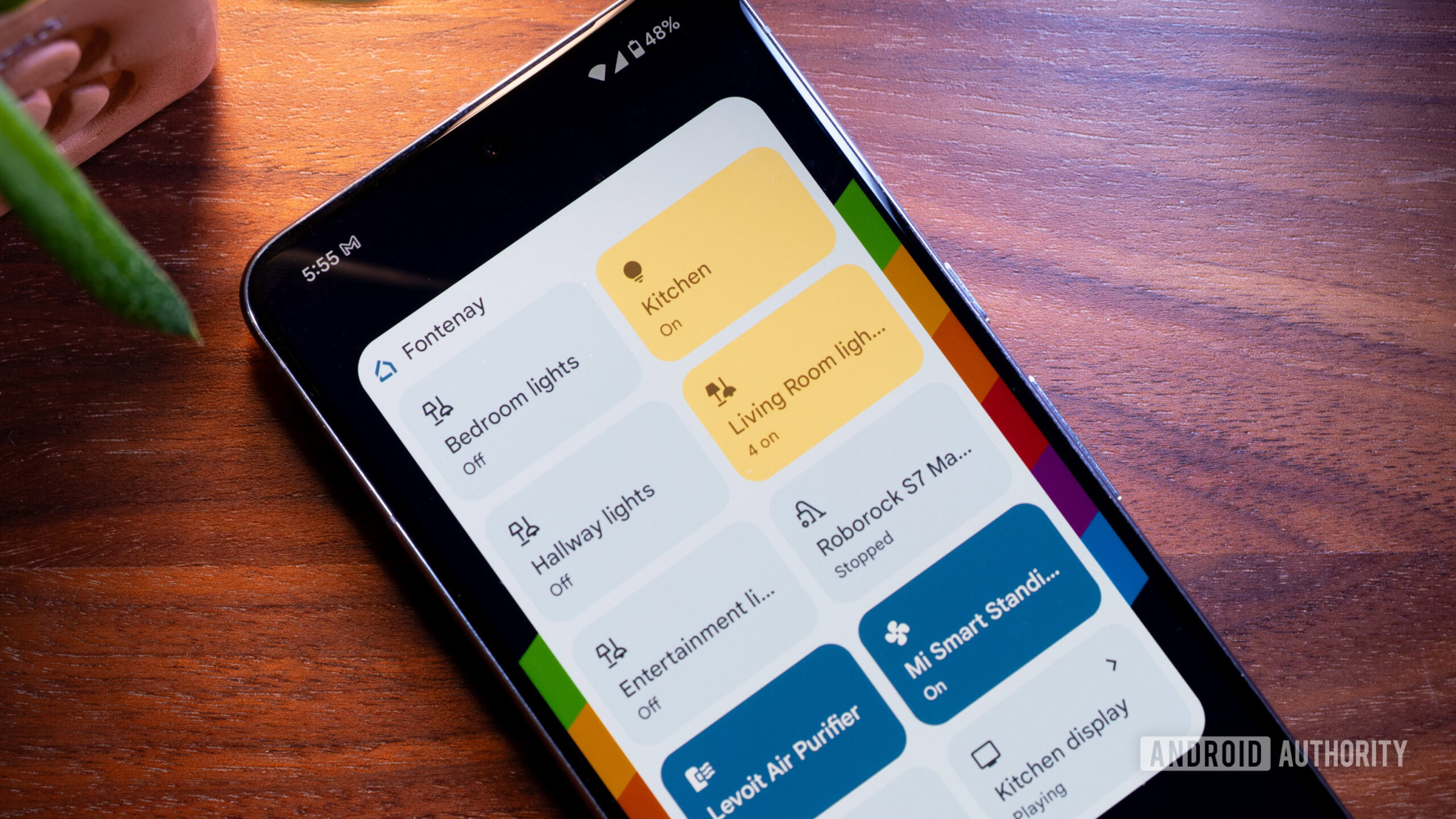
It feels like the Google Home team took forever and a day to gift us with the most basic Android feature of all: a home screen widget to control our smart home devices. And basic it is, even if, at first glance, it looks quite neat with its sexy Material You color scheme.
To use the widget, I have to join the Preview program, which renders all my Chromecasts inaccessible.
Before I get started with all the limitations of this widget, I should specify that it’s still in testing and thus only accessible if you join the Google Home app’s preview program (Google Home > Settings > Public Preview > Join public preview). Putting aside the baffling fact that it took so long and it’s still under “preview,” the biggest downside to using it now is that your smart home may not be 100% stable if you join the preview program. For example, each time I am part of the preview program, all my Chromecasts (and smart speakers) become unreachable from my phones. My husband can control them just fine, but not me.
I’ll come back to this in a bit. For now, let’s focus on the actual widget. When it first launched, I had the option to add all my Google Home favorites by default or pick and choose specific devices. Now, the second option seems to be gone. I’m not sure if the team is working on bringing it back, but it was certainly handy to create special and separate widgets. The Google Assistant, Broadcast, and Call Home buttons you see in one of my widgets were made when the custom shortcuts option was available.
So yup, for now, it seems like we get an all-or-nothing approach of favorites. Still better than nothing, eh? Until you add the widget and realize it’s a matter of all or nothing with most controls too. Lights? On or off, there’s no brightness or color wheel. Fan? Robot vacuum? Air purifier? Same. Even the few controls that Google Home is generous enough to give us in its app aren’t available here.
It's an on/off affair for most buttons. Even the few extra controls available in the Google Home app aren't accessible from the widget.
And if, like me, you think, “Eh, no fuss, I’ll just tap and hold to access more options,” then no, that won’t work. Tapping and holding triggers the widget movement and editing mode, not the selected device’s extra options.
The confusing part is that some devices, like Chromecasts, Nest cameras and thermostats, and routers show a small arrow indicating that they’ll open their full control panel in the Home app. So there is a way to get more controls, but Google has chosen to implement it for some device types and not others!
Other limitations of this widget include the lack of any scene or routine support: Even if I have some routines in my favorites, they don’t show up in the widget.
Then there are buggy behaviors like the disappearing icon in some widget sizes and configurations, the slow-to-update state, and the inability to force refresh it. If you add a new device to your favorites, it might show up immediately or take forever.
No routines, no scenes, no extra controls — at this point, it's not worth joining the preview program to get this widget.
At this point, given the limitations, it’s simply not worth it for me to stay in the preview program and get that buggy Chromecast issue just to be able to get a couple of homescreen on/off shortcuts. I’ve removed the widget and pivoted back to my stable Google Home app. Your mileage may vary, depending on whether or not your Chromecasts go berserk when you’re part of the preview program.
But if the widget gets back its custom picks, adds the tiny arrow to control more options for every device, starts showing routines, and fixes those silly bugs, then it’ll finally be a nice way to control your smart home. For now, all it really has going for it is that it looks good with Material You.
Google Home Wear OS tile: Your guess is as good as mine

It took me forever and a day to realize that the new Google Home tile had rolled out to my Pixel Watch 2. Why, you ask? Well, because it’s called “Favorites” in the Wear OS tile picker and I was looking for “Google Home” or “Home,” but I digress.
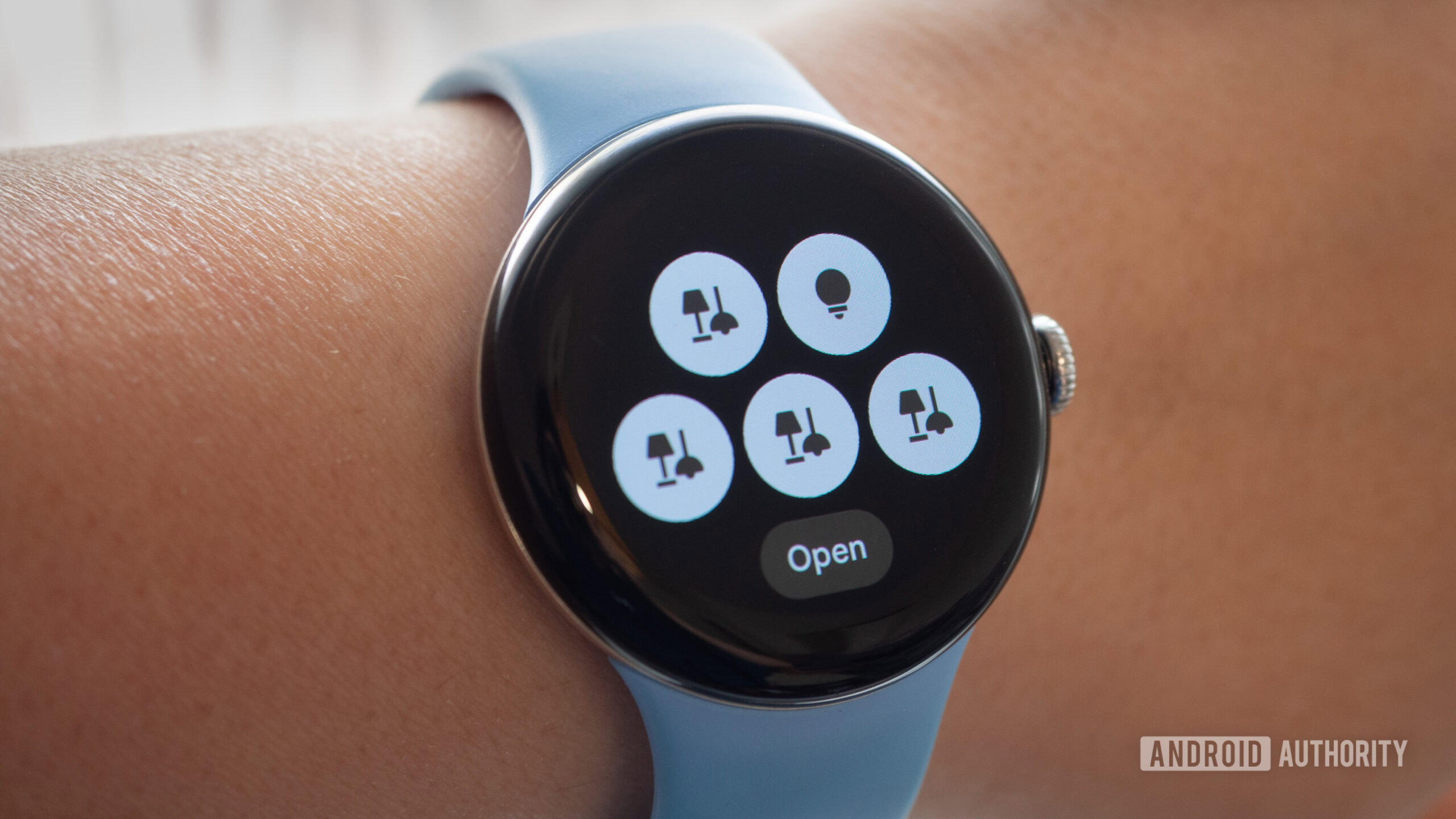
The tile allows me to have five shortcuts to my top five favorite devices or groups in the Google Home app, which, in my case, are all of my light groups and lights. The problem with the tile is that it only shows a generic device-type icon with no name and no indication as to what it may or may not control. You see where this is going, right?
Look at the image above and tell me which ones are my living room lights, which ones are my bedroom lights, and which ones are the hallway controls. Oh, you can’t guess… Well, neither can I. It doesn’t even show the current state of these devices, which might’ve helped me a bit with the guessing. The only way to solve this is to go in the Home app on my phone, see the order I’ve put these in and try to make it logical so I can fully memorize it on the watch. Or tap each one until I get the right light.
Good luck figuring out what you're controlling if you have more than one light or one thermostat in your favorites.
This isn’t a problem if you have one favorite light, one thermostat, one fan, one vacuum — you get it, just one of everything — in your favorites. But if you happen to have more than one room in your home and at least two or three of the same type of device, i.e. like the most simple smart home setup, then the tile is nearly useless to you.
Once again, this one isn’t worth keeping for me. I’d rather remove it than waste time swiping over it to access more useful tiles on my watch, so off it’s going again. I need names or more descriptive icons to be able to use it efficiently.
Alright, I’ll stop complaining for now. I’m still of the opinion that the Google Home app is finally on the right path and is getting lots of interesting updates and features, but some of these should be better implemented to be usable.
Thank you for being part of our community. Read our Comment Policy before posting.