Affiliate links on Android Authority may earn us a commission. Learn more.
Google Maps on Android rolls out new colors, but they're still not dynamic
Published onDecember 11, 2024

- Google Maps for Android is retiring the blue accent color used for buttons, text, and other user interface elements.
- The new Google Maps UI features shades of teal that better complement the app’s color palette.
- The change is rolling out to Android users running app version 24.49.06.x or later.
While many Google apps have already adopted Dynamic Color (aka Material You theming), Google Maps continues to show a static palette. Like other unvarying mobile apps from the company, the default accent color has long been blue. To better complement the Maps app’s palette, Google is rolling out a teal interface to Android phone users.
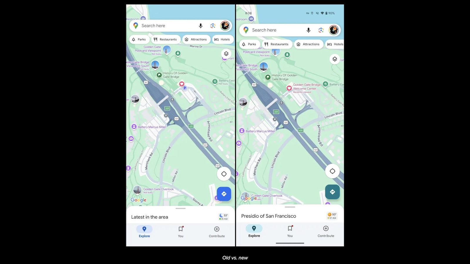
As spotted by 9to5Google, Google is retiring the blue accent color in its Maps app in favor of teal. For now, the change appears to be exclusive to Android users running Google Maps version 24.49.06.x or later. If you don’t see it, ensure your app is up to date and try force quitting it via the Settings app. It’s currently unclear when the iPhone app will follow suit.
The new shades of teal can be seen across the entire Google Maps app, affecting buttons, text, and other UI elements. For example, the tab icons in the bottom navigation bar have adopted the new hue, while the labels beneath them have switched from blue to black. Other in-app buttons like Directions, Reviews, and Directory have similarly adopted the teal look.
While some users may find the change jarring, teal arguably better fits the Google Maps color palette than blue. The retired color may have been too saturated compared to the app’s UI. Teal, on the other hand, is gentler on the eyes and complements the navigation service well.
