Affiliate links on Android Authority may earn us a commission. Learn more.
Google Maps' controversial new color scheme is coming to third-party apps
Published onJuly 5, 2024

- Google has announced that it’s updating the default map style in the Google Maps Platform.
- The Google Maps Platform is composed of APIs and SDKs that let third-party websites, Android apps, and iOS apps integrate Google Maps.
- The new default map style will include the controversial revamped color palette that rolled out last year, but developers aren’t forced to use it.
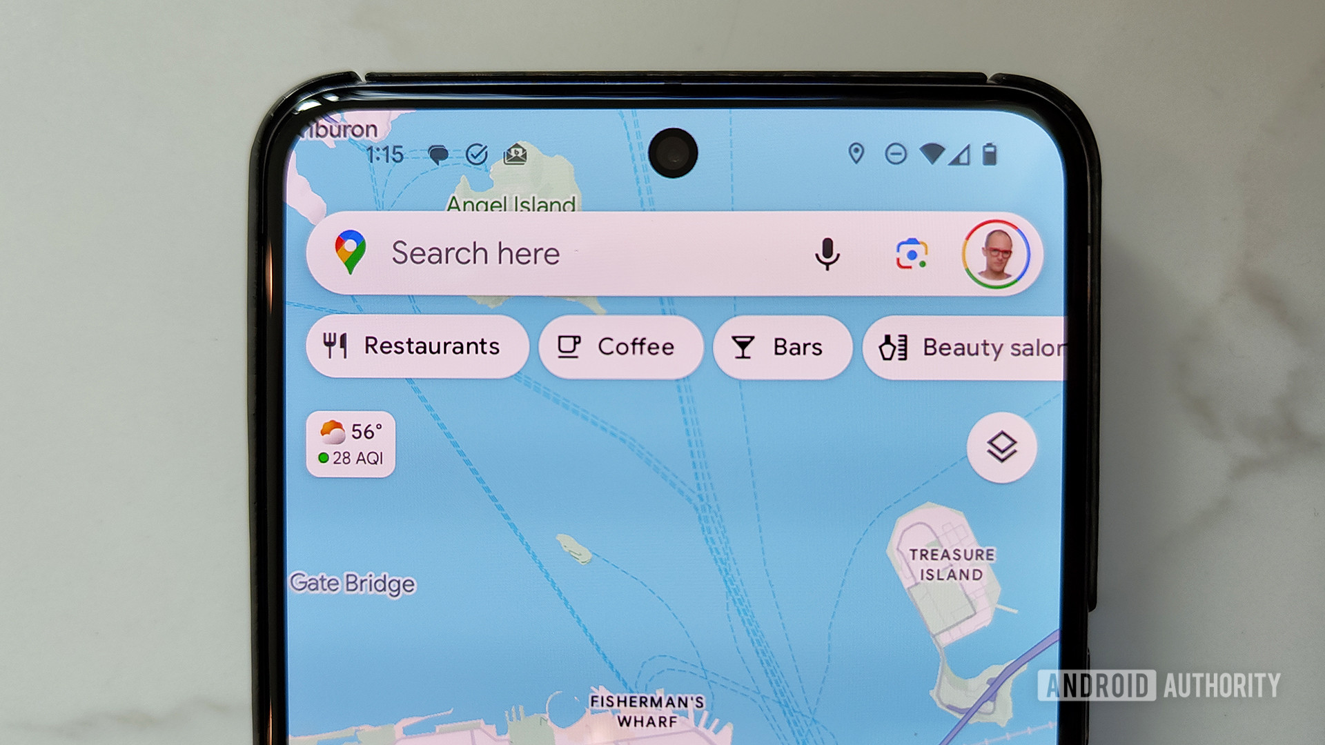
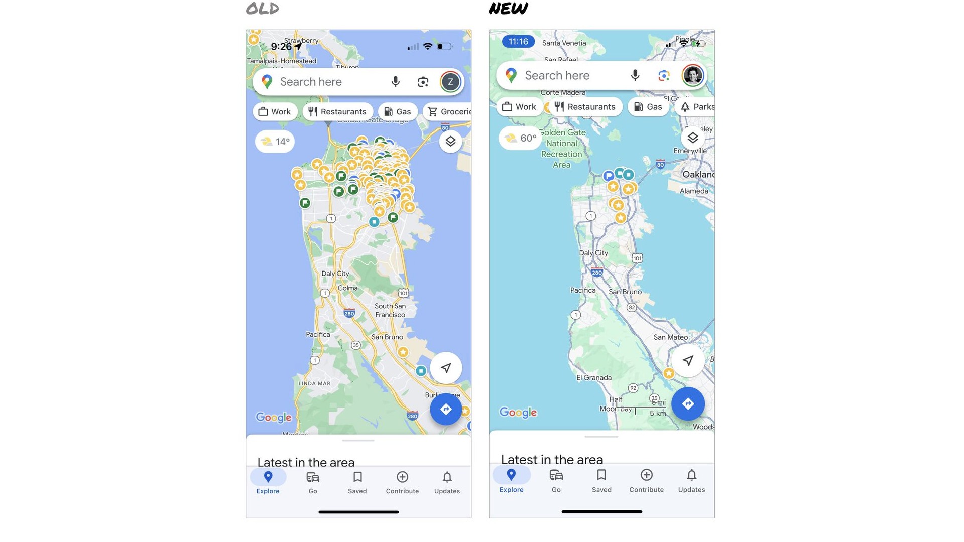
Late last year, Google revamped the color scheme of its Maps app for iOS, Android, and the web. Although the revamp wasn’t that drastic, many users were annoyed by the sudden changes to the styling they’d been used to for so long. Those changes are now coming to maps within third-party apps that are powered by the Google Maps Platform.
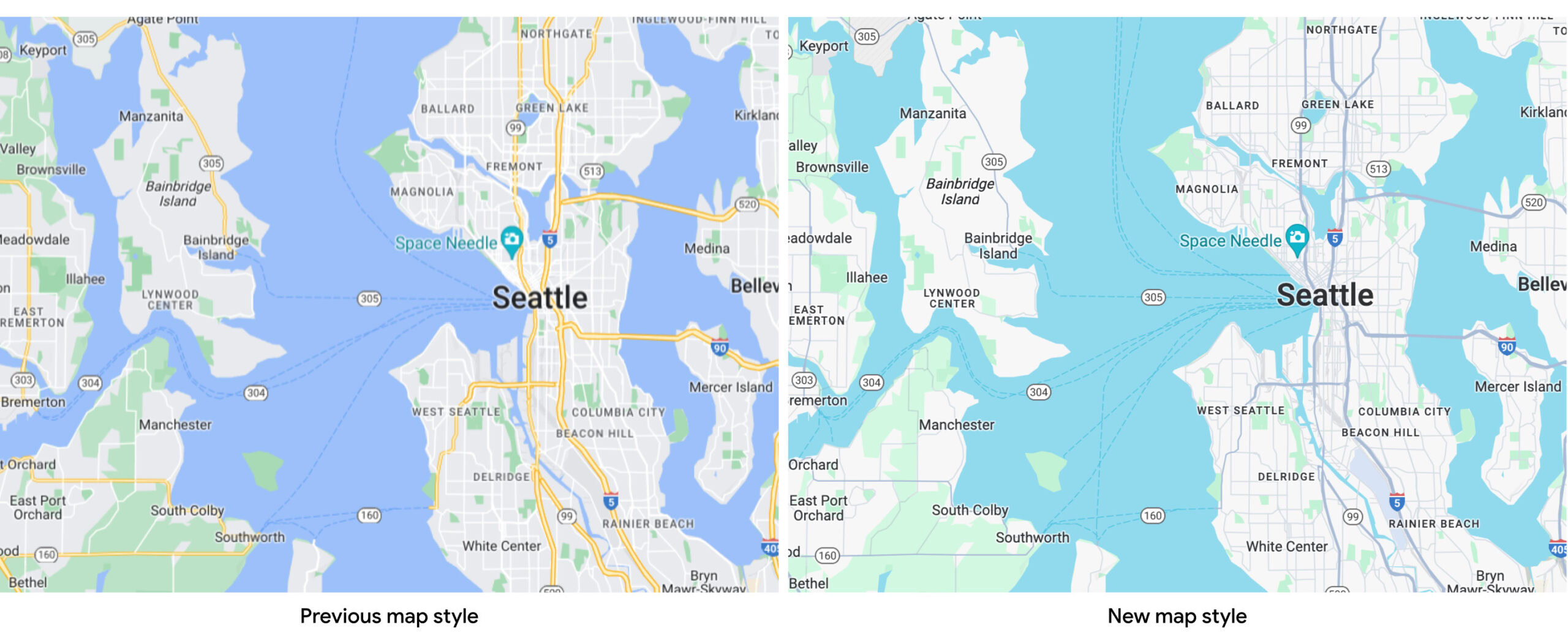
Back in November of last year, we reported that Google Maps had changed its colors to be brighter overall. Major and minor roads were now shades of gray instead of yellow or white, bodies of water were now turquoise instead of blue, forests were now a pastel green instead of a muted green, and routes were now a brighter and more jarring blue. When we polled our readers about these changes, an overwhelming 69% of 3,277 respondents said that they didn’t like the new colors, with many stating that it made details harder to see. A former designer for Google Maps even chimed in to express her opinion on the revamped color scheme, calling it “colder, less accurate, and less human.”
Despite these initial complaints, Google Maps’ new color scheme has widely rolled out across Android, iOS, and the web and looks to stay. However, the updated styling isn’t widely available yet in maps embedded in third-party apps that use Google Maps as their backend. Google is looking to change that soon with updates to its Google Maps Platform, the set of APIs and SDKs that lets developers embed Google Maps into their mobile apps or web pages.
Google recently updated the documentation for the Google Maps Platform to add a notice stating that the “new map styling is coming soon to Google Maps Platform.” The notice specifies that the updated map styling “includes a new default color palette and improvements to map experiences and usability” and that all map styles will be “automatically updated in March 2025.”
A new developer-facing document titled “new map style for Google Maps Platform” was recently published detailing how developers can opt in (or out) of the new style. It highlights how apps that use “map IDs,” which are unique identifiers that represent a single instance of a Google Map, can be updated to the latest version of cloud-based map styling, which supports the refreshed map style on both web and mobile. Cloud-based map styling lets developers “create a customized road map experience for [their] users without having to update [their] apps’ code each time [they] make a map style change.”
Apps that don’t use map IDs, meanwhile, will need to manually update the Google Maps API or SDK they’re embedding to use the new default map style. The recently released V19.0.0 of the Google Maps SDK for Android, for example, includes a new map renderer that supports the updated styling. Other Maps SDKs, such as the Navigation SDK for Android, Maps Static API, and Maps Embed API, will be updated later this year to allow for opting into the updated map style.
Google warns that developers won’t be able to opt out of the new map styles after March 18, 2025. This means that the new Google Maps color scheme you see in the Android, iOS, and web clients today will be the default color scheme for all Google Maps-powered maps within third-party apps and websites going forward. However, Google says that “developers are welcome to create custom map styles reminiscent of the current default map styles,” so third-party apps won’t be forced to use Google’s preferred styling.
How do you feel now about last year's Google Maps redesign?
This makes sense, as customization is a key feature of the Google Maps Platform. In fact, Google provides numerous ways for developers to configure the initial map settings, including the camera position, map type, the UI components to display, which gestures to enable, whether lite mode should be enabled, and whether dark mode should be enabled.
Depending on the level of customization, it may not be immediately obvious whether the map you’re looking at within a third-party app or website is powered by Google Maps. If the maps you’re used to looking at within your favorite apps suddenly change colors to match Google Maps, though, then that’ll be a good clue that they’re using the Google Maps Platform.
Now that we’re nearly eight months past the rollout of the new colors in Google Maps, how do you feel about them? Do you still dislike them, or have they grown on you? Let us know in the poll above and the comments below!

