Affiliate links on Android Authority may earn us a commission. Learn more.
The Google Material Design Awards 2019 are here, check out which apps won
Published onOctober 10, 2019

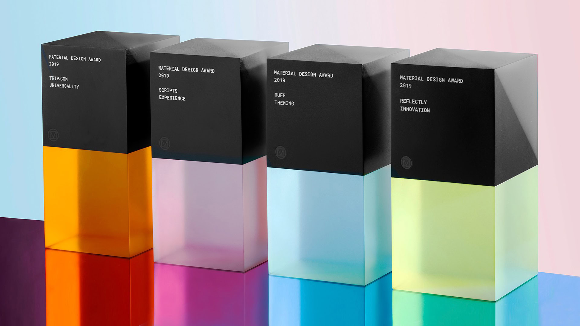
Each year, the Google Material Design Awards showcase four different apps that Google feels uses its design language in excellent ways. The company just announced the 2019 winners, and they are four relatively-unknown apps.
As with years past, Google categorizes each win by highlighting a specific aspect of the design and how it excels at that particular feature. This year, the four categories are Experience, Theming, Innovation, and Universality.
Google doesn’t hand out any cash prizes for these Material Design Awards, but the app developers do receive one of the classy-looking statuettes above as well as recognition on a page dedicated to the awards.
Without further ado, here are the winners this year:
Universality — Trip.com
The Trip.com app is one of the many, many travel-booking services on the Google Play Store. Its design is refreshingly simple, with lots of white space and an easily-understandable format that allows the user to quickly figure out what they need to do to get their trip or experience booked.
Google also points out that the Trip.com app is able to achieve this while still supporting 19 languages and meeting all accessibility guidelines within Material Design. That’s impressive!
Theming — Ruff

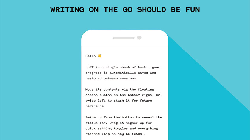
The Ruff app is a very simple service that allows users to write notes to themselves. Although the initial layout of these notes is incredibly simplistic (see the image above for an example), users can customize texts and themes as they wish.
Google also calls out how effectively Ruff uses color to signify function, as with the large blue floating action button that site perpetually at the bottom right of the screen.
Experience — Scripts
Using Scripts, people can learn how to write in other languages by following along with diagrams of letters of the alphabet. Haptic feedback gives users indications that they are doing well, and the minimalist design of the app itself keeps users focused and learning.
Google calls out how Scripts is able to keep all of its typography consistent, which is no small feat considering it is offering help with such diverse alphabets as Korean, Russian, and Japanese.
Innovation — Reflectly
Reflectly is a journaling app that encourages users to write each day through various prompts. The app has many features, but its skillful design keeps everything calm and orderly rather than becoming full of feature bloat.
Google mentions that the apps smooth onboarding experience is another great feat of design as it lets the user know what the app does in a playful, conversational style.
Those are the big winners of this year’s Google Material Design Awards! Is there an app you think should have won? Let us know in the comments.