Search results for

All search results
Best daily deals

Affiliate links on Android Authority may earn us a commission. Learn more.

One year later, have developers warmed to Google's Material You overhaul?

There are some early successes, but Google has a long way still to go.
By

Published onOctober 23, 2022

material you 2022 1
Ryan Whitwam / Android Authority

Android updates aren’t as exciting as they once were, but there’s still some fun to be had if you’re patient. Google began the process of overhauling the Android UI with Material You in Android 12, and the process continued in Android 13. As with so many changes over the years, Material You will only reach its full potential with buy-in from developers — this has long been Google’s Achilles’ heel. There’s reason to be optimistic about Material You, but it’s too soon to call it a success. Some pieces of the puzzle are still missing, and they may never slot into place the way Google envisions.

There were plenty of reasons to be skeptical of Material You’s success right out of the gate. Google rolled out Android 12 on the Pixels with good but not great first-party support. Most of Google’s apps supported the basic theme options, but some stragglers took a few months to catch up.

Third-party support was non-existent, but that was all on Google too. Android 12 did not officially support most Material You features for third-party developers, and Google didn’t even make its Monet color-picker engine available to OEMs. Thus, some Android 12 phones didn’t even have Material You, and those that did had questionable and limited color options. Samsung was one of the few OEMs that made any effort to adopt Material You, but it only supported its own first-party apps and not Google apps. So, that was a mess. With Android 13 Google has finally opened up Material You in a meaningful way, and Samsung is pulling even with Google with as it prepares to launch One UI 5 with expanded Material You support.

Android 13 Themed Icons beta
Robert Triggs / Android Authority

With most device makers still weeks or months away from launching Android 13, we can only speculate on how fully they will support Material You, but it seems assured that things will be better than last year. Android 13 has the Material You styles in AOSP. We should begin to see more takes on Material You as Android 13 expands. So far, Samsung has shown us what happens when you crank up the saturation, but other OEMs can give Material You their own spin — there’s no requirement in the Android 13 CDD that they should ape Google, after all.

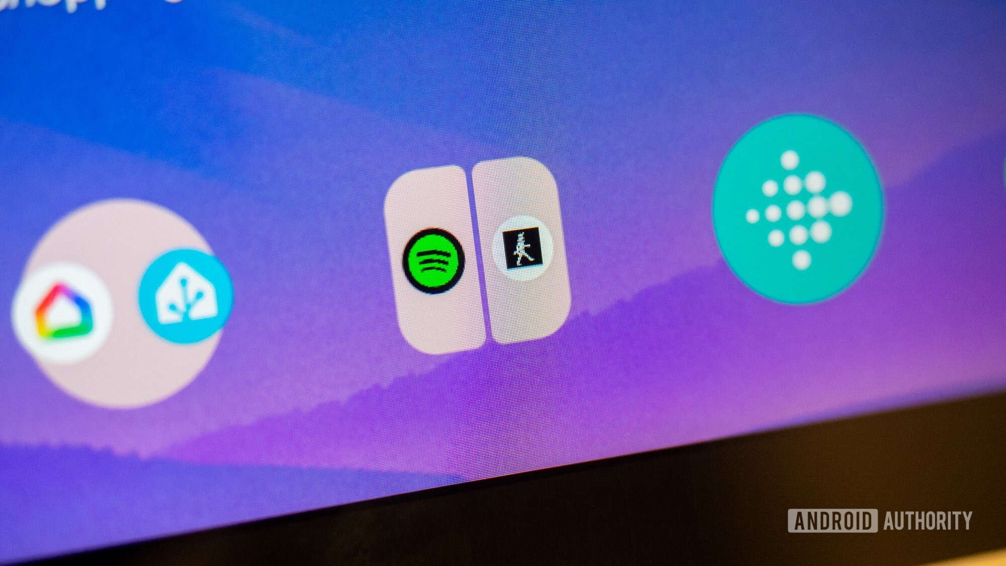
Spotify's brand is highly associated with the nuclear green icon, so it's surprising to see it out front with Material You support.

Now that we’re a few weeks out from Android 13’s debut, some app developers are starting to take notice, and they might not be the ones you’d expect. For example, Spotify has already updated its app to support icon theming. Color is an important element of most brands and Spotify’s identity is highly associated with the nuclear green icon, so it’s surprising to see it out front with Material You support. The app even has a Material You widget!

The early selection of apps with Material You icon support runs the gamut. There are financial apps like AmEx; communication tools like Slack and Telegram; ESPN for sports news; and social apps like Reddit and the popular third-party client Sync for Reddit. Dropbox, another brand that heavily leans on its trademark color, has also added a Material icon. WhatsApp, so popular outside the US, also has icon support. However, the rest of the Meta portfolio, including Facebook and Instagram, leads the way in pretending Material You doesn’t exist. It’s the same for many other top apps like Snapchat and Netflix. Until these highly popular apps get on board, activating icon theming leaves the average home screen looking like a patchwork.

android weather widgets android 12 material you google apps beta
Jimmy Westenberg / Android Authority

It’s easy to forget with all the focus on home screen features and system accents, but Material You is intended to unify the way apps look, too. The same color palette that controls your icons and buttons should ideally flow into the apps themselves. All developers need to do for icon support is add a monochrome asset so Android can apply themes, and that’s as far as most are going right now. The same goes for widgets — almost no apps have adopted Google’s new style outside of Gmail, Keep,  YouTube Music, and other bundled apps.

Supporting Material You throughout an app requires more work, and Google will probably only see limited success here. Many of the aforementioned apps that have offered a hint of Material You support, like Slack, Telegram, and Dropbox, have only gone as far as adding an icon. Sync for Reddit is one of a handful that actually change the UX based on your system theme, but this is an app that is constantly pushing to conform to the latest Android standards. Most app developers, particularly those that work for big companies, can’t just materialize the interface overnight (or possibly ever). Material You may never creep into app interfaces in a significant way. Third-party developers had the tools to adopt Holo and Material Design in past iterations of Android, and by and large, they didn’t. Seeing an app utilize Material You accents is going to be a pleasant surprise, not the default.

You can’t blame developers for not immediately jumping at the chance to add Material You support — Google seems to have trouble really committing to its own design guidelines. While the company’s disparate development teams succeeded in getting most of its popular apps updated with comprehensive Material You support, there are strange gaps.

The Pixel embargo has passed, so I can finally share this screenshot, presented without comment. pic.twitter.com/8GHMFIasZ3
— Ryan Whitwam (@RyanWhitwam) October 12, 2022

Case in point: Google just released its first smartwatch after eight years of toiling on Wear OS — another story entirely — but the Pixel Watch has its own phone app separate from the standard Wear OS app. While Wear OS got at least rudimentary Material You icon support, the Pixel Watch app did not. It just sits there on my home screen, mocking me with its unmatched app icon. The app itself is also unconnected to the current Material aesthetic — it looks more like the Pixel Watch’s UI, which has its charm, I suppose. Although, why am I manually changing the Material accent colors on the watch faces in the first place? Google missed a huge opportunity to connect the watch face accents and the app UI with Material You on the phone. It was right there, Google!

I truly hope developers continue expanding Material You, even if adoption isn’t total. This is a completely subjective aesthetic judgment, and you don’t have to agree with me, but Material You is the best Android has ever looked. I know a lot of people really love the pre-MY Android 11 theme, but many used to say the same thing about KitKat back in the Material 1.0 days. Material You, as it’s implemented in Android 13, is a much-needed breath of fresh air for smartphones. When an app supports Material You theming across the board — from icons, to widgets, to UI — it’s a delightful experience that gives Android the cohesiveness it has always lacked. Sadly, it’s also rare and it’s up to Google to fix that.

You might like