Affiliate links on Android Authority may earn us a commission. Learn more.
Google Messages is preparing its biggest search overhaul yet
Sep 22, 2026 — 7:07 AM ET



- Google Messages is testing a search homepage that previews shared photos, videos, links, and places.
- Search could soon list every matching text and let you search within a specific conversation directly from the main page.
- Google is also testing swipeable media results and redesigned pages for in-chat searches, links, and places.
Digging up an address, photo, or years-old texts in Google Messages can quickly turn into a search expedition. But Google appears to be working on a substantial search redesign that puts more of your shared content up front, lets you search within a specific chat from the main search page, and even shows every matching message without sending you hopping through conversations.
You’re reading an Authority Insights story. Authority Insights brings you all the latest exclusive reports, app teardowns, leaks, and in-depth tech coverage from the Android Authority team that you won’t find anywhere else.
We spotted the changes in Google Messages beta version 20260917. But since this is an APK teardown, none of the features discussed below are guaranteed to roll out. Google could change or abandon them before release.
Search becomes a hub for everything you have shared
We recently reported that Google Messages was preparing to move search to the bottom of the home screen. But this is more than a relocated button. The current search page presents a grid of filters for unread messages, known and unknown senders, starred content, images, videos, places, and links. You must select one of those categories to see its contents.
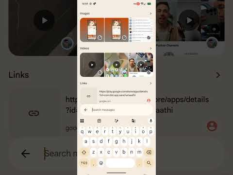
Google’s new design instead opens on a visual overview of content pulled from across your conversations. It shows preview rows for images, videos, links, and places, with an arrow next to each category that opens the full collection.
That makes the page more useful before you have typed anything. A recent photo or link may already be sitting in front of you, saving you from choosing a filter and searching another screen. The trade-off is that only a few items from each category appear initially, while the current category pages can show the full collection immediately.
The previews also make this screen much longer, but the bottom-mounted search bar remains within easy reach as you scroll.
You could search inside a chat without opening it first
Another practical addition is a shortcut for searching within a particular conversation. Typing a contact or conversation name into the main search page can surface matching chats in a dedicated Chats section. A search icon appears beside each matching conversation. Tapping it opens the new “Search in chat with…” screen for that person or group.
The new screen shows previews of images, videos, links, places, and other content shared in that conversation. The existing filter chips for categories such as starred, images, videos, and places are gone. Instead, you can tap the arrow beside each section to view everything in that category or use the bottom search bar to find text within the conversation.
The shortcut makes sense. When I search for someone’s name in Messages, I am often trying to find something they sent, not simply reopen the conversation. Google’s approach could save a few taps while keeping the familiar in-chat search option available.
Message results no longer hide matches inside each chat
The larger improvement concerns ordinary text searches. Google Messages currently groups global results by conversation and may show only one matching message from each chat. Selecting that result takes you into the conversation, where a counter and left and right arrows let you move through the remaining matches.
For example, a global search for “Hi” might show one result from a conversation even though that chat contains 60 matches. You must open the conversation and cycle through all 60 results one at a time.
The new interface can display each matching message directly on a dedicated results page. In our test, the page listed the separate “Hi” matches from the same conversation instead of collapsing them into one result.

Tapping one of those entries opens the chat at that exact message. The previous result counter and navigation arrows are no longer shown because you have already selected the individual match you want. A subtle pop animation briefly highlights the message after the conversation opens, making it easier to spot.
This feels like the most meaningful part of the redesign. Showing every result creates a longer list, but it also lets you use the surrounding preview and date to identify the right message before leaving Search. That beats repeatedly jumping into a chat and tapping arrows until you stumble across what you need.
Shared links and places get a visual refresh
Google is also changing how links and places appear. The new category pages use larger, cleaner cards. Link results show the URL, domain, and an avatar identifying the conversation, but they no longer show the sender, chat name, or timestamp directly on the card. Place results similarly lean on a richer visual preview.
Tapping a place opens a redesigned action panel with a larger preview and shortcuts such as See in chat, Open, Share, and Copy. The existing interface uses a more utilitarian card that includes the sender and time, along with buttons to view the message, open Maps, copy the link, or share it.
The new cards look more polished, but dropping the visible name and timestamp may make older links harder to place in context. An avatar can show which conversation a result came from, but it is less informative than a name and date, especially when several contacts use similar or default profile images.
The media viewer is catching up with individual chats
Opening a photo or video from search currently launches an older media viewer. Download and Share sit toward the bottom left, while See in chat appears on the opposite side.
Google’s replacement adopts the media viewer already used in individual RCS and SMS conversations. It adds a blurred background based on the media, places Download and Share in the upper-right corner, and centers the See in chat button near the bottom.
More importantly, you can swipe left or right to move through other images and videos in the search results. The current search viewer does not support that, forcing you to back out whenever you want to open the next item.

That swipe gesture is overdue. Once you reach a gallery of shared photos, it should behave like a gallery rather than a series of isolated attachments.
These experiments turn search from a set of basic filters into a proper browser for your conversations and shared content. Some choices, such as hiding timestamps from link and place cards, may need more thought. However, direct chat searches, complete message results, and swipeable media address real annoyances in the app.
Google has not indicated when — or whether — it plans to release the redesigned experience. Since we surfaced it before an official announcement, the final interface could look or behave differently if it reaches users.
Thank you for being part of our community. Read our Comment Policy before posting.