Affiliate links on Android Authority may earn us a commission. Learn more.
Google Messenger 2.0 goes live with smart redesign
Published onOctober 25, 2016

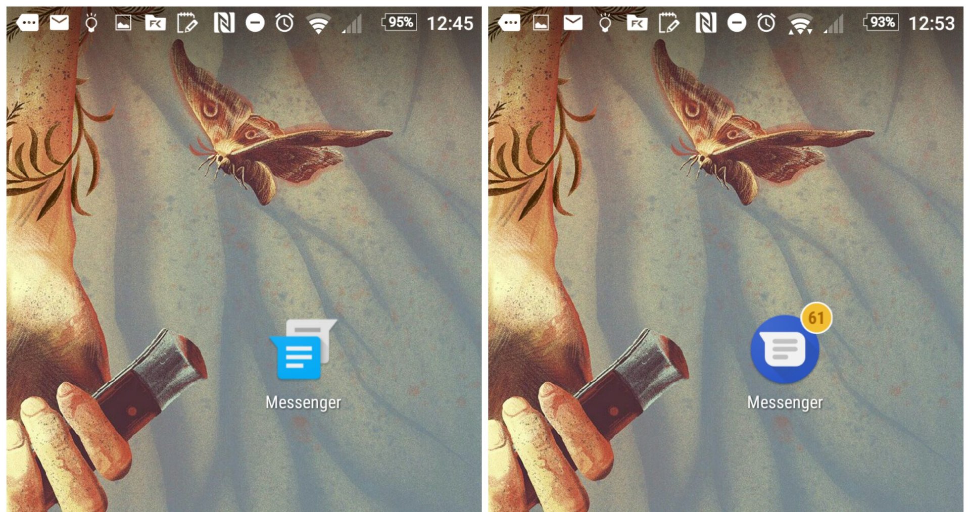
Google Messenger has been updated from version 1.9 to version 2.0 and a subtle redesign comes along with it. You’ll see an immediate difference with Messenger’s new circular icon (above right) and inside are some other UI tweaks more congruous with the design ideology of Android 7.1.
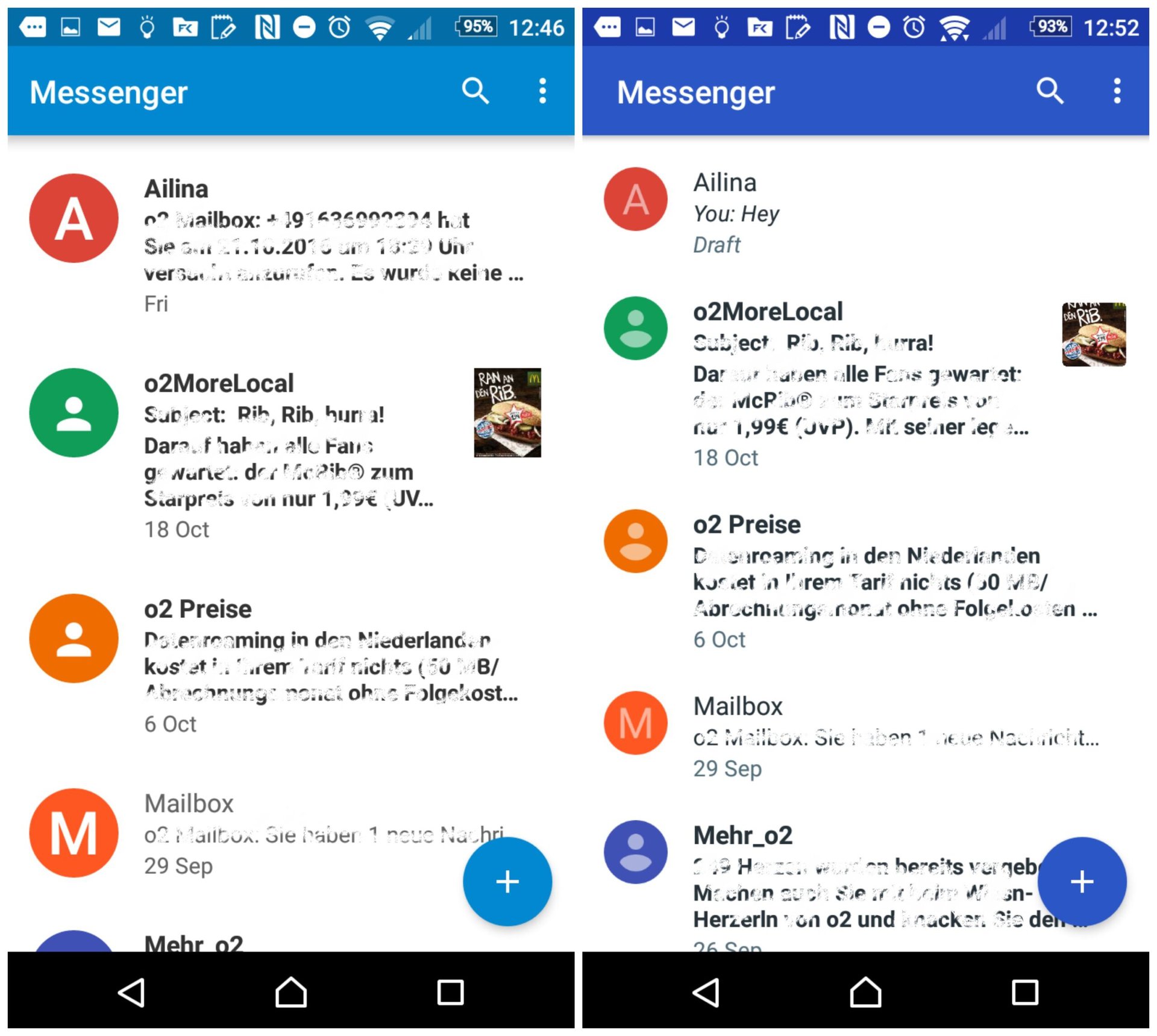
Contact profile icons have shrunk, meaning more text can be displayed, and the palette is now a darker shade of blue (huzzah!) than previously. See the old version below left and the new design below right.

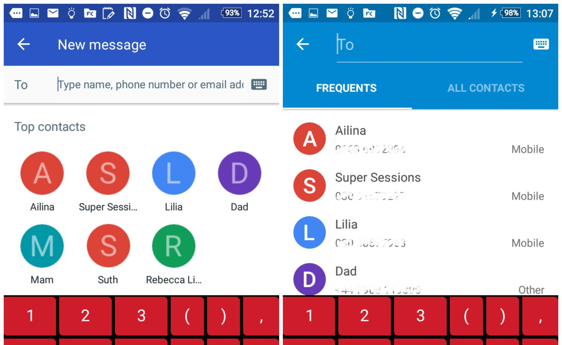
Also, when pressing the ‘plus’ symbol to send a new message, a list of top contacts appears first with your address book below, rather than the separate ‘Frequent’ and ‘All contacts’ tabs that were there before. Finally, the notification tray icon features the new design format and unread messages are now displayed on the home screen icon.

It’s certainly a ‘less-is-more’ update, though Google often favors small usability tweaks compared to radical innovation with its app updates. The update is rolling out now and you should be notified of it in due course. If you want to get it fast, you’ll find it at APK Mirror at the link.
What are your thoughts on Google Messenger 2.0? Let us know in the comments.