Affiliate links on Android Authority may earn us a commission. Learn more.
(Update: rolling out now!) Google gives us a good look at what its new visual language will look like on mobile
Published onSeptember 1, 2015

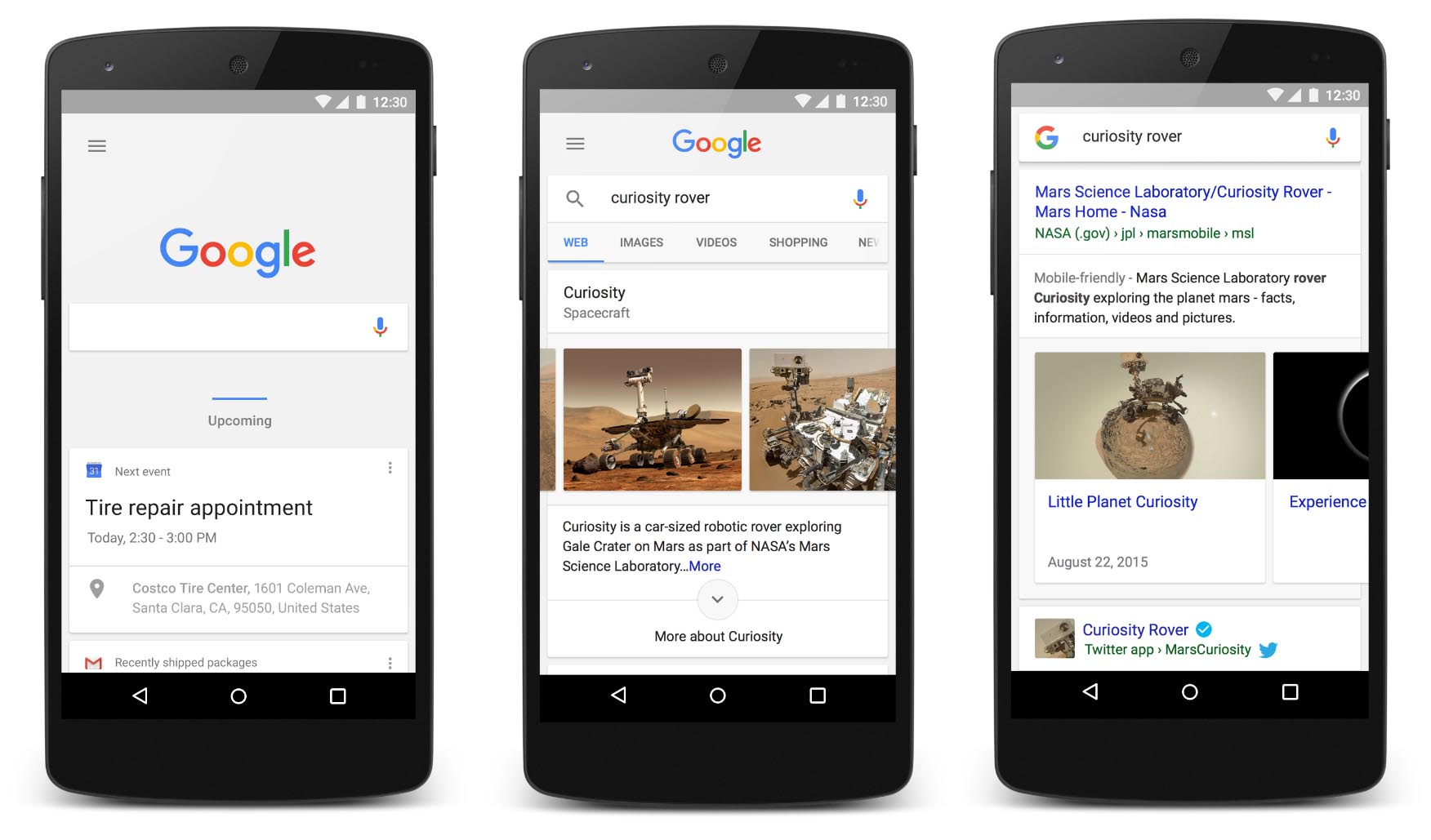
Original post: Earlier today, Google revealed a brand new logo and visual language that better reflects the company as a whole, no matter what screen size you’re using. We knew the revamped logo would begin rolling out to various products starting at some point today, and thanks to a new blog post, we’re getting a good look at the new visual refresh coming to mobile devices.
As you can see from the images attached above, search results on mobile devices will soon begin to look much more refined and modern. Google Now cards are getting a visual refresh, as well. Now they’ll be grouped together by category so you can find what you need more quickly, and they’ll also shift around and change sizes so the most important cards stand out.
Moreover, some big changes will also start to make their way to the home screen Search experience on Android devices. Take a look at the video below. As you can see, the Google logo and microphone have been updated to sport the iconic four color scheme. When the user taps the microphone, four colored dots appear on the screen and morph into the Google logo when the voice search is completed.
https://g-design.storage.googleapis.com/production/v5/assets/g-voice-flow.mp4
We’re not sure when all of these changes will come to mobile devices, but we’re hoping they do sooner rather than later. What are your thoughts on these new visual changes? Are you a fan, or do you like the way things look already?