Affiliate links on Android Authority may earn us a commission. Learn more.
Google News gets a fresh new look and more features

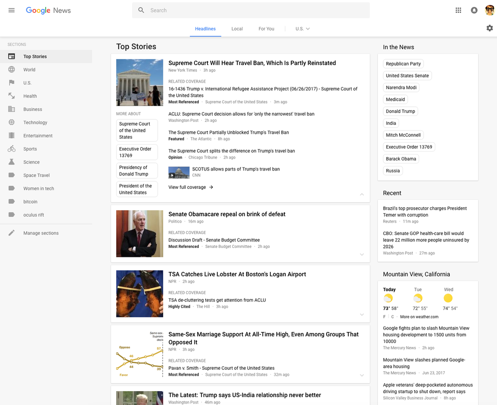
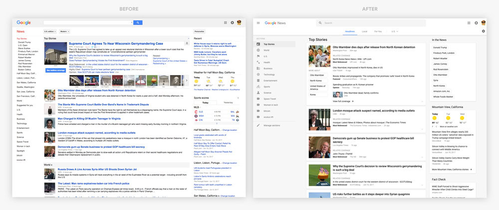
The Google News desktop website has finally been redesigned and now looks a lot cleaner and less cluttered. There’s now a new navigation column on the left side which you can customize by different topics of interest including Sports, Entertainment, Food, and more.
The website has adopted a card format and also features a new navigation bar on top for “Headlines,” “Local”, and “For You.” You have the option of personalizing the last two. In Local, you can stay up to speed with the news around your location or in any other part of the world you care about, while in For You, you can select the topics you’re interested in and create your own mini news feed. You can check out the before and after image of the websites’ design below.


There’s also the “Full Coverage” link at the bottom of each story that will show you additional articles written on the same topic by other journalists. Other things worth mentioning are the Fact Check box on the right that shows the top fact checked articles recently published (US only) and an improved algorithm for selecting videos.
Google said that the new design is rolling out globally and will be available to everyone in the next few days.