Affiliate links on Android Authority may earn us a commission. Learn more.
Google News & Weather gets dark theme, search, and pretty graphs
Published onDecember 4, 2014

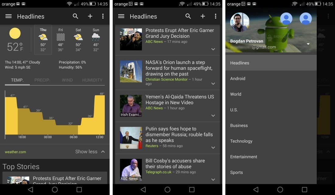
If you rely on Google’s News & Weather app to stay up to date with your favorite news sources, you’ll be happy to hear about the update to version 2.2, which brings a new dark theme, Material Designs touches, and some new functionality.
After a long period of neglect, News & Weather received a major facelift in August, and now the latest update further improves the app’s appearance. Little touches like a Lollipop-style refresh indicator and a modern side menu that uses the new account selection interface give the venerable app an air of freshness. The biggest change however is the addition of a dark theme, available from the overflow menu. Personally, I prefer this dark interface to the light color scheme that Google favors now, and I’d love to see more of Google’s apps “go dark.” The theme should look especially snazzy on AMOLED displays, like the one of the Nexus 6.
There’s some added functionality as well: you ca now use the search button in the action bar to dig in a specific topic, while the weather panel has been redesigned and now includes sleek graphs for things like temperature or humidity.
Google News & Weather 2.2 is currently rolling out to all users. To try out the app, head over to the Play Store, while those who can’t wait for the update can download the APK file from GappsEarly.