Affiliate links on Android Authority may earn us a commission. Learn more.
A sleek new transparent Google Feed pane might be on its way soon
Published onJune 14, 2017

It looks like Google might soon roll out a redesign of the Google Feed on Android devices.
The Google Feed (previously known as Google Now) has pretty much had the same design since it first launched on the Nexus 5 with Android 4.4 KitKat. If you’re using the Google Now Launcher, a quick swipe to the left-most pane would reveal a mostly white feed of Google cards. Sure, Google’s been tweaking the design ever so slightly over the years, but it looks like we’re about to see a pretty big redesign of the feed.
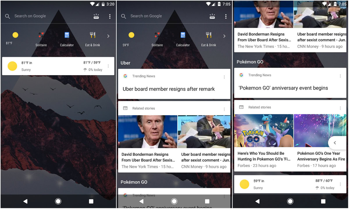
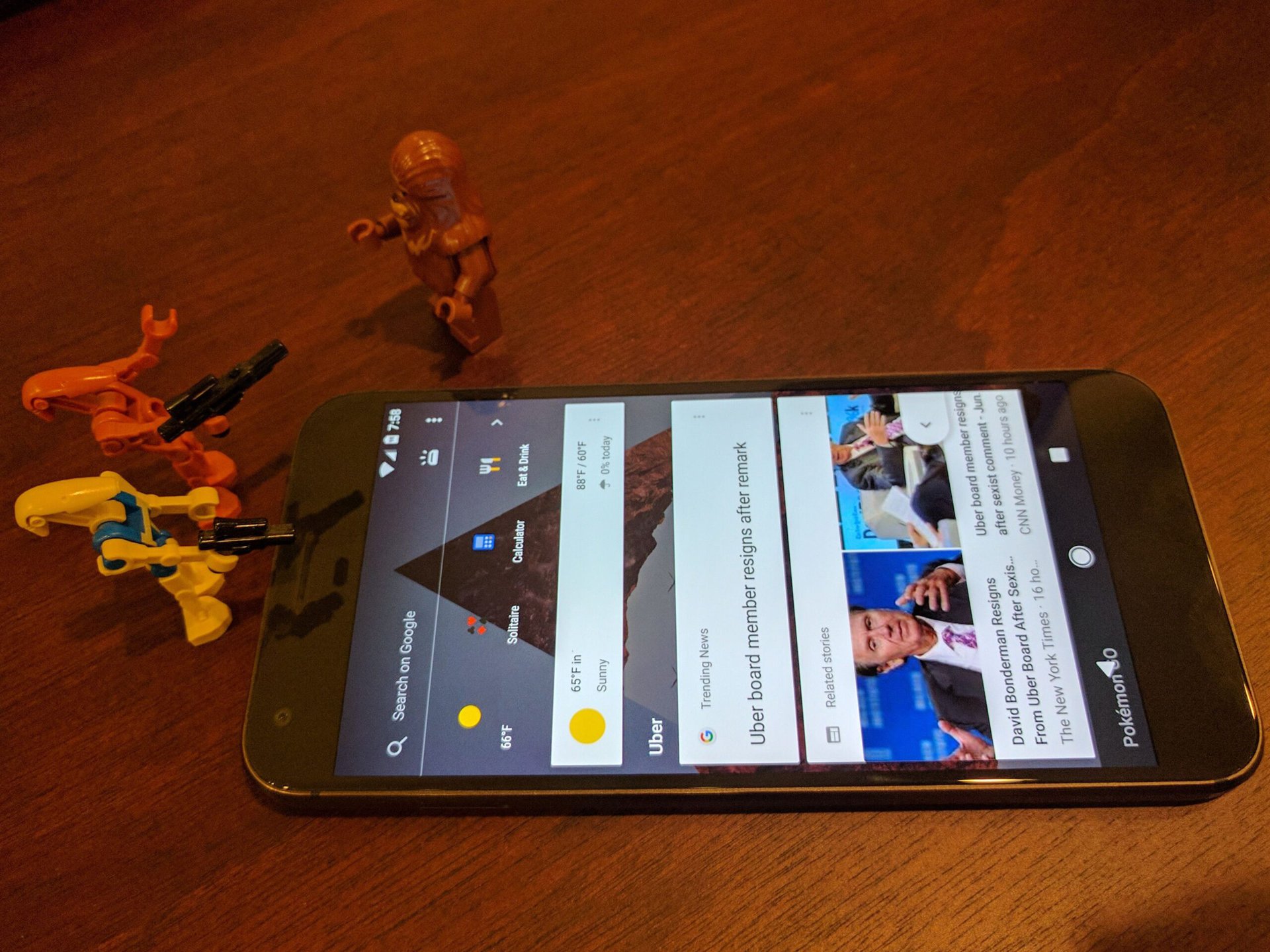
According to a Reddit user, Google is testing a transparent, tabbed layout for the Google Feed. Screenshots of the redesign can be found above.
As you can see in the images attached to this post, the new-and-improved Google Feed is showing the device’s wallpaper with a tinted overlay, which I think looks pretty sleek. You’ll still have access to your most important Google cards, now with a few icons up top with access to weather, a calculator, and more. Tapping on the little box icon on the top right will bring you to an Upcoming section, which will display info such as weather warnings and your parking location.

The screenshots were taken from a stock, unrooted Pixel XL running Android build number N2G47O with the May 2017 Android security patch.
We’ve seen this design a few times over the past few weeks, but it now looks like Google is testing out the redesign before rolling it out to all Android users. It certainly looks cool, but you may feel differently.
Have you received this redesigned layout yet? If so, let us know!