Affiliate links on Android Authority may earn us a commission. Learn more.
Google Now Launcher update brings Material Design tweaks to KitKat and Jelly Bean
January 13, 2015

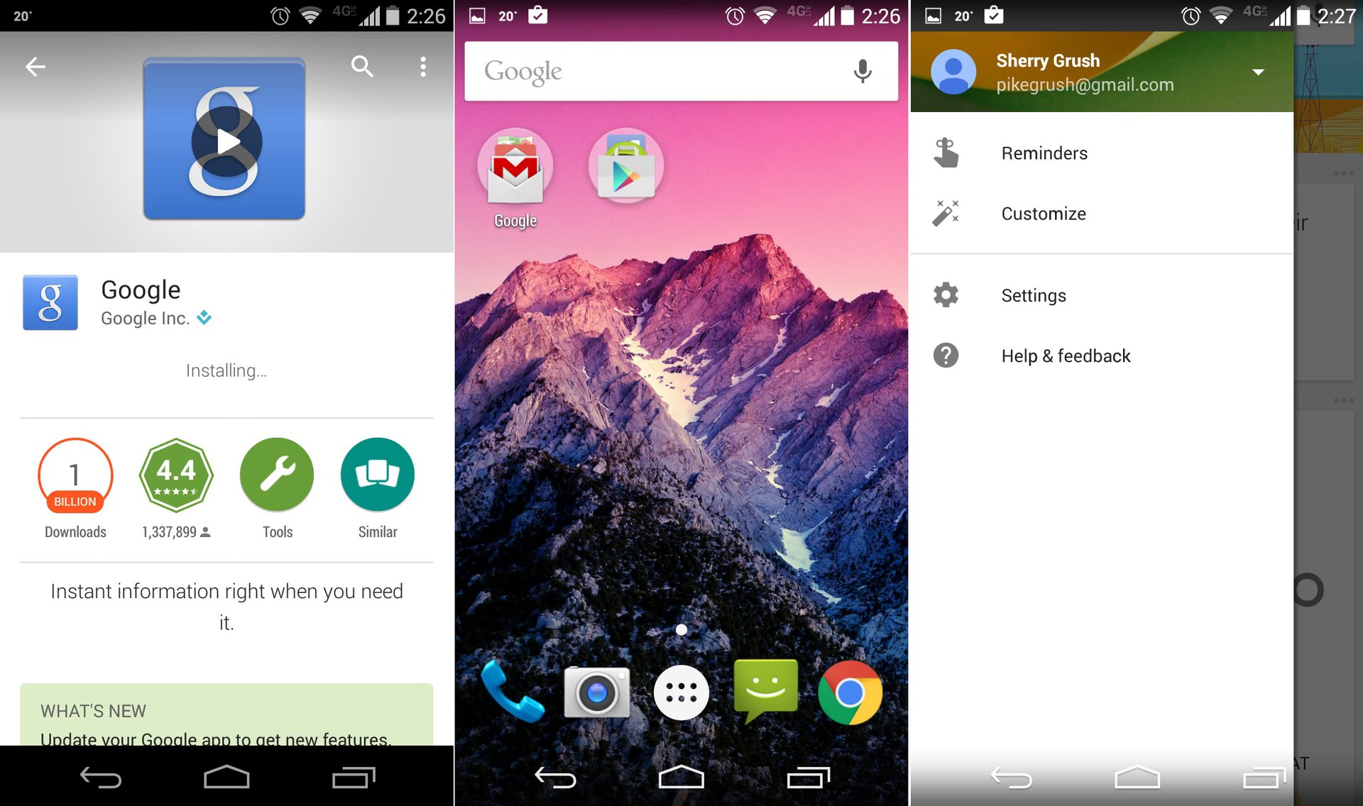
A new update is rolling out for the Google Search app that brings a new look to the Google Now Launcher. Well, at least it is new if you’re someone running something older than Lollipop.
For those running Android 4.1 through 4.4, the latest update will bring Material Design elements to the Google Play launcher. Now before you get ahead of yourself, this doesn’t mean all MD design changes like the new navigation buttons, but there are a few changes to the aesthetics including slightly improved animations, the white app launcher button, a white color in the Google Search bar and improvements to the Google Now area of the launcher including a slide-in panel that lets you switch Google Now settings and accounts.
If you’ve yet to see these changes rollout to your device yet, be patient, as it should only be a matter of a few more days. Already have the latest update? What do you think of the changes to the Google Now Launcher? What do you think of Material Design in general? Let us know your thoughts in the comments.
Thank you for being part of our community. Read our Comment Policy before posting.