Affiliate links on Android Authority may earn us a commission. Learn more.
A ‘leaked’ screenshot of Google Now shows off possible Material Design makeover

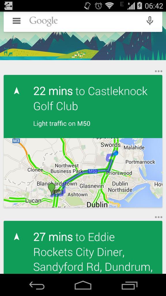
Very early this morning a Tweet from a Googler by the name of Michael OHerlihy hit the web, in it contained a screenshot of what appears to be a totally revamped Google Now interface. Since then, the tweet has been deleted, but this is the Internet and so nothing is ever truly forgotten. We can’t say that the idea of revamped Google Now is surprising, after all the final release of Android L is just around the corner and that means that there are likely plenty more Google apps and services that will be getting Material Design tweaks in the days and weeks to come.
So what’s new here? First, there’s a hamburger menu on the left side, something that currently doesn’t exist in Google Now. It’s unclear what the purpose for it is, but given its presence in the search box we’d guess it allows you to select different types of searches like images, videos and so forth. Some of the other changes include the new placement of the overflow menu outside of the individual Now cards, and it’s possible that the green-hued cards are also part of the Material Design makeover.
We can’t confirm this is really what Google Now will look over when it gets a full Material Design makeover, as it could be a mock-up or even an early unfinished makeover. Still, we wouldn’t be surprised if it ended up looking something like this. What do you think of the new look (if legit), how do you feel it compares to the current look within Google Now?