Affiliate links on Android Authority may earn us a commission. Learn more.
Google Now on Tap experiments with Now cards
Published onAugust 5, 2016

The ambition of Google Now on Tap seemed coherent enough. The idea was to analyze content on the screen and provide the user with relevant search results preemptively. Google has long been attempting to bring users the information they want before they know they want it, but by and large Google Now on Tap has felt like it has missed the mark.
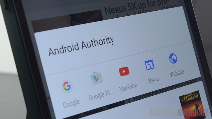
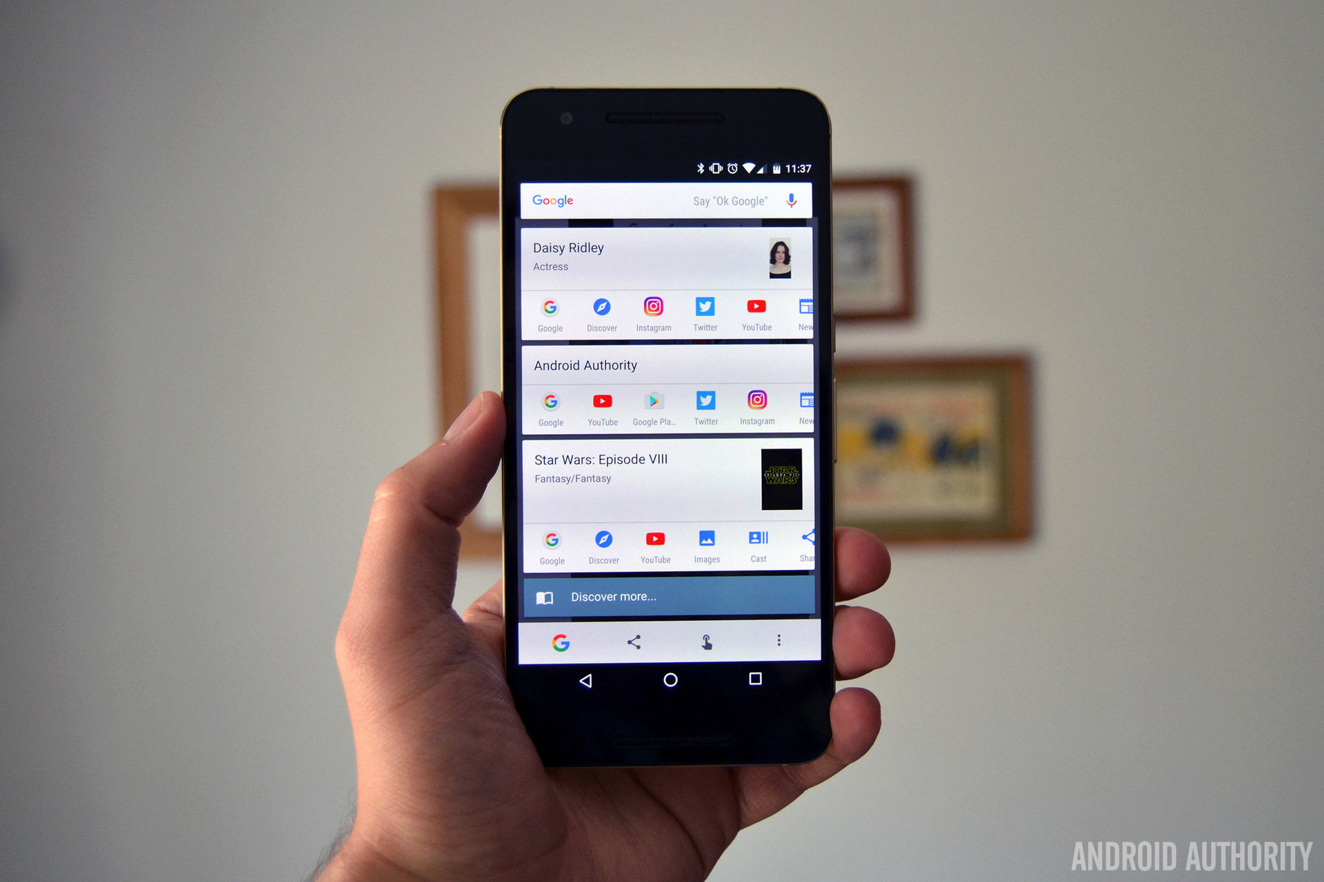
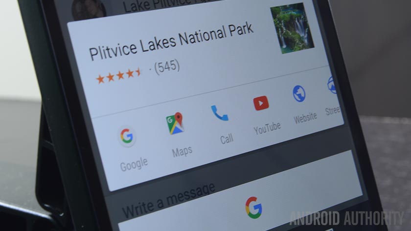
Now Google looks like they’re experimenting with a new feature that helps pad out the all-too-frequently empty field for fruitless Google Now on Tap results. For many users, in addition to seeing smartly fetched search results, they’re also seeing the list of Google Now cards that would normally appear in the far left screen of the Google Now launcher.

These cards don’t appear to be specific to information that is on the screen at the time of accessing Google Now on Tap. Rather, they’re the same cards you would normally see.
This may feel like a lack of meaningful content, but whereas Google Now on Tap has been something of a letdown, Google Now cards are actually pretty damn useful. Even if you don’t find exactly the kind of information you were planning on seeking out, you’ll at least find some content that is likely to be relevant to your general interests and recent activity.
Google Now cards are actually pretty damn useful.
Right now there’s no evidence to confirm that this feature will make it to the final version of Google Now on Tap. It appears to be under testing in beta, but if response is positive, then you should see cards appearing on Tap sometime down the road.
What are your thoughts regarding the addition to cards to Google’s context-sensitive search anticipator? Useless fluff or something that could make Google Now on Tap actually practical? Give us your take in the comments below!
