Affiliate links on Android Authority may earn us a commission. Learn more.
Why does Google get so much hate for the design of the Pixel 3?
Published onNovember 30, 2018

The Pixel 3 and Pixel 3 XL by Google are tricky smartphones. The Pixels have always been well-rounded devices with arguably the best cameras on a smartphone riding on the company’s brilliant work in computational photography. Yet, in its third generation now, they’ve not been flying off the selves either.
The design of the Google Pixel 3 (and I’ll use that to imply both Pixel 3 and Pixel 3XL through the article) is one aspect of the phone that caused the most controversy. A lot of our readers and friends on Twitter were underwhelmed and called the design as “boring”, “not premium enough”, and even “lame”.
Unlike everything on the specifications sheet, design is a subjective thing (along with camera, I guess, where one may prefer a more saturated photo over another one with true-to-life colors or vice versa). There are some absolutely gorgeous devices – like the HUAWEI Mate 20 Pro – but mostly design is a personal choice and a matter of individual taste.

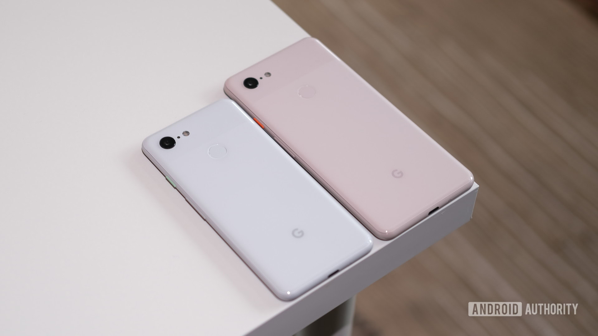
The Pixel 3 continues with the Pixel DNA with its unassuming two-tone design.
Of course, the most contentious design aspect of the larger Pixel 3 XL was the notch – the largest notch ever on a smartphone. It’s like a bathtub placed in your office – huge and intrusive. Yet, most us eventually end up tuning it out, like we do for notches, of all shapes and sizes, on all other phones. Notches are a design abomination that we have to live with, and not celebrate. This too shall pass, one hopes. Or you could pick the smaller Pixel 3, which is also my pick because I’m a big fan of smaller phones.
See Also: I’m done with 18:9 displays, and have fallen in love with the ‘boring’ Pixel 2
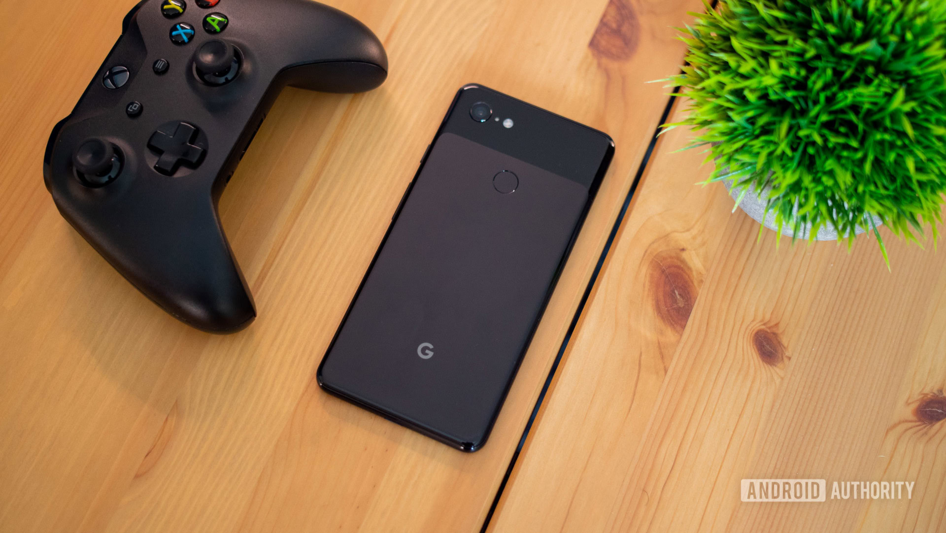
That apart, the Pixel 3 is the best-looking smartphone ever from Google. The shift to an all-glass back with a soft-touch matte finish looks great and feels very assuring in the hand. Of course, there’s Gorilla Glass 5 on the back and fingerprints are not much of a problem. The rounded aluminum rails replace the blocky edges and make for a nicer grip.
The Pixel 3 is for everyone who prefer an understated design.
While most of the changes are quite subtle, the Pixel 3 looks a lot more like a contemporary product. The colored buttons on the white and pink variants are a nice touch.
The Pixel 3 might be quotidian for a few, but is quite organically pleasing to me. There’s a sense of comfort and class with this one and Google has clearly withheld any temptation of jazzing it up. The Pixel 3 is for everyone who prefer an understated design, like this old writer.