Affiliate links on Android Authority may earn us a commission. Learn more.

Google Pixel 3a XL camera review: Category leader
Published onJune 21, 2019
Google Pixel 3a XL
What we like
What we don't like
Google Pixel 3a XL
The Google Pixel 3a XL is a delightfully capable device. The low-cost wonder carries forward the basic principles of Google’s no-muss, no-fuss Pixel line — and that includes the powerful camera.
Since Google debuted the original Pixel in 2016, the series has been known for its photography prowess. The Pixel 2 and Pixel 3 both upped the ante with even more features such as Night Sight and Portrait Mode. Now, Google has watered down its Pixel line to make a more affordable option in the Pixel 3a and 3a XL.
These devices feature the same camera sensor and software as the main 3 series, but there are some important differences that impact image quality in some circumstances.
Here is Android Authority‘s Google Pixel 3a XL camera review.
Google Pixel 3a XL camera specs
Rear Camera
- 12.2MP dual-pixel
- 1.4μm pixel size
- ƒ/1.8 aperture
- Autofocus with dual pixel phase detection
- Optical and electronic image stabilization
- 76-degree field of view
- 4K at 30fps
- 1080p at 30fps, 60fps, 120fps
- 720p at 30fps, 60fps, 240fps
Front Camera
- 8MP
- 1.12μm pixel size
- ƒ/2.0 aperture
- Fixed focus
- 84-degree field of view
- 1080p at 30fps
- 720p at 30fps
- 480p at 30fps

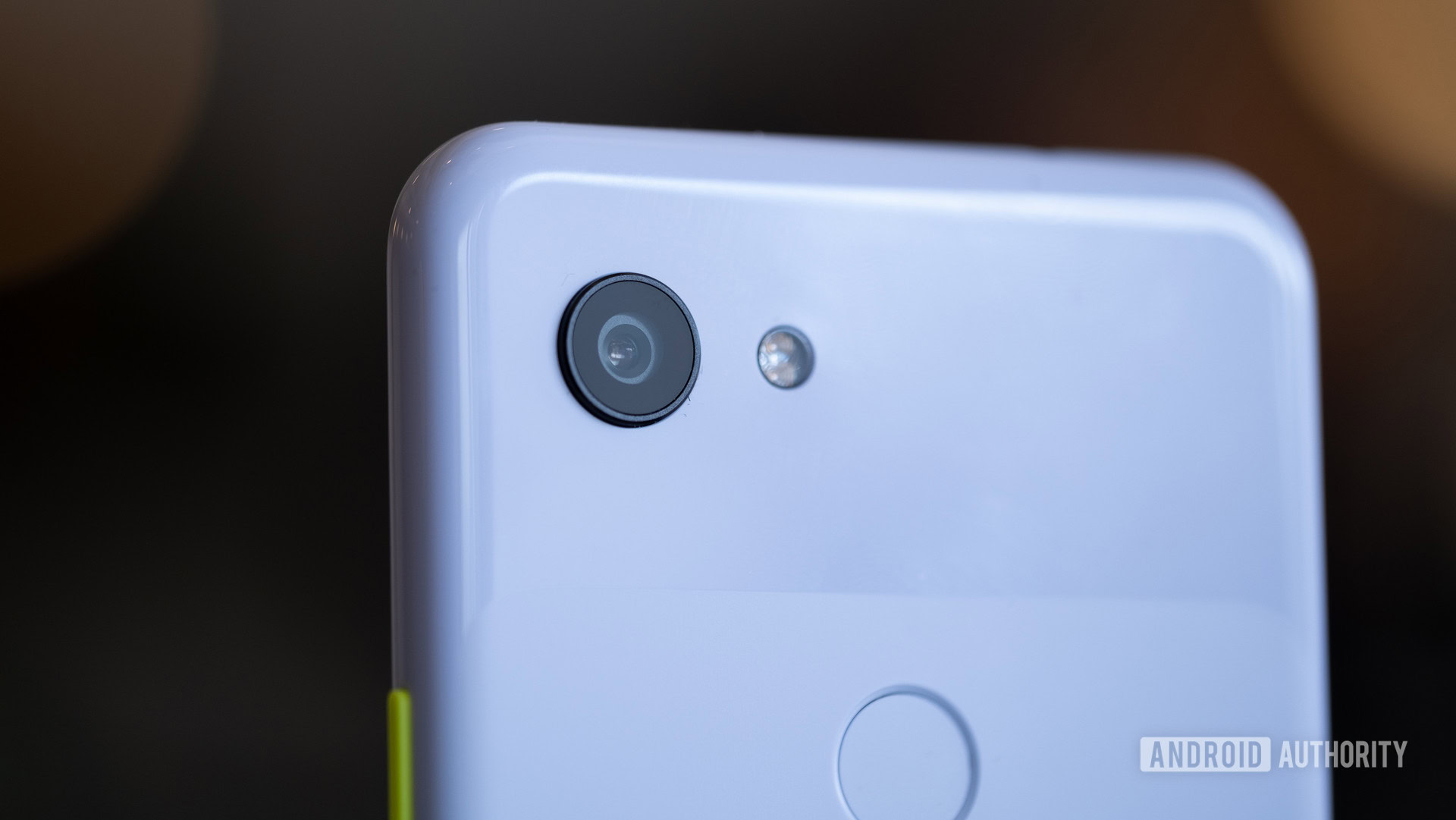
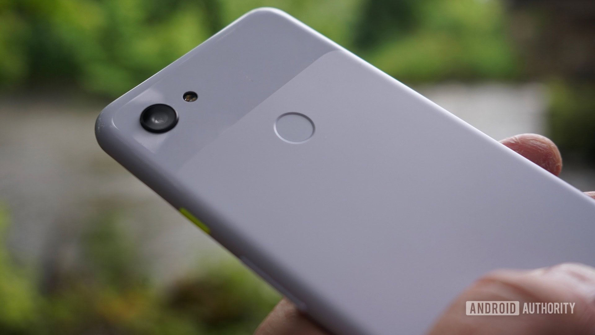
From a hardware perspective, nearly everything found in the Pixel 3 XL is tucked into the Pixel 3a XL. You get the same sensor with the same aperture, same pixel size, same OIS/EIS, and same dual-pixel phase detection. The 3a XL, however, loses the Pixel Visual Core, the 3 XL’s dedicated image signal processor. Google says it moved the processing tasks completed on the Pixel Visual Core to the Spectra ISP of the 3a XL’s processor.
Speaking of processors, this is probably the biggest difference as far as hardware is concerned. Where the 3 XL has Qualcomm’s 2018 top-of-the-line Snapdragon 845 SoC, the 3a XL has the decidedly mid-range Snapdragon 670. The 670 provides the 3a XL with plenty of oomph, but it doesn’t have nearly the same media crunching powers of the 845. Without the Pixel Visual Core, the 670 in the 3a XL has to do more with less.
The Pixel 3a XL’s selfie camera situation is different, too. The 3 XL has two user-facing cameras: one standard angle and one wide-angle. The Pixel 3a XL drops the wide-angle selfie cam in favor of a single 8MP shooter.
Looking at the feature list, the Group Selfie Camera, enabled by the second front camera, is the only thing missing as far as Google is concerned. The 3 XL is able to use both user-facing cameras to create Portrait Mode shots. With but a single front camera, the 3a XL needs to rely wholly on software for this feature to work. Again, the cheaper phone is doing more with less.
So, sure, the Pixel 3a XL has the “same camera” as the Pixel 3 XL, but that’s not the whole story.
Google Pixel 3a XL Camera app
Google’s native camera app for its Pixel phones is one of the simplest and easiest to use in the market. It skips many of the fancy features found on flagships from Samsung and LG in favor of the basics. What it lacks in raw functionality it more than makes up for in performance. A quick double press of the power button launches it rapidly.
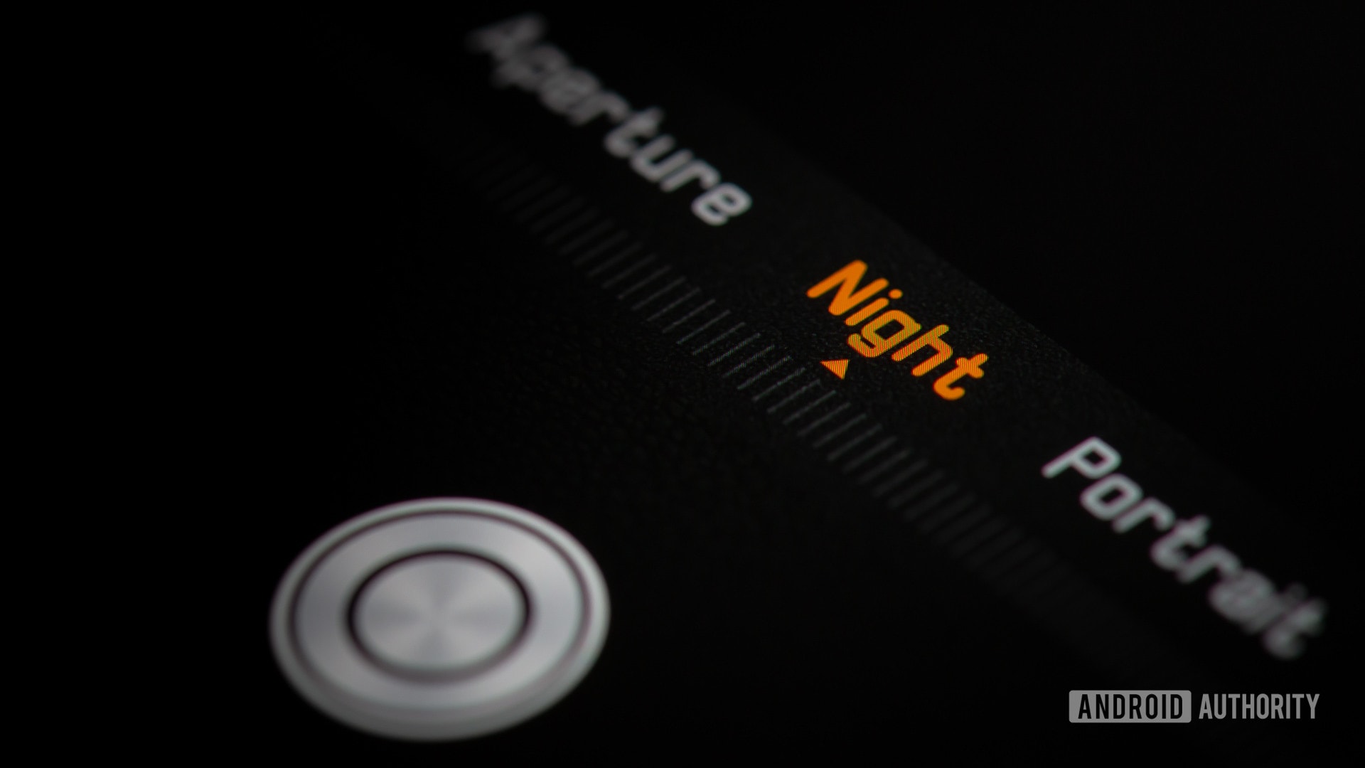
The app’s main screen provides the expected set of controls. A shutter button with camera modes are on one side, and a control strip with settings toggles is on the other. The core shooting modes are panorama, portrait, camera, and video. A “more” option opens up a secondary menu where you’ll find Night Sight, photo sphere, photo booth, slow motion, time lapse, playground (animated AR stickers), Google Lens, and the full settings menu. There’s no manual or pro mode.
You'll find the Pixel 3a XL's camera app is responsive and quick.
In the settings menu, you can adjust basic tools such as gridlines and GPS tagging, as well as advanced features such as motion gestures and whether or not HDR+ is always on. I wish it didn’t take two taps to get the settings menu. Camera apps from the likes of Samsung and HUAWEI are loaded with extra features, though at the expense of usability.
You’ll find the Pixel 3a XL’s camera app is responsive and quick. I didn’t encounter any issues while testing it.
- Ease of use: 10/10
- Intuitiveness: 10/10
- Features: 7/10
- Advanced Settings: 7/10
Score: 8/10
Daylight
Pure daylight can wreak havoc on white balance. If there’s one thing the Pixel 3a XL does really well, it’s nail white balance in daylight shots. There’s no overly-blue hue coloring the photos, despite the vast amount of sky, water, and reflective buildings in the shots.
The photos show proper exposure, plenty of detail (even in the darker spots), and look sharp. Noise is kept to a minimum, as is compression. The flowers could easily have blown out the sensor, and yet the Pixel 3a XL managed to tame the reds without muting their brilliance. Same is true of the Vessel structure, where the sunlight reflecting from the buildings could have overpowered everything. I really like the tone of the sky in the lighthouse shot.
Score: 8/10
Color
People like for their pictures to be colorful. I do, too, but I don’t want them to look unnatural. Phones from the likes of Samsung and HUAWEI are prone to over saturating (or exaggerating) the color in results to give them more pop. The Pixel 3a XL doesn’t do that at all. In fact, it almost keeps colors understated. The examples here are spot-on in terms of accuracy, meaning they truly represent what my eyes saw in real life. The results don’t jump off of the screen, but I’m okay with that.
These photos do suffer a little bit in other ways. The bottom-left skews a bit yellow and the bottom-right skews a bit blue as far as the white balance is concerned, and some of the darker regions lose a touch of detail. To me, the accuracy of the colors outweighs these shortcomings.
Score: 8/10
Zoom
With but a single rear lens, the Pixel 3a XL relies on digital zoom (aka, cropping) to create 2x magnification. Two of these images (flower, skyline) exhibit lots of compression and loss of detail. I think the exposure turned out accurately, as did white balance, but they come across just a hair flat to my eyes.
On the other hand, the right two shots (bricks and bikes) are excellent. There is very little noise in either shot, and each looks sharp to the eye. The shadows in the bike shot could easily have swallowed detail. Instead, there’s plenty to see.
Score: 7/10
Detail
Detail is hard, y’all. It’s one thing to nail exposure and white balance, and another thing completely to maintain sharpness and detail when you zoom way in. The lines of the exterior glass shell edifice of the Javitts Center in NYC are all well defined, and you can still make out the details of the buildings in the background. I particularly like that the beer labels are all legible, as is the text on the monument, should you care to dial in for a closer look.
The bike shot shows plenty of detail in the spokes and bike frames, but starts to lose definition in the shadowy spots. I was a little disappointed with the exposure of this particular image, though the bikes are easy to tell apart. Those rear fenders could easily have blended into one another and instead each is distinct.
Score: 7/10
Landscape
In landscape shots you’re generally looking for blue skies and green shrubbery with everything in focus from top to bottom. These shots are mostly accurate when it comes to representing the scene at hand, though there are issues with each. The biggest problem is noise, which saturates all four pictures.
The bridge shot is the most balanced of the bunch. Nearly everything is right, including color, detail, white balance, and exposure. The fact that the dark areas of the bridge didn’t lose detail are a testament to Google’s algorithms. The opposite is true of the pond photo. The Pixel 3a XL didn’t blow out the sky, but the treeline between the pond and the skit lost lots of detail. The foreground is underexposed, as well. Similar issues plague the curving road image.
The lamppost shot surprised me. The camera somehow dropped the finer details at the front of the SUV, but managed to keep the dark trees on the horizon from being blacked out. I see some banding in the clouds, but it isn’t too bad.
Score: 7/10
Portrait
Portrait photography is all the rage these days. Nearly every phone offers the bokeh effect, which keeps the subject in focus while blurring out the background. Here are four examples, three taken with the rear camera and one taken with the selfie camera. All four rely on Google’s processing techniques to generate the outline around each subject and fuzz out everything else. These examples are decent, but show that Google isn’t infallible.
Google is better than the vast majority of competitors, but still clearly a journeyman.
In the top two shots, the border between subject and background is very clean. Even most of the hair wisps are tackled well. The first image presented a challenge thanks to three distinctly different planes in the background. Google managed to get those to the left and right of the girls correct, but the one in the center is less blurred and it almost ruins the image. Unfortunately, the top two shots show poor white balance, though I’d say the lighting was a bit tricky.
The bottom two shots are better, but still not perfect. In the lower left shot you can see the railing on the left is in focus while the railing on the right is blurred. The girls are in focus and have good skin color. The same is true of the right shot.
Portraiture is an art to be mastered. Google is better than the vast majority of competitors, but still clearly a journeyman.
Score: 7/10
HDR
Balancing light and dark is tricky. That’s why phone makers have spent years working to perfect HDR technology to provide that balance. These shots could have gone in any direction, but I think the Pixel 3a XL did an acceptable job of handling challenging scenes.
The first photo is a lamp. I expected to the camera to blow out the bulbs and leave the rest pitch black. Instead, Google’s post processing managed to strike the right exposure in between. That any of the brushed aluminum detail in the lamp frame is visible is rather surprising. In the second shot, the camera had to balance bright TVs and black leather chairs in the shadows. This is the real winner here. I am pleased to see any detail at all on the TVs. There’s also plenty of visibility all the way to the back of the bar without fading to black. The image is a bit soft, however, and shows some compression artifacts.
The Pixel 3a XL did an acceptable job of handling challenging scenes.
On the bottom-left we see a shot with lots of detail in the light and dark spaces. I particularly like that the color in the eaves on the right is discernible. Still, the photo has plenty of noise when you look closely.
The Pixel 3a XL struggled a bit with the fourth image, which had a bright fire and dark grass. I would have preferred to see more detail in the grass and kids, but that might have meant the house and sky would have been blown out. The phone did well, all things considered.
Score: 7/10
Low light
The Pixel 3a XL’s ability to produce usable shots taken in low light is something special. In these photos, taken well after sundown, the phone’s camera was able to bring out details that might have been lost on lesser cameras. Not only is the exposure decent, but so is the color and white balance. Focus may be a bit soft, and there may be a small hint of banding, but otherwise the photos are quite good.
If there's one set of phones that truly excels at low-light photography, it is Google's Pixel line.
I really like the photo of the boardwalk. The lamps pop nicely and there’s still plenty of detail in the clouds and the sand. The close-up of the restaurant reveals some details of the diners, though the darker spots lose definition.
Google’s Night Sight is something else entirely. It gives the phone an uncanny ability to “see” in the dark. The Night Sight shots are impressive for their ability to transform what would otherwise be inky darkness into something. The shot of the casino tower was taken in near pitch black conditions, but it suffers from noise and artifacting.
If there’s one set of phones that truly excels at low-light photography, it is Google’s Pixel line — 3a XL included.

Score: 8/10
Selfie
Here we have four completely different selfies thanks to the varied settings: overcast, daylight, twilight, and shadowy. In three of these shots, I’m in focus and exposed properly given the lighting conditions. In the other, I’m a bit soft. My face looks over processed in the first shot and the background is under-exposed. My face lost detail in the third shot and I look a bit bland.
In the two shots on the right, you can see two very different stories with exposure. In the second shot, the Pixel 3a XL camera got everything right. the exposure is particularly good, considering the bright backgrounds. The lower shot misses. It blew out part of the background in order to keep detail in the Vessel and my face.
There isn’t too much noise in any of the shots, though I see some banding here and there. In all, however, not bad.
Score: 7/10
Video
The Pixel 3a XL can record video at a max of 4K resolution, though at only 30fps. This matches the video capabilities of the pricier Pixel 3 XL and the less-expensive phone did very well.
I thought exposure and color was accurate throughout, and Google’s video stabilization is quite something. I shot this video as I went for a walk and you can see how smooth it is. The green looks lush and details in the trees comes out as I get closer. I particularly liked the movement of the water of the falls.
Score: 8/10
Conclusion

Google Pixel 3a XL camera total score: 8/10
What you need to know is this: There’s no $400 phone in the market that has a better camera than the Google Pixel 3a XL. The 3a XL delivers the goods through and through. Whether it’s the simple app or the above-average results, the phone is easy to use and easy to love. It will serve as a powerful everyday shooter as well as trusted companion for those special moments you want to capture for a lifetime.