Affiliate links on Android Authority may earn us a commission. Learn more.
Let's talk about those Google Pixel 6 design leaks
Published onMay 24, 2021
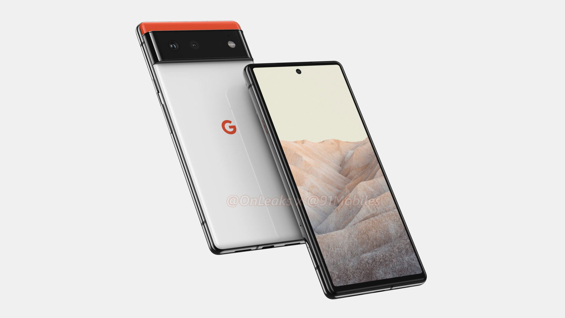
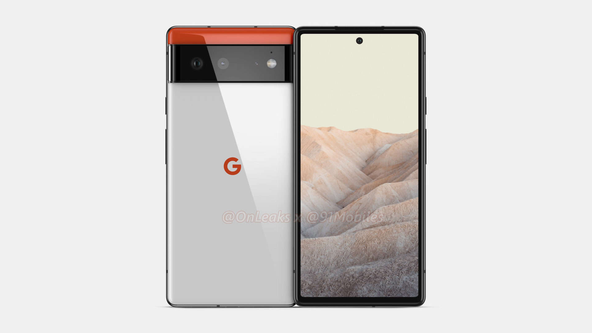
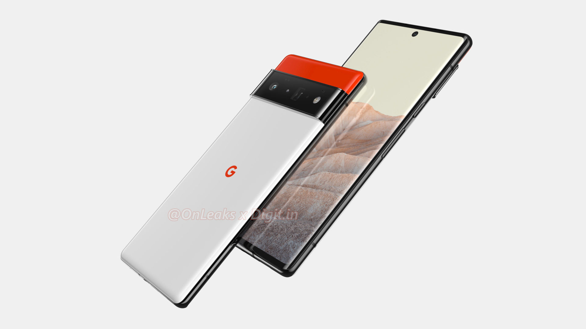
The Google Pixel 6 design renders that have recently come to light are quite something, aren’t they? With renders of both the Pixel 6 and the so-called Pixel 6 Pro now circulating, we have a general idea of what might be in store for Google phone fans come this fall. The renders have certainly given us plenty to think about and consider. Here’s what’s on our minds.
The Pixel 6 represents the biggest design change in the series’ history
While there are some base similarities between the Pixel 6 and previous generations of Pixels (think the black and white color scheme), the new renders show a significant break from designs of the past.
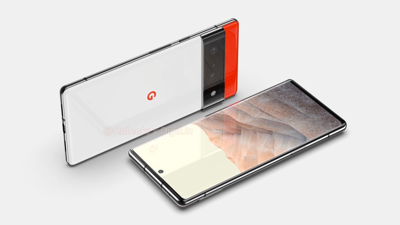
The first three pixel phones had two-tone rear panels and simple, single-camera designs. The Pixel 4 and Pixel 5 got rid of the two-tone look in favor of a single rear-panel color and adopted square-shaped multi-lens camera systems. The Pixel 6 has neither a two-tone look nor a square camera bump. Instead, we have three colors and a camera band that runs from side to side.
The Pixel 6 is very Google-y and yet wholly different from any previous Google phone.
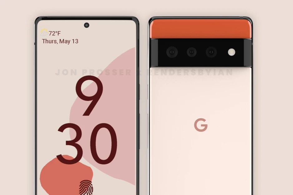
Google has always been one to mix in a small splash of color. The orange mixed with black and white is very Google-y and yet still a wholly different look.
These phones also have sharper corners and bare metal framing when compared to older Pixel phones, which have typically matched paint. The Pixel 6 Pro, meanwhile, reportedly has a curved display — another first for the Pixel line.
It’s safe to say the Pixel 6 series is a huge design shift for the search giant.
There’s no escaping the bump
Significant camera bumps have become a common design element of modern flagship smartphones. Nearly every top-level device has a large camera module dominating the rear panel. Think of the Samsung Galaxy S21 Ultra or, egads, the Xiaomi Mi 11 Ultra, and you’ll get what I mean. Google appears to have fallen prey to the same issue, though it’s handling it differently.
Opinion: It’s time Google updated Pixel camera hardware to match its stellar software
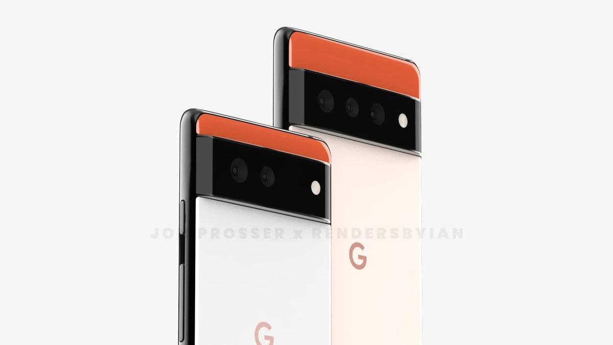
In these renders, we see a raised band that runs from side edge to side edge. Multiple lenses are located inside the band. There appear to be two lenses on the Pixel 6 and three lenses — one of which a periscope lens — on the Pixel 6 Pro. Switching to a three-lens system could be a serious upgrade for the Pixel line, which has since inception been limited to just one or two rear cameras. We can only hope that Google changes the primary sensor under those lenses too.
It’s a nice break from the square and rectangular shapes of today’s beefy camera modules, even if the bump is still there.
Does the Pixel 6 match Android 12?
Google has generally done a fine job of matching the look and feel of its hardware to its software. The Pixel 3, 4, and 5, for example, were simplistic, smooth-looking devices that complemented the Material Design of their respective Android versions.
Related: How Google Pixel prices for phones changed over the years
There’s a clean, almost utilitarian look to these Pixel 6 renders. Google’s Pixel phones have been known for their simplicity of design, but the harder edges of the Pixel 6 phones don’t necessarily gel with the rounded corners that are visible in the Android 12 user interface elements. Think of the new curved shapes of the Android 12 Quick Settings menu or notifications and you’ll get what I mean.
On the other hand, I like the mix of black, white, and orange, but Android 12 is all about “Material You.” The color palettes of both the hardware and software in the renders could match quite nicely, but that will all depend on what shades you pick for Android’s refreshed UI. It will be interesting to see how Google matches other hardware colorways with this customizable software color palette.
Is the Pixel 6 too generic?
Some commenters have called the Pixel 6 renders “third-rate” designs that could come from any phone maker. Calling them generic, un-Google-y designs is a matter of opinion, of course, but it’s one that doesn’t consider the complete history of the Pixel line.
What do you think about these Pixel 6 renders?
The Pixel and Pixel 2 were clearly exercises in raw industrial design. Both were a mish-mash of metal and glass components and odd panel shapes that didn’t necessarily go well together. The Pixel was a little more cohesive than the Pixel 2 to my eyes. The Pixel 4 took things the other way, perhaps oversimplifying the look of the series with its all-glass rear panel. If you want to look at a generic phone, look at the Pixel 4 or the Pixel 5. These phones are Google-y in the most intense way possible.
With the Pixel 6, Google is pulling an Apple and thinking differently. The Pixel 6 and 6 Pro may have a basic industrial look to them but few phones mix color this way. I wouldn’t call them too generic.
Pixel 6 > Pixel 3, 4, 5
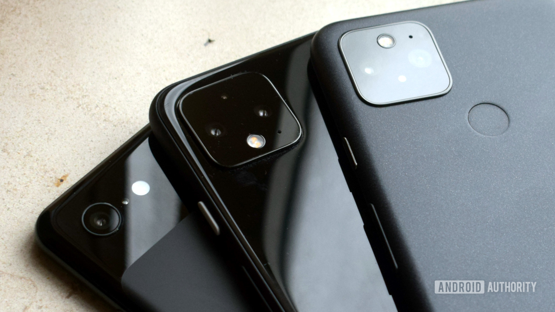
Following the line of thought from the previous point, the Google Pixel 3, 4, and 5 were over-simplistic devices that had little personality. Perhaps their personality was that they had no personality. The Pixel 5 is practically a bar of soap, with its rounded edges and smoothed-over design. It could be a kid’s phone. It looks like entry-level fare from 2017.
The Pixel 4 was a 2019 phone through and through. Its design clearly showed Google chasing after Apple and the iconic look of the iPhone. Things that gave it away as an iPhone wannabe included the curved side rails, the rear glass panel with the square camera module, and the big forehead to accommodate the facial recognition module.
This is a promising step away from previous Pixel designs.
The all-glass Pixel 3 was a disaster thanks to that truly ugly “bathtub” notch on the front. I still can’t get over how bad it looked.
These Pixel 6 design renders are giving us a bit more to look at. I’m not calling them the best-looking phones ever, but I think they’re a good step away from previous Pixel designs.
Remember: Renders aren’t the real thing
The source of the most recent renders, Steve Hemmerstoffer (aka @OnLeaks), is a fairly reliable leaker. That said, it is just as possible that we’re looking at early designs that aren’t 100% final. Google still has time to make tweaks to the color palette and other facets of the design before production begins.
Further, the latest Pixel 6 design renders come from CAD sources. As clean as they look, it’s important to remember that these are not the real thing. Renders are computer-generated, not actual images. Phones tend to look better in real life than they do in renders, particularly CAD renders. In other words, don’t reserve final judgment until we’ve seen the real thing in person.
We know that roughly 72% of you think the Pixel 6 and Pixel 6 Pro look good. How do you think the new phones compare to older Pixel devices? Let us know in the comments below.
