Affiliate links on Android Authority may earn us a commission. Learn more.
7 things the Google Pixel Tablet does better than my iPad Air
Published onJune 24, 2023
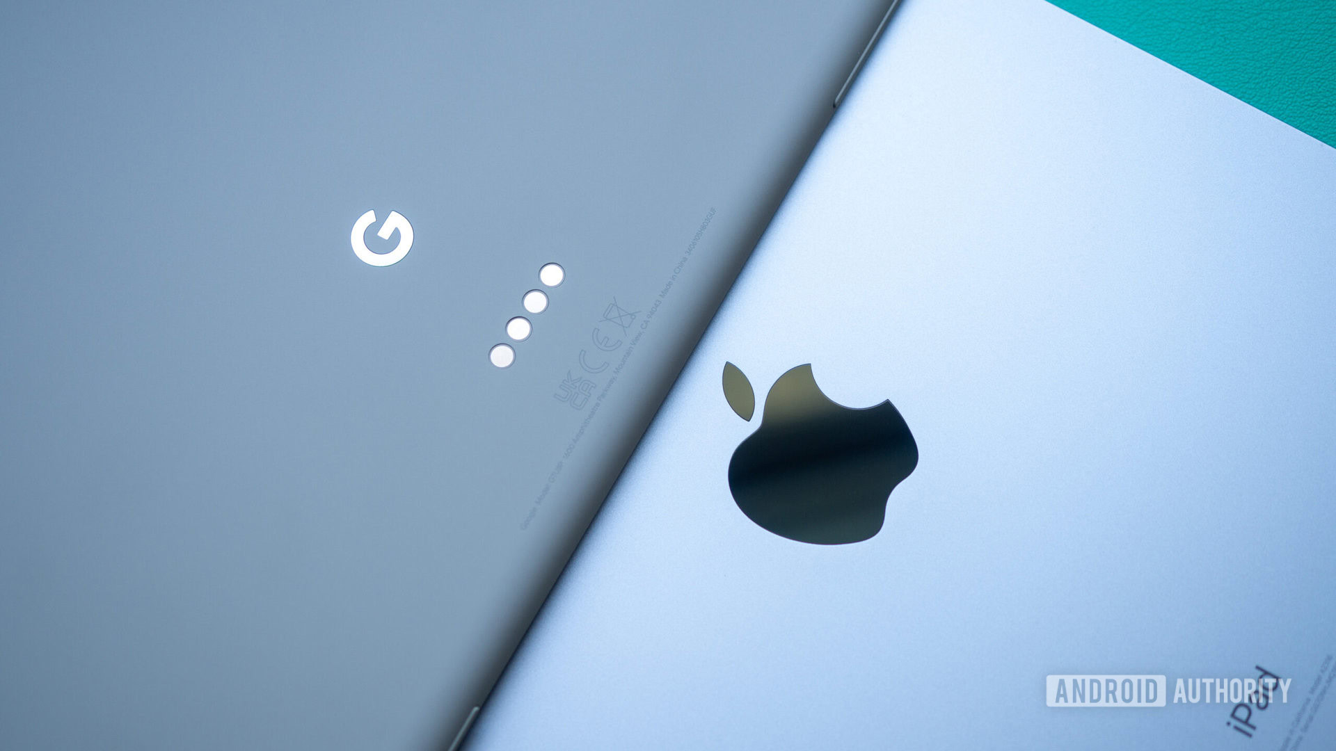
I’m not here to tell you that the new Google Pixel Tablet is better than an iPad. Putting aside the Android versus iOS/iPadOS discussion, Apple has clearly had a headstart in the tablet space and put in the effort to maintain a consistently solid strategy across more than a decade, while Google tried and stopped and changed directions so many times. Apple has had 13 years to refine its tablet OS and attract third-party app developers to get to where it is today with the iPad — miles ahead. So the comparison between the two isn’t even logical.
Still, having used the Pixel Tablet for over a week now, I can say that Google positively surprised me a few times. There are little features here and there that make some aspects of the experience on the Pixel Tablet better than on my iPad Air. Let’s explore them together.
Fingerprint unlock without pressing the button
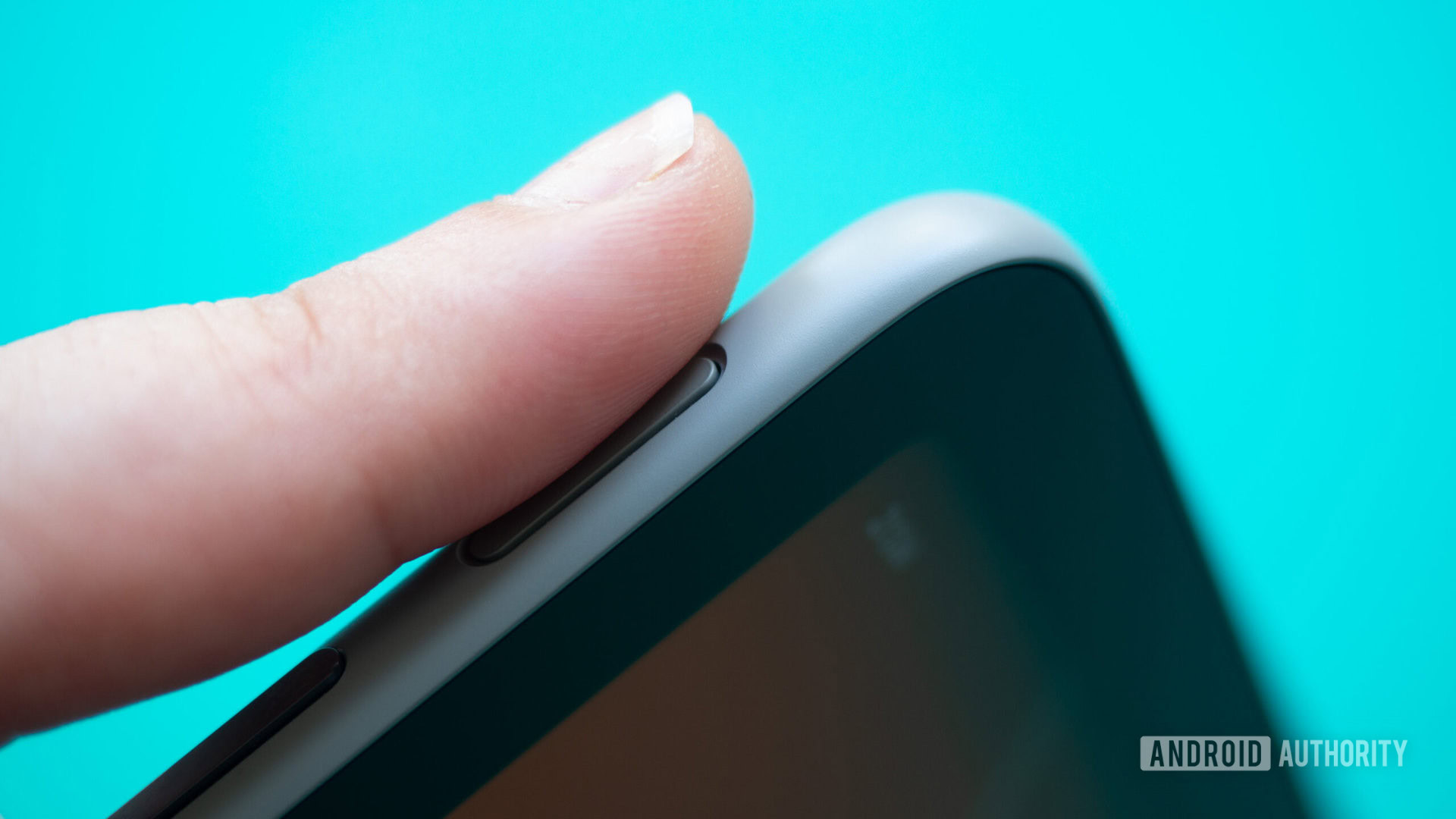
Although both the Pixel Tablet and iPad Air house a fingerprint sensor in the power button, the two tablets don’t take the same approach and that’s the first difference that struck me. On my iPad Air, I have to first turn on the display, i.e. press the power button to wake up the tablet, then leave my finger a fraction of a second longer to bypass the lock screen and unlock it. I often forget to do that, so I wait for the unlock, realize my mistake, then put my finger on the sensor again.
On the Pixel Tablet and many other Android tablets and phones, this fiddly double step isn’t needed. I just lay my finger on the power button for a fraction of a second and the tablet wakes up and unlocks in a snap. I don’t need to turn on the display first or press the power button at all. Another user will need those, but I, the main user, don’t. Small improvement, but anything that removes friction is a win in my book.
Better handling of incompatible apps
Apple’s approach to incompatible, iPhone-only apps is pretty straightforward on the iPad: You can download them, but they’ll either run in the middle of the screen or extend into a low-res fullscreen-ish layout. These apps don’t get any of the benefits of iPad apps either, so no Slide Over or multi-window.
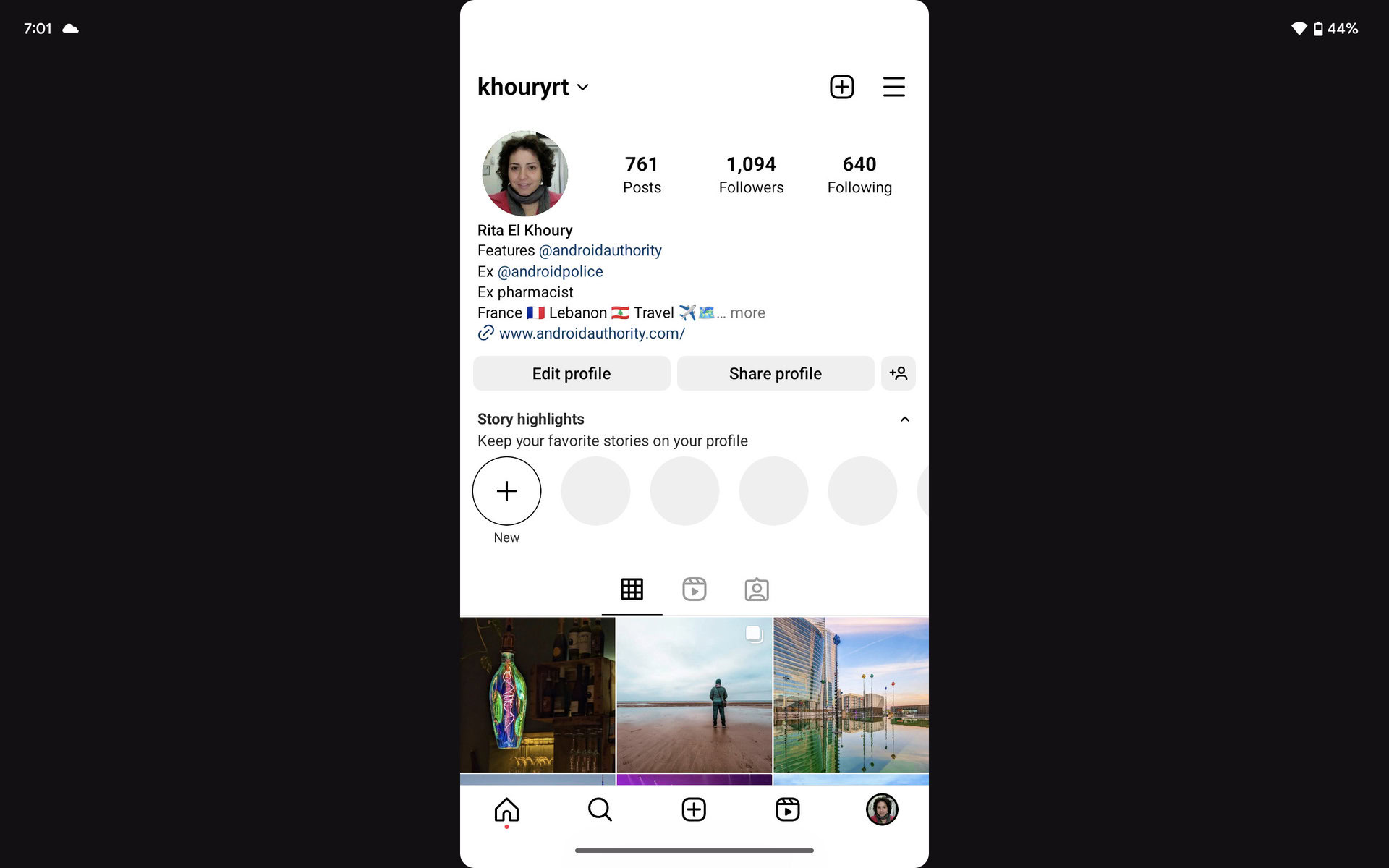
That’s very different from the way Android handles phone-only apps. The platform has been built from the ground up with a variety of devices in mind, so apps often scale pretty well to adapt to all screen sizes. Still, there are outliers, and the Pixel Tablet handles those better than the iPad in a way.
Apps stretch vertically as much as possible; sometimes they’ll fill the entire display, sometimes they’ll have some black bars on the side, but either way, there’s very little if no loss in resolution at all. I can’t see any pixelation in Instagram, GetYourGuide, Booking, Deliveroo, or Uber Eats despite the fact that these apps aren’t adapted to Android tablets. In landscape, they show up with black bars on either side, and you can double-tap to move the app to either side.
The best part, though, is that I can still use multi-window with these apps in landscape and launch another app next to them — all the benefits with fewer black backgrounds.
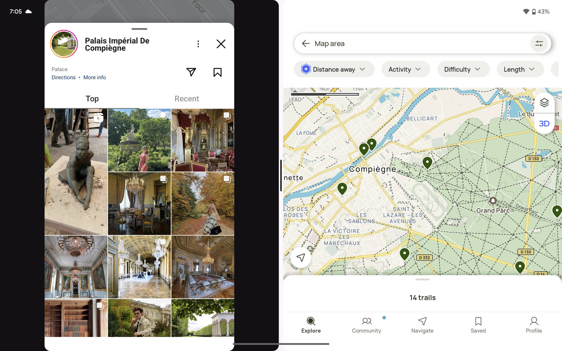
My only issue with this entire setup is that, unlike iPadOS, app developers can completely deny your Android tablet from downloading their phone-only apps, even if they should work fine. AllTrails is an example of that, but I was able to grab the APK and manually install it.
Split Gboard and a superior keyboard experience
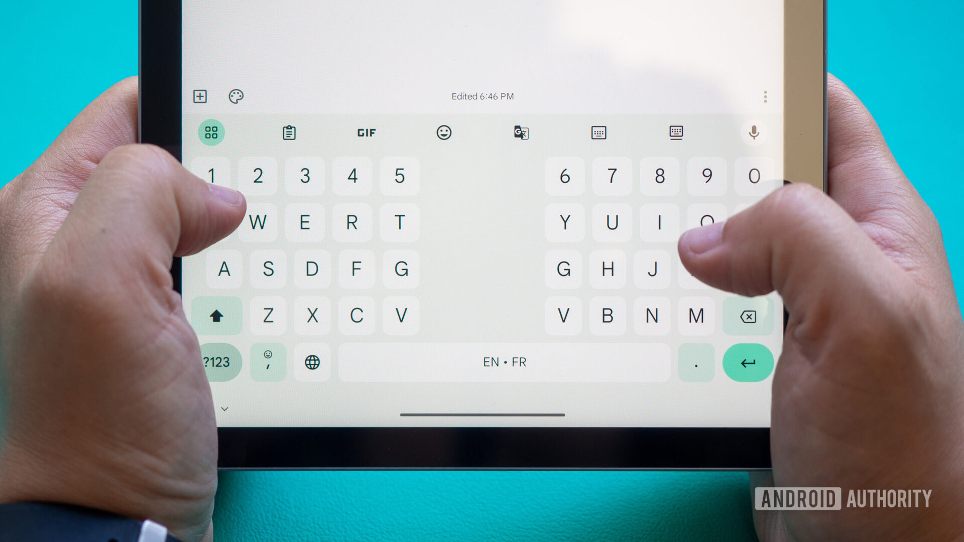
Both the iPad Air and Pixel Tablet allow me to disconnect and float the on-screen keyboard to more easily reach all letters. But Gboard on Android tablets goes the extra mile of supporting a split mode in both portrait and landscape orientations. By pushing all the buttons to either side of the display, they become more accessible to my thumbs so I can hold the Pixel Tablet and type at the same time. And relatively comfortably, I might add.
This gets added to all the other benefits of Gboard, which are unparalleled on iOS or iPadOS. A clipboard to save snippets and paste back from your history, a built-in translator, cool emoji mashups, easy GIF search and insertion, and a — gasp — number row. What modern sorcery is that!
Better notification madness management
A lot of ink has been spilled about Android’s superior notification management, but I believe that’s even more crucial on tablets. This is a secondary device by design and having it bombard me with millions of notifications each time I pick it up is madness.
Apple’s notification approach for apps is all or nothing. You either enable them or you don’t; there’s no middle ground. Some developers are nice enough to let you pick inside the app which kinds of notifications you want to receive, but in my experience, that’s often the exception, not the rule. When you’re given a carte blanche to ping the user incessantly for everything and thus increase your app’s engagements and metrics, you wouldn’t go trying to hamper that, would you?
Android, on the other hand, has had notification channels since 2017 with Android 8.0 Oreo, and developers have had to adopt them over the years. Even the more reticent ones seem to have some kind of channel management these days. Thanks to these channels, I can choose exactly which notifications I want to see on the Pixel Tablet, so I don’t have to see my Amazon order from two days ago or a message I received on Telegram the day before. I can restrict my WhatsApp notifications to calls and my Uber Eats messages to orders, for instance.
Multitasking in portrait mode
I tend to use my tablets in portrait and landscape mode equally, but all tablet makers (understandably) privilege the latter in their interface designs. For example, the iPad doesn’t allow me to split the screen into two windows in portrait mode; I can only use a secondary app as Slide Over, which creates this super tall, nearly useless instance of an app on top of the main one.
Android on tablets supports multiwindows in portrait orientation. Instead of splitting the apps to run in a pointlessly tall side-by-side mode, it shows them on top of each other. This creates mostly square-ish windows that remain very usable. And better yet, I can double tap the separator to quickly switch the two apps around — handy when I summon the keyboard and still want to see the app I’m typing in on top.
WhatsApp for Android tablets
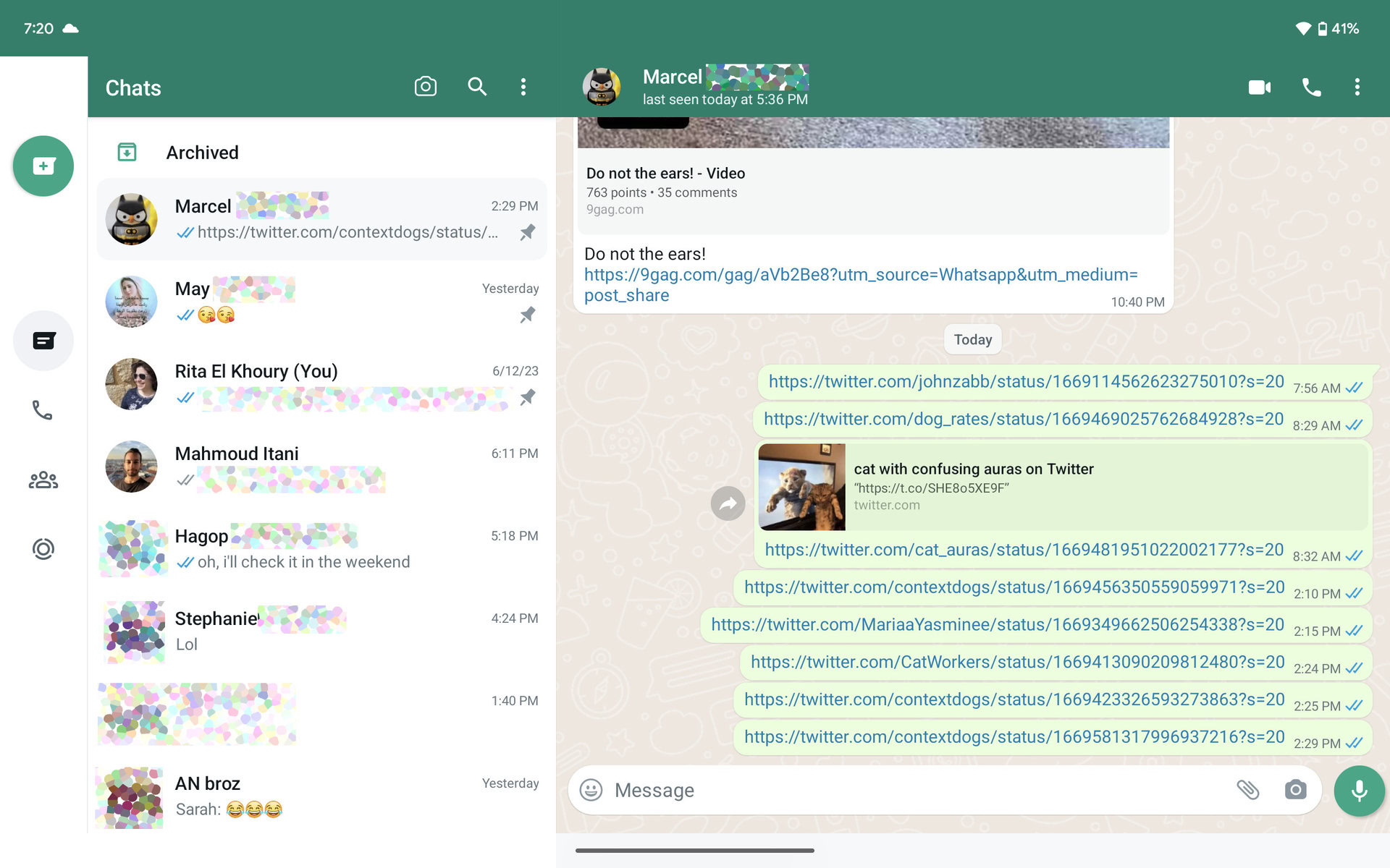
Until this very day, there’s no native WhatsApp app for iPads, but Android tablets are a step ahead. The native WhatsApp is perfectly adapted for the larger screen and can either be used standalone with a dedicated phone number or as a “linked device” to your main phone in a multi-device WhatsApp setup. I opted for the latter so I can see all my conversations and continue where I left off from my Pixel Tablet, without having to grab my phone. This won’t be much of an issue if you live in the US or your friends and family circles use a different messaging app, though.
Always-on digital photo frame
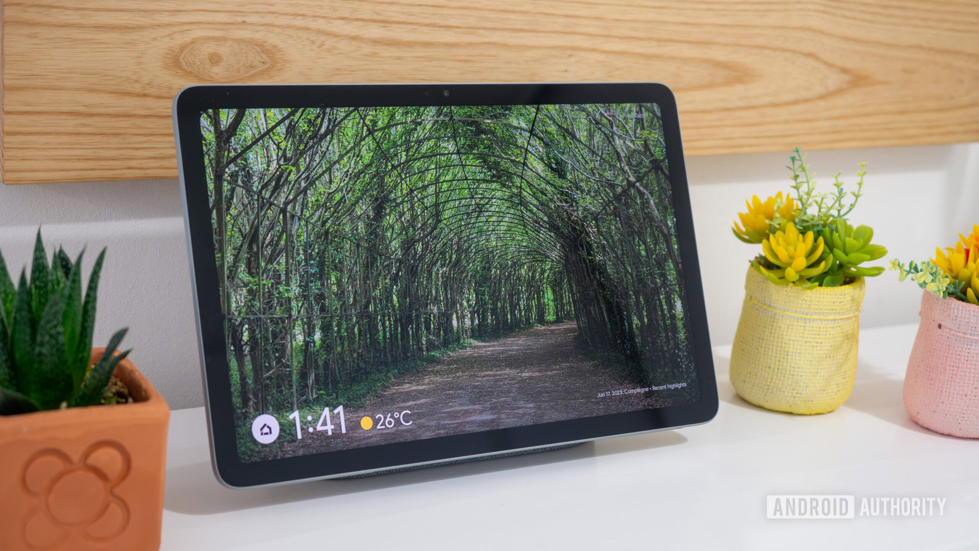
I couldn’t end this article without mentioning the one feature that makes the Pixel Tablet unique today, be it among the iPad line-up or even the best Android offerings — mostly Samsung tablets — and that’s the dock. Thanks to it, the Pixel Tablet is always charged when I need it and still useful when I don’t. It has replaced my Lenovo Smart Display in the kitchen and acts as an always-on digital photo frame that displays my husband’s and my latest and best photo memories.
It often makes us stop and smile at a moment or a person and it’s made me pick up the phone and reach out to friends and family members so many times. There’s nothing like this in Apple’s ecosystem — period.
There are still other aspects I’ve been appreciating about the Pixel Tablet. Arranging icons on the home screen however I wish is an easy win compared to Apple’s forced top-to-bottom approach. Plus, I can use Cinematic wallpapers and Emoji wallpapers while my iPad is only set to get extra lock screen customization by fall. The Pixel’s At A Glance widget is dynamic and informative, while the consistent back gesture is a relief.
I only wish I could use Continuity between my iMac and the Pixel Tablet, but I can’t. So, for now, the iPad Air remains the undisputed secondary display on my desk, while the Pixel Tablet gets relegated to kitchen, bed, and sofa use.