Affiliate links on Android Authority may earn us a commission. Learn more.
Google Pixel Watch hands-on: This would've killed in 2019!
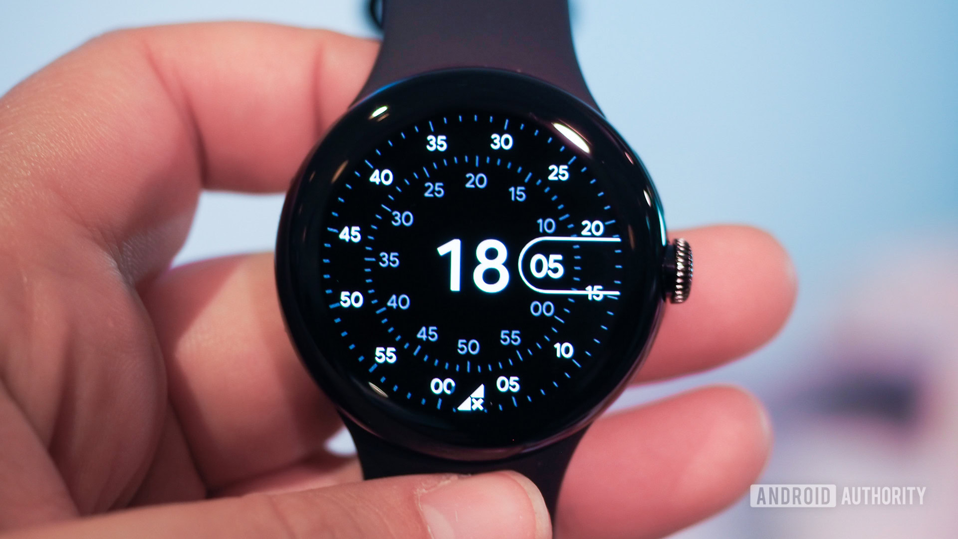
The new Google Pixel Watch is a bundle of contradictions. Thanks to the many, many leaks, I knew that before I even set my eyes on it. Still, it simultaneously felt like I’d seen it a million times before and like I was discovering a brand-new object for the very first time.
Google outdid itself, proposing a cute and professional watch in the same design.
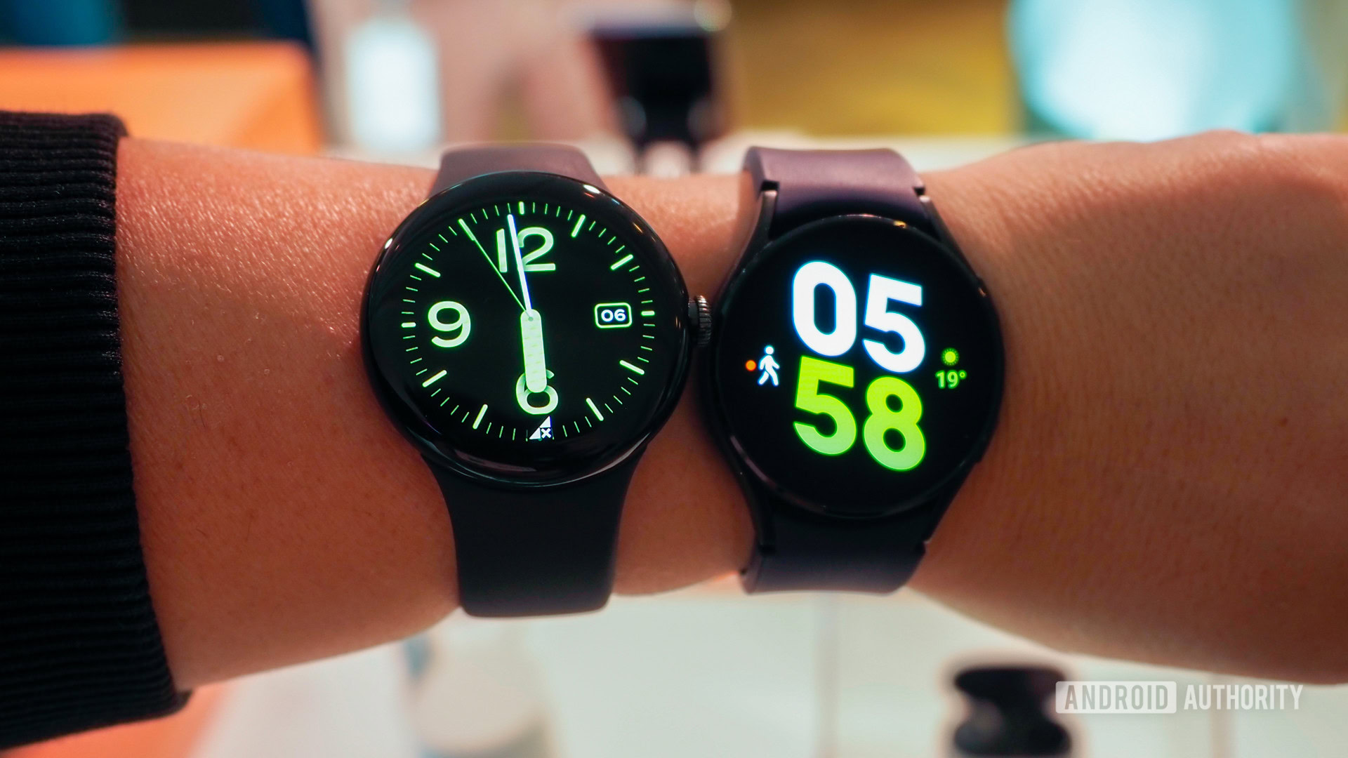
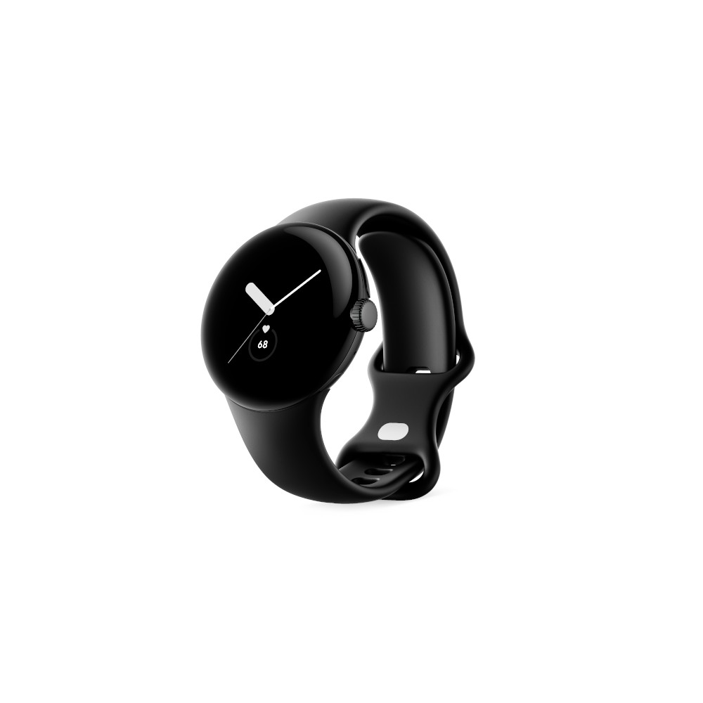
The renders and thousands of leaked photos don’t really do the Pixel Watch justice. In person, I was taken aback by how sleek it looks and how it manages to blend “cute” and “professional” in the same design. With curves in all the right places, the Pixel Watch feels significantly smaller and thinner than it really is. Google outdid itself here, proposing a smartwatch I can imagine complementing a running t-shirt and an evening dress or suit just as well.
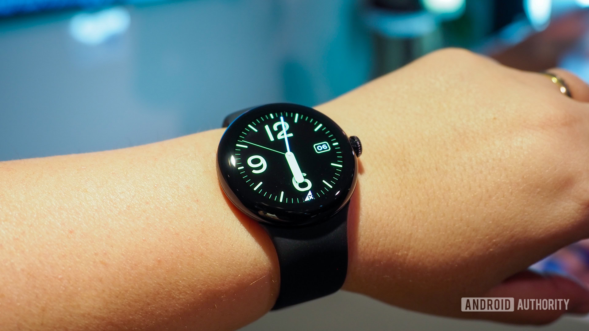
The dome shape plays a huge role in this visual illusion-slash-mastery. It looks modern and minimalistic, but half of it disappears once you wear the Pixel Watch. The bottom part digs gently into your skin, resting deeper against it. It remains to be seen if this could cause irritations, but for now, the end result is that you only really see the two upper thirds of the watch. The bottom third, which houses the sensor array, disappears away. And just like that, Google shaves a good 4mm off the watch’s total 12.3mm thickness.
One optical illusion to make the Pixel Watch look thinner, another to hide the bezels.
This isn’t the only optical illusion Google is playing with the Pixel Watch. Every watch face, every Wear OS 3.5 menu, every built-in app has been optimized with a dark background. We know the reason: bezels. They’re there, they’re black and quasi-invisible most of the time, then you launch something like the torch and you see how big they are. Someone jokingly told me on Twitter that Google traded the flat tire for a fat tire, and well, they’re not that wrong.
Google Pixel Watch: Hot or not?
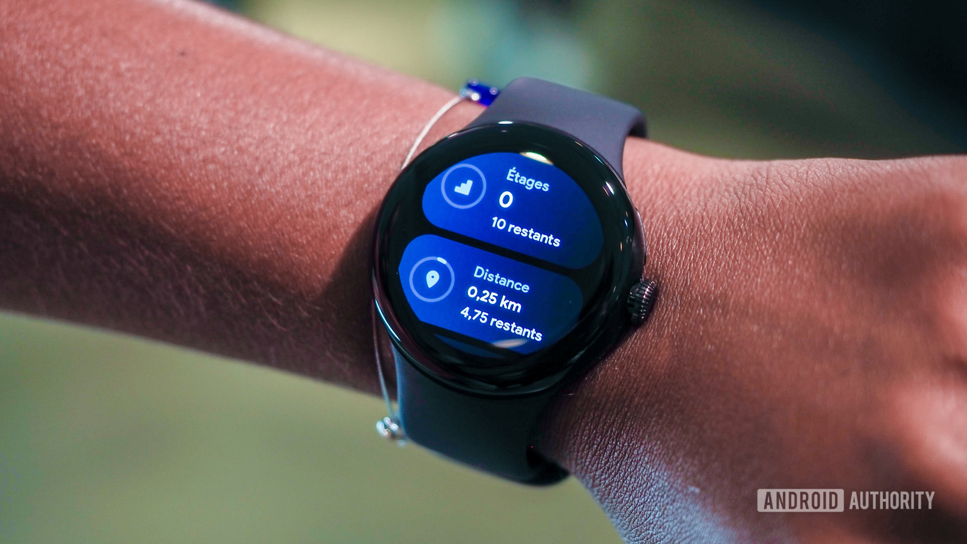
I mentioned contradictions earlier, and this is just the first of many. In everyday use, I doubt I would notice these bezels, but would the Pixel Watch look more modern and display more information with a larger display and smaller bezels? Of course it would.
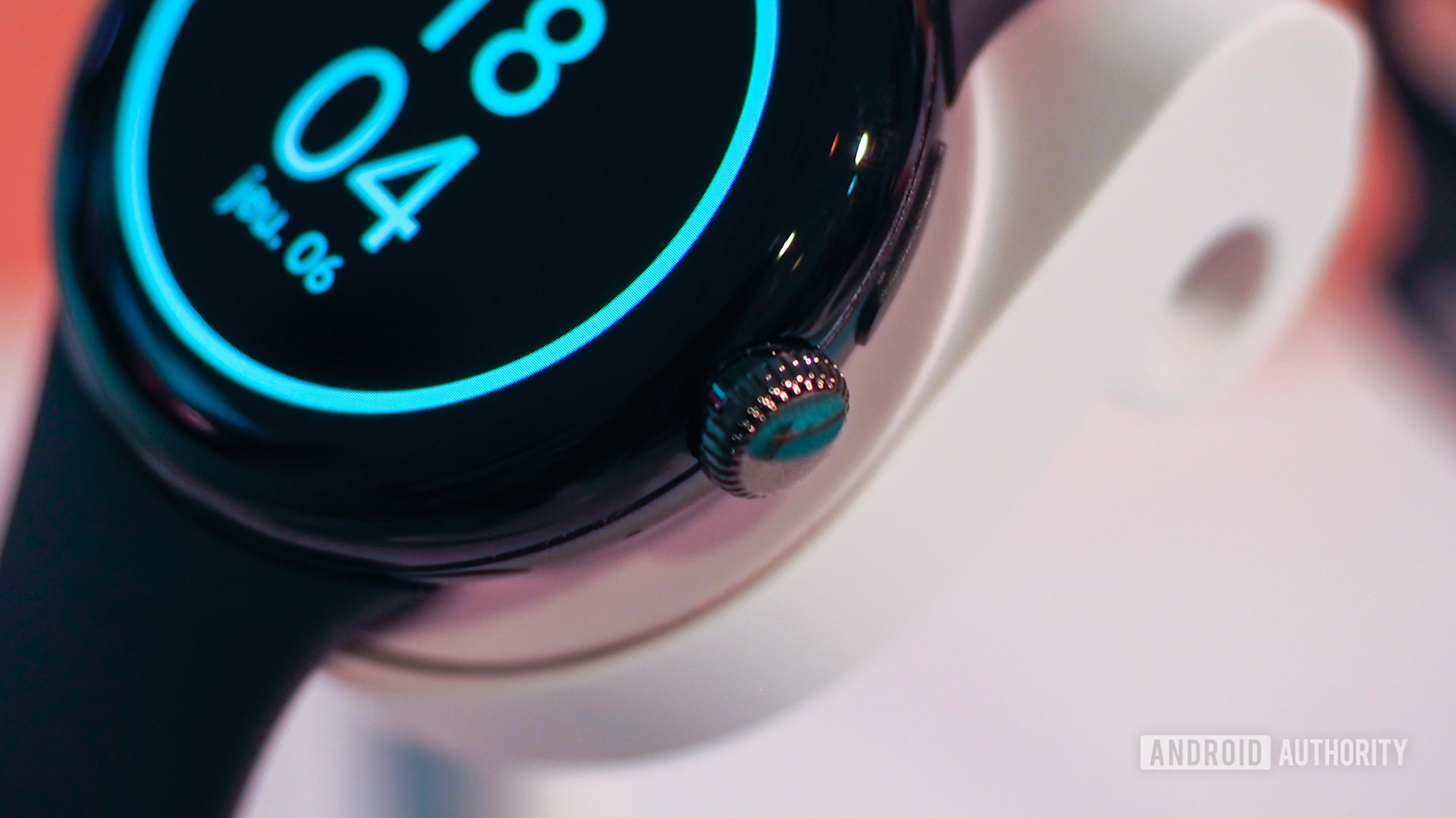
The crown's haptic feedback feels exquisite.
The crown navigation is a welcome addition, saving you from scrolling on such a tiny display (with your index hiding half of it). No one wants fingerprint smudges and streaks on such a beautiful timepiece, but you can’t fully escape them: After you’re done scrolling, you’ll sometimes have to tap on the screen to select. I’ll have to say, though, that the crown’s haptic feedback feels exquisite.
The same goes for every swipe, scroll, and selection. This is by far the smoothest Wear OS experience I’ve seen. In the past eight years, I’ve owned the LG G Watch and G Watch R, HUAWEI Watch, Misfit Vapor X, SKAGEN Falster, and Galaxy Watch 4. Each of them has been janky in one way or another, with the Galaxy Watch 4 being the smoothest.
This is the smoothest Wear OS experience I've seen on any watch, including Samsung's latest Galaxy Watches.
The Pixel Watch feels faster and more responsive than all of them. Heck, even Google Assistant seemed fast on it! Again, we’ll have to wait for our extensive tests to see how well it behaves in everyday use, but the signs are promising.
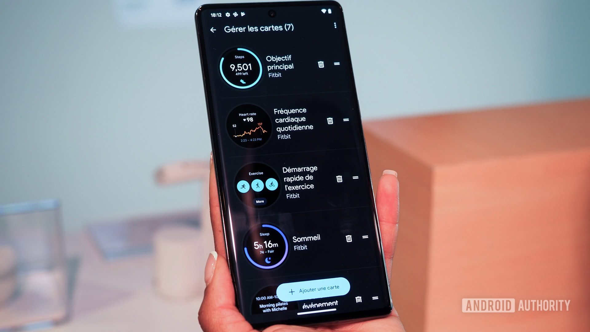
In my short time with the Pixel Watch, I couldn’t test a lot of features, but we kind of know what to expect now. It’s a Wear OS experience with Fitbit tracking built right in. Some extra bits include a camera controller for your Pixel phone that can zoom (so cool!) and an SOS calling option you trigger by tapping the crown five times. Fall detection will be coming later this year.
Like every other Wear OS 3.0-and-above watch, the Pixel Watch requires its own companion app. It doesn’t work with the generic Wear OS app, a change that brings some clear advantages. Google no longer has to cater to all wearables in its ecosystem; it can focus on its own watch and app experience. This allows it to offer a fuller companion app with watch face and tile customization and multiple granular settings, similarly to Samsung’s Galaxy Wear app experience with the Galaxy Watch line-up. On the other hand, Wear OS fragmentation is A Thing now too.
Perhaps the biggest contradiction, though, lives below the surface. Underneath the sexy exterior, the Pixel Watch packs an Exynos 9110, a four-year-old chip with dual Cortex A53 cores built on a 10nm process. We’re far, very far from the latest Qualcomm Snapdragon W5+ Gen 1 platform and its quad-core CPU and 4nm process nodes. With a more modern processor, the Pixel Watch could have been even faster, smoother, and more importantly, it could have lasted two days on a charge — none of this “up to 24 hours” nonsense. That is Qualcomm’s promise with the W5+ Gen 1: 43 hours of use on a watch with a 300mAh battery (the Pixel Watch has a 294mAh battery).
Google picked a four-year-old processor. A more modern choice could have offered double the battery life.
Unfortunately, Google went with the Exynos 9110 and we’re left scratching our heads a little bit more. Here is a fitness-oriented watch that likely won’t last you through the night and track your sleep unless you top up before going to bed. It has a processor from 2018-2019 and bezels from that era too. It lacks sensors and features that the best smartwatches already offer.
It almost, almost, feels like Google built this watch around 2018-2019 but kept it in a drawer until now. I could subscribe to this theory. Picture this: It’s early 2019 and Google finds itself with a sleek Pixel Watch idea, it realizes it needs a unique selling point, starts collaborating with Fitbit, and somewhere along the way, it decides it might as well buy Fitbit, which derails the entire Pixel Watch plan. COVID happens and regulatory matters delay things further, so the Fitbit acquisition is only finalized in 2021 and we get the Pixel Watch today.
Of course, this is all conjecture and I’m digressing, but oh boy, does it not explain everything we’re seeing here? And yes, this Pixel Watch would’ve been a runaway success in 2019. In 2022? I’m not so sure.
I have so many more opposing thoughts about the Pixel Watch, but nothing comes close to the confusion I feel when I look at the price tag. How can Google ask for $449 for the Pixel 6a and $349 for the Pixel Watch? There’s a world of difference between a company that undercuts its competition and offers a great midrange smartphone experience at $449 and a company that overshoots with its smartwatch and prices it just $100 shy of that entire smartphone.
How could the same company ask for $449 for the Pixel 6a and $349 for the Pixel Watch? This pricing strategy makes no sense.
We’ll certainly know a lot more once we’ve put the Google Pixel Watch through its paces, but for now, I can tell you this is the most confusing Pixel product I’ve seen from Google. Oh, it looks great and it feels even better in the hand, but it promises to be a delightfully frustrating experience because I know it could have been much better.
Thank you for being part of our community. Read our Comment Policy before posting.