Affiliate links on Android Authority may earn us a commission. Learn more.
The Google Pixel Watch is a great Wear OS watch but a worse Fitbit
Published onOctober 12, 2022

Over the last nine and a half years, I’ve worn a Fitbit tracker in one form or another every day. I started with the clip-on Fitbit One, and went through several bands and a couple of watches from the company, finally landing on the Inspire HR for the last three years. I love that all my stats are there and I can see the ebb and flow of my activity and sleep cycles throughout an entire decade. I can pinpoint with extreme accuracy my hikes and most active days, and I have a visual representation of my heart rate’s change in the past five years.
On my other wrist, I’ve often had a Wear OS watch. I’m an Android fan and I write about it for a living, so I’ve followed the platform’s progression over eight years. I bit the bullet with the original LG G Watch in 2014, then got the G Watch R, the HUAWEI Watch, a couple of SKAGEN and Misfit models, and eventually the Samsung Galaxy Watch 4 last year.
For a Fitbit and Wear OS double-wrister like me, no product makes more sense than the Google Pixel Watch.
For a double-wrister like me, there’s ostensibly no product that makes more sense than the new Google Pixel Watch. And in a way, it’s everything I’ve wanted. But it’s also frustrating in so many other ways. I’ve spent six days with it so far — not nearly enough to write a full review (stay tuned), but enough to get a general feeling about it.
Yes, it lasts 24 hours, but the charger is my best friend now
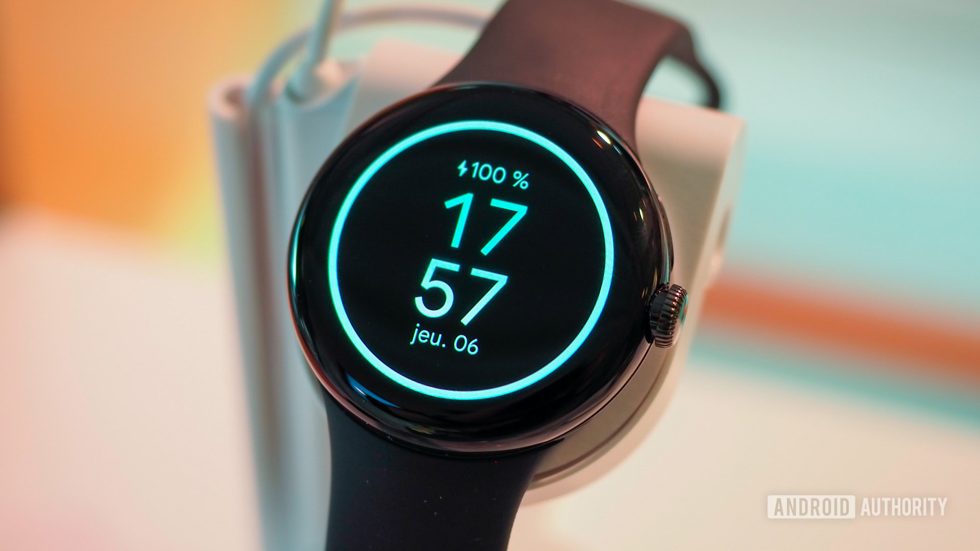
Coming from the Inspire HR as my main activity tracker, my biggest fear was the battery life situation. The first couple of days were rough: The Pixel Watch was downloading updates, I was messing around with menus and watch faces a lot, and I kept staring in disbelief as the battery percentage ticked down towards inevitable doom at blistering speed. Thankfully, things settled down after that.
Anecdotally, here are two example days with the Pixel Watch. On Sunday, I fully charged it up and went out at 11:40 AM. I used it while walking and taking transit, then I started a 3h:38m hike with GPS tracking. I finished the hike at 4:50 PM with 55% battery left, and ended the day with 22% of battery at 11:00 PM. I charged it before going to bed because I was afraid it wouldn’t last through the night (more on this in a bit).
On Monday, I took it off the charger at 100% at 11:00 AM and used it throughout the day while walking and taking transit, but didn’t do any active GPS tracking. I got home at 11:30 PM with 40% battery left, finished some random chores, and went to bed with 31% battery. I enabled bedtime mode on the watch to see if it could rock through the night. I woke up at 8:40 AM with 15% battery and it lasted until a little after 11:00 AM on Tuesday. A full 24 hours, hooray!
I was able to get 24 hours of use out of it, but only when I enabled Bedtime mode.
Take all of these with a grain of salt because everyone uses their watch differently. But, for me, there are three takeaways.
One, always enable Bedtime mode on the watch before sleeping. This turns off the always-on display and disables notifications unless they’re coming from priority or repeat callers. In my experience, a full night without Bedtime mode wastes more than 30% of battery. With it, you’ll only lose around 15%, perhaps less. The problem is that you have to remember to manually enable it every day; there’s no schedule and no automatic recognition. I wish I could tell the watch to automatically go into Bedtime mode after 11:00 PM when it notices that I’m sleeping — I’m sure Google and Fitbit have the AI knowledge to do that, and I’d be very surprised if it’s not added in a future update.
Two, the Pixel Watch’s battery life is better than I expected and better than my 40mm Galaxy Watch 4 for sure. In my normal use, the latter can barely last from morning to evening, whereas I can push through the entire night until the next morning with the Pixel Watch. When Google said “up to 24 hours of battery life,” I admit that I thought that was a hopeful number. I was expecting the watch to die around the 15- to 18-hour mark, but the 24-hour claim holds true so far.
Battery life is better than my Galaxy Watch 4, but it doesn't even compare to any other Fitbit.
Three, with this Fitbit, charging time and duration is an active thought process. My battery life expectations were so low that I ended up being happy with what I was getting, but that doesn’t mean they’re any good for a Fitbit. I’m used to charging my tracker once every week. Now, I have to consciously think about daily charging and fit that within my schedule so I don’t walk out the door with 20% battery or go to bed with 10%. Gone are the days where my Inspire HR could last an entire day on 10%.
For a bit of perspective, my husband and I spent a long weekend away. He left home on Saturday morning with his Fitbit Versa (1st generation) fully charged on Saturday morning, didn’t pack his charger, walked and slept as much as I did, tracked his hike (though with connected GPS), and came back home Monday evening with 30% battery left. Me? I had to charge my Pixel Watch at least three times during the same period.
The Pixel Watch is smarter than a Fitbit smartwatch, but the value of these smart features depends on your use case.
I am fully aware that the Pixel Watch can do way more smart things than a Fitbit Versa. But the value of those smart features against their compromise hinges on every person’s use case. For my husband, for example, the Pixel Watch is a no-go. He’s getting one for free with his Pixel 7 Pro pre-order in France, but he won’t switch away from the Versa. He values activity tracking and battery life more, and he’s happy with the WhatsApp notifications he gets on his wrist. He doesn’t need more.
For me, the smart features are more interesting. I like having walking directions, Google Assistant, Spotify, Google Keep, and Citymapper on my wrist. The battery life and daily charging compromises are almost worth it. Oh, I definitely wish Google went with a more modern and power-efficient processor. Two-day battery life would’ve been excellent because I wouldn’t have to be as obsessed with charging as I am right now.
This is the smoothest Wear OS watch I’ve used, by far
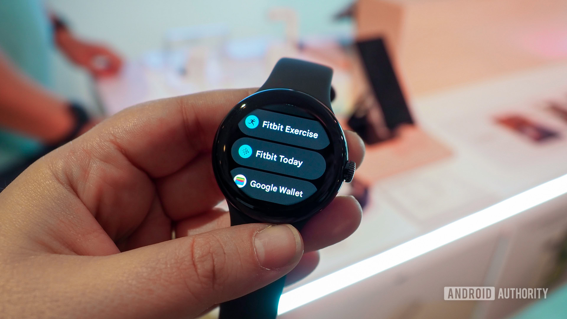
Almost every Wear OS watch I’ve used so far has felt like it was three to four generations older than my phone. They were janky, full of scrolling hiccups, glitchy animations, and non-responsive menus and taps. The Galaxy Watch 4 was the best one by far, but still had some mishaps every now and then. Not the Pixel Watch, though.
For once, my watch is as responsive as my phone. All the scrolling, swiping, tapping, clicking, and crown rotating is buttery smooth. Apps open fast and every action is instantaneous, even in third-party ones. Google Assistant doesn’t stutter and fail half the time, though it’s not an ideal experience (as always, it needs the phone to be online and language support is limited). The crown’s haptic feedback is still as exquisite as in my first impressions.
All the scrolling, swiping, tapping, clicking, and crown rotating is buttery smooth.
And I find that the dome shape gives the Pixel Watch a clear advantage over its competitors. Because there’s no bezel and your finger hits no obstacle whatsoever during any operation (scrolling, swiping, tapping), everything feels nicer. Interacting with the watch is a joy. And that’s something I never thought I would say about any Wear OS watch. Ever.
A collection of other Pixel Watch thoughts
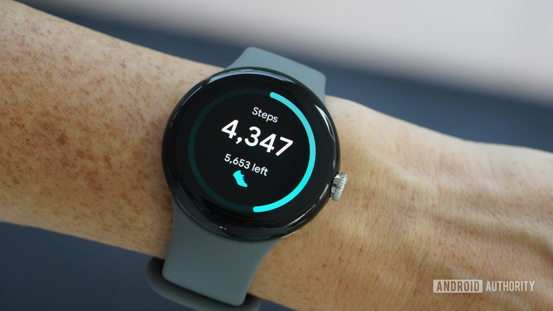
Google is pretty proud about the Pixel Watch’s design and I have to concede that it’s right about that. It looks so sleek and it can easily go from a hike to an evening out (which I actually did) and look at home in both situations. I’m one of the few people who use their smartwatch less when wearing long sleeves because it’s harder to reach and it often snags on clothing, but that was before the Pixel Watch. Not once did it snag on anything. Even when wearing long sleeves, a hoodie, and a jacket, it slipped below them effortlessly and was easy to reach every time.
The comically large bezels do disappear when you’re using the watch — just like they do on any device really. You end up focusing on content more than the border around it. But I can’t help but wonder: Wouldn’t it be better if the watch was a little larger and the bezels were a little smaller? Couldn’t we see more information then and wouldn’t the watch be more useful in more complex situations like navigation and messaging? As it stands, the amount of information displayed is too limited in my opinion.
The design is very sleek, the bezels disappear, and Google is doing its best to make them invisible.
However, Google is doing everything it can to make the best use of whatever screen space is available. The 19 included watch faces are mostly minimalistic with a black background that melts into the bezels and pastel colors that scream Material You. Things get cramped when you pick a watch face with four complications and a dial with hour and minute indicators, but they remain readable. I also like the ability to create and save multiple versions of the same design, but I miss having more color options. Some gradients or multi-color picks, a bit of red, and a stronger purple or blue would’ve been welcome. But well, you can always download third-party faces if Google’s designs don’t do it for you. (Side note: When Google was demo’ing the Watch at its event, the connected phone app showed dozens and dozens of watch faces to pick from. So I think more official options are coming, they’re just not available now.)
Let’s move on to the Pixel Watch’s unique selling point: Fitbit integration. The main tracking features like steps, sleep, and heart rate are perfectly integrated. But a lot is still missing and feels unnecessarily hamstrung. ECG measurement requires a separate app and works about half the time in my experience. Cycle and period tracking is completely missing from the watch’s Fitbit interfaces. There’s no live automatic exercise detection, just recognition after the fact. The SpO2 sensor is present but not activated yet (and we don’t know if it’ll ever be). For a deeper dive, we’ll have a deep dive of the Pixel Watch’s existing and missing Fitbit features going live shortly. But suffice it to say, for the most expensive Fitbit, it lacks a lot of things that cheaper models have.
Many Fitbit features are missing like automatic exercise detection, period tracking, and SpO2 sensing.
Ten years in with Wear OS, several Google experiences still seem half-baked. The Google Maps app doesn’t support transit directions and even transit notifications from the phone don’t show up on the watch no matter what I try. Google Wallet doesn’t show loyalty cards, so you have to take your phone out at stores. You can’t tap to navigate to the location of a calendar event. And lastly, the new Google Home app is still in Preview mode and mostly offers on/off toggles with some brightness and volume adjustments. You can’t change the color of smart light bulbs, turn on the TV, or reorganize items in each room.
Other Google apps seem more mature. The Camera controller lets you switch between front and rear cams, set up a 3s and 10s timer, and zoom back to the ultrawide lens (0.6x) or all the way up to 30x on the tele lens. Gboard supports everything you need from fast replies to voice typing, emoji insertion, and even swiping.
Many of Google's own apps are still half-baked on Wear OS.
And I definitely appreciate Fast Pair a lot more now. I had my Pixel Buds Pro connected to my Pixel 6 Pro, but they automatically showed up on the Pixel 7 Pro and Pixel Watch, so I could listen immediately without having to pair them again.
Google Pixel Watch initial verdict: A lot of delight wrapped around several frustrations
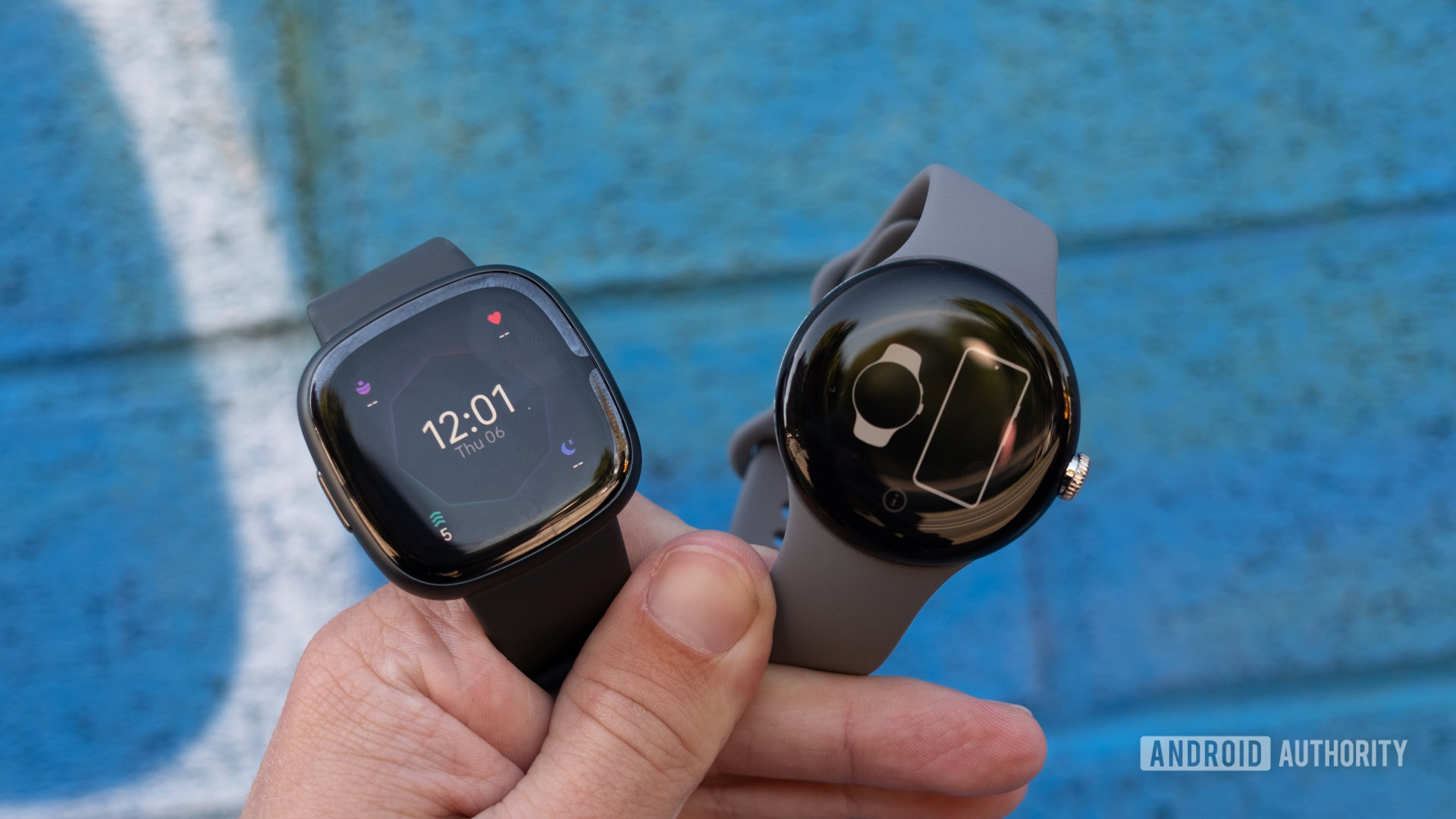
My six days with the Google Pixel Watch have solidified my initial impressions. If you’re not fully immersed in Samsung’s ecosystem (if you are, seriously consider the Galaxy Watch 5 or 5 Pro), this could well be the best Wear OS watch so far, but it’s also a worse Fitbit. We’ve already discussed this multiple times, but it feels like Google and Fitbit could have given us a super-watch by combining the best of the painfully underbaked Sense 2 and Pixel Watch into one device. Instead, we get stuck with two watches that are flawed in their own ways.
And for all the delightful experiences that the Pixel Watch offers, there’s always that nagging question in the back of my mind that goes: “What if?”
The Pixel Watch is fine as is, but I know it could be so much better.
What if Google had made a slightly larger watch with slightly smaller bezels? What if it picked a more modern processor with better power management and two-day battery life? What if it picked a price as competitive as its Pixel phones — say $199 for example? What if it released this Pixel Watch a couple of years ago (because we suspect it has been many years in the making and was nearly ready a year or two ago) and we were now at the second or third generation? And what if Google had spent the last decade continuously developing Wear OS and treating it like a major platform instead of going through long cycles of neglect and short periods of active development?
I think the Pixel Watch is fine as it is, but I’m not convinced it’s worth the asking price, and I know it could be so much better. Right now, I’m slowly shifting into the “acceptance” part of my emotional journey with it. I’m starting to tolerate its shortcomings and enjoy its features for what they are. But I can’t wait for what those promised yearly Wear OS software updates bring, and I’m sure the second or third-generation hardware will be exceptional. Until then, this is what we have.
Next: Pixel Watch alternatives for those who remain unconvinced
