Affiliate links on Android Authority may earn us a commission. Learn more.
New Google Play feature called Collections brings new widget, less app overload

- We previously leaked a new feature for the Google Play Store called Collections, and it is now official.
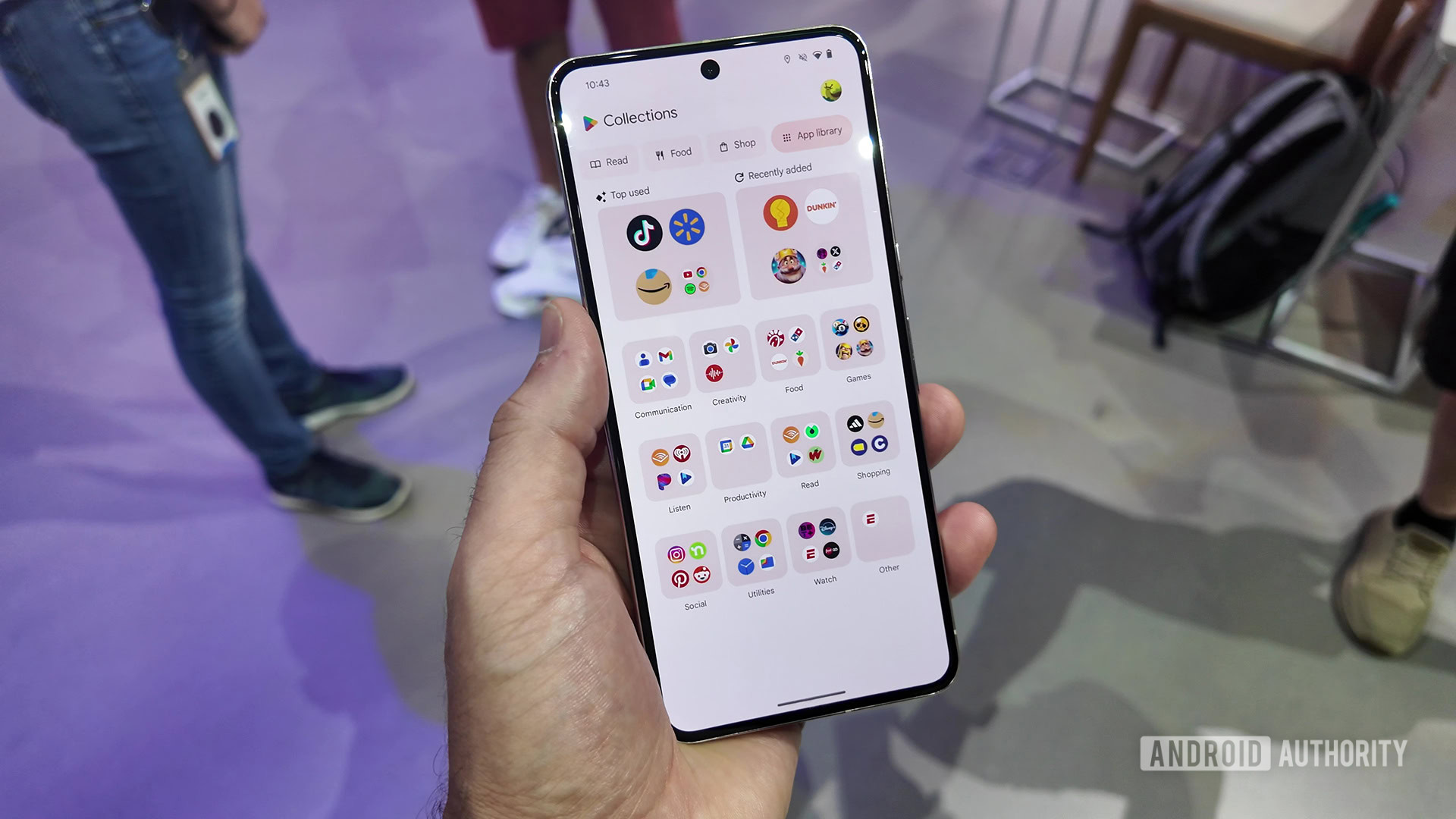
- As suggested by the leak, Collections allows you to group apps by topic and then get info about those apps through a new home screen widget.
- Collections are launching today in the United States but will roll out to other countries soon.
Back in January 2023, Google started working behind the scenes on a new feature for the Play Store called “Cubes.” Over the following months, Google changed this feature’s name to “Collections,” and we actually got a good look at how it works in an APK teardown we conducted last month.
Today, though, Google is making Collections official inside Google Play. As demonstrated by our previous leak, Collections automatically groups apps by topic and, through a new home screen widget, delivers you information, feature updates, and offers related to those apps.
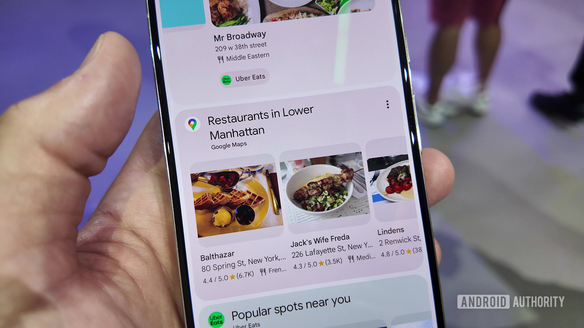
The whole idea of Collections is to avoid you needing to go to the Play Store to find out what’s going on with your apps and games. Instead, the information comes to you.
There’s a lot going on with Collections, so let’s break it down!
What are Google Play Collections?

The best way to describe Collections is to give you an example of the problem it solves. Let’s say you’re in the market for a pair of shoes for an upcoming wedding. Normally, you would need to manually open multiple apps in your app drawer, search for shoes, and browse around. Then, you would need to compare pricing across numerous apps. With Collections, though, that’s not necessary. Instead, the Shop collection will automatically have all your shopping apps front-and-center in the Collections widget on your home screen. Because you’ve searched for shoes already, the apps will have suggested designs and prices right there for you to see — no hunting necessary. Now, you can just tap and buy.
Here’s another example: finding a good movie to watch. You can do this in a variety of ways through various streaming apps, but the widget will have all your suggested content from multiple services under the Watch category, negating the need to browse. Just tap and watch.
This is the power of Collections. To start, there will be seven supported categories:
- Watch
- Food
- Listen
- Shop
- Read
- Social
- Game
There are four more categories coming soon, too:
- Health & Fitness
- Sports
- Travel & Events
- Dating
In the future, Google hopes to allow user-created categories. The example it gave at its press event was a user training for a marathon. They could create a “Training” or “Marathon” Collection and then populate it with a few apps. Google’s algorithm could then suggest apps that you’ve already downloaded that should be in there, such as a timer app or maybe a diet app. It would also be able to recommend other apps and web content that might be beneficial to your training regimen. Google had no concrete timeline for when this would roll out (or even if it would roll out), but it’s exciting to think about.
The new Collections widget

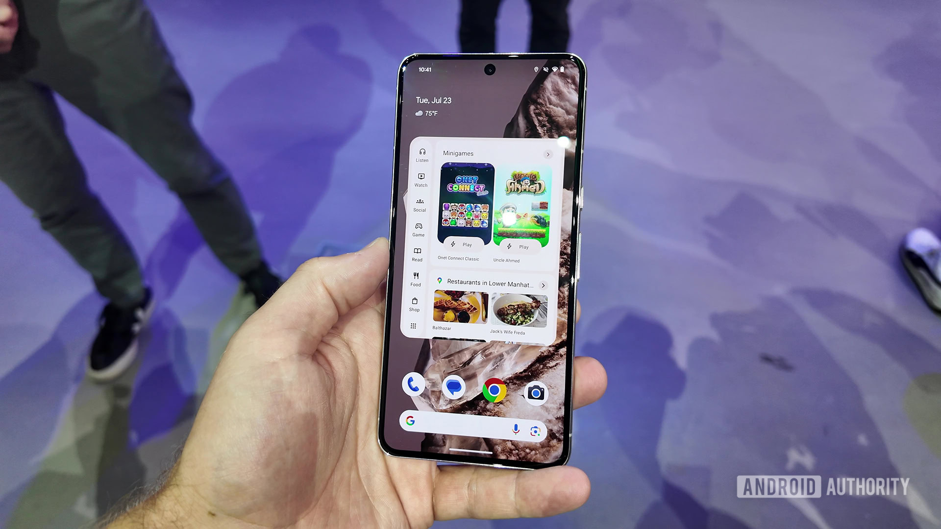
Although you can manually open Google Play to access your Collections, the new home screen widget makes everything easier. The large widget, shown above, has your Collections on the left panel and then the content for those collections on the right. You can scroll through your content here or tap the arrow widget to open Google Play and dig deeper.
There’s also a smaller Collections widget that only lists out your categories. Tapping a Collection category will take you to the appropriate section within Google Play. This is nice for people who don’t want the large widget taking up a huge portion of their home screen but also appreciate having fast access to Collections.
Regardless of your widget choice, you add one to your home screen the same way you add any other, usually by long-pressing on an empty portion of your home screen and selecting the Widget picker. The exact steps will be different depending on your installed launcher.
When will Collections start working for you?
Google is rolling out Collections today to Google Play users living in the United States. However, the company says it will bring this feature to folks living outside the US soon, so stay tuned for more info!