Affiliate links on Android Authority may earn us a commission. Learn more.
Google Play redesign officially announced, rolling out now
August 21, 2019

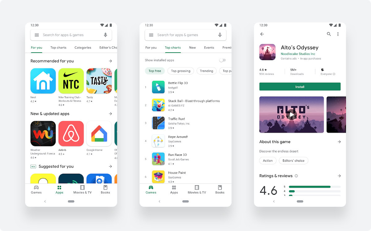
Google recently announced its latest Google Play Store redesign over on the Android Developer’s Blog. This visual refresh features a more polished design and updated layout, improving the overall store experience.
Google claims that the update will increase app discoverability and improve the store’s accessibility.
The most notable change is a redesigned Google Play navigation bar. The bar appears at the bottom for mobile devices and on the left for tablets and Chromebooks. This change makes browsing the store faster and easier, especially on larger mobile devices.
Games and apps are now separated even more, and store listing pages provide richer app information. The redesign also features a new icon system and more prominent call-to-action buttons. These changes help the user find the content they are looking for and enable a more tailored user experience.
Google also offers resources for developers to design more compelling store listings. This includes both visual resources and market targeting tools like Google’s store listing experiments and Academy for App Success.
If you don’t yet see the Google Play redesign on your devices, you should see it soon. The ongoing rollout started a few days ago.
Thank you for being part of our community. Read our Comment Policy before posting.