Affiliate links on Android Authority may earn us a commission. Learn more.
Google Play Store Accounts screen gets a facelift
Published onApril 20, 2016

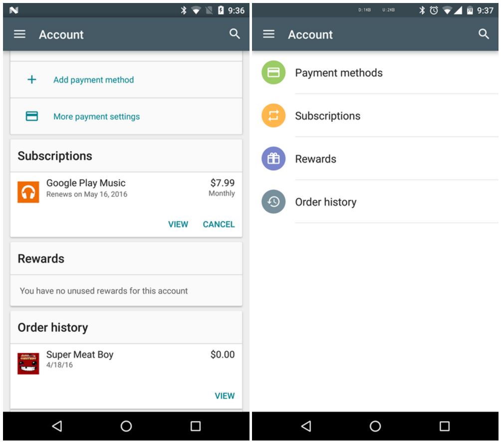
The Google Play Store has received a sneaky little server side update. It looks like it’s only affecting the Accounts screen, and since it’s server-side, you might not be able to see it on your device yet – no update of the app is required. In general, the changes make the Accounts section of the Play Store far easier to navigate by organizing elements into categories.

Previously, the Accounts screen just kind of sprawled downward in a cascade of Material Design cards with little logic to their order. Now, however, these elements have been placed under four discrete headings: Payment methods, Subscriptions, Rewards, and Order history. This lets you more quickly navigate these options at a glance and get to the elements that you really need.

It’s not a large change, but it is part of a trend of Google apps getting little cosmetic adjustments. It seems like Google’s design language is changing very slightly, adopting a more modular approach that is less dedicated to the Material Design aesthetic and more focused on bringing the user a clean and well organized experience. All in all, not a bad shift in our opinion, if a nuanced one. Let us know your thoughts on this update in the comments below, and as always, stay tuned to Android Authority to stay abreast of all the latest updates coming to the apps you use every day.
