Affiliate links on Android Authority may earn us a commission. Learn more.
Upcoming Google Play Store makeover will separate entertainment from apps
Published onOctober 15, 2015

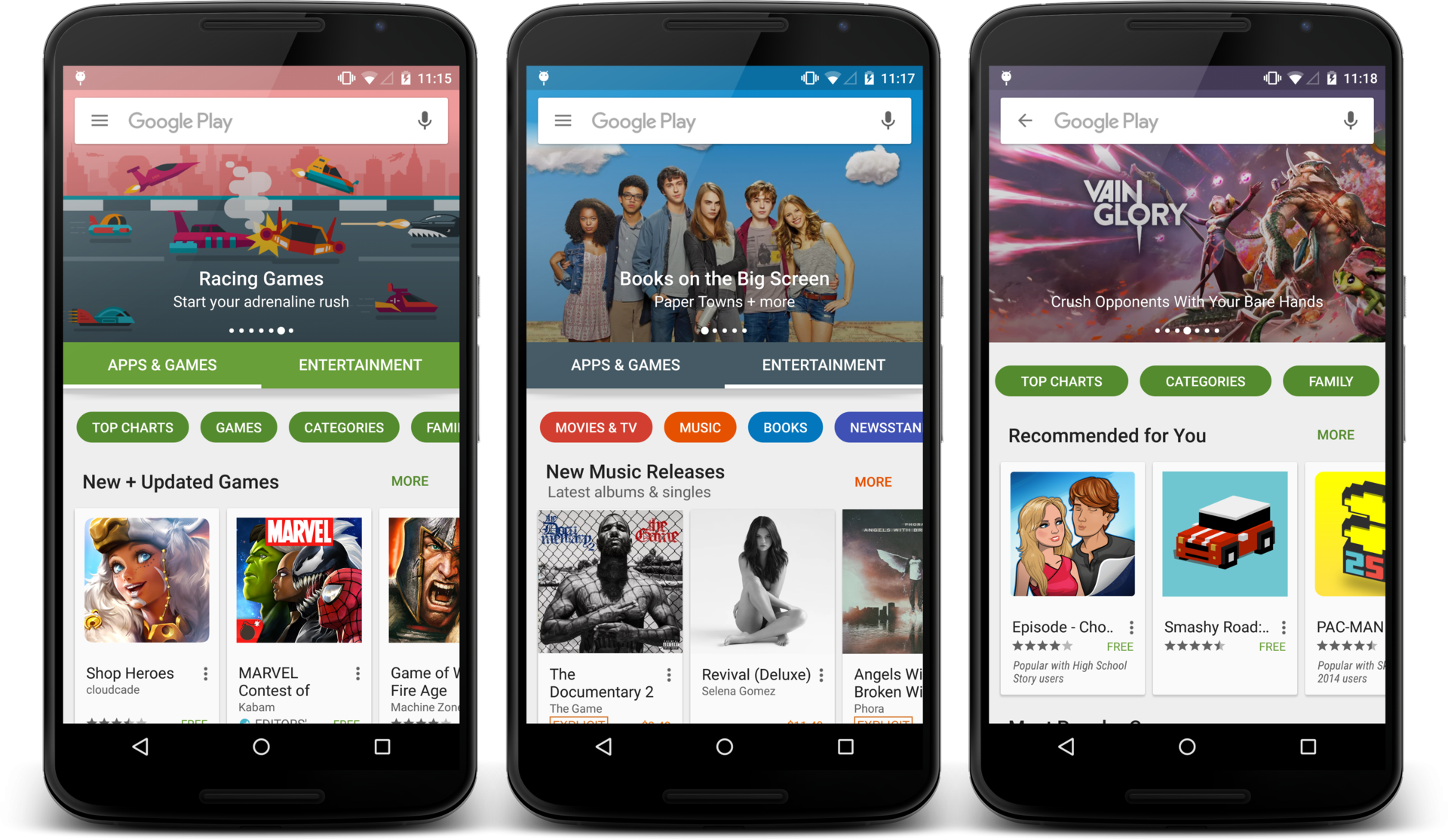
The Google Play Store has gone through a number of redesigns over the years, and it’s about to get another. Kirill Grouchnikov, user interface engineer at Google, has just published a few screenshots on Google+, giving us a good look at what we can expect to see in the next big redesign of the Google Play Store.
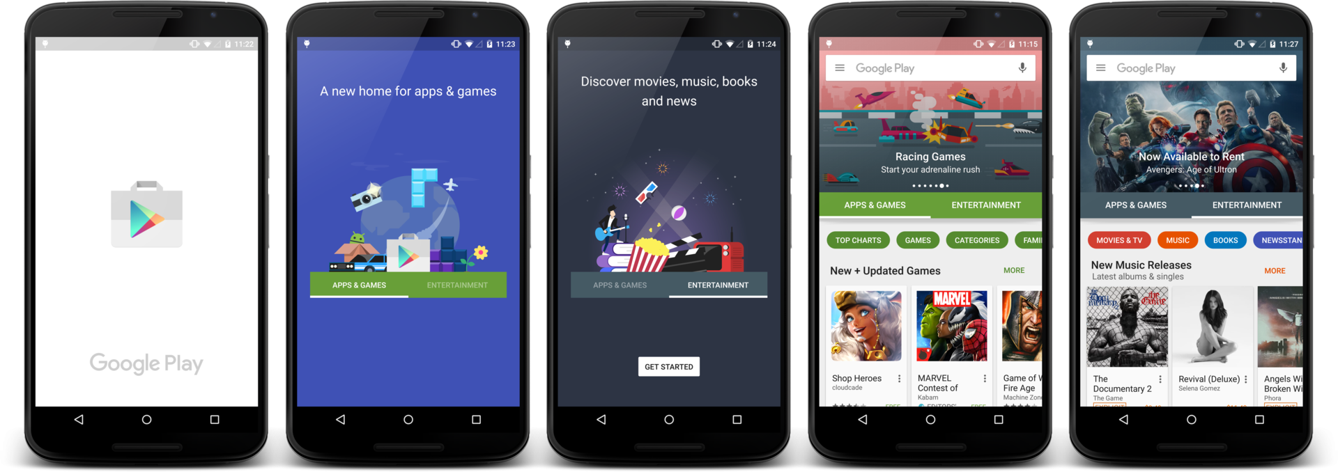
Take a look at the image attached below. As you can see, Google has added in what appears to be a new splash screen, similar to what the company has been including in most recent versions of its most popular applications. Looking beyond that small addition, we’re seeing a mostly redesigned landing page. Currently, the Play Store separates Apps, Games, Movies & TV, Music, Books and Newsstand into separate categories. In this new version, though, the Play Store will feature just two main categories – Apps & Games and Entertainment.

After selecting the Apps & Games tab, it looks like you’ll be able to select from multiple different subcategories, such as Top Charts, Games, Categories, Family and more. Under the Entertainment tab, you’ll be able to choose from Movies & TV, Music, Books and Newsstand.
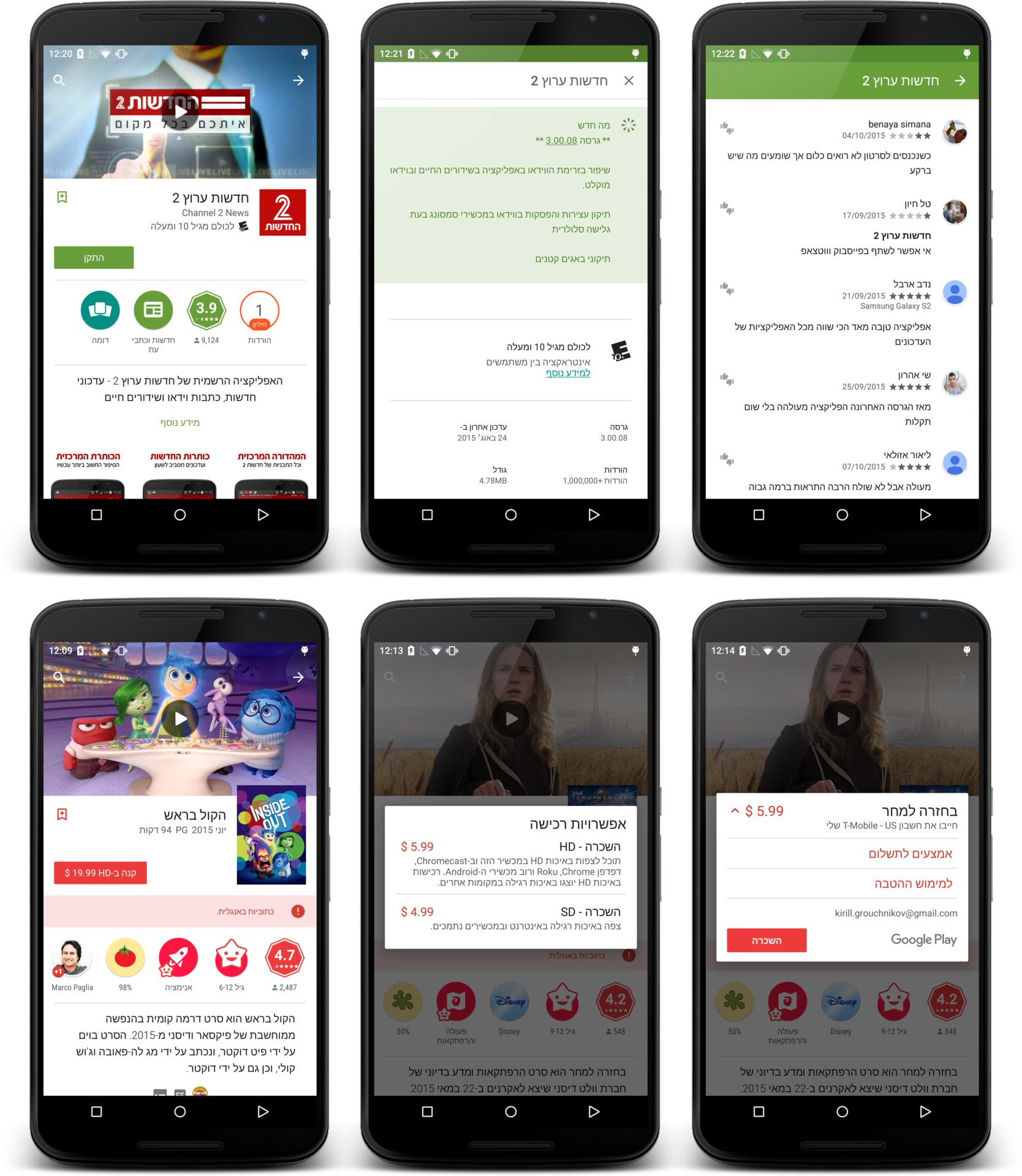
What’s more, the new version of the Play Store will also have support for “right-to-left flow of information for all RTL languages supported by the platform.” Take a look at the screenshots below for a better look:

Beyond that, there aren’t too many other details regarding the next big redesign. Grouchnikov says the update is coming sometime soon, but we aren’t sure of a specific timeframe. So, just based off what you’ve seen so far, what are your thoughts? Are you already scouring the web for the APK, or are you more a fan of the current Play Store design? Let us know your thoughts in the comments.