Affiliate links on Android Authority may earn us a commission. Learn more.
Google is going all-in on the squircle icon for the Play Store
Published onMarch 15, 2019

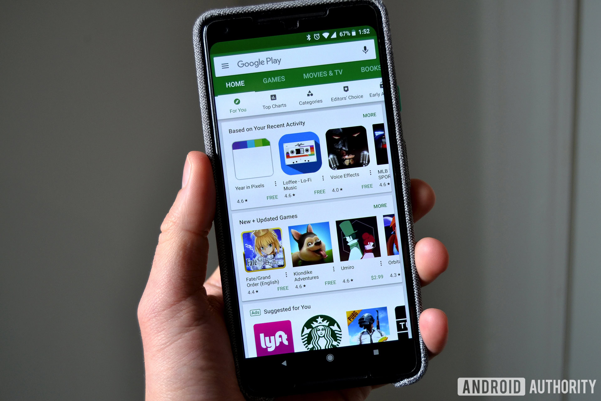
In the image above you’ll see quite a few app icons on the Google Play Store. The Starbucks one is a circle, PUBG Mobile is a square, and the Lyft icon is a squircle — albeit a different squircle shape as compared to the Loffee app.
Google wants to do away with this disparity between icon shapes on the Google Play Store. In a new post on the Android Developers Blog, Google lays out the new rules for developers when it comes to their app and game icons — and it’s going to be all squircle all the time.

Starting in April 2019, developers will have the ability to upload new icons for their apps that will conform to the new squircle shape. As of May 1, new apps submitted to the Google Play Store will not be accepted if they don’t follow the new icon guidelines. By June 24, 2019, all icons that haven’t been updated to the new format will be converted to legacy icons — eliminating the ability for developers to update them.
Legacy icons will be embedded as designed into a white squircle, to keep things more uniform. Check out how it all looks below (the original icon is on the left, the correctly redesigned icon is in the middle, and the legacy icon is all the way to the right):

In addition to this new squircle shape, Google will no longer allow icons to involve transparencies.
Google points out that this new policy only applies to the Play Store when viewed on Android, your desktop browser, or on Chrome OS. The Play Stores on Wear OS, Android TV, and Android Auto will not be beholden to the new design policy.