Affiliate links on Android Authority may earn us a commission. Learn more.
Google Play's "My Apps & Games" section getting a revamp (Update: rolling out now)
Published onApril 18, 2017

Original story, March 27: Following the news of the “Free app of the week” update rolling out to the Google Play Store yesterday comes word of another new improvement: the My Apps & Games section is getting a revamp.
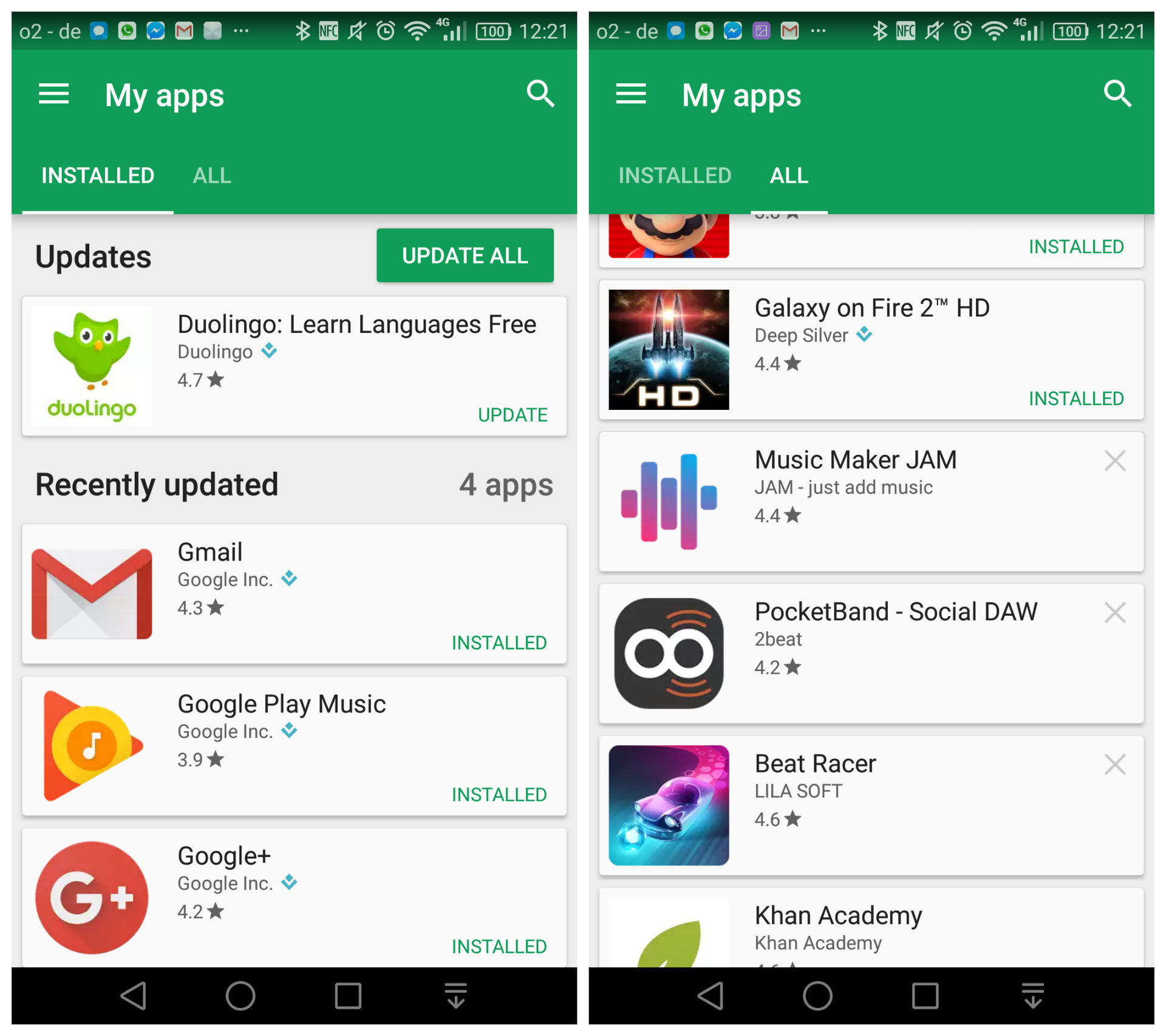
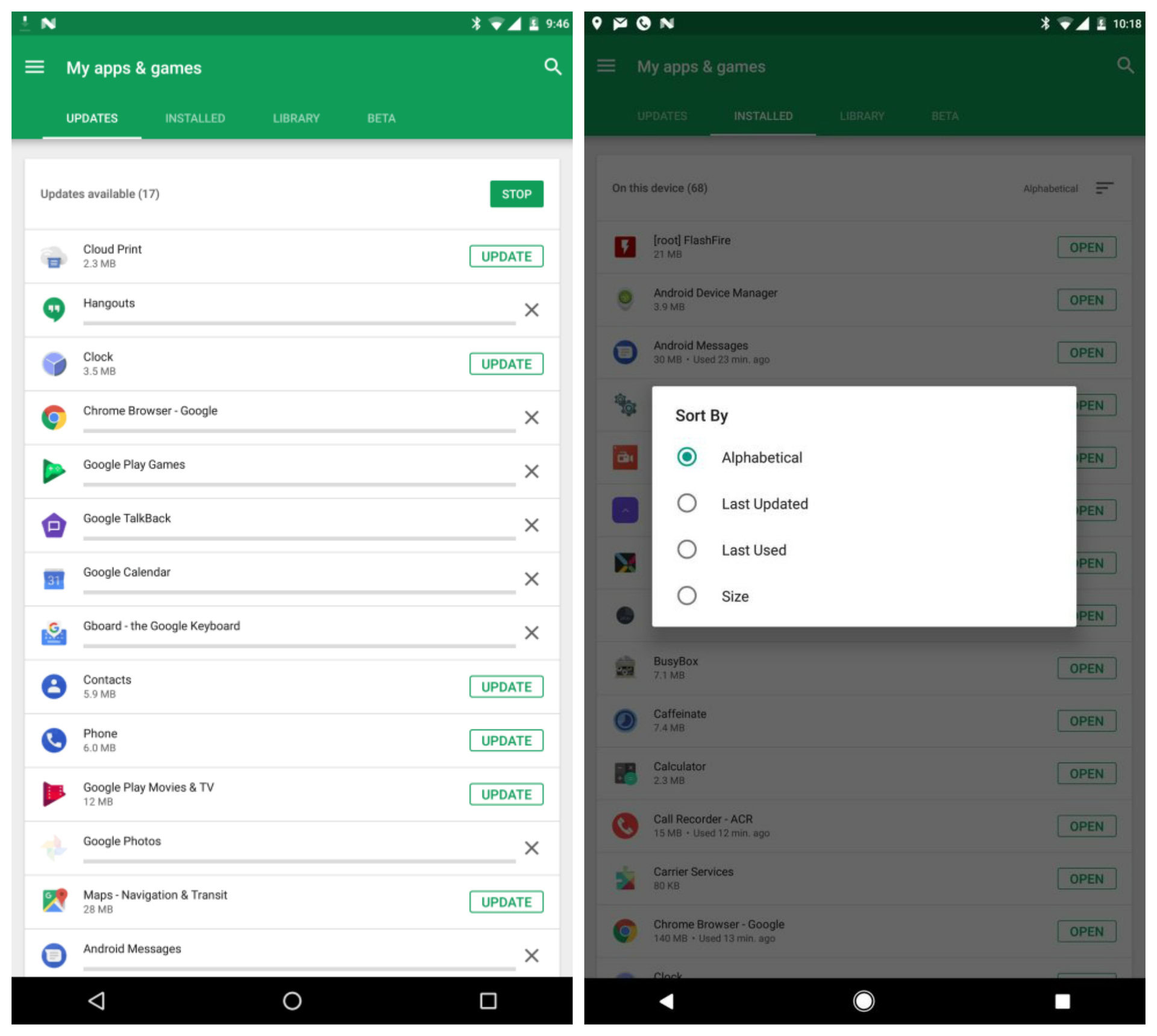
The previous version of this page featured “Installed,” “All,” and “Beta” tabs which you could flick between, while the new version — rolling out now — houses four options: “Installed,” “Updates,” “Library,” and “Beta.”
The Installed page used to contain app updates also, but in the new version, this has been split off into its own tab. That seems like a sensible move, but the renaming of the All tab doesn’t seem as necessary.

The All tab was where you could find currently installed apps, previously installed apps and apps installed on different devices with the same Google account. According to 9to5Google, this has now simply been renamed Library. The moniker “Library” in the digital world usually suggests things that you have, like songs in your media player, for example. Using it as the name for apps that aren’t currently installed seems odd.
The Beta tab, meanwhile, is functionally the same as before,
Also in the update are new sorting options in the Installed and Library tabs so you can arrange the lists by when they were last updated or last used, by file size or by alphabetical order. Take a look at some of the screenshots of the new interface from 9to5Google below.

Though some people have reported seeing this for weeks already, it’s yet to appear on all devices and regions, so it’s likely a tiered server-side rollout. If you haven’t yet, you should see it arrive on your device in the coming weeks.
What are your thoughts on the new interface? Let us know in the comments below.