Affiliate links on Android Authority may earn us a commission. Learn more.
Play Store 5.1.11 brings new My Account section and design tweaks
Published onDecember 5, 2014

The Google Play Store has gone through an impressive number of iterations over the years. The locale formally know as the Android Market has seen icon changes, name revisions, and visual transformations.
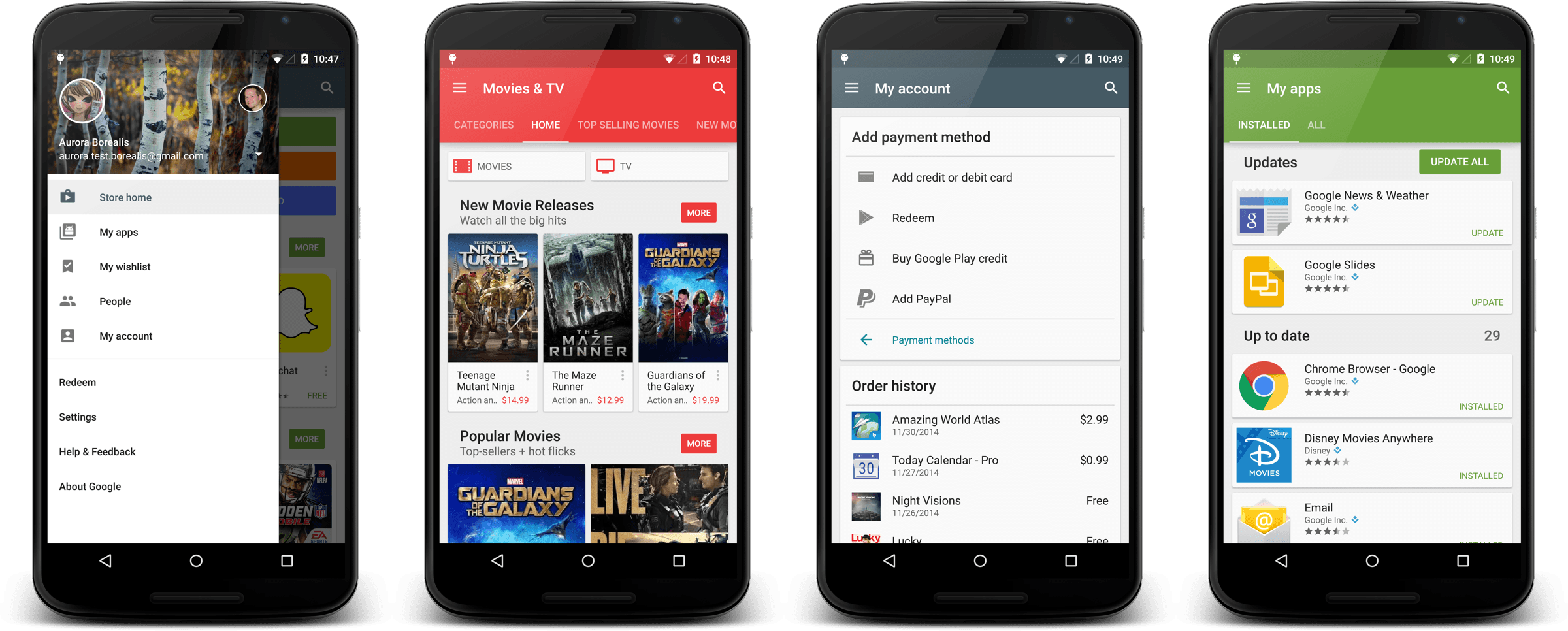
The latest update, 5.1.11, while not as dramatic as the Material Design overhaul released several weeks ago, further transforms the layout by streamlining things. Here’s the details, as posted by Kirill Grouchnikov, one of Google’s User Interface engineers:
[quote qtext=”Coming soon to your Android device(s). The latest release of Play Store has full-height drawer, real-time card shadows on L+, consistent visuals and scrolling in My Apps and a brand new My Account page. The rest you’ll need to hunt down on your own :)” qperson=”Kirill Grouchnikov” qsource=”Google+” qposition=”center”]
The most useful and visible change seems to be the new My Accounts section, accessible from the side menu, which lists all your Play purchases (apps, music, devices, etc) and provides quick access to paying methods.
Google definitely seems to be fine tuning every aspect of Android’s look and feel in order to have a more unified feel. This is yet another step down that road, although be aware that only those running Lollipop will have the full benefits of the new design changes.