Affiliate links on Android Authority may earn us a commission. Learn more.
Google Play Store version 5.3.5 update now rolling out, brings UI enhancements and more
Published onMarch 4, 2015

A new version of the Google Play Store is now rolling out, bringing the version number up to 5.3.5. This update mainly features a few UI tweaks throughout the app. And no, the awesome Google Search bar teased a few weeks ago still isn’t included in this update.
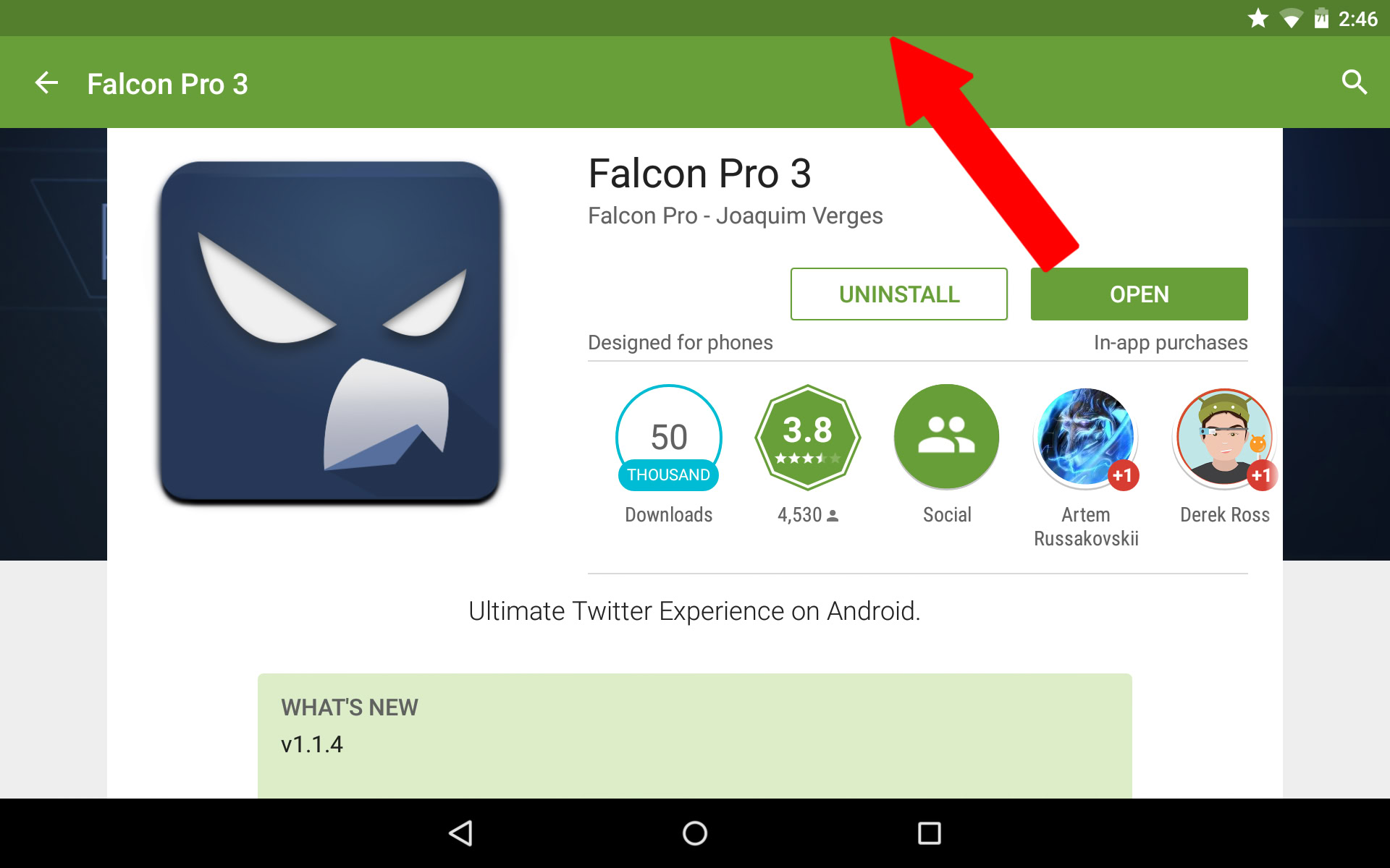
The biggest UI change we’re noticing so far is the way the notification bar changes color throughout the store. In the new update, the notification bar will change colors depending on what listing you’re currently looking through. In the older Play Store version, clicking on a listing would turn the notification bar back to a blue-ish color. Take a look at the screenshot below for an example.

Google’s Kirill Grouchnikov took to Google+ yesterday to show off the next change. While in landscape mode on smartphones with the previous version, movie listing information cards would extend from edge-to-edge, which cluttered up the view a bit. Now, the movie listing card is moved in from the sides which allows for a cleaner view. Take a look at the image below for some more clarification:

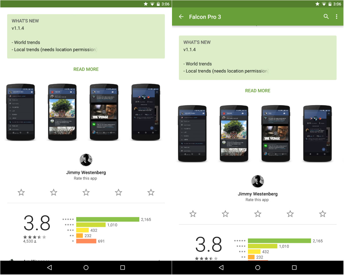
The last change we’re seeing in the update is with the action bar behavior. In the old Play Store version, the action bar would stay at the top of the screen, no matter if you scrolled up or down. In the new version, the action bar hides when you scroll down, but reappears when you scroll back up. It’s a small change, but it allows you to fit more content on the screen while you’re scrolling down.

The update is rolling out now, so everyone should (hopefully) receive it before too long. If you don’t want to wait, however, you can sideload the apk by following this link. Have you noticed any other changes in this update? If so, let us know in the comments.