Affiliate links on Android Authority may earn us a commission. Learn more.
Google publishes Material Design checklist for developers
Published onOctober 28, 2014

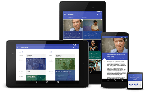
Android 5.0 Lollipop and its redesigned Material Design interface will soon be upon us. In preparation, Google has released a Material Design checklist for developers looking to design their apps around the new Android look.
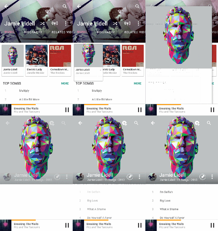
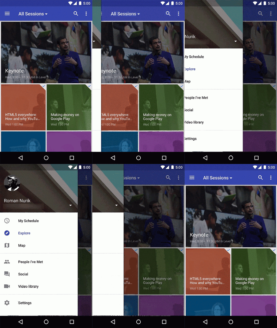
Designing a Material Design UI is split down into four key aspects. Tangible Surfaces for things like single color backgrounds and surface levels of content. Print-Like Aesthetics for the layout and position of text, images, and other content. Authentic Motion for continuity across different contexts and motion to improve the flow throughout an app. Finally, guidelines for the app bar, tabs, and the new navigation draw. There’s quite a lot to get through.


We have already had a good look at what Google wants Lollipop apps to look like, through the recent Newsstand and Google+ updates. The checklist covers much of what we’ve seen already, including the use of shadows, subtle animations and touch feedback, as well as the new look for tabs and the notification drawer. Importantly, the Floating Action Button found in the Google+ and Inbox apps is going to be an essential part of future apps. Developers are being encourage to house all key actions and commands on this button.
Google also hints that there will be a number of other updated Google apps coming our way before the end of the year, suggesting that its full app range might be in line for a Material Design overhaul.
Developers looking to get started with Material Design can also check out the templates and guidelines that Google has published previously, as well as the new checklist.
Are you a fan of Google’s unified app aesthetic?