Affiliate links on Android Authority may earn us a commission. Learn more.
Google Search getting redesign on mobile with website icons
Published onMay 22, 2019

Google announced today that it is slightly tweaking how Google Search looks, at least on mobile devices. The company hopes the new design will make it easier to quickly determine what the source of the information is when viewing Search results.
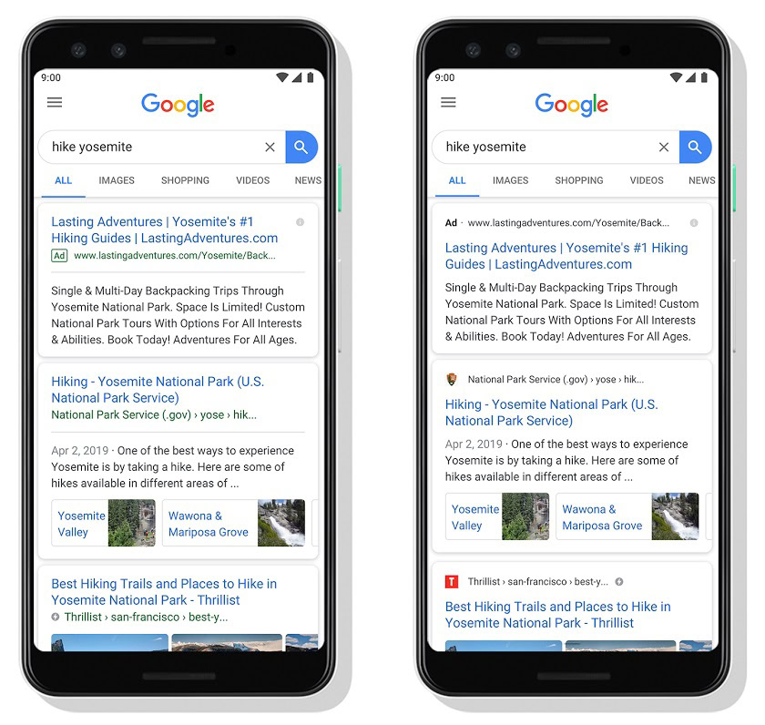
The biggest part of the new design is the addition of website icons next to specific results. The icons will be similar to the favicons you see in web browser tabs, which are usually the website’s logo. The addition of an icon within Google Search will help users quickly identify where they’ll be taken if they click that link.

The second alteration to Google Search will be a revamped ad disclosure notification. Right now, the word “ad” is shown surrounded by a green box at the bottom of the result. The new design removes the box and the green coloring and pushes the disclosure to the top of the result. Google says this will be easier for people to understand which links in Google Search results are ads and which ones aren’t.
Check out the revamped results in the image below. The results on the left are how they look now and the ones on the right are how they’ll soon look:

Google says these new redesigns will roll out to mobile first over the next few days. It’s assumed the design will come to desktop versions of Search soon after.
What do you think? Is this the right direction? Do you find it easier to spot the ads with the new look? Let us know in the comments.
NEXT: Google takes another shot at the iPhone with latest Pixel 3a ad