Affiliate links on Android Authority may earn us a commission. Learn more.
Google's mobile site redesign is all about those curves
Published onNovember 3, 2017

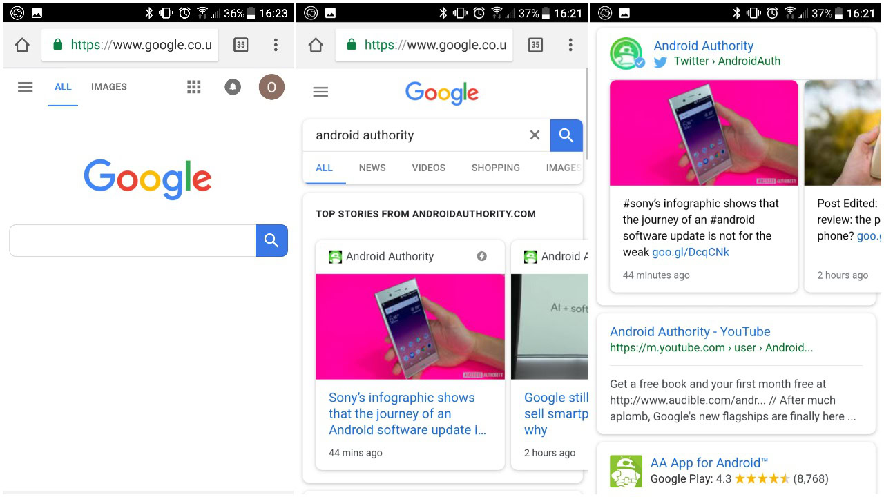
If you’ve searched for anything on your phone today you might have noticed that Google’s mobile homepage and search result pages look a little different. That’s because the search giant has begun rolling out a redesigned mobile interface.
The changes follow hot on the heels of a similar Feed makeover that’s in testing for Google’s primary app which was first spotted mere days ago. The mobile site revamp, which is now live for Android and iOS users that are logged in via their Google account, uses the same rounded UI design Google has been testing for a while.
The first sign something has changed starts with Google’s mobile homepage where the primary search box now has curved edges. Imagine the squircle apps LG introduced in UX 6.0, but stretched into a rectangle (rectircle?). Pop in a search term and the curves keep on coming, as the category tabs and every card you can think of. That includes ‘Top Stories’, social, related searches, search suggestions, weather, sport results, and many other carousel cards.
Link text and titles have also been tweaked ever so slightly, with the blue shifting to a softer, lighter shade than before. In addition, the gray backgrounds we’ve gotten used to for so long now match the bright white cards in the foreground.

The search redesign appears to be live across all mobile platforms in multiple regions. We’re still waiting on the equivalent changes in the Google app, however, which not only includes the rounded cards and search bar, but also shifts the hamburger menu to the bottom navigation bar. That one will take some getting used to.
What do you think of the changes? Is it better than ever, or have Google gone a bit curve mad? Let us know in the comments!