Affiliate links on Android Authority may earn us a commission. Learn more.
Video: Here’s what you can expect from the next version of TouchWiz
Earlier this month Samsung pushed out an update to beta testers in Korea that brought a revamped version of TouchWiz UI to the Note 5. It’s been speculated that this refreshed TouchWiz would power the Note 7, which is due in early August. Thanks to a video walkthrough by HDBlog.it, we now have a good idea of what to expect.
The video (in Italian) is an extensive rundown of what’s new in the refreshed TouchWiz, which is also known under the “Grace UX” codename. The build has been sourced from this XDA-Developers thread, where you can also download some of the accompanying apps.
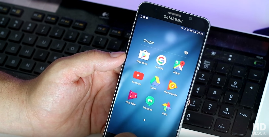
From the beginning, we see that Samsung has streamlined TouchWiz, making it flatter and generally less “bubbly” than before. The UI makes liberal use of blur effects, for instance in the revamped app folder interface, which now features larger icons and a translucent background.

The widget interface has been enhanced with the ability to change the transparency of the backgrounds; it’s also easier to find widgets and to quickly uninstall them. The wallpapers and themes selection interfaces have been consolidated.
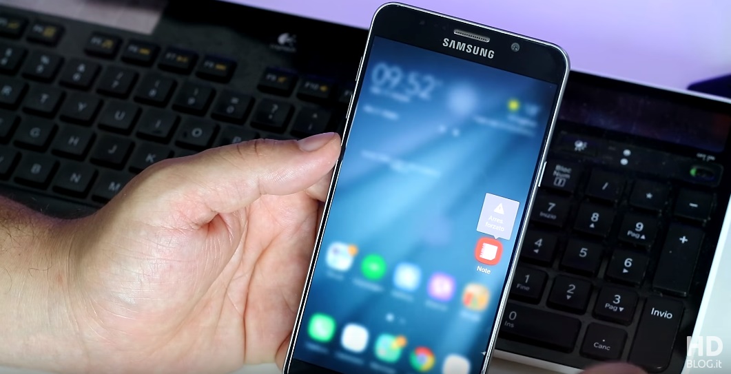
One very interesting addition is the support for swipe gestures. Just like on Nova Launcher, you can swipe up on an icon to open a contextual menu that can hold frequently used functions. This feature is similar to what Apple does with 3D Touch on iOS devices, as well as with the similar contextual menus coming in Android N.

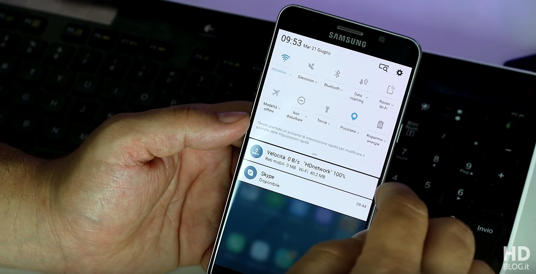
The notification and quick settings dropdown features the same white and blue color palette we first saw with the Marshmallow update for the Galaxy S6. The UI allows you to customize the position of the various settings tiles, and pulling the menu down reveals a second row of tiles, just like on stock Android.

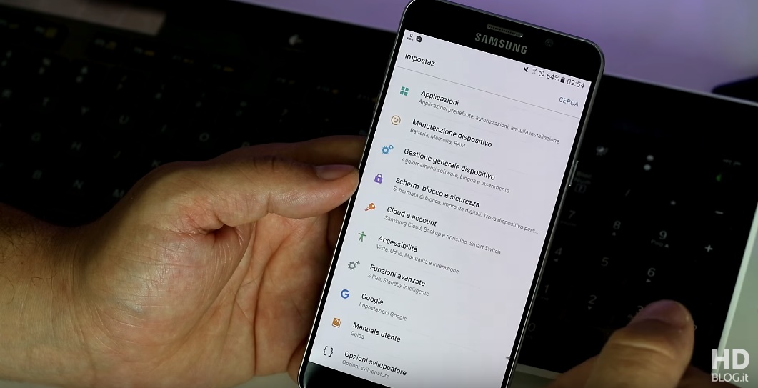
The Settings section has been revamped, with a more compact layout and new colorful icons, as well as Android N-style descriptions for each settings category.

Will we see this new version of TouchWiz on the Note 7? Many people seem to think so, but the truth is, that’s just speculation for now. Even if the Note 7 will run Grace UX, keep in mind that what you see in the video is non-final software and that Samsung is very likely to keep the big new features under wraps until the Note 7 comes out.
Let us know your thoughts!