Affiliate links on Android Authority may earn us a commission. Learn more.
How to use Material Design in your Android apps
Published onOctober 30, 2017

Material design is an important aspect of any UI because it makes apps compelling. We are visual beings and even though an app might have cool features, a poor the design will lead to users abandoning an app.
In this tutorial, we are going to look at some of the principles of material design that are key to an awesome design and in turn, make your application beautiful. We already know how to make different elements of Android come together to create an application, but material design adds beauty and elegance to your app.
In order to get started with material design, we need to apply the material design theme. In your styles file, add the following code.
<!-- res/values/styles.xml -->
<resources>
 <!-- your theme inherits from the material theme -->
 <style name="AppTheme" parent="android:Theme.Material">
 <!-- theme customizations -->
 </style>
</resources android:elevation>
Creating surfaces with Elevations
Material design layouts should conform to material design guidelines. Let’s see how we can create a layout for our App. Creating shadows in material design is made possible by using elevation. To set elevation in surfaces, we use the android: elevation attribute as shown below. Let’s create two surfaces each with different elevations.
<FrameLayout
 android:layout_width="match_parent"
 android:layout_height="200dp"
 android:layout_margin="16dp"
 android:background="#fff"
 android:elevation="4dp"
 ></FrameLayout>
<FrameLayout
 android:layout_width="match_parent"
 android:layout_height="200dp"
 android:layout_margin="16dp"
 android:background="#fff"
 android:elevation="8dp"
 ></FrameLayout>
Here we have two different surfaces that cast different shadows, one at 4 dp and the other at 8 dp. The higher the elevation, the more the shadow cast.
Implementing a Floating Action Button (FAB)

A FAB is a colored circular button that floats above the rest of your content in your app and is a way of promoting a primary action. This has the greatest elevation and thus floats above all the content. FABs have standard sizes and elevations, they come in either 40 or 56 dp diameters and an elevation of 6 dp though they may rise up to 12 dp when pressed.
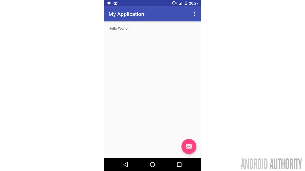
So how do we implement floating buttons? Luckily Android Studio comes the Basic activity that has a built-in FAB element as shown below. However, it’s important to know how to implement it in case of an app that just needs upgrading.
Depending on your version of Android Studio, add the following dependencies to Build.gradle:
dependencies {
 compile fileTree(dir: 'libs', include: ['*.jar'])
 compile 'com.android.support:appcompat-v7:25.3.1'
 compile 'com.android.support:design:25.3.1'
 }
The design library makes it easy to implement material design. Below is the definition of the floating button that you need for our layout file.
<?xml version="1.0" encoding="utf-8"?>
<android.support.design.widget.CoordinatorLayout
    xmlns:android="http://schemas.android.com/apk/res/android"
    xmlns:app="http://schemas.android.com/apk/res-auto"
    xmlns:tools="http://schemas.android.com/tools"
    android:layout_width="match_parent"
    android:layout_height="match_parent"
    android:fitsSystemWindows="true"
    tools:context="com.example.vaatiesther.fab.MainActivity">

<android.support.design.widget.AppBarLayout
    android:layout_width="match_parent"
    android:layout_height="wrap_content"
    android:theme="@style/AppTheme.AppBarOverlay">
</android.support.design.widget.AppBarLayout>

<include layout="@layout/content_main" />

<android.support.design.widget.FloatingActionButton
    android:id="@+id/fab"
    android:layout_width="wrap_content"
    android:layout_height="wrap_content"
    android:layout_gravity="bottom|end"
    android:elevation="6dp"
    android:translationZ="16dp"
    app:fabSize="normal"
    android:layout_margin="@dimen/fab_margin"
    app:srcCompat="@android:drawable/ic_dialog_email" />
</android.support.design.widget.CoordinatorLayout>
Our FAB has a normal size and an elevation of 6dp. The translationZ means that the button will rise to 12dp when pressed. Our FAB will elevate and show ripples when touched.
Scroll Events
Scrolling is another major aspect of material design that cannot be ignored. Many of the Google’s Material Design’s scrolling effects depend on the CoordinatorLayout design and there are several ways to implement.
Let’s see how we can implement WhatsApp like scrolling effect which uses the collapsing and expanding toolbar. First make sure you have the following dependency in your grade file: compile ‘com.android.support:design:26.0.0-alpha1’
Then you XML file should like something like this:
<android.support.v4.widget.DrawerLayout
    xmlns:android="http://schemas.android.com/apk/res/android"
    xmlns:app="http://schemas.android.com/apk/res-auto"
    android:id="@+id/drawer_design_support_layout"
    android:layout_width="match_parent"
    android:layout_height="match_parent">

    <android.support.design.widget.CoordinatorLayout
        android:id="@+id/rootLayout"
        android:layout_width="match_parent"
        android:layout_height="match_parent"
        app:expandedTitleMarginStart="60dp">

        <android.support.design.widget.AppBarLayout
            android:layout_width="match_parent"
            android:layout_height="255dp"
            android:theme="@style/ThemeOverlay.AppCompat.Dark.ActionBar">

            <android.support.design.widget.CollapsingToolbarLayout
                android:id="@+id/collapsing_toolbar"
                android:layout_width="match_parent"
                android:layout_height="match_parent"
                app:layout_scrollFlags="scroll|exitUntilCollapsed">

                <android.support.v7.widget.Toolbar
                    android:id="@+id/toolbar"
                    android:layout_width="match_parent"
                    android:layout_height="?attr/actionBarSize"
                    android:background="?attr/colorPrimary"
                    android:minHeight="?attr/actionBarSize"
                    app:layout_collapseMode="pin"
                    app:popupTheme="@style/ThemeOverlay.AppCompat.Light"
                    app:theme="@style/ThemeOverlay.AppCompat.Dark.ActionBar" />

            </android.support.design.widget.CollapsingToolbarLayout>

        </android.support.design.widget.AppBarLayout>

        <android.support.v4.widget.NestedScrollView
            android:layout_width="match_parent"
            android:layout_height="match_parent"
            android:fillViewport="true"
            app:layout_behavior="@string/appbar_scrolling_view_behavior">

            <LinearLayout
                android:layout_width="match_parent"
                android:layout_height="match_parent"
                android:orientation="vertical">

                <TextView
                    android:layout_width="wrap_content"
                    android:layout_height="wrap_content"
                    android:layout_marginTop="26dp"
                    android:text="Androi Material design"
                    android:textColor="#666" />
                <TextView
                    android:layout_width="wrap_content"
                    android:layout_height="wrap_content"
                    android:layout_marginTop="26dp"
                    android:text="Androi Material design"
                    android:textColor="#666" />
                <TextView
                    android:layout_width="wrap_content"
                    android:layout_height="wrap_content"
                    android:layout_marginTop="26dp"
                    android:text="Androi Material design"
                    android:textColor="#666" />

            </LinearLayout>
        </android.support.v4.widget.NestedScrollView>
    </android.support.design.widget.CoordinatorLayout>
</android.support.v4.widget.DrawerLayout>
You can then bind to the UI elements from your Java file like this:
public class MainActivity extends AppCompatActivity {
    Toolbar toolbar;
    CollapsingToolbarLayout collapsingToolbarLayout;
    @Override
    protected void onCreate(Bundle savedInstanceState) {
        super.onCreate(savedInstanceState);
        setContentView(R.layout.activity_main);
        initInstancesDrawer();
    }
    private void initInstancesDrawer() {
        toolbar = (Toolbar) findViewById(R.id.toolbar);
        setSupportActionBar(toolbar);
        collapsingToolbarLayout = (CollapsingToolbarLayout) findViewById(R.id.collapsing_toolbar);
        collapsingToolbarLayout.setTitle("Android Authority");
    }
}
Color and material design color palettes
Color and material design color palettesColor can be able to distinguish items, for example, it can tell if a fruit is ripe or not. It can also be used to direct our attention to something or simply imply hierarchy and structure of elements in an application. Material design encourages app developers to embrace purposeful uses of color to make applications easy to use.Material design provides a color tool and color pallets that make it fast and easy to design your UI.
Primary and secondary colors

A primary color is basically the color displayed most frequently in your screen and components. It is recommended to pick a primary color that represents your brand or personality. This color can be used in the app bar to make your application recognizable. You can also use different shades to provide contrast between elements.
A secondary color is used to accent different parts of your UI. This is a more saturated color designed to draw attention to a certain element, ie floating action buttons or a fab.Secondary colors are best used for:
- Text fields, cursors, and text selection
- Buttons, floating action buttons, and button text
- Progress bars
- Selection controls, buttons, and sliders
- Links
- Headlines
Color can also be used to create a hierarchy, For example, bright colored app bars make an applications to stand out. The example below shows how to use color and color pallets to create a contrast between elements.
Let’s implement our app using the color palettes provided by material design. The first thing we need to specify the colors we want to use in the color file as follows:
<?xml version="1.0" encoding="utf-8"?>
<resources>
    <color name="colorPrimary">#3F51B5</color>
    <color name="colorPrimaryDark">#303F9F</color>
    <color name="colorAccent">#FF4081</color>
</resources>
Then in the style, we use the identifies, prefixed by @color and a / for the primary color, primary dark, and accent color.
<style name="AppTheme" parent="Theme.AppCompat.Light.DarkActionBar">
    <!-- Customize your theme here. -->
    <item name="colorPrimary">@color/colorPrimary</item>
    <item name="colorPrimaryDark">@color/colorPrimaryDark</item>
    <item name="colorAccent">@color/colorAccent</item>
</style>
In the xml file, we set the elements to use the respective background colors. Here is how we set the background color for the AppBarLayout
<android.support.design.widget.AppBarLayout
    android:layout_height="150dp"
    android:layout_width="match_parent"
    android:background= "?colorPrimary">
</android.support.design.widget.AppBarLayout>
Implementing Lists.
The RecyclerView widget is used to create complex lists with material design.The Recycler widget is a more advanced version of the traditional ListView. The widget uses an adapter and a layout manager and it looks something like this:
<?xml version="1.0" encoding="utf-8"?>
<RelativeLayout xmlns:android="http://schemas.android.com/apk/res/android"
    xmlns:tools="http://schemas.android.com/tools"
    android:id="@+id/activity_main"
    android:layout_width="match_parent"
    android:layout_height="match_parent"
    android:paddingBottom="@dimen/activity_vertical_margin"
    android:paddingLeft="@dimen/activity_horizontal_margin"
    android:paddingRight="@dimen/activity_horizontal_margin"
    android:paddingTop="@dimen/activity_vertical_margin"
    tools:context="com.example.vaatiesther.racycler.MainActivity">

    <android.support.v7.widget.RecyclerView
        android:id="@+id/recyclerview1"
        android:scrollbars="vertical"
        android:layout_width="fill_parent"
        android:layout_height="fill_parent"
        />
</RelativeLayout>
Once we have added the widget, we attach the layout manager to an adapter that is used to display the data:
public class MyActivity extends Activity {
    private RecyclerView mRecyclerView;
    private RecyclerView.Adapter mAdapter;
    private RecyclerView.LayoutManager mLayoutManager;

    @Override
    protected void onCreate(Bundle savedInstanceState) {
        super.onCreate(savedInstanceState);
        setContentView(R.layout.my_activity);
        mRecyclerView = (RecyclerView) findViewById(R.id.recyclerView);
        // use this setting to improve performance if you know that changes
        // in content do not change the layout size of the RecyclerView
        mRecyclerView.setHasFixedSize(true);
        // use a linear layout manager
        mLayoutManager = new LinearLayoutManager(this);
        mRecyclerView.setLayoutManager(mLayoutManager);
        // specify an adapter (see also next example)
        mAdapter = new MyAdapter(myDataset);
        mRecyclerView.setAdapter(mAdapter);
    }
    ...
}
Wrap-up
The above guidelines are just a scratch of the information available for app developers. For more information, visit the material design documentation