Affiliate links on Android Authority may earn us a commission. Learn more.
HTC Desire 626 impressions: a cheap Moto G rival with some cool features
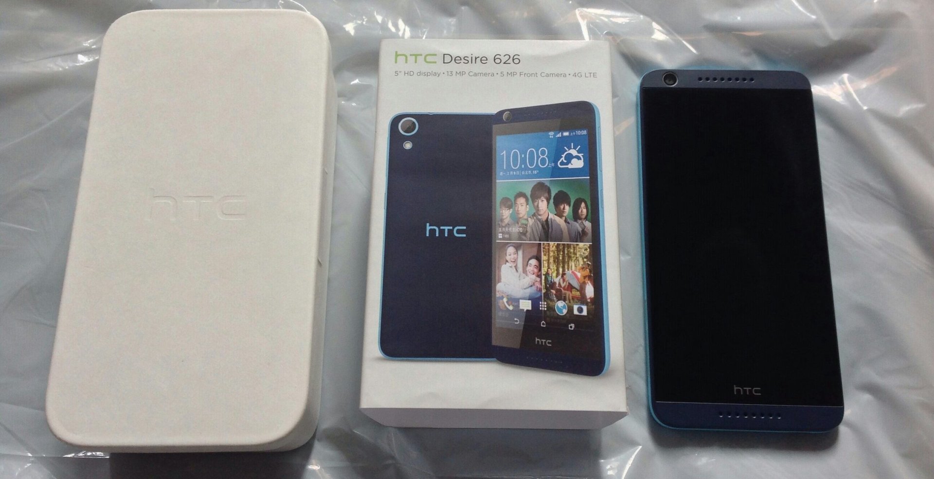
HTC has a long history of making devices, and, while times have changed, and all eyes are on its One series, there was a point when the name “Desire” was arguably superior to even Samsung. The original was a modified Nexus One with a nifty optical tracking sensor that allowed for navigation sans use of the touch screen and a fantastic AMOLED panel that really showcased what organic display technology could do in the early days of Android.
More recently, the Desire brand was relegated to mid-tier status at HTCand today’s impressions are of one such product: the HTC Desire 626 which is currently available in Taiwan and costs roughly $190.
The price and specs, interestingly enough, make it quite a direct rival to Motorola’s Moto G (2014 Edition), but there are a few key differences that set the two apart. Please note this is an “impressions” post, and thus the content and scope will not be as thorough as a full, formal review.
Of Specs and Unboxings and Guides Tours
Honestly speaking, the HTCDesire 626 is a rather unremarkable phone, for it lacks the hardware and performance to stand out among a sea of similar devices, the Moto G 2014 included. It has a 1.2GHz 64-bit Snapdragon 410 processor, 1GB of RAM, 16GB of storage, microSD support, a 13MP rear/5MP front camera combo, a 2000 mAh battery and support for LTE. It runs Android 4.4.4 KitKat with Sense 6.0. Given the device released months after Lollipop hit, and especially give the speed at which HTC attempted to update its One series, the presence of KitKat is rather off-putting. Still, with Sense on top of things, it’s not as noticeable.
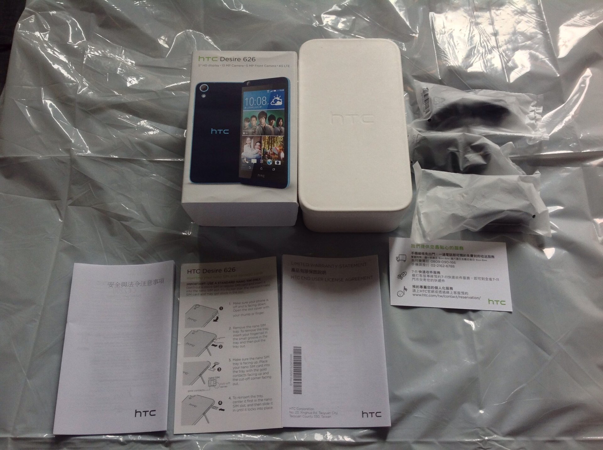
The packaging is quite nice actually, with the main box itself looking not unlike that of previous HTCproducts. The cardboard “tub” (top center) is sheathed inside a colorful label (top left). Inside there is a pair of headphones, USB charging cable, and AC adapter (top right). For reference, the headphones didn’t look to be of good quality, but they are still better than nothing. In terms of literature, we have the safety precautions and warnings booklet (in Chinese/bottom left), the SIM insertion card (bottom center), and warranty information (bottom right). On the far right is something that I suspect may only be in Chinese/Taiwanese HTCproducts: a business card that lists customer service quick reference information. Very handy in case something goes wrong, and given the size it’s easy to keep in your wallet.

The phone feels rather light and almost toy-like (more on that shortly) and stands quite tall. One thing that truly annoyed me in the time spent with the device – and this is true of most reviews of the HTC One M9 as well – is the placement of the power button. Instead of leaving the power button on the top of the phones as most every other device produced by the manufacturer has done, it was moved to the right hand side, directly below the volume keys. Take a look:
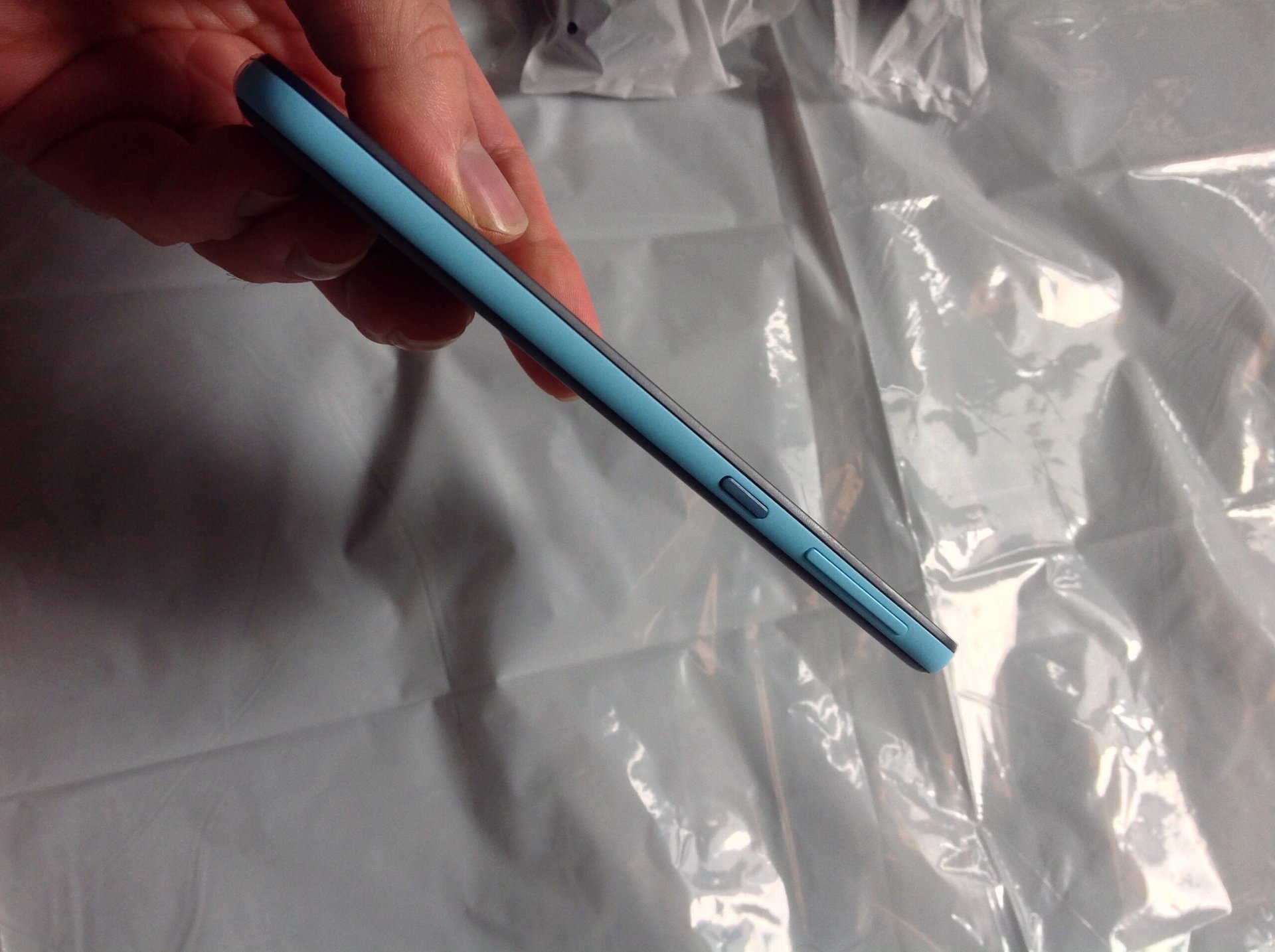
Whereas the One M9 at least provides a power button with different texture than those of the volume, here everything is plastic and thus there is no difference to speak of save for an extra bit of paint. Despite spending days with this device, there was rarely an instance when I hit the correct button. Basically, every time I wanted to lower the sound, I hit the power, and every time I wanted to hit the power, I ended up touching the volume. The volume rocker is, in my honest opinion, just too far up the side of the phone, whereas the power is located just about where you would be able to comfortably reach without stretching. Granted this is inevitably what HTCintended, but the combination just doesn’t work for me and caused endless annoyance.
Let’s take a look at the left side:

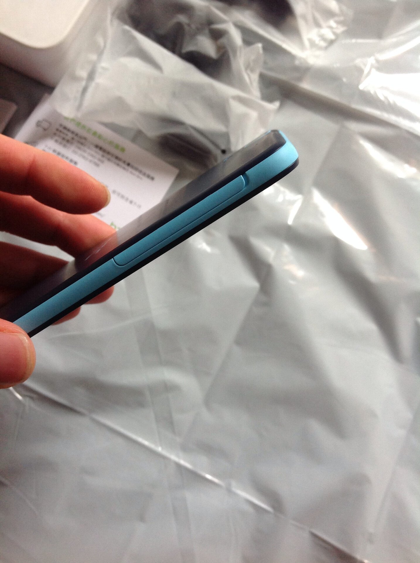
Here we have a single door (not waterproof for those interested) that houses the nano SIM card and the microSD card expansion. In the center you will actually see space for a second nano SIM card, but this was not a dual-SIM variant, so the center slot is plugged with a non-removable plastic stopper. For reference the nano SIM must be put inside a removable tray that pulls out of the device; it is not push-to-eject.
Here we have the door once closed. Note the area at the top of the panel used as the pry point:
Sense 6.0’s Big Appeal
There aren’t a ton of changes to Sense to speak of, and, in truth, unless you are an avid HTCuser, chances are you wouldn’t really notice much difference from earlier builds. The one aspect that I found to be fantastic was the HTCTheme Store. Gone are the days when you were given access to a bare minimum of OEM-designed alterations. Icons can be changed, the home screen background, the app draw background, and even system sounds. It felt like back in the day when you got Windows 95 and discovered all the neat features it had to offer with customization. If that wasn’t impressive enough, you can actually design your own theme and list it in the store for others to download. I must have spent a good half-hour or so just browsing through all the options and trying them out, though ironically enough I ended up using the Google Now Launcher…
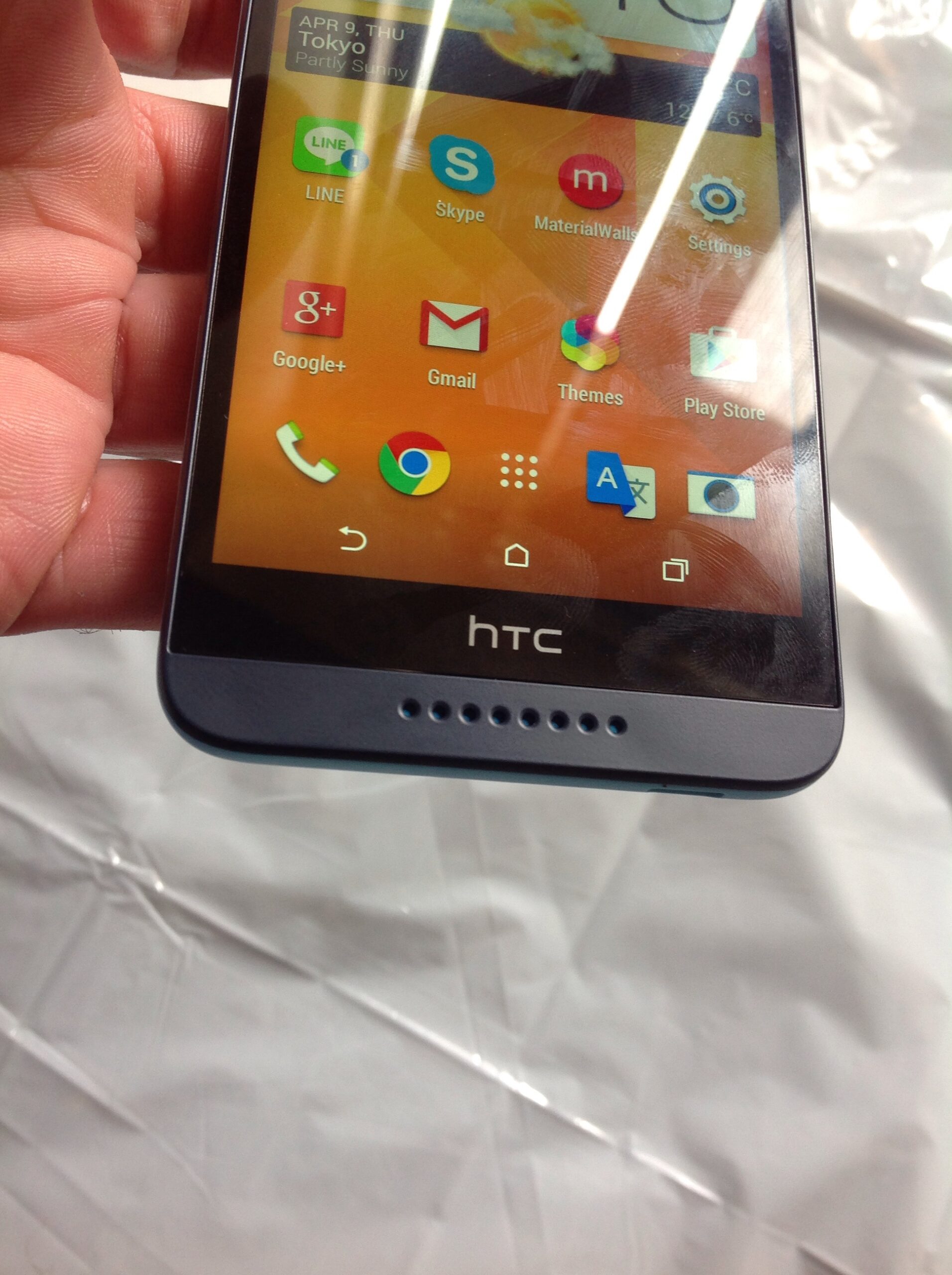
This kind of customization is something that really goes a long way as to making the device feel your own. All the more so with the ability to download new fonts, something that Google itself has yet to do.
Sizable Screen yet a Regrettable Ratio
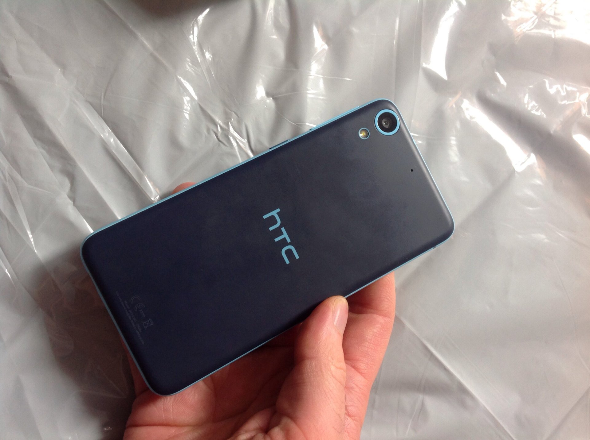
The screen isn’t eye-popping, but at 5 inches and 720p resolution, it’s also not a bad offering, either. There is decent enough color saturation to make things looks nice, but admittedly nothing along the lines of the AMOLED-chasing LED technology which Motorola employed with its Droid Mini some time ago. The only real issue I took with the display was how it only occupies around 66% of the Desire’s front face. When you hold the thing, it feels like an oversized chocolate bar, yet when you look so much of that space is wasted with the now-infamous HTCbezel and the BoomSound speakers beyond that.
In addition to the “wasted space” issue, various sensors can be seen when looking directly at the front of the phone in normal light conditions. I’m not referring to the usual assortment located near the camera, but other sensors that are apparently contained within the aforementioned bezel (probably the proximity sensor). While it’s not a problem per se, I do wonder why it is they were so visible here yet in other handsets (including the One M8) I wasn’t able to notice them.
There is definitely a sense that a larger panel could be used if HTCwould decide to make new designs instead of modifying internals. In truth this Desire looks almost the same as those which released last year. Had the device included a 5.5 inch screen, for example, I would have actually considered using it for a longer period of time, beyond the scope of purposes for review.
Hiccups Along the Way
Interestingly enough performance is something that leaves something to be, well… desired. Ultimately I’m not sure if the problem is the Snapdragon 410 CPU/Adreno 306 graphics combo, HTCSense 6.0, or a combination of both. I frequently had issues where the phone would slowdown or freeze, and on at least two occasions it restarted. While the CPU itself is a 64-Bit chip, as the Desire ships with Kitkat 4.4.4, the OS itself can’t make use of the extra performance power. To this end, I suspect there might be some degree of improvement with the (presumed) eventual update to Lollipop.
Then again, the Moto G (2014 Edition), in my testing, had no real slowdown of lag to speak of when using an inferior chipset (Snapdragon 400/Adreno 205). This might be in part to the fact that I used it with Lollipop, or it might be a result of the absence of an OEM skin on top.
Not Toying Around
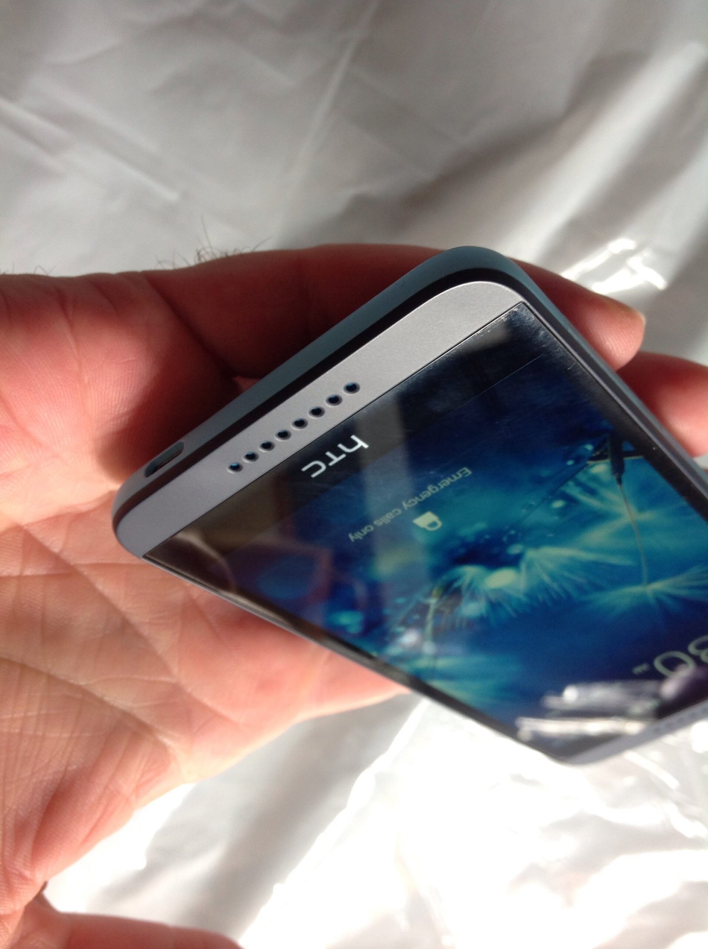
Perhaps the biggest problem with the HTCDesire 626 is its build quality. The thing feels like a cheap toy. Truth be told, it’s not so different than the Desire lines that released last year, but once you actually have the device in hand, the plastic nature makes it feel as if you’re holding a small child’s toy. Then again, considering the price tag, in some ways it is a “toy” of sorts. Ultimately, I can’t fault the device too much, for it does feel solidly built, and didn’t get any scratches or scuffs during my time with it.
Ironically, the color choice serves to make the Desire look trendy and cool, yet also serves to further the toy scenario. This might be different with the other color variants, but at least for the Blue Lagoon option I used, it was the case. I would very much like to see this kind of color scheme used on the HTCOne M9 actually, as it would make the product a bit more “fun” than the “minimal” approach the company is going with. For that matter, I’d love to see a Galaxy product from Samsung with this coloring as well. HTCdefinitely deserves credit for making a cool looking phone.
As far as the BoomSound speakers themselves went, the sound was indeed loud, but not remarkably deep. I was slightly more impressed than the Moto G (2014 Edition), but, honestly, I didn’t find much use for the speakers given the performance issues often kept me from wanting to play games or even stream videos on YouTube.
Cutting Corners with the Camera
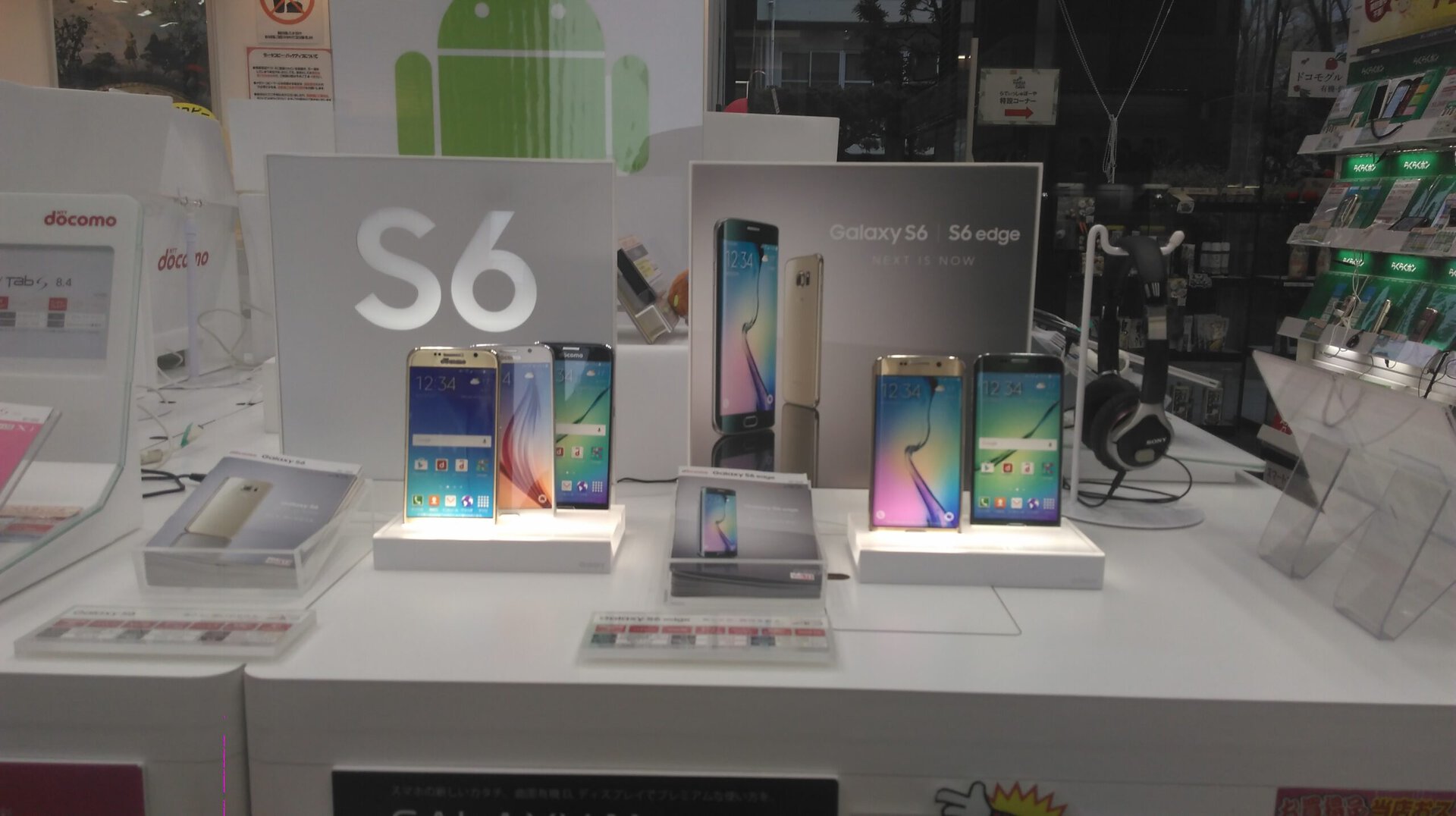
Picture quality was rather poor, though given that even the One M9 with its 20-megapixel rear camera has some major issues with photography, this shouldn’t come as a surprise. Low light shots often looked so bad that I simply had to delete them as the content I desired to capture blended into the background too much. Shots taken in broad daylight were acceptable, but nothing special. Selfies were somewhat better given the higher resolution but alas I opted not to save any of them.
Here is an example of a picture that turned out quite poor. It was about 5:10pm and thus dark outside, but the docomo store the image was taken at had more than ample lighting.
Here was another image I took, this time inside an enclosed room with quite bright overhead lighting. Notice how dark the picture is:
Regrettably, the other images I took with the camera were all unsuitable for use (as if the previous two were) as they ended up too blurry. Still, returning to the price tag issue, the fact that the Desire’s cameras can take decent pictures to begin with is a pretty nice feature if you ask me.
Wrap Up
Chances are, if you bothered to read this far, you’re not very impressed, and rightly so. The HTCDesire 626 isn’t a special phone, it’s not even a great phone. It’s a forgettable, unremarkable product released by a company that at least had the foresight to include some modern (mid-range) specs and top it off with a (relatively) small price-tag. Were I forced to choose between this and the Moto G (2014 Edition), honestly speaking I’d go for Motorola hands down simply because there was less lag, it was already on Lollipop when I used it, and it had all the neat Moto features which the Desire lacks. Still, if you want something with a sporty, colorful design, nice front firing speakers, a good display, and made by HTC, this really does fit the bill (and the budget).
While the Desire 626 is currently only being sold in select Asian countries, it’s quite easy to get one online via import stores or eBay. Just make sure you don’t overpay for it: anything over $250 shipping included is just too much.