Affiliate links on Android Authority may earn us a commission. Learn more.
HTC, it's time for you to come up with a new design

This year’s HTC 10 and Bolt have been promising efforts from a smartphone company looking to turn its fortunes back around, but the models haven’t quite done enough to recapture high-end consumer interest outside of HTC’s fan base. While the phone’s hardware specifications are good enough to compete with other flagships on the market, I suspect it’s actually HTC’s design language that is probably preventing the company from regaining some of its leading flagship status. Despite a few changes, the HTC10 carries very much the same look and feel as the One M9, M8, and even the old M7, and it makes the company look like it’s struggling for innovation.
Of course, HTCisn’t the only smartphone company stuck in an old design language. Apple’s iPhones have barely changed at all and Sony’s Xperia flagship line-up has looked the same for multiple generations. Even Samsung’s Galaxy S7 was criticized for looking exactly the same as the Galaxy S6. I’m not saying that these company’s shouldn’t change things up to, but HTChas more reason to than most.
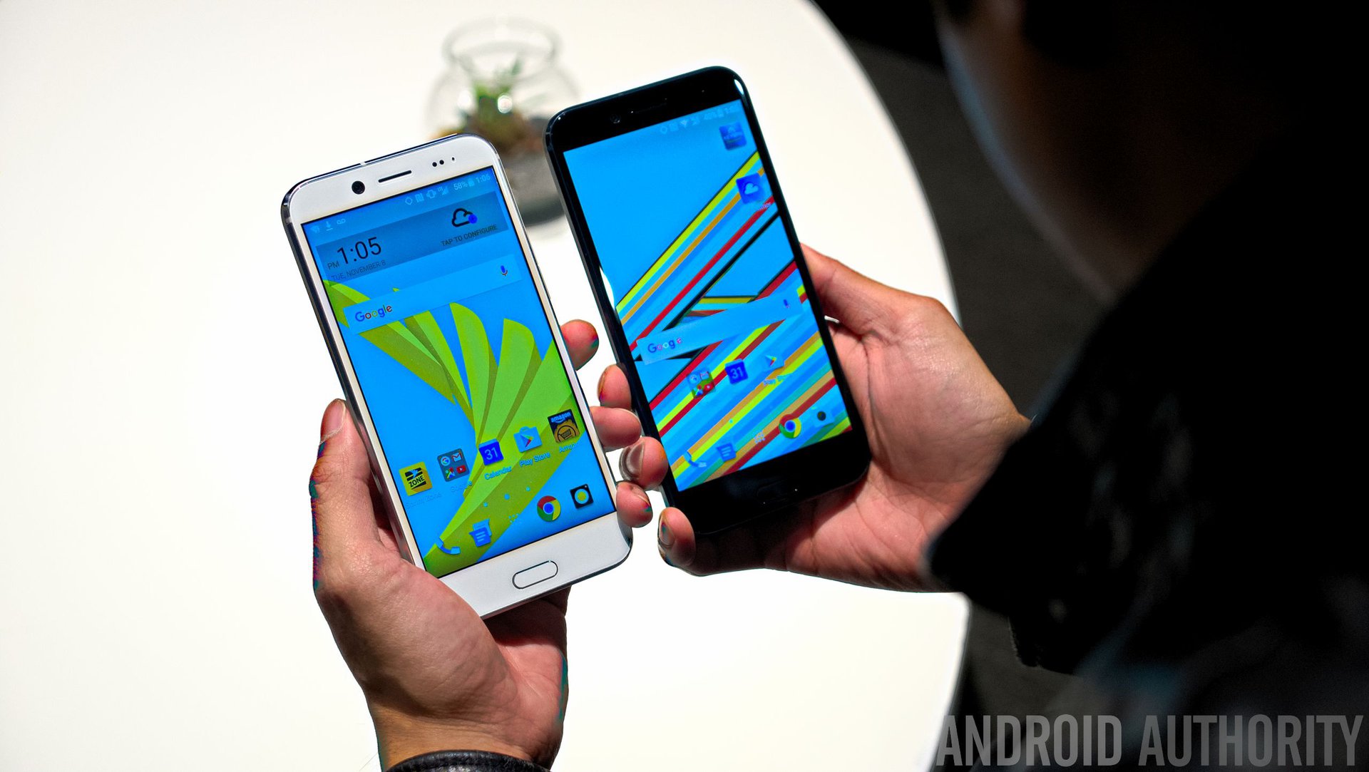
HTC has stuck with a virtually identical design for four flagship generations. You have to be a real Android enthusiasts to tell these phones apart at a glance.
Samsung’s glass look and edge display help create a brand look that stands out and is instantly identifiable. You know that the Galaxy S6/S7 edge is a cutting edge piece of tech just by looking at it, but the HTC10 looks like it could have been built 3/4 years ago. Meanwhile, Apple has a unique position of being globally known for its look and logo, changing these up would upset its brand recognition. HTChas shrunk to a minor player in the smartphone industry, and few people will be upset if the company changes its design.
It’s about time too, the company has been sticking with a virtually identical appearance for the past four generations of its Android flagship. You have to be a real Android enthusiasts to be able to tell these phones apart at a glance.
I want to make it clear that there’s nothing particularly wrong with HTC’s aesthetic design. It’s a good looker and the build quality is solid, but frankly it’s now just a little boring after so many years. Furthermore, other manufacturers have upped their build quality lately and the company simply doesn’t stand out any more.
By modern standards, the design of the HTC10 is functional rather than inspired. In 2016 this aesthetic is a dime a dozen
The circle camera design on the back is sensible, and the top and bottom antenna lines stop the back from being a boring slab of metal, but it’s functional rather than inspired by modern standards. The bezels are a bit wide compared with other phones, and the capacitive buttons are frankly outdated. HTCmay have been one of the first with such a look, but in 2016 this aesthetic is a dime a dozen. Just take a look at the OnePlus 3T, HONOR 5X, Meizu M3 Note, or the Redmi Note 3, to name just a few.
As you’ve probably noticed from these names, you don’t have to pay a fortune for a metal unibody either. There are plenty of lower cost smartphone designs out there that give HTC’s design language and quality a run for its money. It’s time to innovate again if the company wants to stand out. Look at the positive consumer responses to new looks like the bezelless Xiaomi Mi Mix this year and Samsung’s edge display before that. Consumers love great but unique looking phones, and this is the angle that HTCshould be after if it wants to be considered a market leader, rather than playing it safe.
While there will be some reluctance to ditch a design that we have come to identify with HTC’s flagship range, really there’s very little general consumer recognition left with the HTCbrand anyway, at least outside of Taiwan. The company accounts for less than 1% of the global smartphone market. Even then, the company’s current flagship reputation isn’t exactly squeaky clean. Android followers are still quite familiar with the range’s underperforming camera, and will likely even remember the overheating fiasco from last year. The brand has its its positive points, such as audio quality that’s better than most, a sleek software experience, and Boomsound speakers, but these would be picked up on in a new range regardless.
The bottom line is that the most recent generations of HTCflagships haven’t captured the imagination of broader consumers, and the company should be willing to try something new. If anything, a complete design refresh will gift HTC the opportunity to shake off association with its so-so received flagships of the past few years, and might just help the brand stand out from the pack. Next year’s HTC 11, or whatever the phone ends up being called, could be a fresh start for the company, free to stand out on its own looks and merits.
What does HTCreally have to lose?