Affiliate links on Android Authority may earn us a commission. Learn more.
HUAWEI P9 feature focus: software
Published onJune 3, 2016

Today we are here to take a closer look at the HUAWEI P9, but this is not a review – instead we’re taking a closer look at the software experience on HUAWEI’s new flagship. We know it can be one of the key factors when choosing a new smartphone, so let’s jump right in.

The HUAWEI P9 is running Android Marshmallow out of the box. But unlike the Nexus 6P (also a Huawei device), it is not running a stock version of the Android OS. Instead you are getting HUAWEI’s Emotion UI, or EMUI, and you would be getting version 4.1. If you’ve used a HUAWEI-made device in the past, the software experience will feel very familiar.
Similarities with iOS
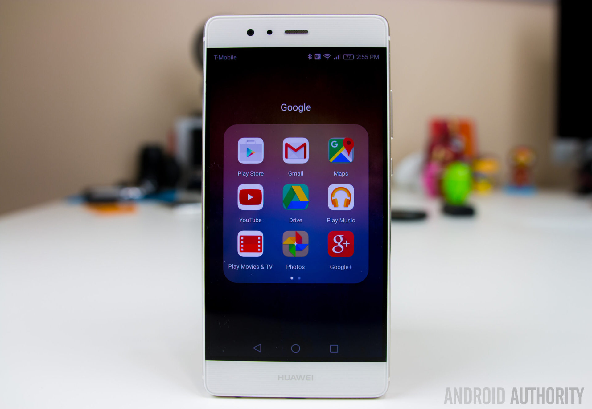
There’s really no getting around it; HUAWEI’s skin will look and feel a lot like iOS, and even its functions resemble Apple‘s experience. There’s no app drawer, which is usual of HUAWEI devices (or Chinese smartphones, for that matter). There’s not much in the way of organization either, outside of simply using folders. The icons are rounded off squares that are slightly colorful and cartoonish; and you can even swipe down on any home screen to start a search… just like in iOS.
As far as the appearance goes, the interface hasn’t changed much from the last couple versions of EMUI. Transparencies are abundant, something we can see in folders, widgets and the notification panel. Talking about the notification area – it still features the usual HUAWEI set-up, in which the notifications are on the left and shortcuts rest in the right side. By the way, these shortcuts can be changed to your liking.
Let’s stop complaining, though. Even though HUAWEI’s skin feels very similar to iOS, and changes a lot of what we know from stock android, there’s actually a lot to like here. We will start from the outside and work our way in, starting with the lock screen.
The lock screen
The first thing you’ll notice is these high-quality, gorgeous wallpapers HUAWEI calls “covers”. We have seen these in other HUAWEI phones. They change each time the phone is woken. It’s also possible to manually change these covers by swiping down and hitting the previous or next buttons. And, of course, adding your own images is also an option.
Swiping up from the bottom of the lock screen gives you quick access to some common functions like the sound recorder, calculator, flashlight and the camera. Swipe up to unlock and you will be greeted by a zoom in effect. It’s subtle, but I happen to think it looks rather cool.
What I really like about this lock screen, though, is how notifications are displayed. It looks a lot like the stock Android lock screen notifications, but they’ve been improved with this transparent/frosted glass effect to match the rest of the transparencies seen across the OS. It’s just a really nice touch that makes the notifications look a tad more elegant and still allows your wallpaper to shine through.
Got bloat?
Don’t be mistaken: Emotion UI is a heavy skin with many manufacturer changes. But it does seem like HUAWEI went a little easier on the P9 when it comes to bloatware. Outside the regular apps, there’s not much to see in terms of pre-installed software. The only thing to complain about is a folder with some cheesy games, which you can easily uninstall.
Customization
User customization is another department lacking in this smartphone. There’s not much HUAWEI is letting you do to the UI, but you can have fun with a few things. Long pressing on the home screen will give you the typical customization options, like wallpapers and widgets, but you can also change transition animations, and the home screen grid size can be bumped up to as high as 5×5.
There are some built-in themes that will allow for changing icons, wallpapers and the lock screen, but these are not as full-fledged as something you would find in a Samsung or HTC device. It would have been nice to have more themes to pick from, but you do have a few options, which is still better than having nothing at all.

Knuckle Sense
There’s a very unique feature HUAWEI has been working on for the last couple years. They call it Knuckle Sense, and it is available on the P9. If you’re not familiar with this, it’s a feature that allows you to use your knuckles to do various gestures for specific functions. For example, one can double tap with a single knuckle to take a screenshot or if you want to start and stop a screen recording you can do so by double tapping with two knuckles. It’s also possible to crop out areas of the screen, take a scrolling screenshot and open specific applications by drawing letters on the screen.
But here is where it gets inconsistent and feels really gimmicky. In order to get the best results, you have to use the very back of your knuckle, which just doesn’t feel very intuitive. And even then, it still has a hard time detecting the use of a knuckle. Some of the gestures, like the double tap to take a screenshot, work really well, but the other more complex gestures really show that Knuckle Sense needs some work before it can become a truly reliable feature.
Camera software
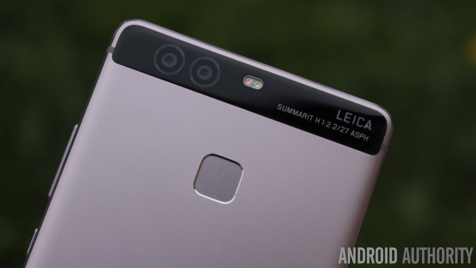
One of the biggest changes to Emotion UI has to be the camera software, but this is something that is linked to the camera sensor in the P9. It’s really clean and easy to use, and navigating the interface is all based on swipes.
You can swipe up from the bottom (or left side, if you’re in portrait); this will open up all of the different shootings modes. And the P9 has a lot to offer when it comes to shooting modes. Swiping in from the opposite side will take you to the camera settings where you can adjust the resolution, audio and other typical camera functions.
If you swipe outwards from the shutter button you can access the camera’s pro mode. I really like this because it makes it really quick and easy to switch back and forth between auto and pro. The pro mode is exactly what you would expect. It gives you manual controls over ISO, exposure, shutter speed, auto-focus and white balance, just like you would get on a DSLR.
Wrapping up
There you have it for our HUAWEI P9 feature focus on software and overall, I think there’s a lot to like about EMUI despite the fact it deviates from stock Android. EMUI on the HUAWEI P9 is definitely improved over previous versions and while it may not be for everyone, it does have some useful features.
What do you think of this latest version of Emotion UI? Are you a fan? It has its ups and downs, but as always, it’s nothing but a matter of personal preference. What would you change about it? Let us know your views in the comments below!