Affiliate links on Android Authority may earn us a commission. Learn more.
IMDb update 7.0 brings big interface changes to the app
Published onMarch 28, 2017

The IMDb mobile app has been upgraded to version 7.0 and with it arrives some significant changes to the UI.
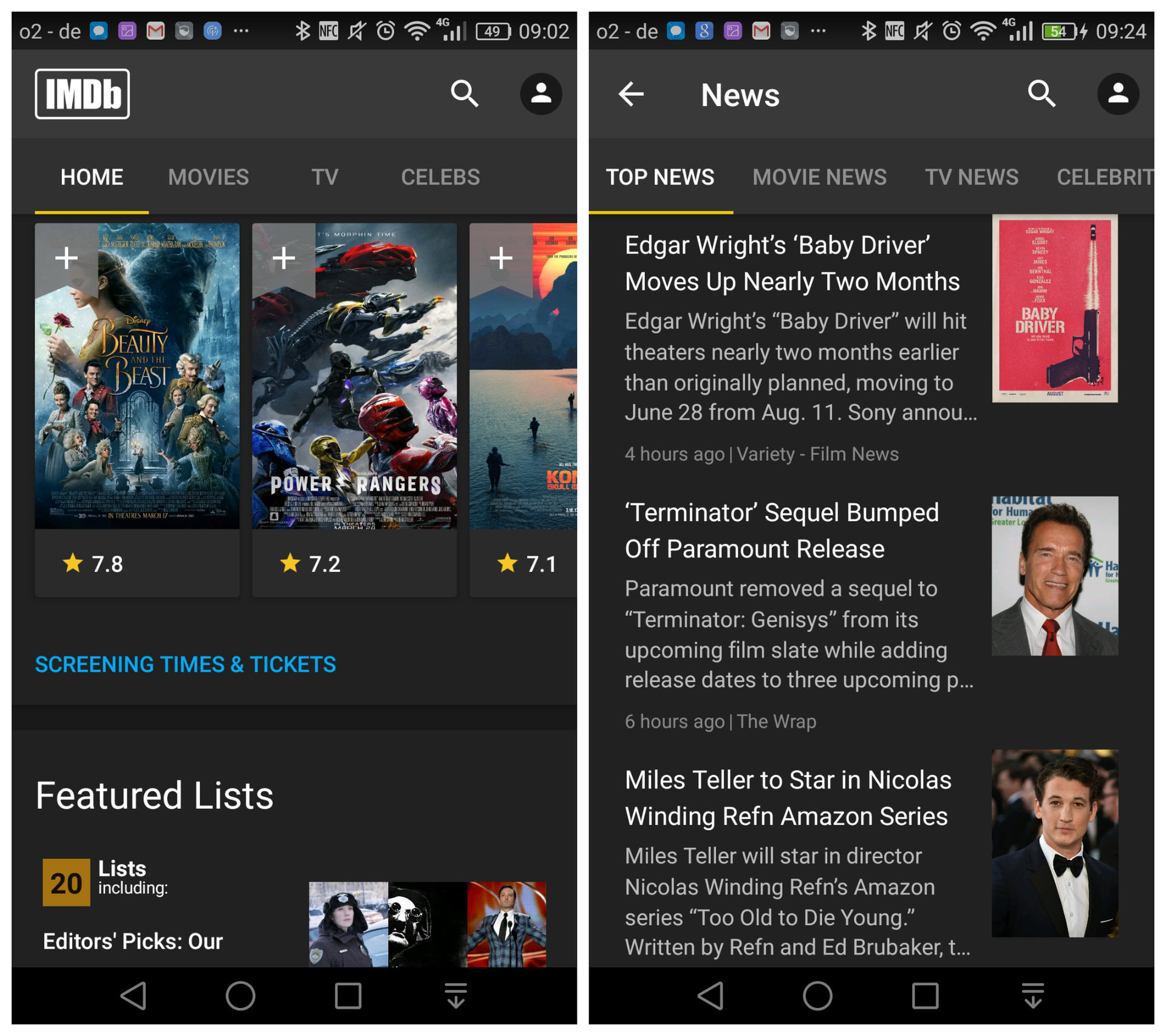
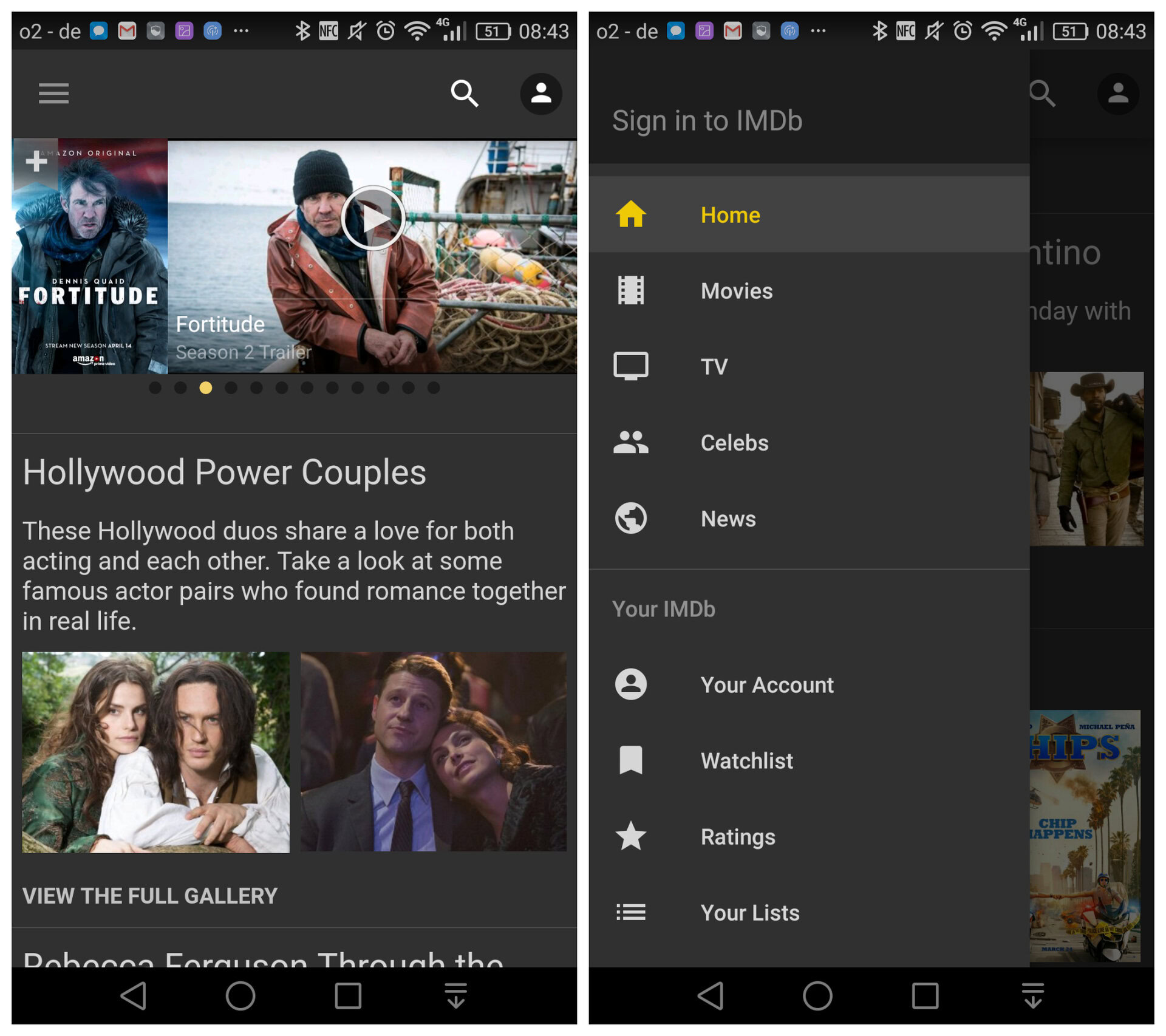
The most notable of these is the removal of the hamburger menu. The IMDb logo now sits in its place and the previous “Home,” “Movies,” “TV,” “Celebs,” tabs that were found there have been fixed to the top of the main interface.
The “News” option from the previous slide-out menu, meanwhile, hasn’t been given its own tab but some news has been rolled into the Home section along with the previous “Your IMDb” options. The search and profile buttons remain in place at the top-right of the app.

IMDb has the right idea in terms of where it’s going with the app: it feels better using the four main areas rather than previous sliding menu (seen above, right). But it’s still poor in terms of user-experience.
The Coming Soon and In Cinemas rows appear in both the Home and Movies sections for example, which unnecessarily clutters the interface. You’ve also got a Top News section and a Movie News section — both of which contain news about movies.
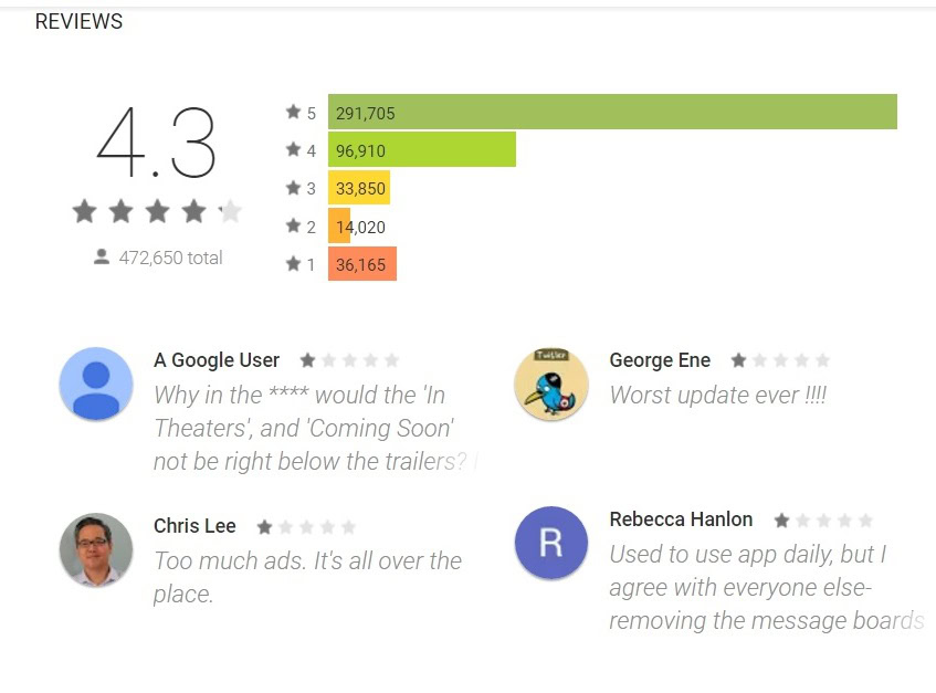
There are just a few instances of that doubling up which make it seem a little clumsy; the latest user-reviews haven’t been very kind to the app either.

The update is live in the beta channel and should be rolling out in the Play Store soon. What are your thoughts on the new interface? Let us know in the comments.