Affiliate links on Android Authority may earn us a commission. Learn more.
How will Android respond to Apple's new iOS 16 customizations?
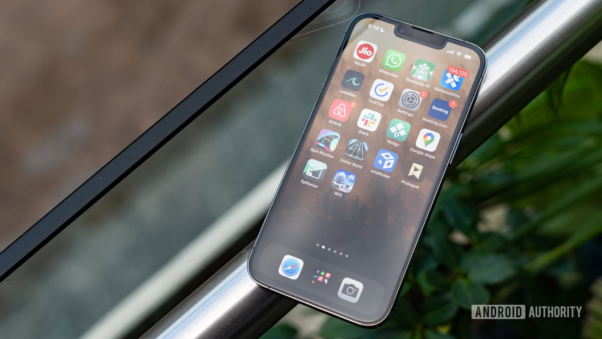
If you want customization, get an Android. That used to be my number one argument to friends and family in favor of Google’s operating system. You can put apps where you want them, add widgets as you please, and then Material You opened the door to a rainbow of possibilities — literally. Android still has all those freedoms, but iOS is catching up now. Apple showed off a heap of new customization options as part of iOS 16, and I’m glad it’s finally giving Android something to worry about.
Need a recap? Here’s everything Apple showed off at WWDC 2022
Love for the lock screen
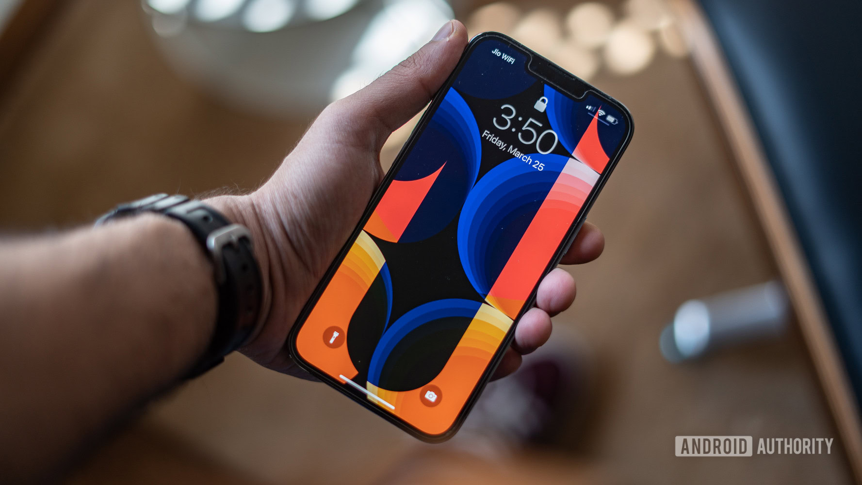
Apple’s biggest claim to fame with iOS 16 is its lock screen customization. After years of looking like the lock screen above, with a simple clock and quick access to the camera and flashlight, you now have plenty of power in the palm of your hand. For starters, Apple finally lets you change the color and style of the clock. Not exactly groundbreaking, but it’s a step towards making iOS your own.
Part of customizing your clock includes control over a multilayered photo effect. You can set the subject of your lock screen photo to appear in front of your clock instead of letting the time block out their face. iOS 16 even includes a Lock Screen gallery with predesigned options that adapt to your subject in various colors and styles.
iOS 16 shows customizable love to the lock screen in a way we haven't seen before.
More importantly, iOS 16 marks the start of lock screen widgets on iOS. They’re not the most in-depth (yet), but lock screen widgets are a new claim to fame that Android no longer matches. Right now, Apple’s widgets include weather, calendar access, upcoming alarms, your Activity Rings, and a few more. Early versions of Android supported lock screen widgets, and you can still get them in some skins, such as Samsung’s One UI, but it’s not a default Android feature.
Material You introduced plenty of customizations for Android, but it seemed to skip over the lock screen. You can color coordinate your clock, but that’s about it. iOS 16, on the other hand, lets you cycle through lock screens to match different times of your day. You can set up a lock screen for work, one for the gym, and one for home if needed. It that’s not enough, you can also tap into dynamic lock screens that reflect the weather outside or check on the phases of the moon in real-time.
Learn more: Here are the Android 13 features to know about
Google still commands the home screen
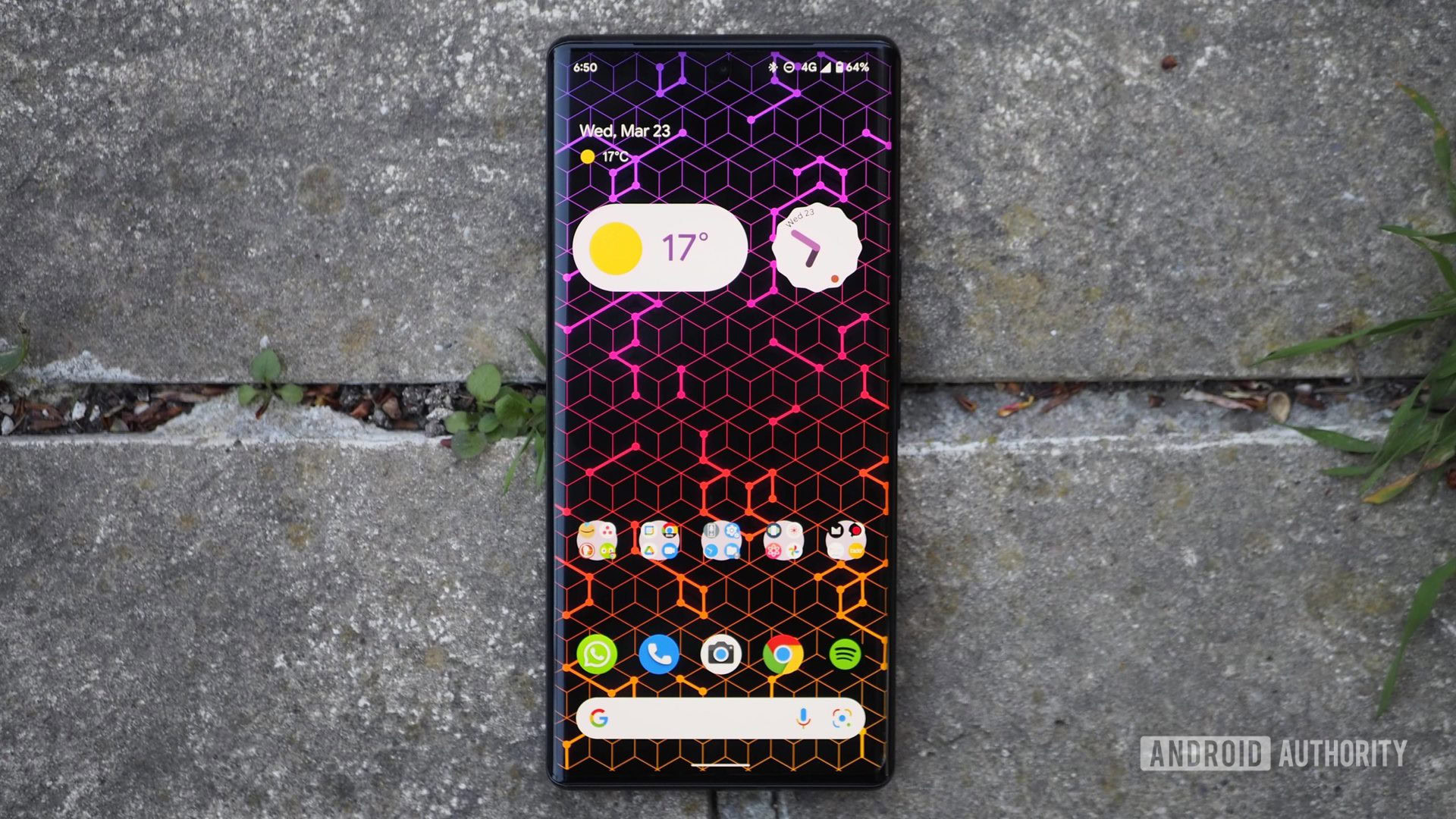
Despite Apple’s progress on the lock screen, Google still has an advantage when you unlock your phone. Android supported widgets for years before iOS brought them back, and there’s still much more freedom when it comes to Material You. You can reshape and resize select Android widgets — Google Photos is a great example — while Apple is all-in on the rectangle. Rectangles are great, but any Tetris player will tell you that there are only so many ways to put four-sided shapes together.
Apple's rectangles are great, but any Tetris player will tell you that there are only so many ways to put four-sided shapes together.
While Apple might have cohesive shapes down, Android’s Material You options feel like a party with a well-executed theme. The optional color palettes pick up Google’s first-party apps and widgets and make sure they’re all dressed in the same color. We can’t skip over the fact that there’s no third-party widget color matching, but it’s far easier to get a clean, simplistic look in recent versions of Android.
See also: The best Material You apps to try on your Android phone
It almost feels wrong to compare iOS to Pennywise the clown, but it still fits in some ways. Apps still float to the top of your iOS home screen, and there’s almost nothing you can do to get them down. The power of friendship doesn’t help, and neither does overcoming your fears. Instead, you have to ballast your apps down to the bottom with widgets. There’s no other way around it. Depending on the size of your display, that might require a trio of double-height widgets to bring your apps within thumb’s reach.
Pay no attention to the iPad in the corner
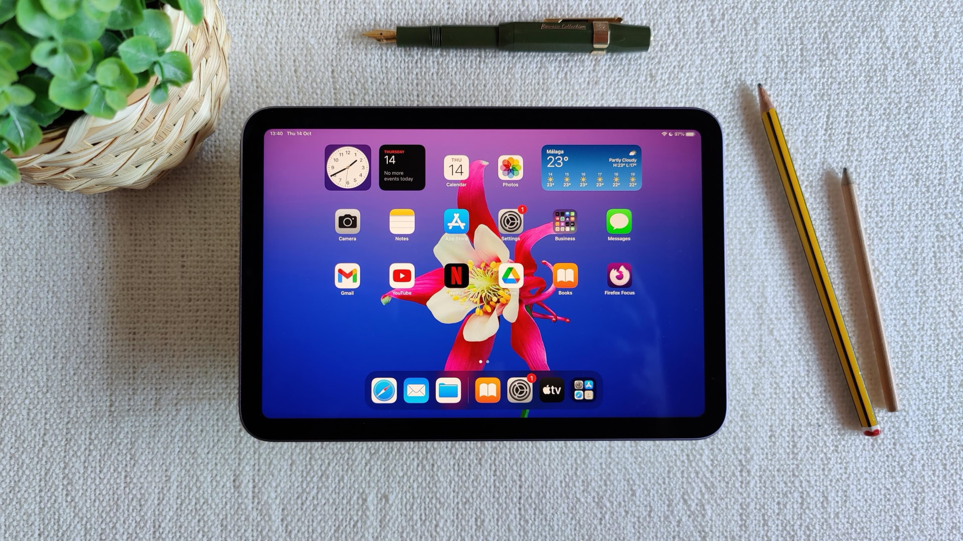
For all of the credit that we’re willing to give iOS 16, it comes with one glaring, tablet-sized omission. All of the customization features we’ve mentioned will land on iOS and only iOS. Sure, iOS and iPadOS are meant to be two separate operating systems at this point. Still, it seems like the larger displays would be a golden opportunity to make even better use of Apple’s customization developments.
Android has its differences from smartphones to tablets, but Material You is a common presence. It should become even more ubiquitous by the time the Pixel tablet rolls around next year. There’s also Android 12L to think about — a tablet-sized version of Android optimized to function smoothly on larger screens. It scales everything from the lock screen to the home screen and even the notification shade, all with a healthy seasoning of Material You on top.
Apple's iOS 16 updates come with one hefty, iPads-sized hole in them.
As for iPadOS, it’s finally getting a proper weather widget. For those of you keeping track at home, it took 15 years after the iPad’s introduction to get proper weather support. It’s still a drop in the bucket when considering what the iPad is missing out on. Its larger display is practically begging for lock screen widgets, and it needs to go further to keep up with Apple’s iOS innovations.
So, how does Android respond?
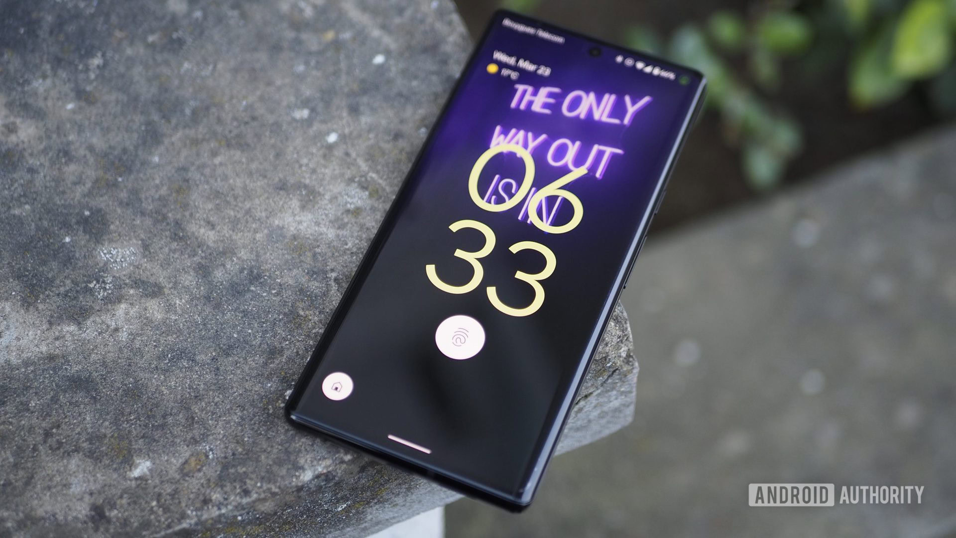
Nobody likes to have their toes stepped on, but that’s exactly what Apple is doing to Google. Now, the only way for Google to protect its so-called toes is to take a few more steps forward. It has to match Apple’s lock screen love or take it even further.
Luckily, there’s no shortage of rumors to suggest what Google’s next customization options might look like. We heard talk of customizable lock screen clocks as part of Android 13, though it seems to be a simple toggle between a one-line or a two-line clock. Yes, you can already change your clock as much as you want with certain devices — like those from Samsung — but the feature is absent from Google’s own Pixel lineup.
Google isn’t for everyone: Material You unicolor themes are bound to fail
There’s no reason for Google to stop at the clock, either. It already loves to build albums in Google Photos, especially based on the faces of your family and friends. Why not integrate those albums into wallpapers so you can get a fresh, color-coordinated shot from your selected album whenever you please? You just might have to make sure there’s nothing too saucy if you let Google handle the shuffling.
If Google wants to level up its lock screen, make contextual At A Glance a reality.
One more idea if Google wants to take Apple head-on is to resurrect the contextual lock screen concept. We saw what the superpowered At A Glance widget would look like back in February, and it gives lock screen widgets a run for their money. Essentially, it monitored your location and other factors to intelligently suggest cards you might need. If you were at the train station, it would open popular routes or metro cards. If you just connected a pair of headphones, At A Glance populated with some of your most popular playlists. It might not be a color-changing lock screen, but it would certainly be a more powerful one.
Android remains the king of customizable freedom. It still puts the power in your hands across a bevy of smartphones and tablets. However, it’s tough to argue that Google holds an edge for the lock screen. Apple is doing its best to make iOS 16 feel like the most personal version yet, and it might be poking the bear. Now, we just wait and see what kind of bite Google can respond with.
Thank you for being part of our community. Read our Comment Policy before posting.