Affiliate links on Android Authority may earn us a commission. Learn more.
iOS 18 feels like Apple admitting that Google got more than just RCS right
October 8, 2024

I’ve spent plenty of time on both sides of the iOS vs Android debate. I’ve written about features I wish Android would steal from iOS and features I thought Android skins could steal from each other, but it usually hasn’t gone the other way around. Most of the time, Apple seems content to do its own thing, mainly ignoring Android developments until it can later copy them and pretend they were its own ideas. With iOS 18, however, it finally feels like Apple is giving Google some credit. It’s jumping on several features I’ve loved for years as an Android user, and it’s about time.
Icons, icons anywhere

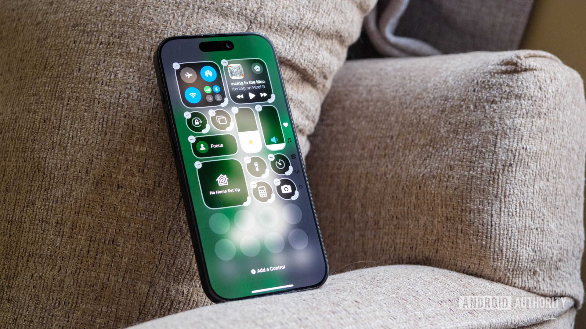
For a long time, whenever my iPhone-toting friends asked why I carried an Android phone, I’d talk about the customization options. I’d point out that every app I needed was in a folder where my thumb could reach it and that I could simply open the app drawer if I needed anything else. I would press on a widget and drag it around just to show that I could. Then, I’d point out their home screens — generic grids full of so many apps that they could barely see the wallpapers that they’d carefully chosen. It never swayed them from the comfort and familiarity of iOS, but it was usually enough to make them envy the flexibility of Android.
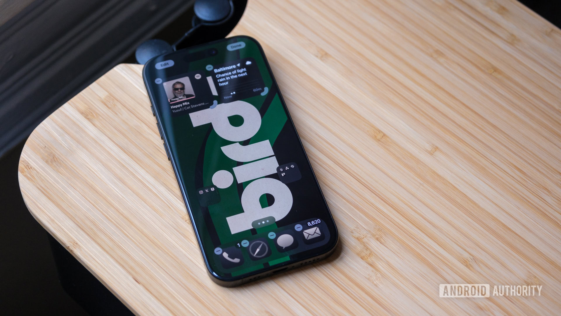
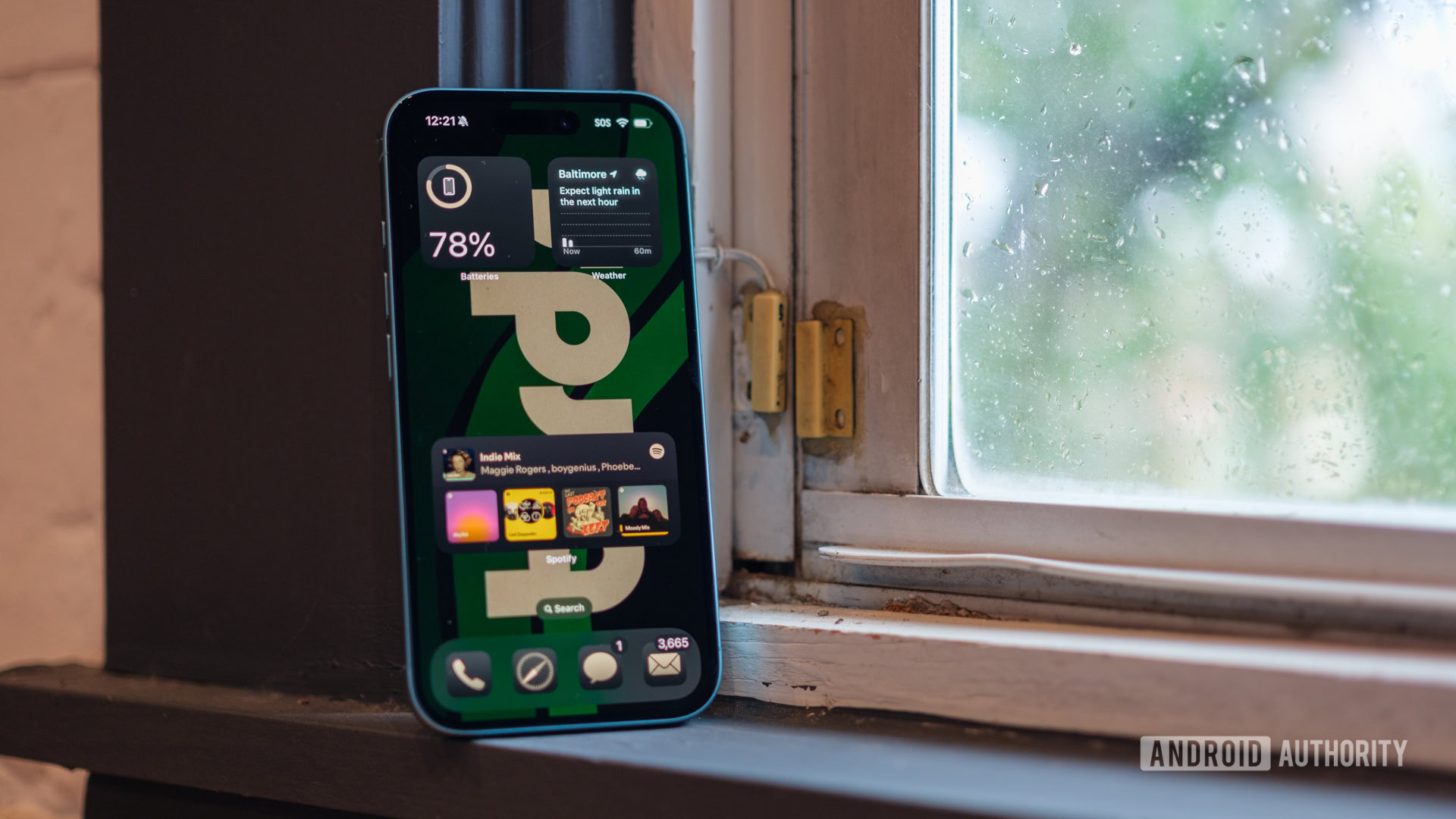
And honestly, part of me thought I’d always be able to hold that flexibility over them. After all, Apple always seemed so committed to the simplicity of its grid, boring as it may be. But now, with iOS 18, iPhone users are finally on a level playing field. They can finally drag and drop apps and widgets anywhere on their home screens, and it’s been one of the most effective ways to convince them to update their phones. All other upgrades aside, the people just like their customization.
Farewell, boring app grid, you won't be missed.
While writing this piece, I asked one of my friends if she’d updated her phone. I wasn’t sure what answer to expect, but she cheerfully responded that she had. Next, I asked if she’d moved her apps around — not whether she’d removed them from her home screen or pulled some to the bottom, just moved them. She immediately responded yes to that, too, showing me a picture that I’d taken of her dog that she was using as her wallpaper, emphasizing how happy she was that she could finally see his face.
I’ve since checked with other friends running iOS 18, and they’ve all shown me completely unique home screen layouts — something that didn’t exist a year ago. It didn’t matter to them that Apple was finally co-opting from Android; it just mattered that they had new flexibility to play with. I’ll even admit that I’ve been enjoying it too. I don’t spend much time on an iPhone each year — mostly for review purposes — but having my social and work folders within reach has made my annual excursion feel a bit more like Android than usual.
Perhaps the only part of this newfound flexibility that I’m not sure about is whether it’ll bring more Android users to iOS or iOS users to Android over time. I could see it tempting those who don’t like showing up as green bubbles yet weren’t previously willing to conform to the grid, but I could also see it swaying iPhone users who have had a taste of flexibility and suddenly want more.
AI, but not quite Gemini

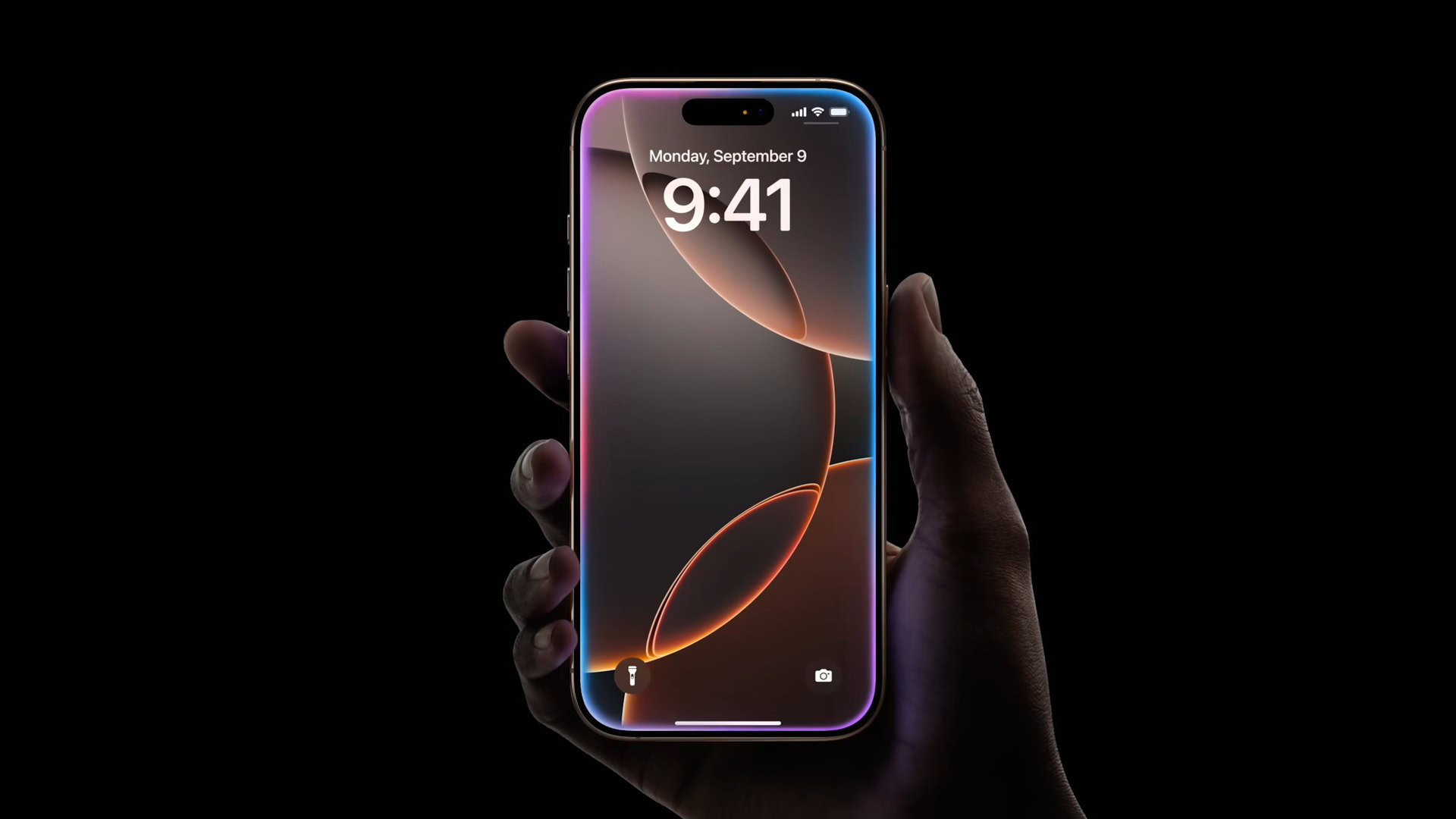
If customization is as “Android” as iOS 18 can get, then the long-awaited AI rollout comes in a close second. After all, what would a flagship launched in 2024 be without some form of artificial, er, Apple Intelligence? Sure, Apple has its own definition of AI, but I must admit that the overall approach feels decidedly Google. By that, I mean that almost everything coming out of Cupertino for future versions of iOS 18 sounds a lot like a feature that Google has already come up with.
Let’s start with the obvious one — Apple’s more conversational Siri sounds like it’ll be almost exactly like Gemini, or at least Gemini Live. It’ll have greater awareness of your personal information and be able to tackle requests across apps. You’ll even be able to type out questions you’d rather not ask out loud — something you can do from the second you open the Gemini app. Don’t get me wrong, updating Siri is long overdue; I’m just not sure it could be smoother or more effective than what I’ve already experienced with Gemini Live.
Updating your voice assistant and adding writing tools is great, just ask Google.
Outside of Siri, I can’t help but get a sense of deja vu from Apple’s other AI features. It’s planning to implement new writing tools to proofread, rewrite, and change the tone of just about anything you type out, and the Image Playground sounds almost identical to the Pixel Studio, though it should be more willing to generate images of people right off the bat — even if they come out like that strange cartoon of someone’s mom dressed as a superhero that Apple showed at WWDC.
Sure, Apple will probably have a nice coat of polish on everything it rolls out, or at least it’ll be well-polished by the time it escapes beta testing (whenever that is), but I can’t help thinking it will take a long time. Google started rolling out its on-device features back when it launched the Pixel 8 series, yet some took more than a year to reach a point where they were reliable-ish. The Magic Editor had more artifacts than the British Museum at launch, Gemini still warns you about potential inaccuracies, and Zoom Enhance was so far from being ready that it launched the same day as the Pixel 9 series.
And yet, when Google launched each new feature, it felt like it was trying something new and trusting the user to find flaws. With Apple, it feels slower and more cautious even though the roadmap is already out there. I get that Apple has to figure out how to make its Apple Intelligence work across an entirely different operating system, but it doesn’t feel like it should take iOS 18.4 or into 2025 for users to start trying some of the most exciting features.
iOS 18 feels more like Android, and I love it

Honestly, I’ve realized that iOS 18 is as close to Android as Apple has ever come. It’s not the same experience, nor do I want it to be, but I’m relieved Apple is finally learning from those outside its walled garden. I’ve already written a few times about how glad I am to have RCS support on my iPhone and how tricky it’s been to convince my friends of the benefits, but, like Apple, they’re slowly coming around. In some ways, it’s even bringing me around in the opposite direction, letting me feel like part of the iMessage crowd while also having my home screen set up just the way I like it.
By making some parts of iOS feel more like Android, Apple has suddenly allowed me to explore its more unique features — ones like the Action Button and Camera Control — without grumbling about how bland and repetitive iPhones often feel. It’s elevated the software experience so that I’m now hunting for cool new features rather than focusing on the ones that haven’t changed. The iOS 18 update has also given my friends a new experience on the phones they’ve already used for so long, making it feel like they’ve at least kind of gotten a new phone without actually spending the money.
It won't replace Android in my life, but iOS 18 is the first iPhone software I've enjoyed using in a long, long time.
However, I’m not about to let iOS replace Android as my permanent platform of choice. I’ve enjoyed my exploration of iOS 18, but it still feels like many of the features that Apple has embraced are halfway ready rather than fully baked. Yes, I like being able to rearrange my apps, but Apple’s color-matched apps are dreadful. It’s tough to find a color within your wallpaper that doesn’t make your apps look almost invisible against their dark gray backgrounds, and the color seeps into widgets, too, making them harder to read. Mix in the fact that Apple’s app library has nothing on the convenience of the Android app drawer, and there’s still an easy customization king.
Now that Google has created the best iPhone ever in its Pixel 9 Pro XL, it only makes sense for Apple to take a shot at the best Android experience in iOS 18, doesn’t it? Maybe, but it still has a long way to go.
Thank you for being part of our community. Read our Comment Policy before posting.