Affiliate links on Android Authority may earn us a commission. Learn more.
iOS 18's icon theming is no Material You, but it is a step in the right direction
Published onJune 29, 2024
Apple’s neglect of customization on iOS has been a sore point for both long-time iPhone users and dual wielders of Android and iPhones like myself. With iOS 18, Apple is finally addressing this issue and has introduced a plethora of new features, like the ability to move icons wherever you want on the home screen, a reworked control center and, finally, a way to customize app icons. Many of these additions are features Android users have enjoyed for years, but, in typical Apple fashion, it has its own unique twist or set of limitations.
iOS 18's customization upgrades borrows liberally from Android, but adds its own twist.
Now, I’ve been using the iOS 18 developer beta since its release, and I’ve wanted to talk about its customization features since then. But I decided to wait till a few of my most-used apps, like Instagram, got support for iOS 18’s tinting feature to get a better read on how most apps will behave with it. I’ve also been keeping a close eye on my Pixel 8a‘s Material You customizations to see how the two compare. Here are my first impressions of Apple and Google’s two very different approaches to customization, which, surprisingly, share a lot in common.
iOS 18 vs Material You: Two custom sides of a familiar coin
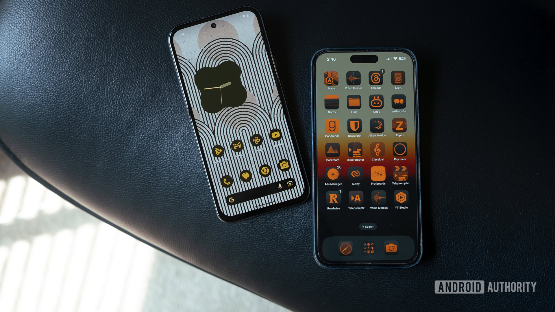
Functionally similar to Material You’s themed icons, iOS 18’s new icon theming aims to build cohesiveness across the interface by giving all your apps and widgets a uniform look. However, in typical Apple fashion, the implementation is a blend of customizable options and rigid constraints.
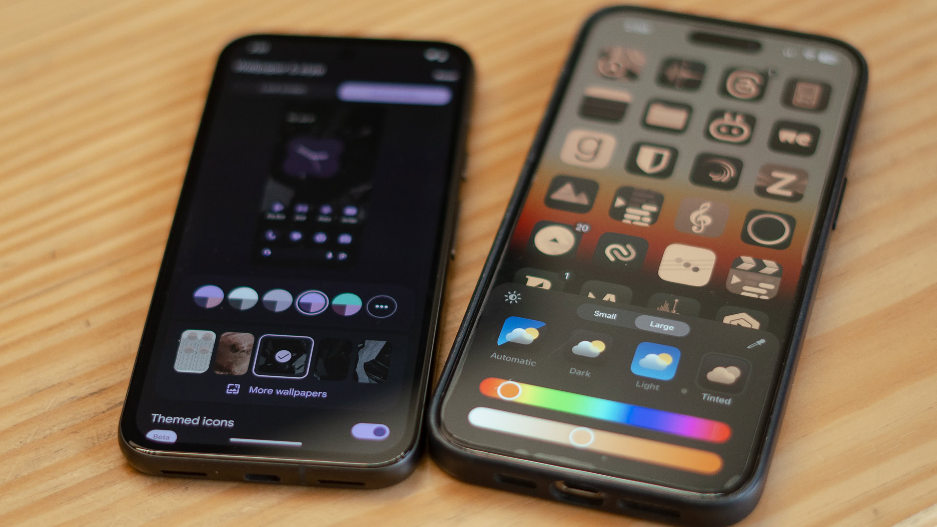
First, let’s discuss the similarities. You can finally change the color of app icons. There’s the usual dark mode and light mode, but also the ability to shade all icons in a uniform color. Apple calls it tinting. Like Material You, iOS 18 supports dynamic color extraction, picking an icon shade based on the dominant color in a wallpaper. Users can also use a color picker to extract a shade from the wallpaper or manually choose another from the color slider. From there, it offers extensive customization through a saturation slider and, of course, the ability to completely switch out the color for whatever you want.
Apple cedes unprecedented control to let users theme iOS, but I'm not sure if this is the right approach.
But that’s where the similarities end. While Material You is all about cohesiveness, creating a custom palette of matched icons based on color science and implementing it across the interface, iOS 18’s take on App Colors does the same but offers only a single color option. Additionally, iOS 18’s color tinting only applies to home screen icons and widgets. The limitations don’t end there — the tint seems to apply only to dark mode variations of widgets. So, for example, there’s no way to turn your light mode Google Calendar widget peach in color. Instead, you’ll have to settle for a dark mode widget with a peach filter tossed on top. Predictably, it doesn’t look very good. It’s surprising to see image-conscious Apple drop the guardrails for app tinting, knowing that it can portray the iPhone negatively on the internet.
However, unlike Material You, iOS 18 lets you pick any color to tint the interface using a color slider, with results ranging from aesthetic to absolute rubbish. Want to build a theme with a green wallpaper and red icons for Christmas? Sure, you can. Apple is giving users more control, even more so than Android, allowing you to find the exact shade needed for your application icons. However, I’m not entirely sure this was the best choice.
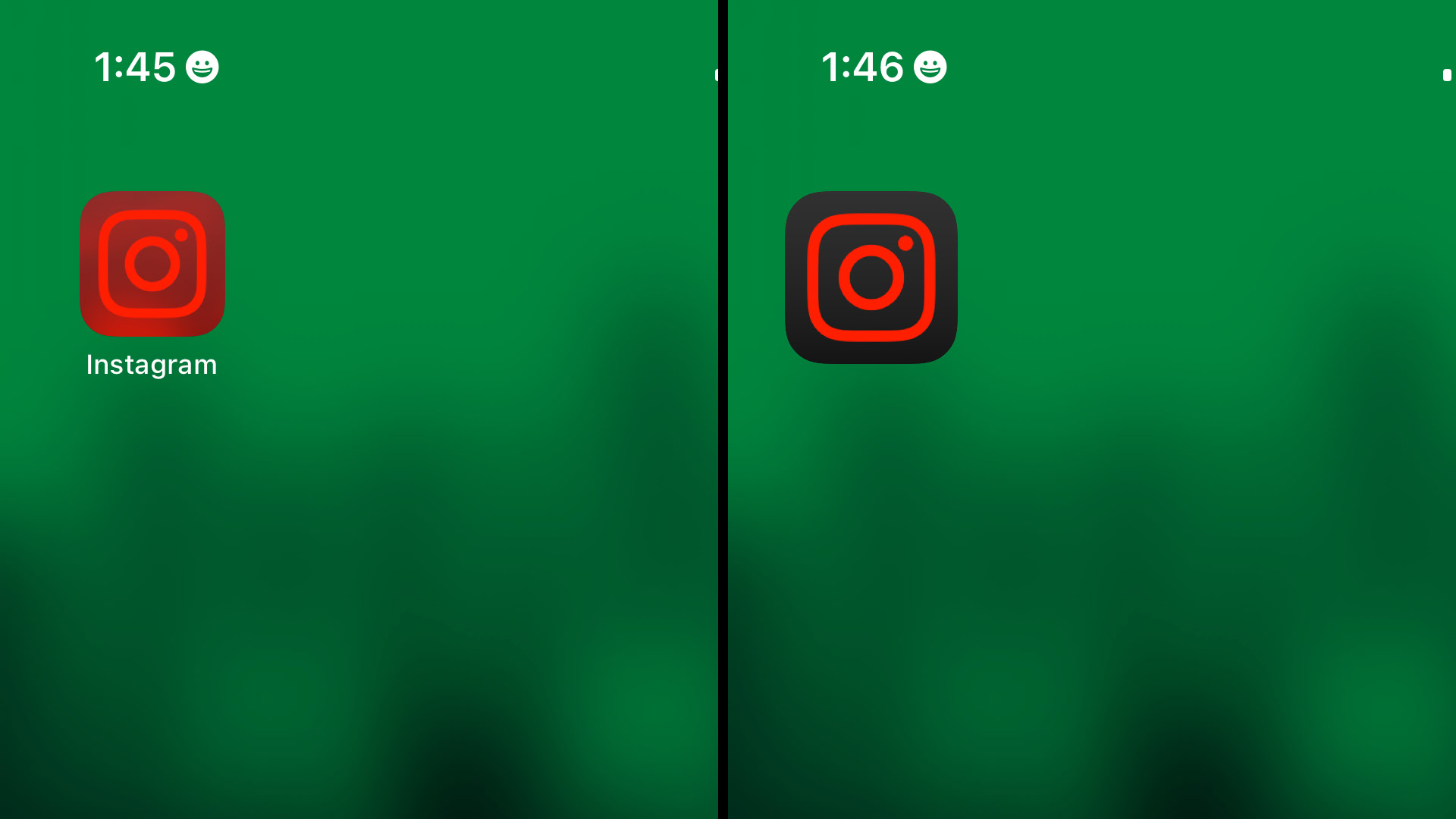
However, there is one area where iOS 18’s color tinting stands out. Android’s Material You will not touch any app icon that hasn’t been updated to support theming. This can create a somewhat disjointed home screen experience unless you go all in on custom icons. iOS 18, on the other hand, applies a uniform tint even if the app hasn’t been updated yet. This can make some app icons look illegible or hard to distinguish, but it creates a uniform look throughout. You can see the difference in the Instagram app, where the larger icon has been updated to support tinting, but the smaller one hasn’t. This problem should largely be resolved by the time iOS 18 rolls out later this year, with popular apps updating their icon sets to support the feature.
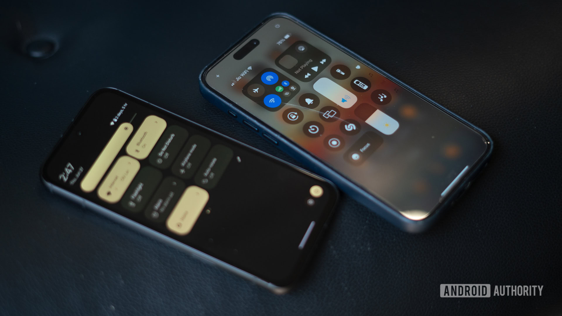
Material You's color science spreads across the entire interface, while Apple's icon tinting is limited to the homescreen and widgets.
On the topic of cohesiveness, I’m surprised that Apple hasn’t done more with the feature. While Material You uses the extracted color to paint the system interface, notification center, and other elements in color-matched hues, iOS 18’s tinting feels like an early beta (which it is) or a system that has been deliberately limited to reinforce Apple’s viewpoint that it knows better.
iOS 18 icon tinting vs Material You: A half-baked start, but a welcome one
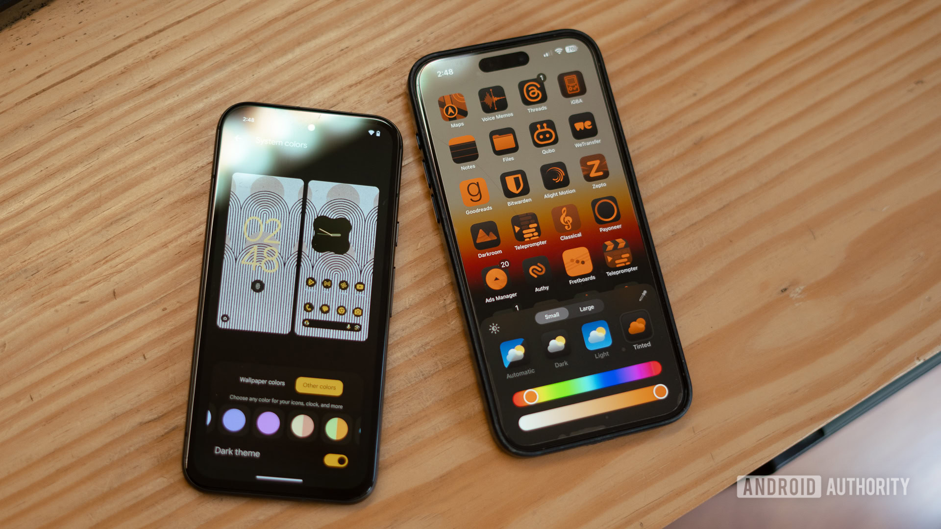
From widgets to full-blown theming, Apple has come a long way from its rigid enforcement of design principles. The latest iteration, app tinting, however, falls a bit short of Apple’s usually well-thought-out approach to design. It’s way too easy to create a color scheme that ruins the aesthetic, doesn’t cover enough of the interface, and lacks smart additions like a custom color palette akin to Material You. However, despite that, I’d say it is a welcome step in the right direction. While my above orange-on-orange color scheme was an extreme example of exploring the extent of tinting possible, I’ve enjoyed sporting a desaturated look with darkened icons. Hopefully, this represents the start of more granular customization for iOS 18. How about custom icon packs next, Apple?