Affiliate links on Android Authority may earn us a commission. Learn more.
Has iOS finally caught up with Android in terms of customization?
Published onOctober 14, 2024

When the iPhone 15 released last year, I took the plunge and switched from Android after a decade of loyalty, hoping that Apple’s long-awaited adoption of USB-C would ease the transition. Unfortunately, I quickly found that I missed Android’s extensive customization and certain features like notification channels. But with each iOS update, Apple seems to be listening to its users and addressing common pain points from migrating Android users.
In that vein, the latest iOS 18 update this year brings many customization options and usability improvements that could finally offer the flexibility I’ve always loved about Android. But is it enough to convince long-time Android users like me to stick with iOS this time around? I think so, and here’s why.
The Home Screen can now be truly yours

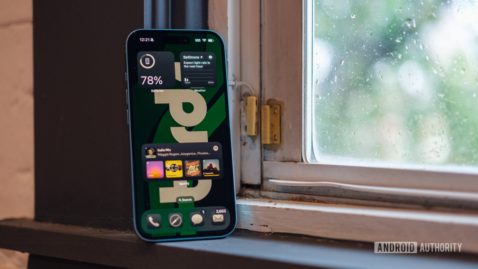
After nearly two decades, iOS now finally allows you to place icons anywhere on your homescreen — with as much blank space as you’d like. You still have to respect the underlying grid but there are few restrictions otherwise. Icon gaps between may not seem like a big deal but it’s an important feature to me — it means I can avoid placing icons along the top edge of the screen where it’s difficult to reach one-handed. It also lets me show off more of my wallpaper, which I greatly appreciate coming from Android.
Besides placement, the latest version of iOS offers a surprising amount of icon-level customization too. For instance, you can now remove app labels entirely for a minimalist look and make certain icons larger than others. And all of that’s before we even talk about widgets, which have been neglected on Android for some time now. It goes without saying that built-in and third-party iOS widgets offer far more functionality than on Android, and you can even stack them. Only Samsung’s One UI skin comes close to matching this experience.
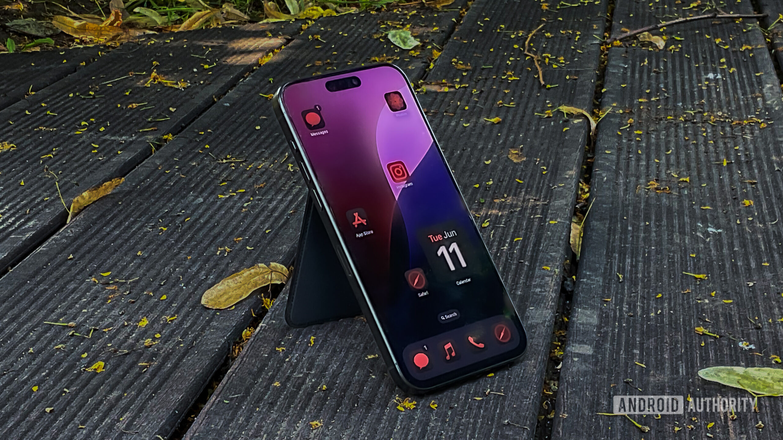
The iOS 18 update also introduces a wealth of icon theming options. You can’t install fully custom icon packs, but the color tinting and dark mode option should be enough for most Android users, including myself.
The iPhone Home Screen has become more Android-like, but some frustrating limitations remain.
Of course, iOS won’t replicate the traditional Android launcher experience for me until you can swipe up for an app drawer. Moreover, I’m not happy that Apple doesn’t let me select a custom grid size like many Android launchers. The default density leads to a lot of wasted space especially on the larger models. At the very least, going from the iPhone 16 to the iPhone 16 Plus should result in an additional row of icons.
So while the home screen changes are a step in the right direction, I wouldn’t call Apple’s offering better than the myriad Android launchers we’ve had for over a decade.
Lock and hide apps
On the subject of home screen management, locking and hiding apps is an example of the small, quality-of-life features that Apple manages to perfect, even if it won’t single-handedly convince me to switch to an iPhone. With iOS 18, you can long press on an app’s icon and select a new option to hide it behind an additional Face ID gate. This will move the app into a secure “Hidden” folder in the App Library page. It’s a handy feature if you frequently hand your phone out to strangers and don’t want them to access messaging apps while casually scrolling through your phone.
This isn’t a groundbreaking feature, but it’s surprising that Android still doesn’t offer something like this at a system-wide level. I could download third-party launchers that do the same thing, but they only offer the illusion of security. Luckily, you can still use One UI’s Secure Folder or the Private Space feature in Android 15 to create a…private space for your apps and data. However, this is more like a separate user account in PC terms and isn’t as convenient as tapping and authenticating individual apps.
Given that Google already offers a Locked Folder within the Google Photos app, I hope the ability to hide singular apps comes to Android sooner or later.
The Action button

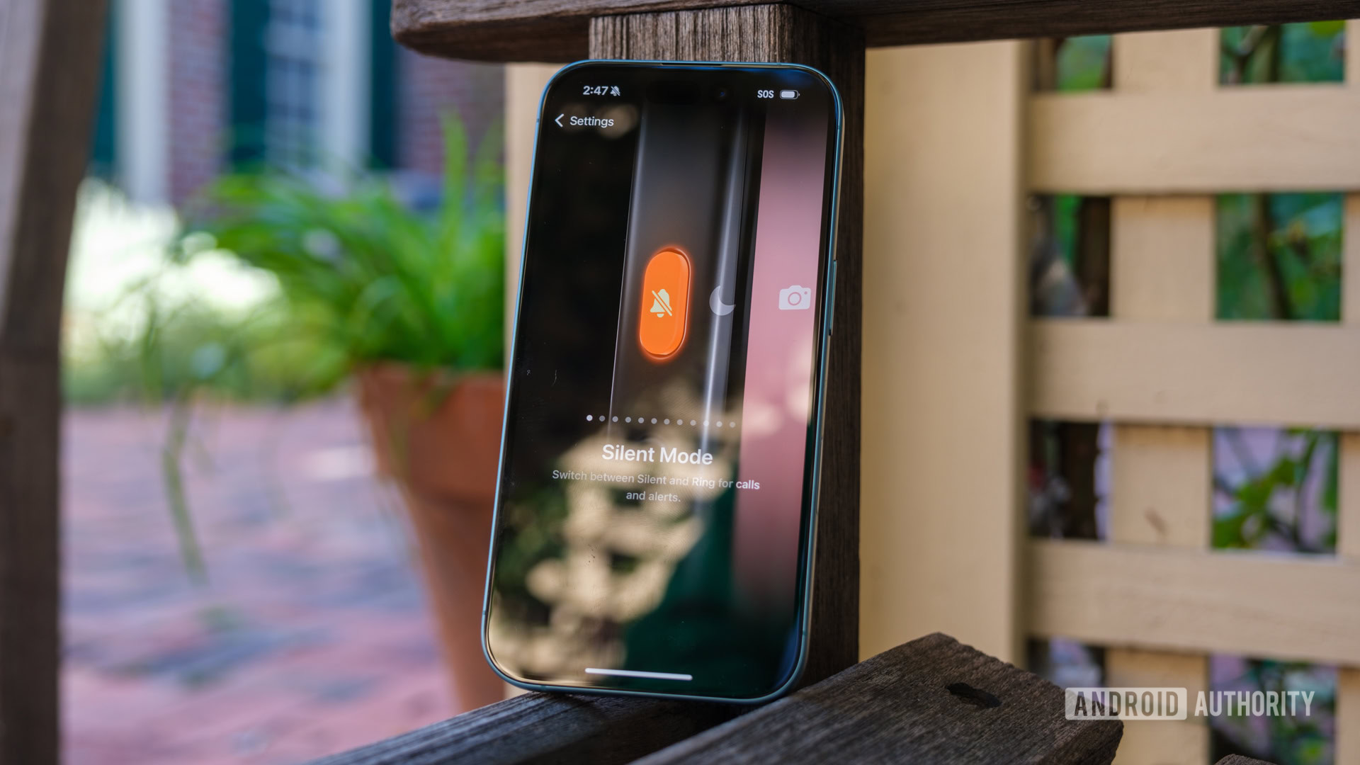
The iPhone 16 series introduced a Camera Control button, complete with a capacitive sensor that allows you to slide your finger to access features like zoom. But even before that, the iPhone 15 Pro replaced the mute switch with a programmable Action Button. Given Apple’s usual one-size-fits-all policy, you’d expect the button to be limited to one or two functions. However, the company broke from tradition here, allowing us to customize the button for a variety of genuinely useful actions.
You can set up the Action Button to launch the camera, turn on the flashlight, open specific apps, or even run custom Shortcuts for more complex routines. It’s a small addition, but it offers a level of flexibility that’s rare to see from Apple. And surprisingly, we haven’t seen it replicated on Android yet. The Pixel’s quick-tap gesture or Samsung’s Bixby button remapping come to mind, but the latter was short-lived and Google has changed how the power button works too many times to count at this point.
Once again, the Action button isn’t revolutionary but it’s helping to close the gaping customization gap that has long existed between iOS and Android.
The Shortcuts app
If you’re a long-time Android user, you might already be familiar with automation app Tasker. It allows you to create custom routines and actions, like automatically turning off Wi-Fi when you leave home or enabling auto-rotate when you open the Netflix app. But Tasker is a separate app, and some of its more powerful functions require ADB permissions or even root access, which isn’t practical for everyone.
Apple’s Shortcuts app achieves effectively the same thing on iOS, with an easy-to-use interface as an added bonus. It’s not a new feature, but I was surprised to find it when I first started using an iPhone, given Apple’s reputation for favoring simplicity above all else. And if you’re willing to tinker a bit, Shortcuts can even be used to get around certain iOS limitations, like setting up custom app icons.
The Shortcuts app is an underrated iOS feature that deserves to be on Android.
Samsung admittedly offers similar functionality via Bixby Routines but most people don’t venture that far into Bixby menus and it’s not available on my Pixel. I wish I could turn off my Pixel’s always-on display between certain times like when I’m sleeping or automatically fire off a WhatsApp message to my partner when I tap an NFC tag in my car.
You can do a lot of device automation with Tasker on Android, but it often feels like a workaround rather than a fully integrated solution. This makes the Shortcuts app one more example of Apple delivering a polished yet powerful option that helps motivate advanced users like me to switch away from Android.
The iOS Control Center slingshots past Android
Like the power button, Google has changed various aspects of the Android notification shade and quick settings menu more frequently than I’d like. Not all of these changes are consequential or even well-received, though, like the decision to combine the Wi-Fi and mobile data toggles. On the other hand, Apple has only improved the iPhone’s Control Center, which is equivalent in function to the quick settings menu on Android.
With iOS 18, the Control Center has gained the ability to rearrange the layout of controls and delete toggles you’ll never use. At face value, this might look like iOS has only caught up to what Android has offered for years. However, Apple didn’t stop there and added the ability to resize controls, similar to homescreen widgets. The interface now also has the ability to create multiple pages for different controls. This means you can create a page dedicated to smart home controls, another for media playback controls, and so on.
As an Android user, the iPhone’s Control Center seems far more customizable and interactive. You can add a dedicated cellular data toggle, for instance, and that’s already more choice than modern Android versions. Beyond that, I’d love to add individual toggles for my smart home or programmable buttons that let me open any app. Once again, these are possible on Android but only with the right third-party app.
All in all, the iOS 18 update is not just a step in the right direction but a clear indication that Apple has finally opened its eyes to the benefits of customization. It brings the iPhone closer than ever to the flexibility that Android users have long enjoyed, without losing any of iOS’ simplicity. There are still areas where Android remains ahead for me personally, though, mostly in relation to notification management. But with another major iOS update or two, I could definitely see myself and many other Android loyalists lured to the other side.