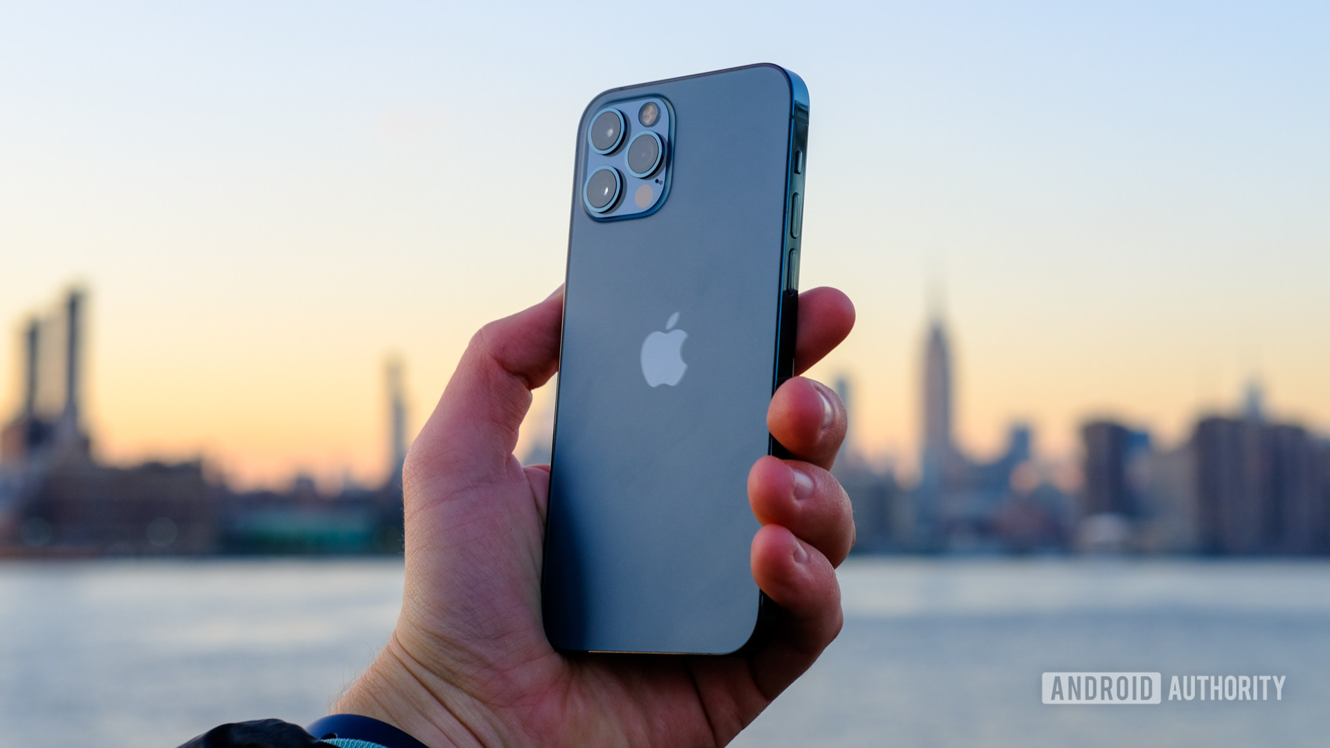
Affiliate links on Android Authority may earn us a commission. Learn more.
Apple iPhone 12 second opinion review: It really does just work
Published onNovember 15, 2020
Unless you’ve been living under a rock, you know that there’s a new iPhone series out. Apple’s yearly refresh draws more attention than almost all other phones combined and sets the trend for where the smartphone industry is headed. This year, the phone brings a significant design refresh, updated internals, and additions like 5G.
I’ve been using the iPhone 12 for almost two weeks now, enough time to understand where the phone excels, and where it does not. So when my colleague David published his exhaustive review of the iPhone 12 Pro and later the regular iPhone 12, it really got me thinking.
Our verdict: Apple iPhone 12 Pro review
David posits in his reviews that Apple hasn’t made many significant changes with the iPhone 12 Pro, but also that the iPhone 12 is rather awkwardly placed in the lineup. Now, I’m not entirely disagreeing with him — four very similar phones with minimal differences between them other than size is a bit much.
But as a corollary, I’m convinced that it is the vanilla iPhone 12 that offers the most value this year. Here’s why.
Oh so premium
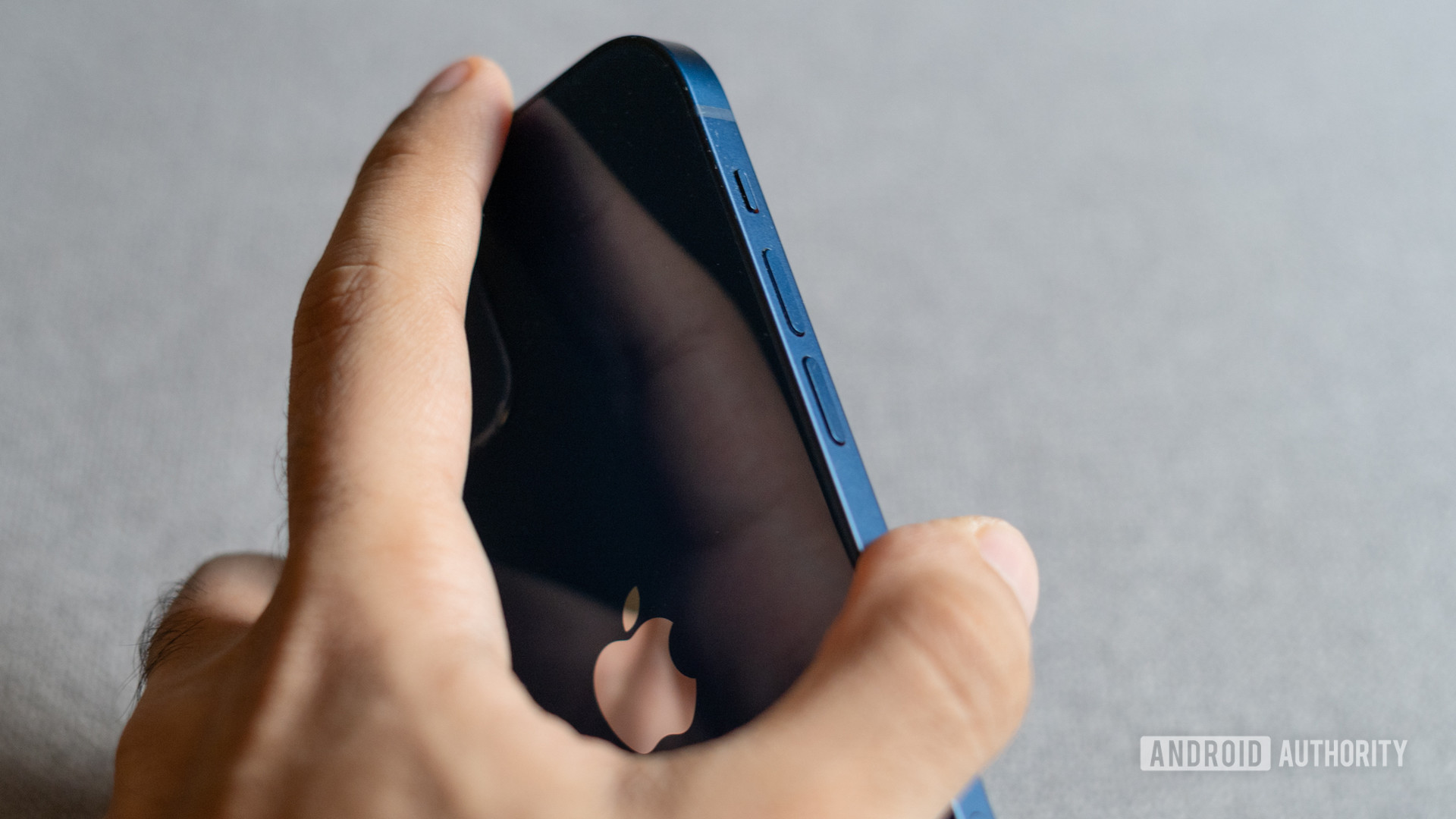
Between the iPhone 12 Pro and the iPhone 12, the latter is the more “affordable” option. I place affordable in quotes because it is still a $799 smartphone. That’s a lot of money no matter how you swing it. However, the no compromise approach is evident the moment you pick up the phone. The construction here is truly premium.
Placed next to, for example, the OnePlus 8T, a phone that at $749 is a mere $50 cheaper than the iPhone 12 in the US, there’s a noticeable difference in the hand feel and tolerance levels. It’s not night and day, but little things like the right amount of feedback and incredible haptics make Apple’s top-down approach very apparent.
The glass and aluminum sandwich of the iPhone 12 now channels the classic iPhone 4 design language with its flat edges and squared-off look. In a world of gradients and curved edges, the phone stands out in a good way.
I’m a bit biased in that the iPhone 4 and 5-series have always been two of my personal favorites, but the industrial — almost Bauhaus — design of the iPhone 12 is a definite head-turner in its minimalism.
The iPhone 12's construction is truly premium.
The only thing that I’m not too enthused by is just how much of a fingerprint magnet the back of the phone is. I’ve got the all-new blue color with me and a case is highly recommended to keep the phone clean.
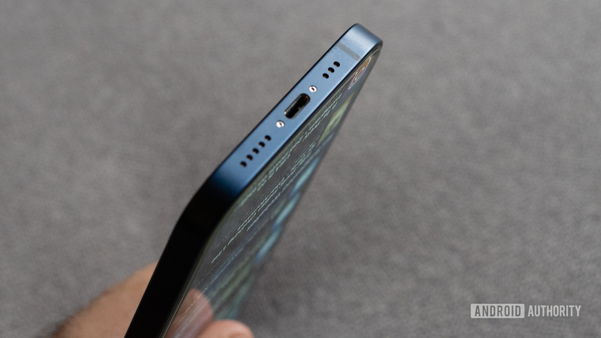
Of course, some things never change and the iPhone 12 is still rocking a lightning port like its 2012. I’d have hoped that with the iPad Pro styling, the new iPhones would have cribbed the USB-C port as well, but it looks like Apple might just transition to a portless future instead. It’s… not ideal.
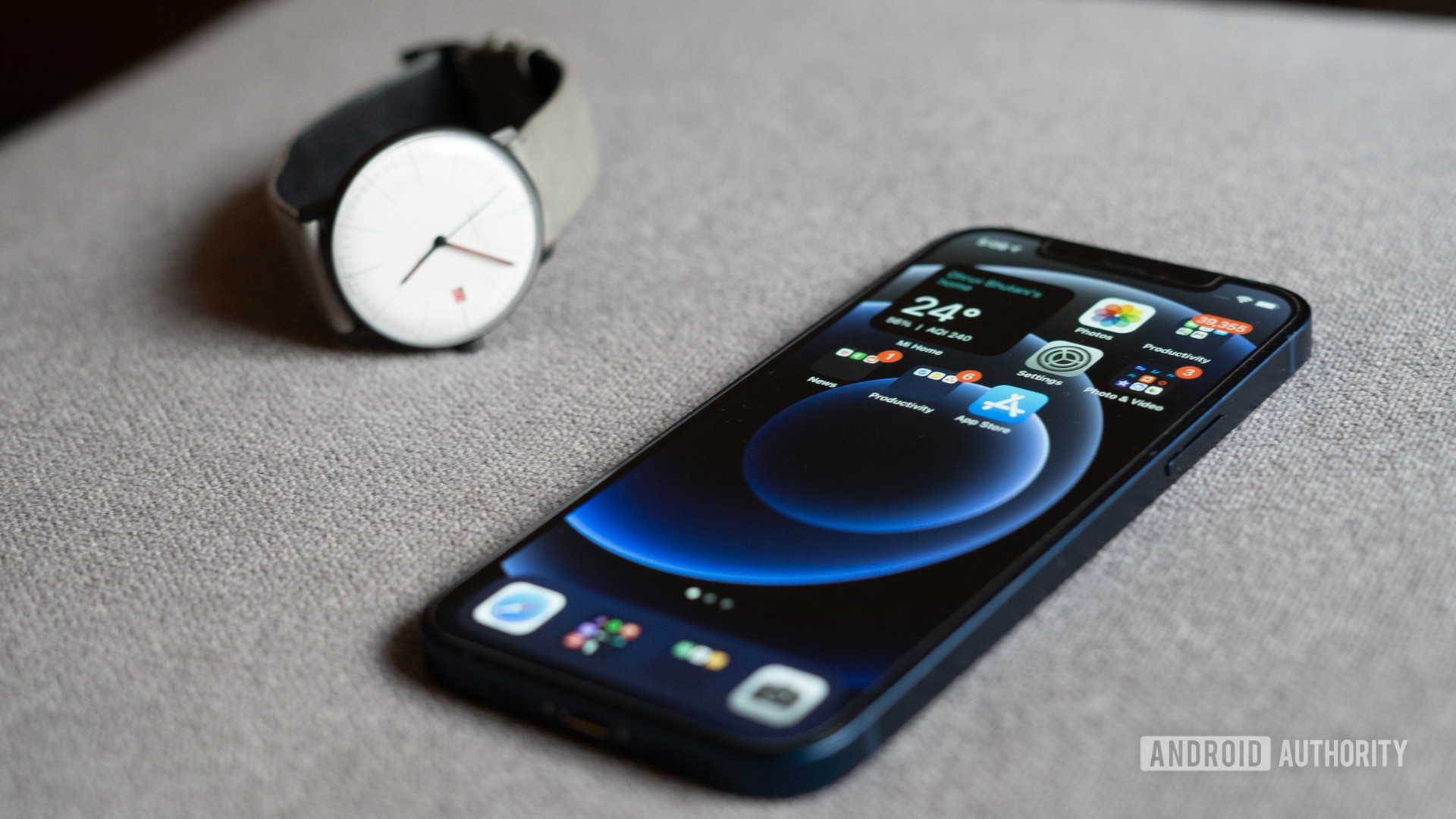
The iPhone 12 finally makes the move to OLED which is a very welcome addition. What isn’t, is the fact that it is still stuck to a 60Hz refresh rate. Look past that though, and you can see that the iPhone packs a truly gorgeous display with incredible color accuracy, and peak brightness levels that absolutely stand out.
Yeah, it’s still got a big ol’ notch, but Apple’s designs have a tendency to get accepted by the zeitgeist. It’s not great, but you get used to it. More importantly, it enables Face ID.
For anyone switching platforms, the speed and accuracy of Face ID will stand out.
As someone who has predominantly stuck to Android hardware over the last few years, I haven’t had an opportunity to extensively test out Face ID. It might be old news for most iPhone users, but for anyone switching platforms, the sheer speed and accuracy will come across as impressive.
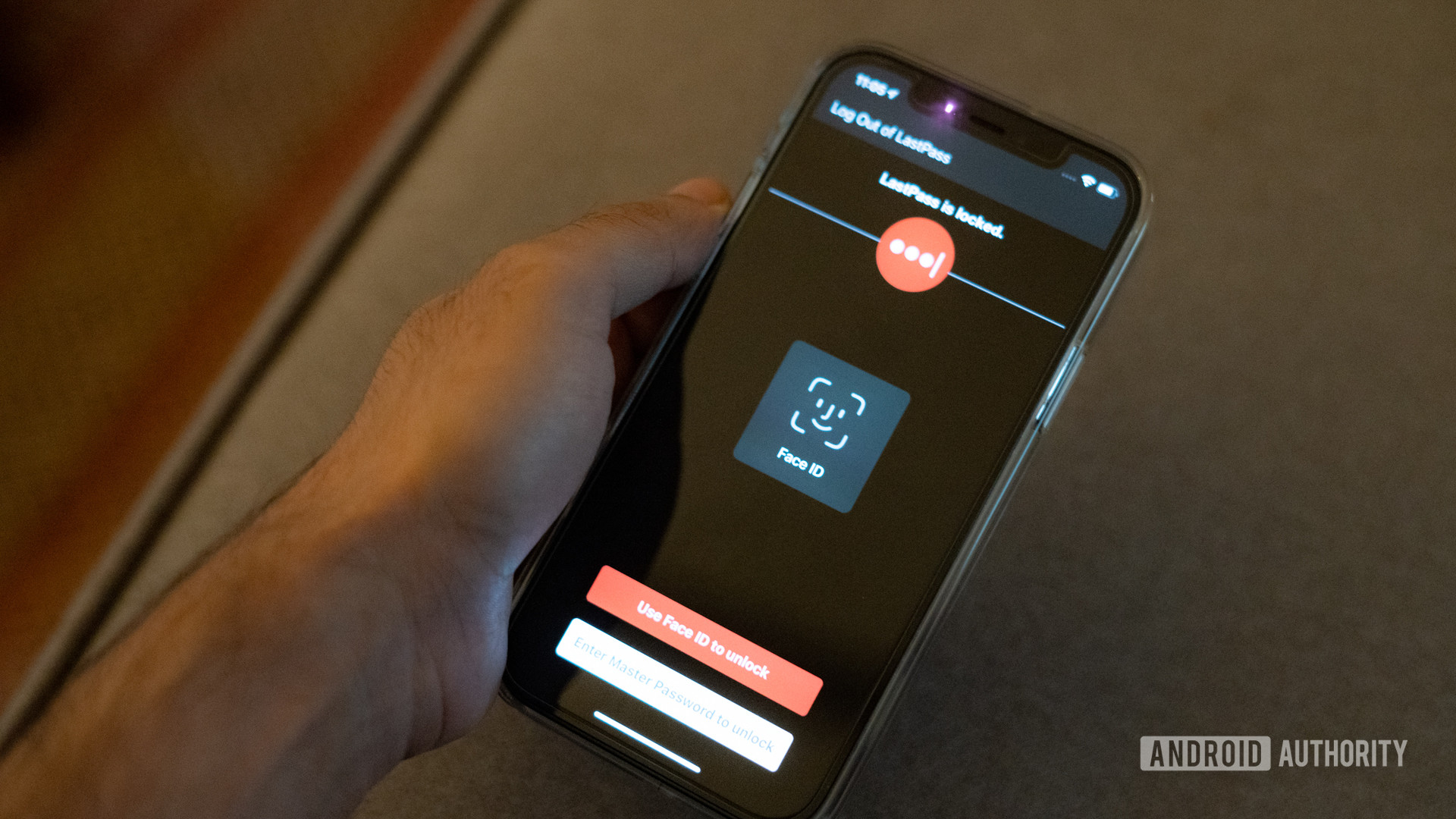
Of course, a fingerprint reader might have worked out a bit better in this day and age of face coverings, but there’s simply no way Apple could have engineered around a pandemic.
For me, the deep integration with iOS is what really seals the deal with Face ID. Biometric authentication on Android is iffy at best. A whole lot of apps simply don’t support it, and those that do don’t always work. I’m looking at you LastPass.
In my two weeks with the phone, it’s this reliability and effortless ease of use has left a mark. Adding in a password via LastPass? FaceID pops up on demand every single time. Unlocking my phone late at without having to fumble around with the in-display fingerprint reader on my OnePlus phone has been refreshing.
See also: These are the 5 best Android alternatives to the iPhone 12 series
Elsewhere, battery life has been more than satisfactory. The phone lasts me a day and a half on a single charge. Charging speeds are certainly not fast at 18W. Moreover, there’s no charging brick in the box. I imagine Apple expects most buyers to splurge on a new MagSafe charger that will enable 15W wireless charging.
Personally, I don’t really mind the absence of a charging adapter since I have enough chargers lying around as it is and I prefer to just plop the phone on my bedside Qi charger. However, most buyers will likely have to spend extra on a USB-C charger.
Software and hardware interplay
Look, I’m a self-professed Android fanboy. I do write for Android Authority, after all. The ease of customization and the ability to use my phone however I want has been a key motivation for me sticking to the platform.
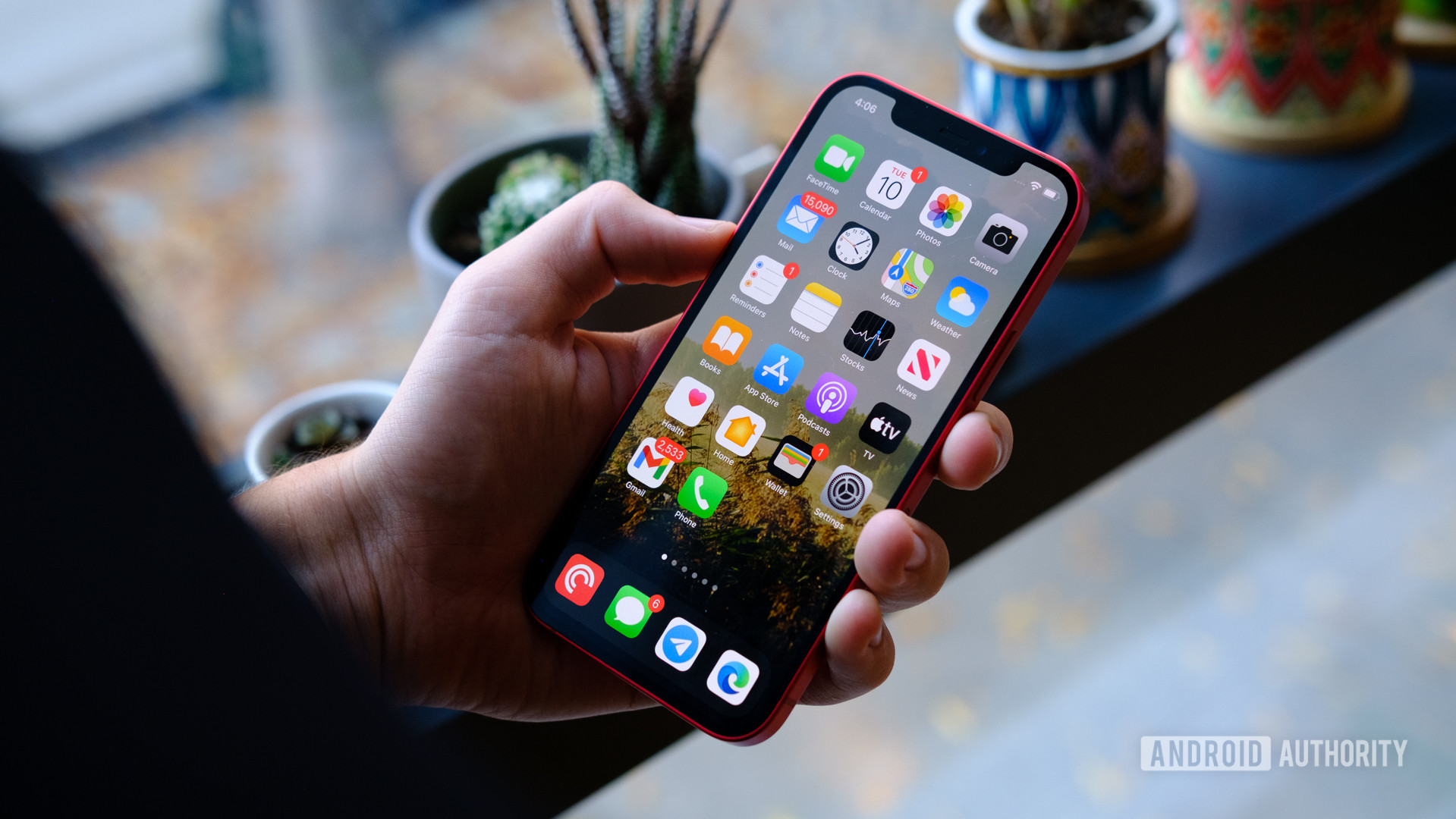
However, iOS 14 has had me intrigued ever since Apple announced it earlier this year at WWDC. The latest update brings some of the best features of Android over to Apple’s walled garden. And in some cases, does it better.
For example, widgets. While Android has had support for widgets for years, iOS 14 finally brings them over to iOS. Apple’s implementation, however, reeks of simple sophistication, and not only are the widgets more functional, but also a lot more elegant and aesthetically pleasing. In fact, that’s a running theme across iOS.
iOS 14 finally introduces widgets and propels them forward with a modern aesthetic and functionality.
Yes, Android phones afford more options, but the iPhone’s interplay between a focus on design, functionality, and ease of use makes it seem like a much more premium experience. Compare this with Android phones where apps are often designed for the lowest common denominator, the difference becomes even more stark.
Coming back to iOS after a few years of exclusively using Android devices, the difference in fluidity was even more obvious. There’s a degree of system-level cohesion that not many Android phones are able to reliably achieve.
Part of this is due to Apple’s use of its own custom, benchmark-topping chipsets across the entire line-up. Now, Apple has been setting the benchmark as far as processing capabilities are concerned for a few years now.
The A14 Bionic in the iPhone 12 sticks to the formula and delivers performance that is ahead of the curve and easily bests Qualcomm’s Snapdragon 865 Plus. That performance boost, however, doesn’t necessarily mean too much today. Instead, that extra boost is meant to make your phone last years at peak performance. Keep in mind, the iPhone 6S from 2015 is still getting updates.
Coming back to the software though, it’s not all perfect. There are still significant gaps that I noticed in my time with the phone. Switching over from Android, the lack of an app drawer can be a bit jarring but Apple has made moves to fix this with iOS 14. App Library is a collection of folders that auto-populates the most recent and popular apps using categories. It’s not going to be enough to placate avid customizers but it’s a definite step in the right direction.
iOS 14 takes a big step forward but still has some baffling old-school design choices.
But then there are things like the Settings menu. It boggles the mind that Apple’s solution to changing settings for most apps involves going back to the home screen, looking up the settings app, navigating to the category, and then changing the most basic options.
Sharing files outside the iOS ecosystem also continues to be a big hassle, and on more than one occasion cloud transfers simply stopped the moment I turned off the screen.
I understand that iOS has a fundamentally different approach towards its operating system, but these are basic features that should’ve been long resolved by now.
Camera: Great imaging, better video
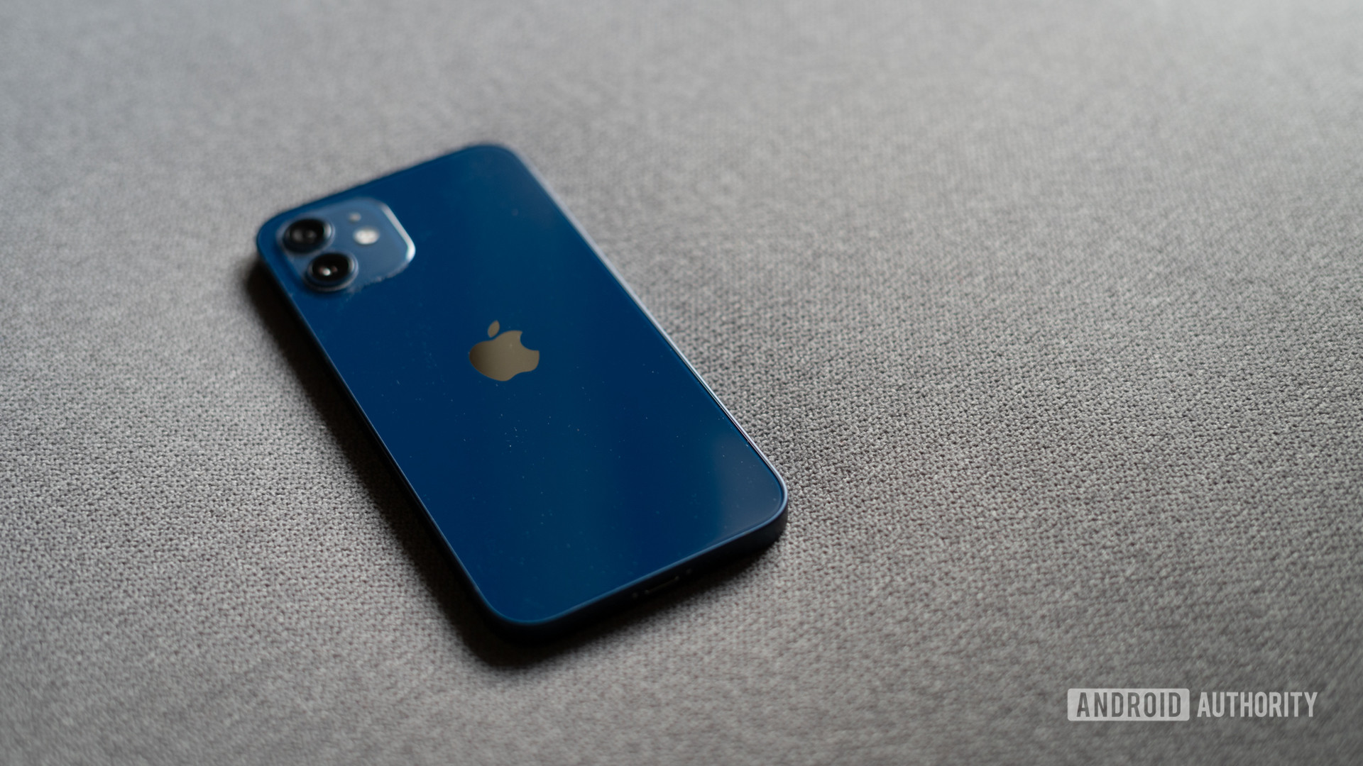
The iPhone 12 employs the same primary camera and ultra-wide camera as the iPhone 12 Pro, but drops the 2x telephoto lens and LIDAR sensor. The real upgrades are on the software side of things. This includes Smart HDR3 processing as well as support for Dolby Vision video recording, albeit at a reduced 30fps compared to the 60fps option on the iPhone 12 Pro.
David has already done an excellent job covering the iPhone 12 and 12 Pro’s camera over in his review, but the long and short of it is that you won’t be disappointed. The iPhone 12 doesn’t have the most cameras, nor does it pack the highest resolution, but like the rest of the package, the focus is on consistency.
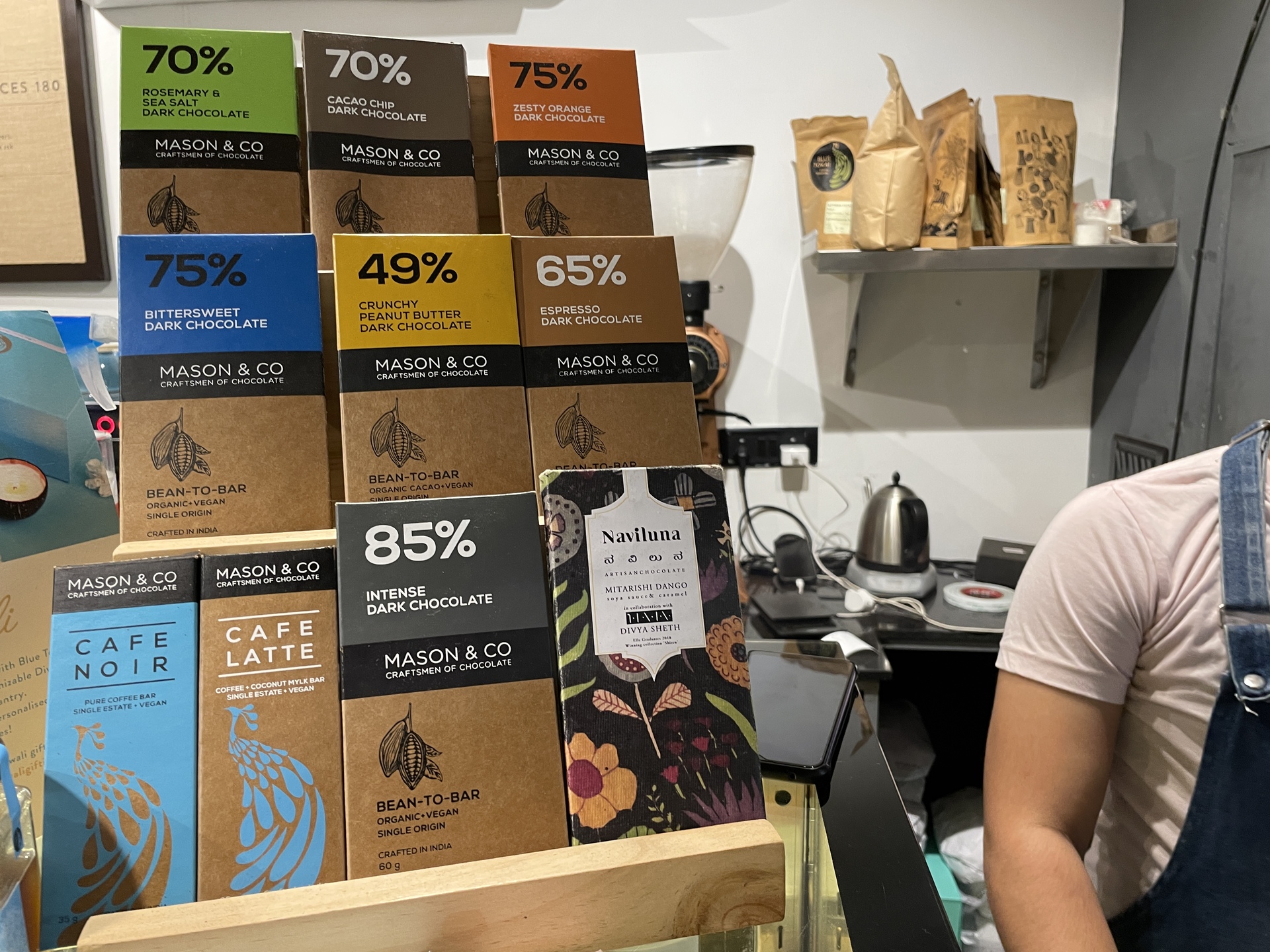
Images in most lighting conditions look excellent. The iPhone 12 continues Apple’s signature tuning that has ever so slightly raised shadow levels and an overall brighter, cooler image.
It’s a bit different compared to the Pixel 5‘s moody and often contrasty image, but most users should get a consistently good shot out of the iPhone 12.
And then there’s video capture. While the Android ecosystem has started to come close, especially with devices like the Galaxy Note 20 Ultra and even the Xiaomi Mi 10 Pro, Apple is still a step ahead with its excellent out of the box results.
The ecosystem advantage
As a long term MacBook user, and a recent iPad Pro owner, I’m well aware of the ecosystem advantage that comes with buying Apple products. However, that advantage really shines when you extend it to your smartphone.
Be it AirDrop for quick and dirty file sharing or Handoff to seamlessly use the same apps from one platform to the next, the effortless interoperability between Apple products remains unmatched by any other product.
Read more: Does Google have a reply for Apple’s all-in-one ecosystem?
On more than one occasion, I found myself checking out a long read over on Twitter. The pop-up notification on my Mac let me continue reading on the larger screen without having to use workarounds like bookmarks or forwarding URLs via third-party apps like I would on an Android device.
Yes, I know, Chrome OS has a similar feature, but it’s the ease of use and reliability that stands out as a key thread in the iPhone user experience.
Meanwhile, Apple is building out yet another hardware ecosystem with Magsafe, which could be the stepping stone towards Apple’s next billion-dollar accessory business through wallets, dash mounts, and more.
Apple iPhone 12 review second opinion: The verdict

If this review sounds overly positive, that’s simply because of how much Apple gets right here. The omissions are careful, the experience is nigh-identical to the premium models, and more importantly, consistent.
That consistent approach towards design, fluidity, imaging goes a long way towards creating an effortless user experience. And that’s where the true value lies. It’s not an affordable phone, but factoring in the performance, quality of hardware, imaging, and, yes, longevity, there’s very little that offers this degree of value.
The iPhone 12 eschews bells and whistles for an effortless, fluid user experience — and there's value in that.
The iPhone 12 doesn’t have all the bells and whistles of Android competitors. What it does offer is simplicity, reliability, as well as continuity between Apple’s hardware and software.
Some of those features might not be worth it to you, especially if you haven’t bought into Apple’s broader ecosystem. However, the operating system has evolved enough that most people will find a lot to like here.
Related: iPhone 12 series comparison: Which one would you buy?
The deliberate and close-knit tie-up between iOS and the iPhone 12’s hardware shows just how much is possible when a company sets its mind to create a system that, for the most part, just works.
The iPhone 12 might not be a perfect phone, but it is a darn good one. For an entry price of $799 and no significant battery trade-offs like the iPhone 12 Mini, it’s also possibly the best for most buyers looking to pick one from Apple’s 2020 line-up.
