Affiliate links on Android Authority may earn us a commission. Learn more.
Standby Mode on the iPhone 14 Pro replaced my Google Nest Hub
Published onSeptember 2, 2023
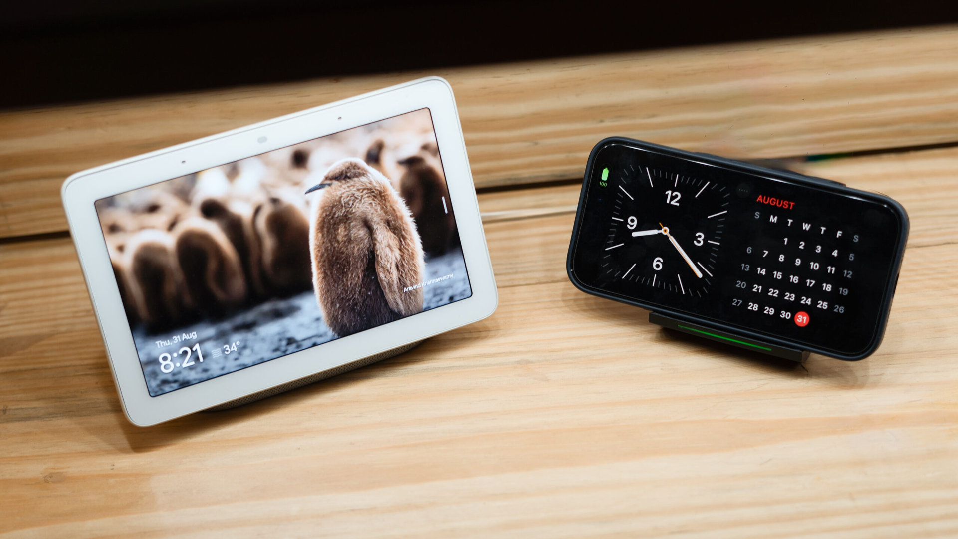
I’ve spent the last few years assembling my ideal smart home. More importantly, I’ve invested much time and money to ensure that most of my home automations run without user intervention. But there are still some instances, like when I’m sitting at my desk, where having a control surface comes in handy.
While the Raspberry Pi powering my Home Assistant backend sits tucked away in my server closet, I’ve got a Google Nest Hub that occupies prime real estate on my desk and acts as a control center for controlling smart lights, fans, music, and podcast playback, all while serving up photos from my Google Photos library.
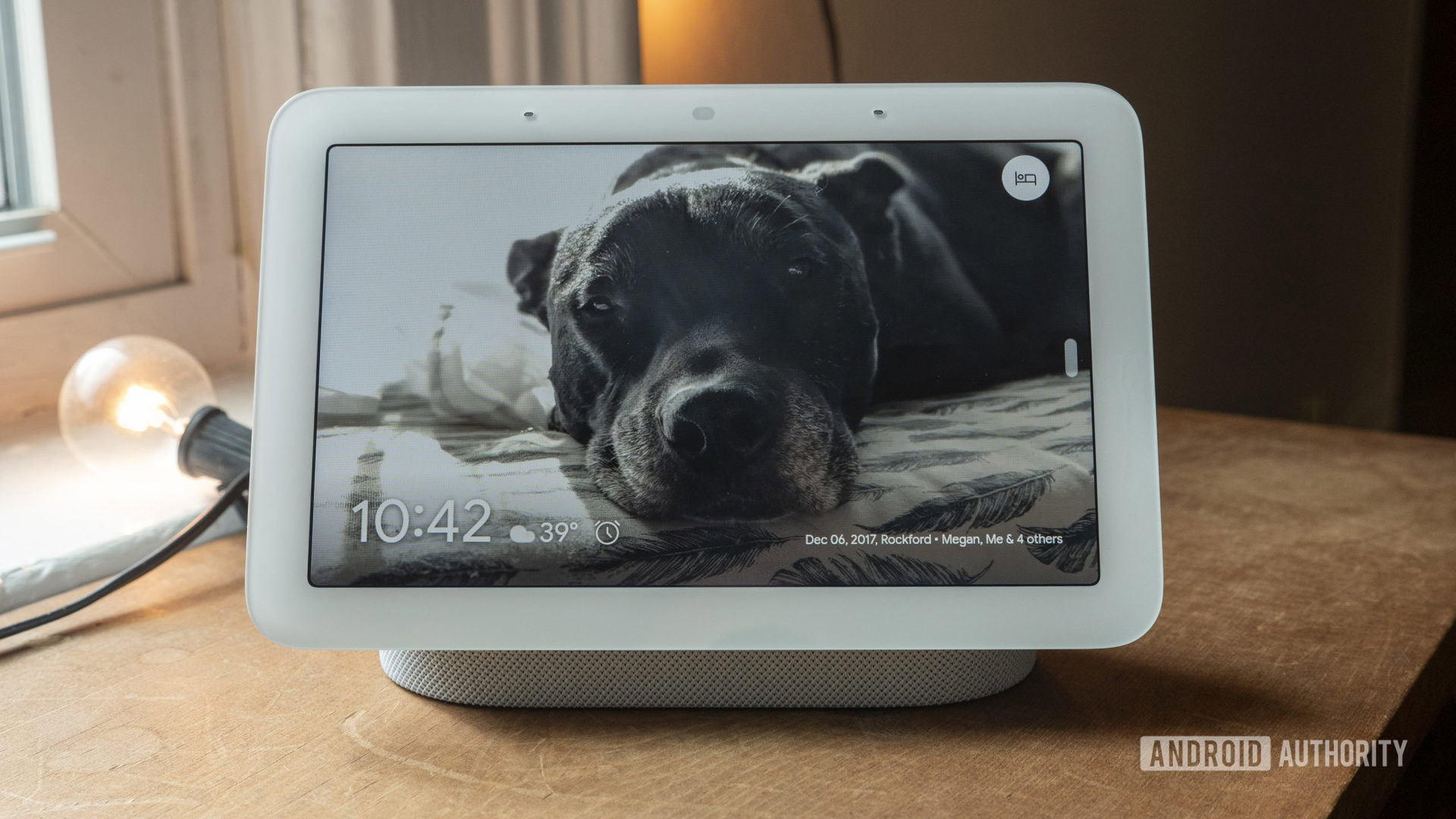
However, much as I like my Nest Hub, it has been pretty clear to me for a while that it is starting to show its age. The lagging software and very iffy voice control have been a constant stress point lately. Additionally, Google’s constant removal of features has me concerned about shifting priorities within the company. Finally, the Nest Hub occupies a sizeable chunk of desk real estate for the limited amount of use it gets.
I’ve been looking for a solution that would help me streamline my setup without losing functionality. When Apple introduced Standby Mode on iOS 17, it immediately struck me as a potential solution for my smart home dilemma. Lately, I’ve been all about the minimal life. I want to maximize what I do with my existing gadgets instead of collecting toys that rarely get used, and Standby Mode on the iPhone 14 Pro could potentially help me get there. Could Apple’s always-on standby mode truly replace a dedicated device? There was only one way to find out.
Would you replace your smart display with a Standby Mode-like option on a phone?
Standby Mode’s steep price of entry
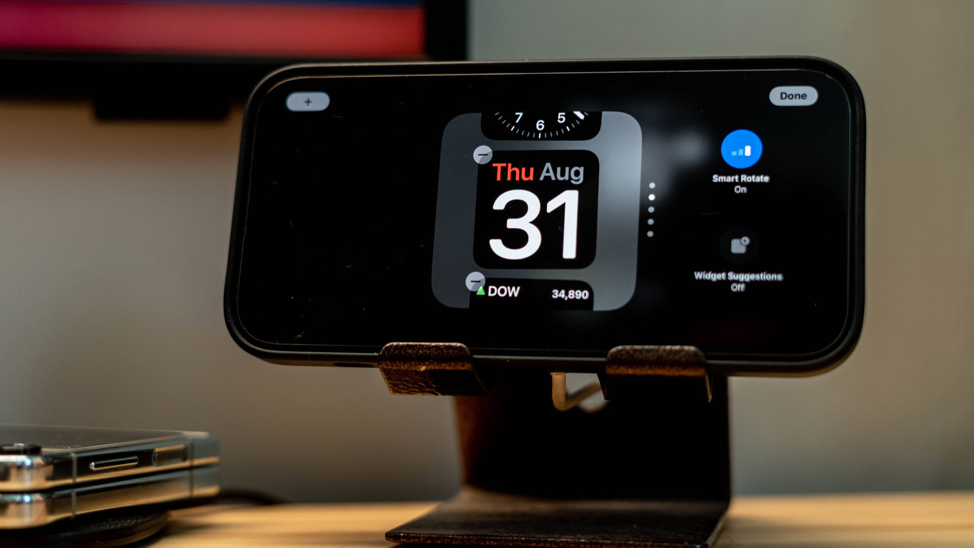
I’m usually cautious about switching out tech that already works for me, but in the case of Standby Mode, I decided to jump off the deep end. Considering my iPhone 14 Pro sits on a MagSafe charger all day, I had nothing to lose. Of course, I was under no delusion that Standby Mode would be a drop-in replacement for a cheap Nest Hub. In fact, the steep $ 1,000 cost of entry to even get access to the feature puts this squarely in the realm of nice-to-have addons for existing users.
I was under no delusion that a $1000 phone is meant to replace a cheap Nest Hub, but could it be a successful replacement for current owners?
But since I had an iPhone 14 Pro running the iOS 17 beta and a spare MagSafe charger on hand, I did the obvious thing — disconnected my Nest Hub, propped up my iPhone on a cheap desk stand, and started my little experiment.
Limited, but purposeful functionality
Let me preface this by saying that Standby Mode on iOS 17 is extremely limited by design. I’m not trying to justify its limitations, but Apple clearly doesn’t want you to think that its software is anything more than a widget hub. The onboarding process consists of selecting a few widgets, and that’s about as far as you can customize things. You won’t be manipulating recurring alarms or swiping across multiple UI elements here. Obviously, it can’t be used as an Airplay target, either. For my use, those limitations did not matter as much. I’ve spent years in the smart home game, and my use cases have evolved to cover just the essentials. As long as it can display photos and control my music and my smart home, it’s good enough for me.
Standby Mode takes Apple's typical walled-garden approach to ambient mode widgets, and is extremely limited by design.
Apple’s approach presents you with a few preselected scenarios that the company thinks might suit a quick-access display environment. This consists of a two-widget desktop pane where you can have various clock options or most first-party widgets. I was surprised by the lack of support for third-party widgets, as that would’ve drastically opened up the capabilities of Standby Mode.
Meanwhile, the other half of the pane can be configured to place a calendar, weather, reminders, or your to-do list. Apple’s smart suggestions are also implemented here, and they can helpfully toggle the widget depending on the time of day or an upcoming appointment. I prefer to swipe through relevant widgets manually.
Compared to my Nest Hub, this two-pane home screen setup has proven much more useful to me. I live my life through to-do lists that get synced to my calendar, and having glanceable access to that information was exactly what I needed.
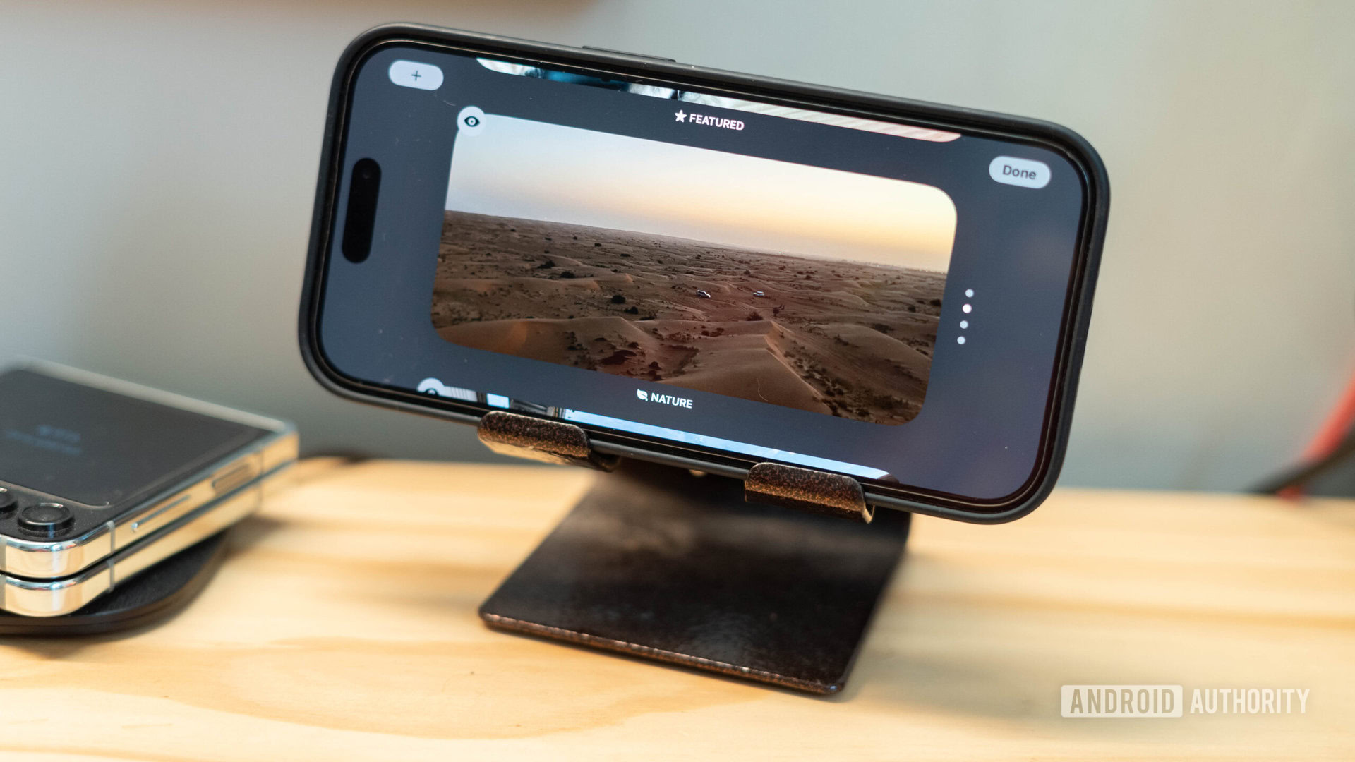
Next, a swipe to the right gives me access to a rolling selection of pics from my photo library. My primary phone tends to be an Android device, and Google Photos is my central repository of photos, so I definitely miss the better selection of images accessible on my Nest Hub.
Apple’s take on the photo frame feature gives you a few different options to play around with. A people-centric tile pulls up images of your preferred contacts. Other options include cityscapes from your photos, nature, and finally featured images from your local photo library. It’s a far cry from Google’s album-based approach on the Nest Hub, but it comes with the territory given Apple’s local-first approach.
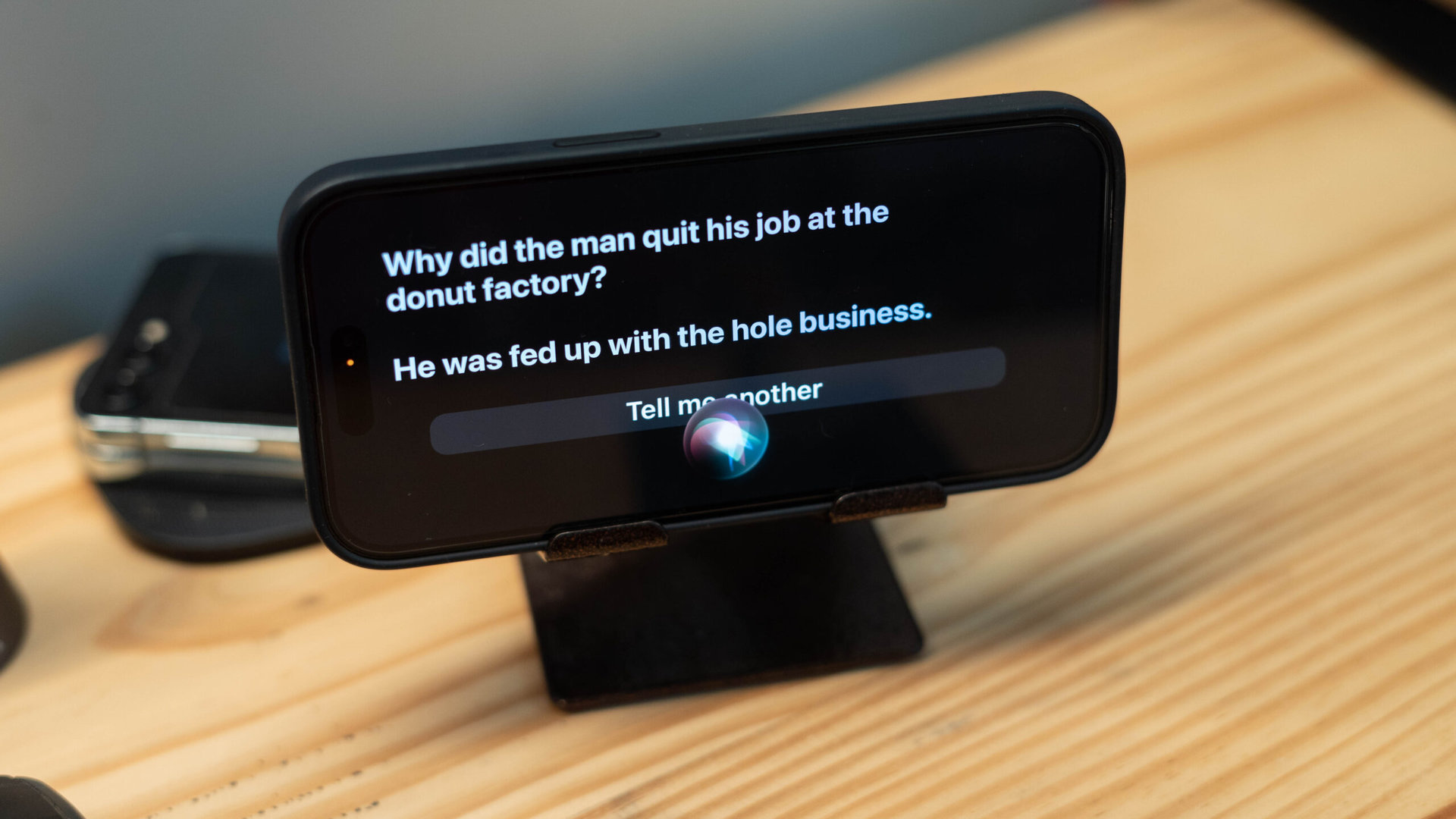
So far, so good. Putting the smart in the smart hub is the voice assistant element, of course. Let me be clear: I’m a Google Assistant devout, and I rarely, if ever, use Siri. However, this experiment necessitated using voice controls, and I’m rather surprised by how well Apple’s much-maligned voice assistant worked. It’s certainly not going to replace Google Assistant’s smarts, but Siri has been perfectly capable of pulling up relevant information like weather forecasts, controlling music, opening up apps, and, yes, even telling me the customary joke — all within the Standby Mode interface.
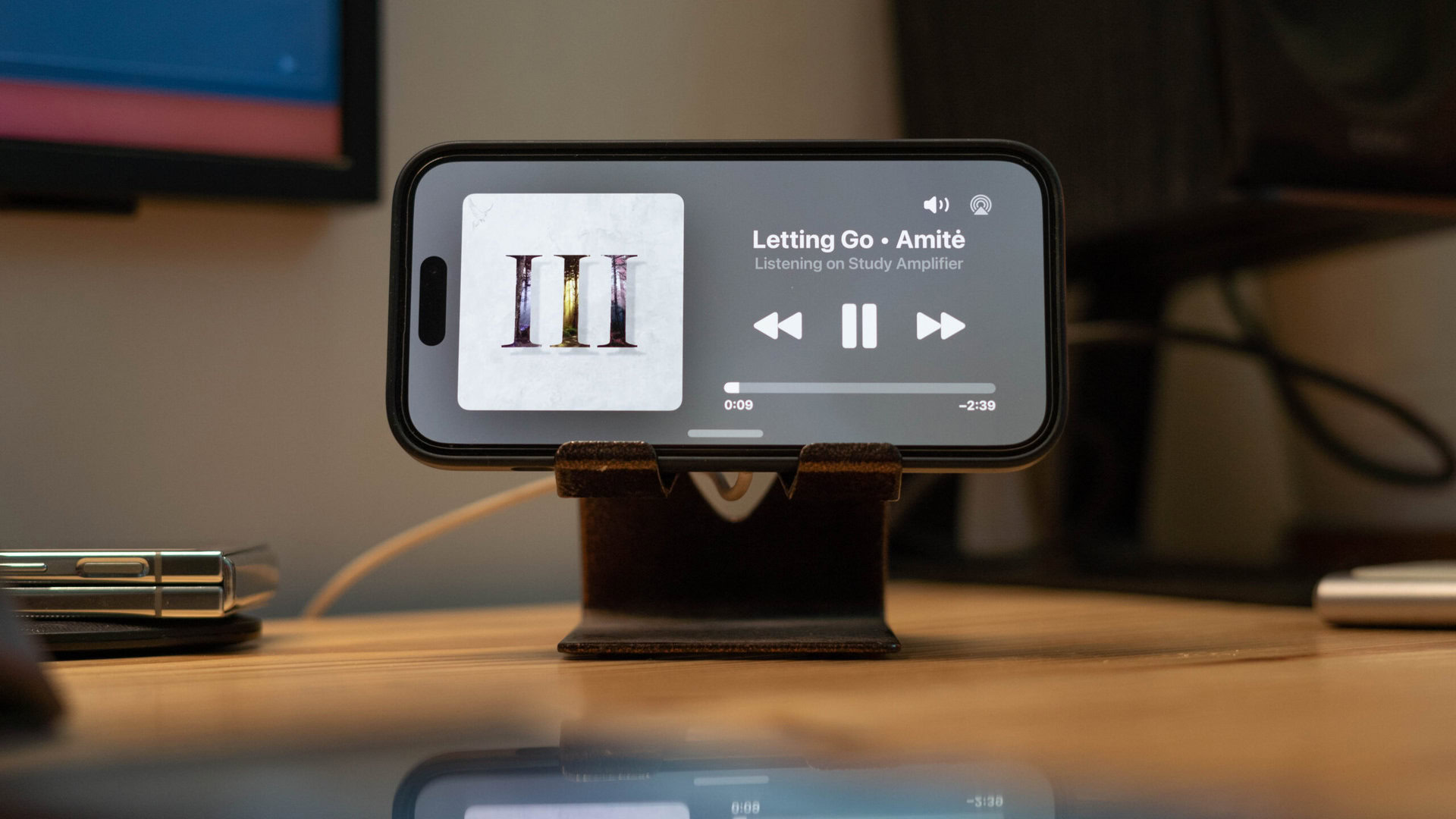
However, my favorite feature, which I use the most, is the music playback interface. The Nest Hub, by design, can only control music playing back on the hub’s internal speaker or other Nest speakers in a group.
Standby Mode offers the best implementation of ambient music controls across smart home ecosystems, and it's not even trying to replace them.
On the iPhone, however, I can use Spotify Connect to launch playback on my Alexa-enabled amplifier or bedroom soundbar and control it directly from the Standby Mode interface. It shouldn’t be all that surprising since it’s just using the installed Spotify app for the feature, but it’s a marked step up for my use case. Be it playing back a podcast on the iPhone’s speaker, using Airplay to cast to my soundbar, controlling an Alexa speaker, and, through a bit of a workaround, even a Google Nest speaker — Standby Mode turns the iPhone 14 Pro into the most comprehensive music control hub on the market, without even trying to be one.
I even tested out Netflix playback from the ambient mode interface using Siri. Apple clearly didn’t design the interface for such use cases, but Siri dropped me right into the Netflix app, and I could easily tap and launch the latest blockbuster. It’s not all that different from how you’d run Netflix on an Amazon Echo Show.
As for smart home controls, that’s where things get tricky. If you’ve got a Homekit-enabled smart home, it is possible to add Apple’s Home widget to the desktop, giving you quick-tap access to all the essentials. If you prefer voice control, you can also use Siri to control all your smart home gadgets.
Full control over smart home equipment requires access to a Homekit hub like an Apple TV or Homepod speaker.
Unfortunately, almost none of my smart home gear is Homekit-enabled. I use Homebridge to parse my smart home gear into Apple’s Home app and assumed that Apple’s Home widget would populate all my smart home accessories. However, that’s not the case. The widget requires an official Homekit hub like an Apple TV or Homepod for full functionality. So, if you use a DIY solution and prefer a touch-based interface to control electronics, Standby Mode might not be an optimal fit. For my use, though, Siri’s voice control could easily connect to my lights, fans, and thermostats over the Homekit bridge, and I didn’t find the lack of widget support particularly limiting.
An almost ideal replacement — with caveats
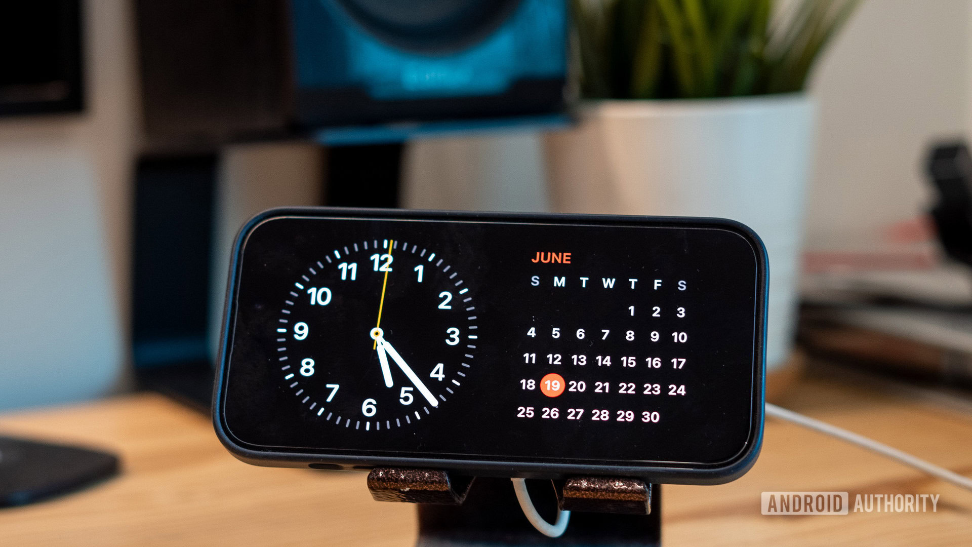
A couple of weeks of use later, it’s clear to me that, like all things, Standby Mode’s utility comes down to what you use your smart home hub for. Apple’s selection of use cases covers most things I do with my Nest Hub, and I’m not planning to plug the latter back in. The convenience of propping up my iPhone in landscape mode on a wireless charger and dropping straight into a standby screen with a couple of widgets is exactly what I need for my desk setup.
I see Standby Mode on the iPhone 14 Pro as a convenient addon for an office desk or nightstand where you might not want another device hogging desk space. In its current state, the feature is already good enough to cover a lot of ground, but I can see Apple gradually plugging away at it and adding more functionality or expanding it to more devices.
Standby Mode in iOS 17 isn't a full-blown smart display replacement, but it makes for an excellent ambient display for your desk.
That said, it should be pretty obvious that your phone isn’t going to replace an always-on ambient hub — especially in a shared-use environment. Battery concerns are also something to keep in mind. Keeping your phone perpetually connected to a wireless charger can’t be great for battery health. And then there’s the matter of screen real estate. The 6.1-inch screen on my iPhone 14 Pro is serviceable when I’m sitting at my desk, but it definitely isn’t visible from across the room. The same interface, or better, would make a lot more sense on an iPad. We’ve already seen the Pixel Tablet doubling up as a Nest Hub, and I can see Apple working on the feature once it rolls out OLED-equipped iPads.
For the most part, though, I’d call my experiment a success. Barring a few hiccups with getting my smart home gear working, I’ve had no issues using Standby Mode as a Google Nest Hub replacement. In fact, I prefer the cleaner, smoother, and, dare I say, more sophisticated-looking interface over Google’s smart display. Would I recommend others to chuck their Nest Hub and splurge on an iPhone for the feature? Of course not. But if you’ve already invested in the latest iPhone or are considering the iPhone 15 series, Apple’s surprisingly forward-looking feature is definitely worth checking out.