Affiliate links on Android Authority may earn us a commission. Learn more.
iPhone vs Android gestures: Who does it better?
Published onOctober 16, 2018
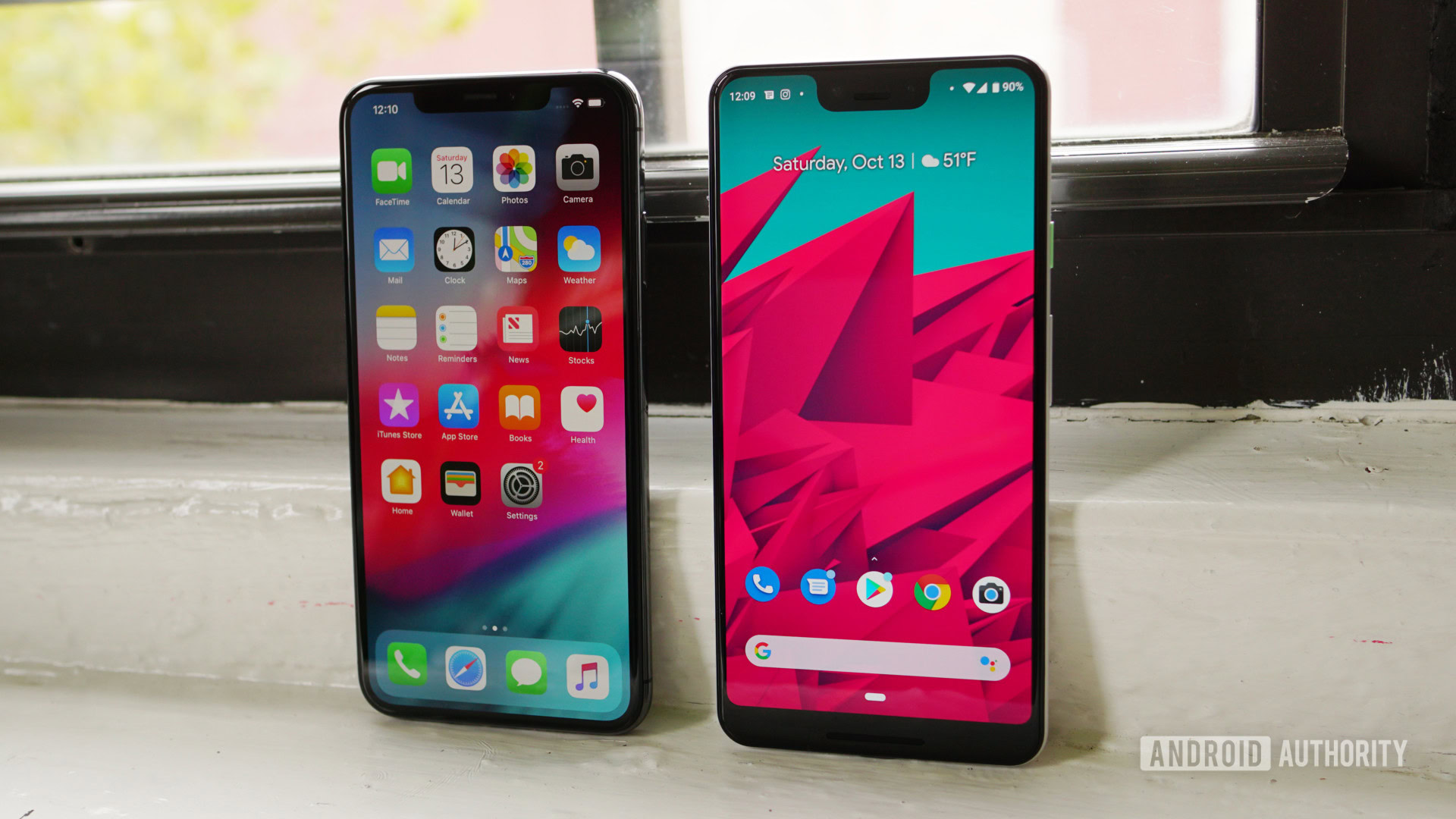

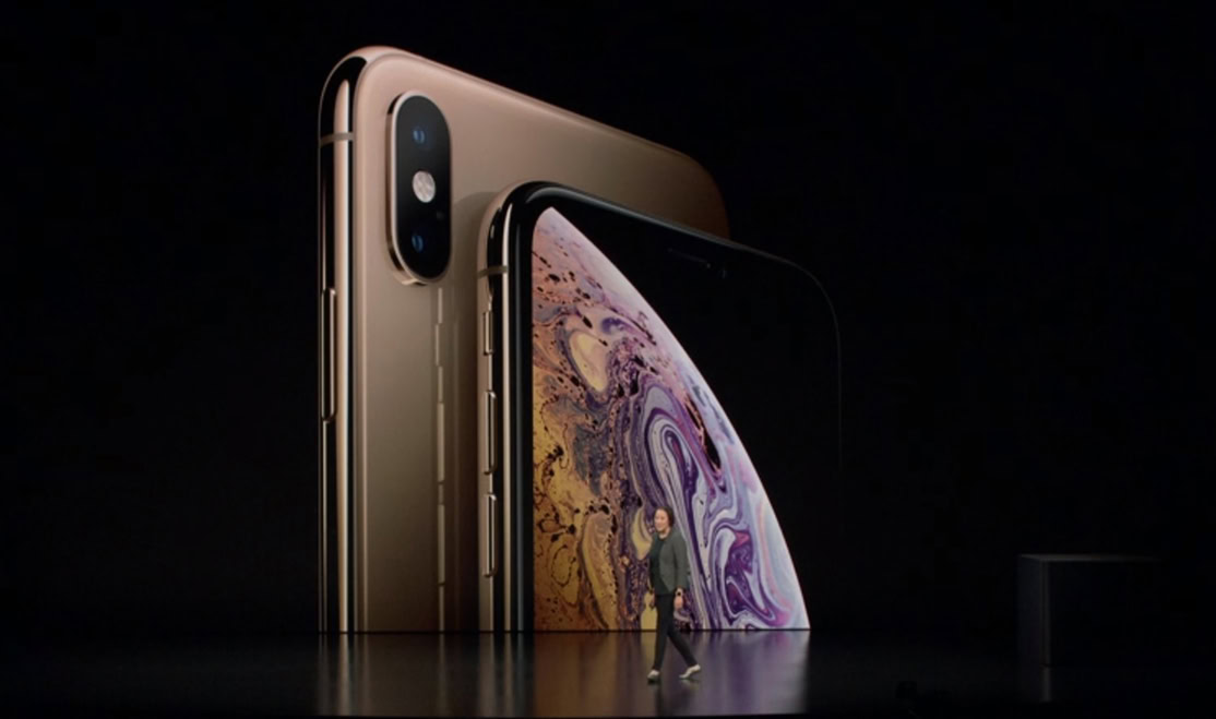
When Apple introduced the iPhone X in 2017, the Silicon Valley company launched a new gesture-based navigation system after removing its physical home button. While we’d seen some Android manufacturers experiment with gestures, Apple’s decision profoundly influenced the rest of the smartphone market to follow suit.
Enter the latest version of Google’s mobile operating system: Android 9 Pie. Halfway through the summer of 2018, the search giant released an Android Pie public beta update that introduced its take on gesture navigation.
As Google has stated that it won’t be offering the traditional navigation buttons on the Pixel 3 and will require its gestures to be used on future versions of Android, it’s time to see how well Google’s implementation stands up against the mighty Apple’s.
Home
As Android and iOS both rely on the use of home screens as a central location for app launching, both mobile operating systems have a way to navigate out of open apps. For iOS, this involves a short swipe up from the bottom of the phone on the gesture bar while Android 9 Pie retains an on-screen home button that’s now shaped like a pill.
After using the gesture on my iPhone XS for several weeks, I have found this to be the more natural and comfortable motions when comparing it to Android’s home button. Introducing the swiping motion makes it seem like you’re actually swiping away the app.
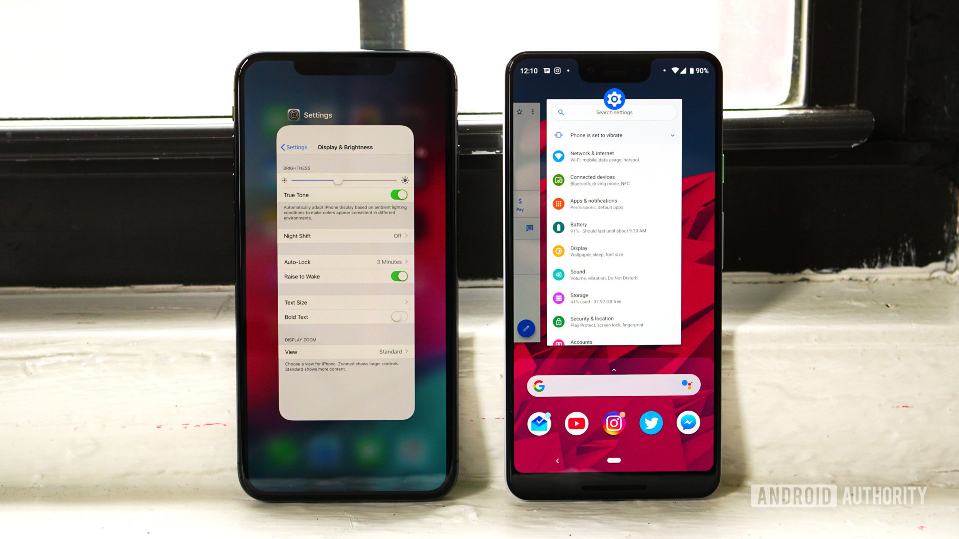
Despite this, I prefer Android’s on-screen animation more. When you hit the home button, the app turns into a card and slides away into the bottom of the display. With iOS, the app window shrinks and disappears back into its icon. While I can understand why some people might enjoy this experience, I preferred the uniform motion found on Pie.
Recents
To allow the user to access previously-opened apps, both iOS and Android offer recent menus. The way to reach this area changed when gestures were introduced on both operating systems.
With iOS, the recents menu gesture is built on top of the Home gesture. In addition to quickly swiping up from the bottom of the screen, users have to hold their finger in the middle of the screen for a split second. After, a small vibration indicates that you can remove your finger and swipe through all the apps running in the background.
Read next: Apple’s new pricing strategy: Is it good news or bad news for Android?
With Android 9 Pie, Google removed the dedicated Recents button and made it a short swipe-up gesture off of the home button. With this, users have to be careful only to swipe up a small amount as a longer swipe opens the app drawer.
One thing I will note from my experience with iOS is that the recents gesture felt more natural on the iPhone since it was an extension of the home gesture. With Android, the recents gesture is similar to that found on iOS, but it’s drastically different than just hitting the home button. While both utilize the pill-shaped icon, the fact that one is a tap while the other involves motion is just a little awkward. It’s honestly something I wouldn’t have even noticed if I wasn’t comparing the two platforms side-by-side.
Quick app switcher
In previous versions of Android, you were able to quickly jump to the most recently opened app by double tapping on the recents button. As that option is now gone, Google has implemented a new gesture that recreates this action. Ironically, iOS has an almost identical gesture.
On Android 9 Pie, you can find a bunch of unused space just right of the home button. We’ll call it the gesture area. If you’re either on the homescreen or even within an app, you can quickly swipe the home button to the gesture area and let go. As you’re doing this, Android will bring up the most recently opened app. If you use the gesture again, the phone will bring back the previous app.
With iOS, this quick app switcher utilizes the gesture area at the bottom of the screen. Swipe to the right and a recently opened app will slide over. You can continue swiping right until you find the app that you want. At this point, though, you might as well open the recents menu.
Continue reading: Why it has taken so long to get Android gesture controls right
Each platform adds extra functionality to this gesture. For iOS, you can swipe back to the left shortly after the initial gesture. This ability lets you quickly just back and forth between two apps in case you need to find information on one app and input it into the other.
With Android, if you hold onto the pill after swiping it to the right, the recents menu will become a carousel, briefly jumping into previously opened apps. Once this action takes place, you can swipe left and right on the gesture area (without lifting your finger) to navigate through the recents menu.
Back
Lastly, let’s look at how both mobile operating systems handle going back. With iOS, some apps offer back buttons either at the top or the bottom of the app. Even if these are present, you can swipe inward from the left edge and move a step backward.
On Android 9 Pie, nothing has changed from previous versions of Google’s OS. If you want to go back, you need to tap on the back button found to the left side of the home button.
Who does gestures better?
As a long-time Android user, I have always loved that three distinct buttons work the same way no matter what phone you’re using. So when Apple introduced gestures, I was in the camp that believed that the change was user-hostile. You no longer had simplistic buttons that perform specific tasks and instead had to memorize different motions.
But now that Google has introduced its gesture-based navigation controls and I’ve had some time to use iOS, I can say I was wrong. Apple got it right from the start. Just like with webOS from years ago (R.I.P.), it seems clear that fluid on-screen gestures make for an easy to use and enjoyable smartphone experience.
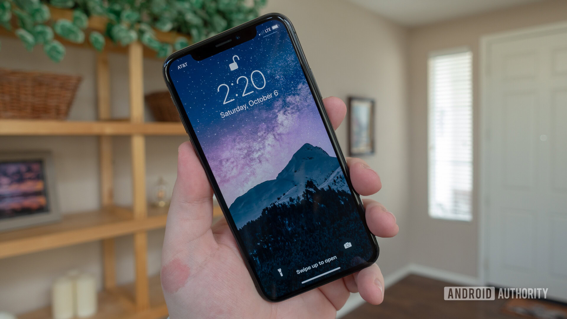
With that in mind, I think the gestures found on iOS are miles better than those introduced in Android 9 Pie. Apple overhauled its mobile operating system to allow for the new navigation controls, which allowed the company to design everything to be fluid and natural.
In what could be seen as an act of playing catch up, Google’s implementation feels half-baked, primarily since the gestures still utilize the old software buttons instead of starting fresh. I feel like the controls found in Android 9 Pie are still being developed and can be immensely improved upon in Android Q.
What do you think about the gesture controls found on Android 9 Pie? Do you like them more than those found on the iPhone? Let us know your thoughts in the comment section below!
Read next:
- Apple iPhone XS review: How does the experience compare to Android?
- Samsung Galaxy Note 9 vs iPhone XS Max: Which is worth your $1,000?
- Apple’s new pricing strategy: Is it good or bad news for Android?
- Apple iPhone XS vs the Android competition
- Android vs iOS – seven things Android does better than Apple’s iOS