Affiliate links on Android Authority may earn us a commission. Learn more.
Level design in mobile games - how developers make their games fun
Published onDecember 16, 2015
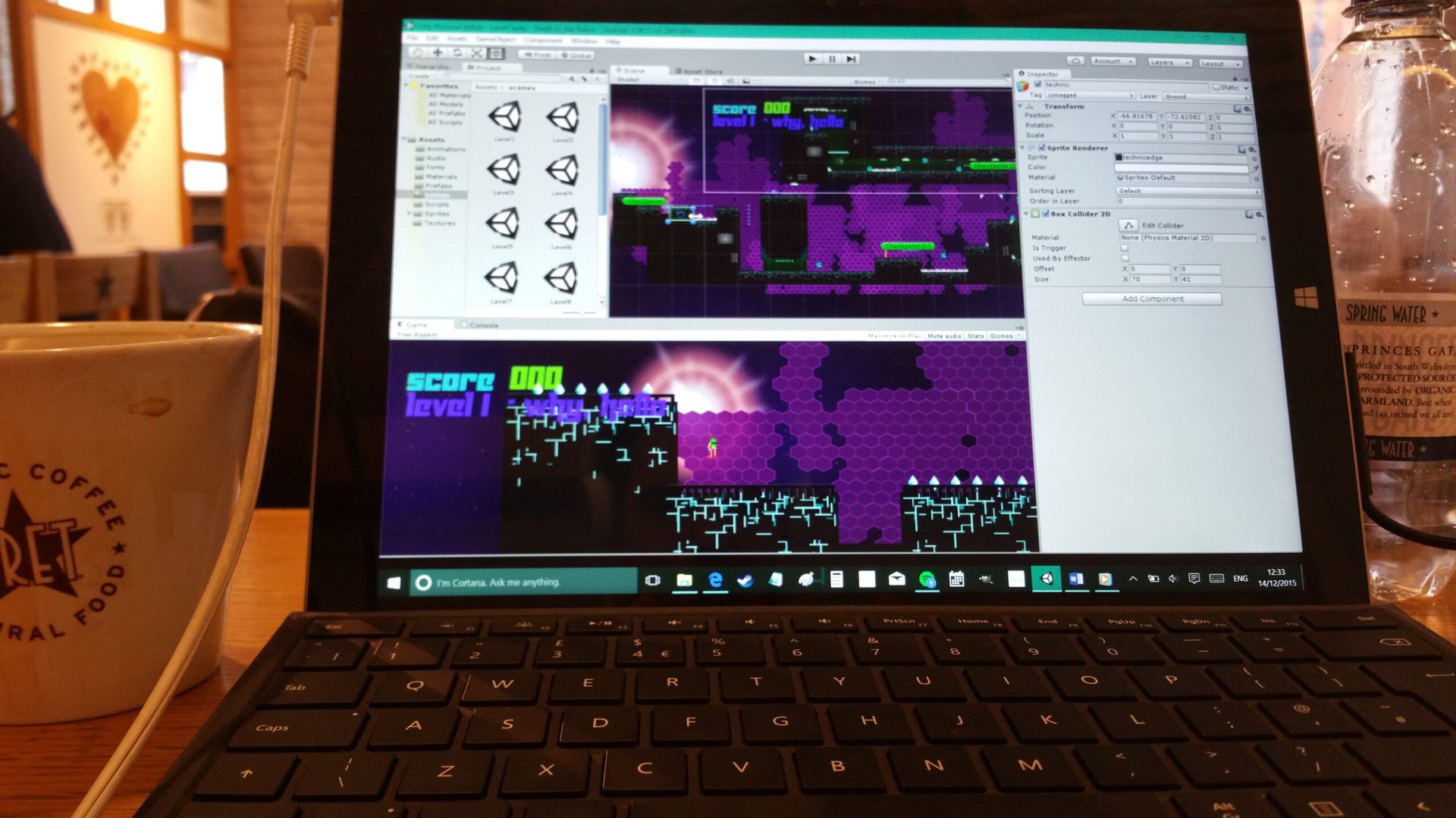
Great mobile game design is a little like a great film soundtrack – if it’s done well, you shouldn’t notice it. Unfortunately, this also makes it all too easy to overlook the amazing detail that goes into the best games and to take for granted subtleties like camera movement and gameplay mechanics.
This also means that when you come to design your own game, you may well be unaware of everything you need to consider to ensure a good experience for your players. Whether you’re a developer who wants some tips on good design, or you’re a gamer who wants to appreciate all the hard work that went into your favorite titles; game design is something worth reflecting on.

Ultimately, the smallest tweak can often the difference between a game being lots of fun or highly frustrating. Let’s take a look at what’s going on behind the scenes of some classic games and see what we can learn.
The tutorial level
Remember when computer games came with thick instruction manuals? Reading these tomes on the bus home was always part of the fun back in the days of the SEGA Genesis/SNES and is something many gamers recall fondly.
But things have changed and especially when it comes to mobile games. Android games are downloaded from the Play Store, so there’s no option to include a booklet. And the last thing anyone wants to do before diving in is sit and read a bunch of in-depth instructions on their phone screens!
Good tutorial levels shouldn’t need dialogue or explicit instruction to guide the player but should instead should teach the rules implicitly.
This is where the ‘tutorial level’ comes in. The purpose of a tutorial level is to teach the player all the basics of the game before they go up against any significant challenges but this needs to be done in a way that’s still fun.
Good tutorial levels shouldn’t need dialogue or explicit instruction to guide the player but should instead should teach the rules implicitly. This all comes down to level design, which can be used to encourage certain interactions while also directing attention in specific directions.
One particularly popular example used to illustrate this point is the classic Super Mario Bros. World 1-1. In this thoughtfully designed opening level, the player is presented with a large amount of space to their right, which indicates clearly which way they’re supposed to go.
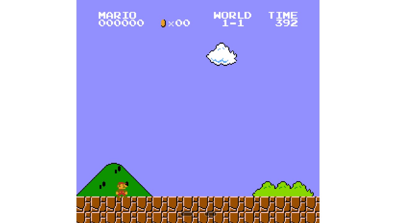
After a couple of seconds, they’re shown their first enemy: a Goomba. They can deduce this is something they need to avoid by the angry-looking eyebrows and the fact it’s on a collision course with Mario. To evade the Goomba, the player needs to jump. They therefore can’t progress beyond this point without learning the main mechanic of the game.
Next, the player is likely to jump and hit the question mark boxes; the question marks themselves illicit curiosity. Upon doing so, they will release a mushroom and the positioning of the platforms ensures that it’s almost impossible for them to avoid picking it up (it drops down onto the player and if it misses, will rebound off the pipe to the right). Thus they get to witness their first transformation into Super Mario.
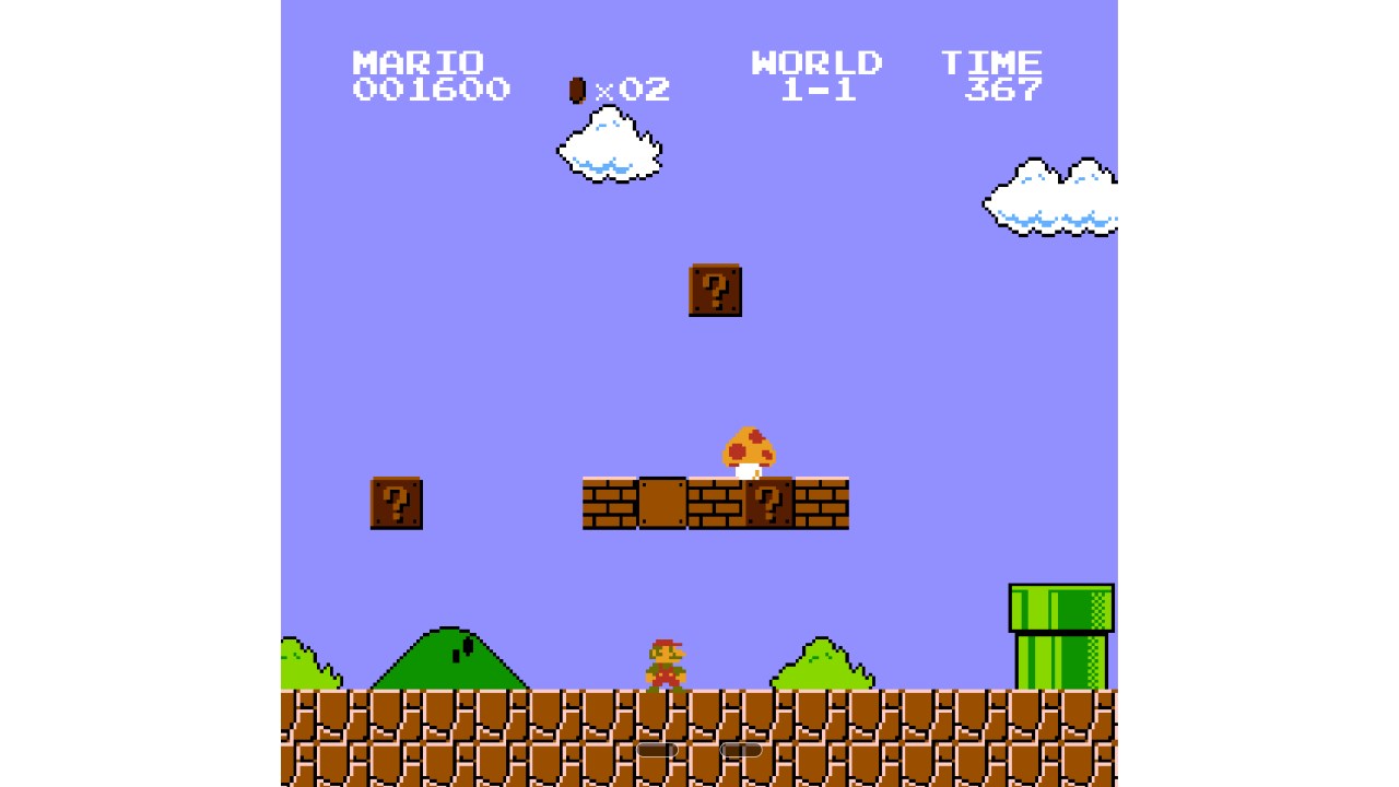
At this point, the player has learned:
- Where they need to go
- How to jump
- How to evade bad guys
- That question mark blocks contain items
- How a mushroom moves
- What a mushroom does
All of this happens without the player being explicitly told anything.
Another fantastic example of implicit tutorials is the game Portal, which is often praised for its design and intuitive method for teaching the player to ‘think with portals’. After initially introducing the portal gun, the game goes on to gradually introduce more and more elaborate scenarios and gradually show how the physics work. Only once the player is comfortable with how everything works, does it then introduce puzzles with escalating difficulty.
Watch the video below for more on this, but look out for spoilers if you haven’t played the game!
Of course these aren’t Android games but the same principles apply on mobile. Your objective as a game designer is to teach your player without necessarily telling them how to interact with the world you’ve created.
You might also want to introduce new obstacles and enemies in your game as the player progresses. When you do, make sure that you go through a similar ‘tutorial’ process each time you do and never assume that your player will inherently know how to interact with your spring, spikes or bad guy.
If you get this right, you can eventually string together a challenging sequence that tests the player on everything they’ve learned up to that point. This can be crazy rewarding because someone who hadn’t played through the previous levels wouldn’t know how to even begin going through that sequence! It’s almost like learning a whole new language.
The learning curve
So why can’t you just drop your player in at the deep end by presenting them with an obstacle they’re unfamiliar with and forcing them to figure it out?
Simple: it’s not fun.
This is why the learning curve in your game is so important. Some players like difficult games and that’s fine – but you still need to make sure the game is fun which means it needs to be fair and it needs to build up to the challenge.
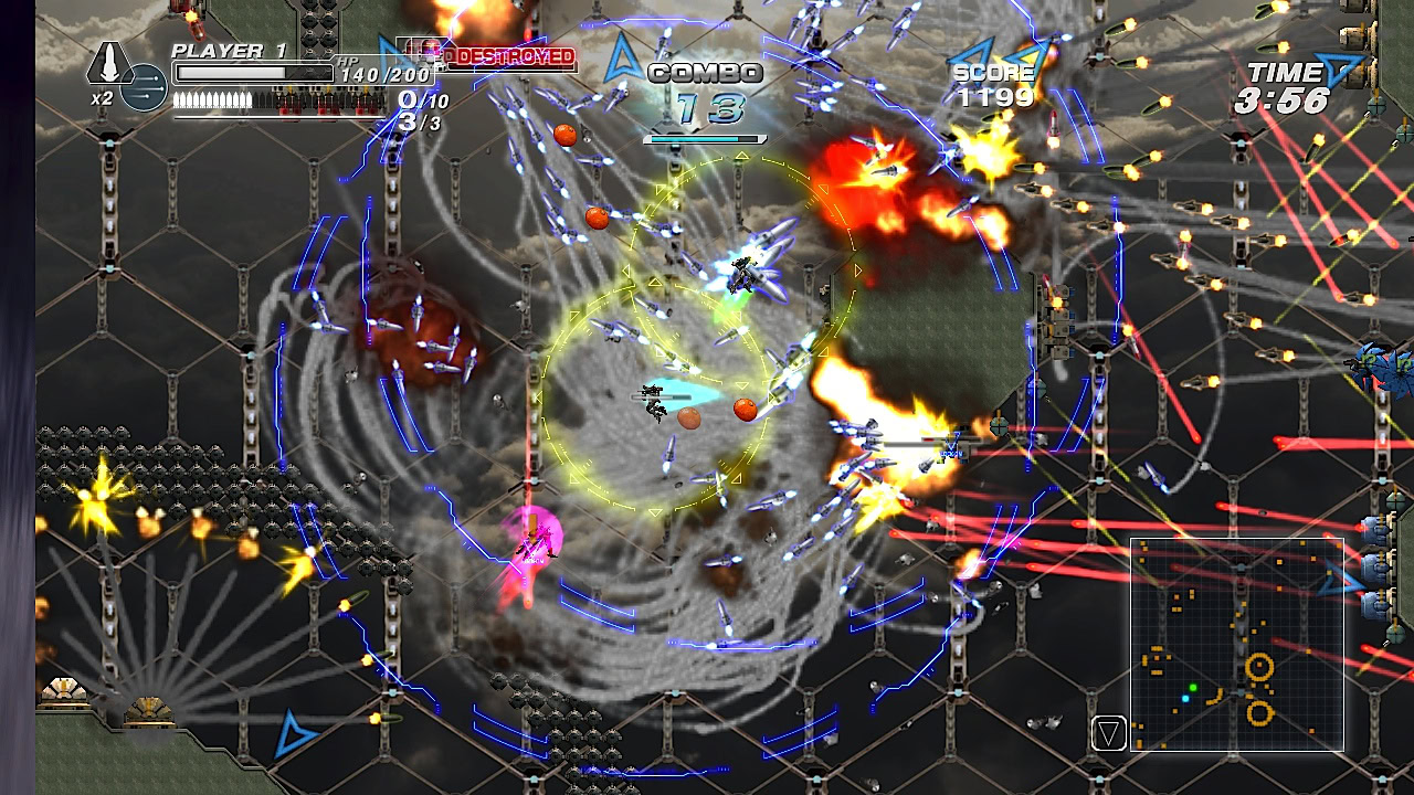
Bullet hell games can sometimes throw a million missiles at you on a single screen and give you one life with which to survive the onslaught. But even the cruellest won’t make that screen the first screen.
We can actually relate this back to a psychological concept called ‘flow’. Flow is a state of mind where we are optimally engaged with the task at hand, resulting in improved attention, learning and enjoyment (I’ve written about the neuroscience of flow states or ‘transient hypofrontality’ here). Researchers generally agree that a task will be more likely to encourage flow if it presents just the right amount of difficulty – challenge that sits at the upper end of what the individual is capable of. Consider this image taken from lithosphere.lithium.com:
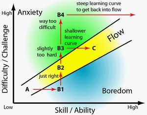
If something is too easy, it’s boring and if it’s too hard, we’re inclined to give up. But if it’s hard yet doable we’ll be focused and our brains will reward us with lots of dopamine (the neurotransmitter associated with anticipation of reward). Ultimately, our brains like games that lie just outside our comfort zones in order to trigger learning and create a sense of progress. We like getting better at things.
As a game designer, you need to maintain your players’ interest by keeping the difficulty at the right level as they improve at the game. Compare the first and last levels of Super Hexagon, one of the simplest and yet most difficult games on Android:
(The second video here shows Terry Cavanagh playing, who actually made the game).
You’ll probably agree that the last level looks nigh impossible. But by repeatedly playing the first levels and developing the necessary muscle memory, it eventually becomes doable… and the sense of reward you get upon completing it is incredible (I imagine…). Now imagine if that was the first level, how long do you think you’d last before turning it off?
The same is true for puzzle games. You need to ensure that the player is given all the necessary elements to solve the puzzle and that the number of steps taken to reach solutions increases gradually over time.
Keeping it fun
When you die in some games and have to do the level again, it makes you want to pull your hair out. Conversely, if it’s a game you really love then you might find the opposite thing happens: you’re actually excited to give it another shot and can’t wait to jump back in.
This is how I feel when I play Sonic Generations. To me, the levels in that game are such a rush that I actually feel disappointed when they’re over. They’re fast paced and constantly surprising and the action is never interrupted. I don’t mind dying and trying over because getting to that same point is still so much fun.
Another good example of this on Android is Shadow Blade. Shadow Blade is a game where you control a ninja and it’s fantastic at stringing together different obstacles in a way that allows a skilled player to move swiftly through the levels without pause. Not only does this allow for subsequent speed running but it also ensures that the game never feels like a chore to play.
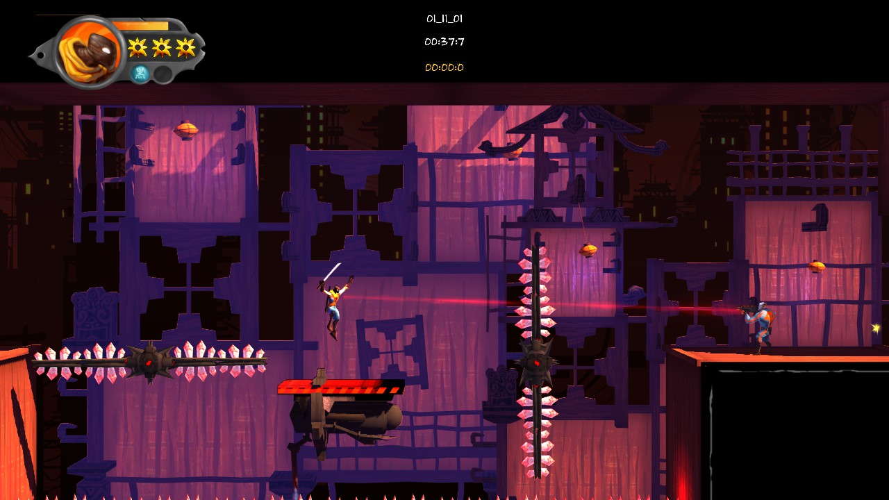
The mistake that’s very easy to make here is to make the game punitive and actually dull to play as a result. Causing your player to get lost in a huge maze with no idea of where to go isn’t fun. Likewise, making them repeat the same repetitive action, or wait for a long time for an on-screen element to move also isn’t fun. Try to resist the urge to become sadistic in your level design and always make sure that maintaining the fun is your first priority.
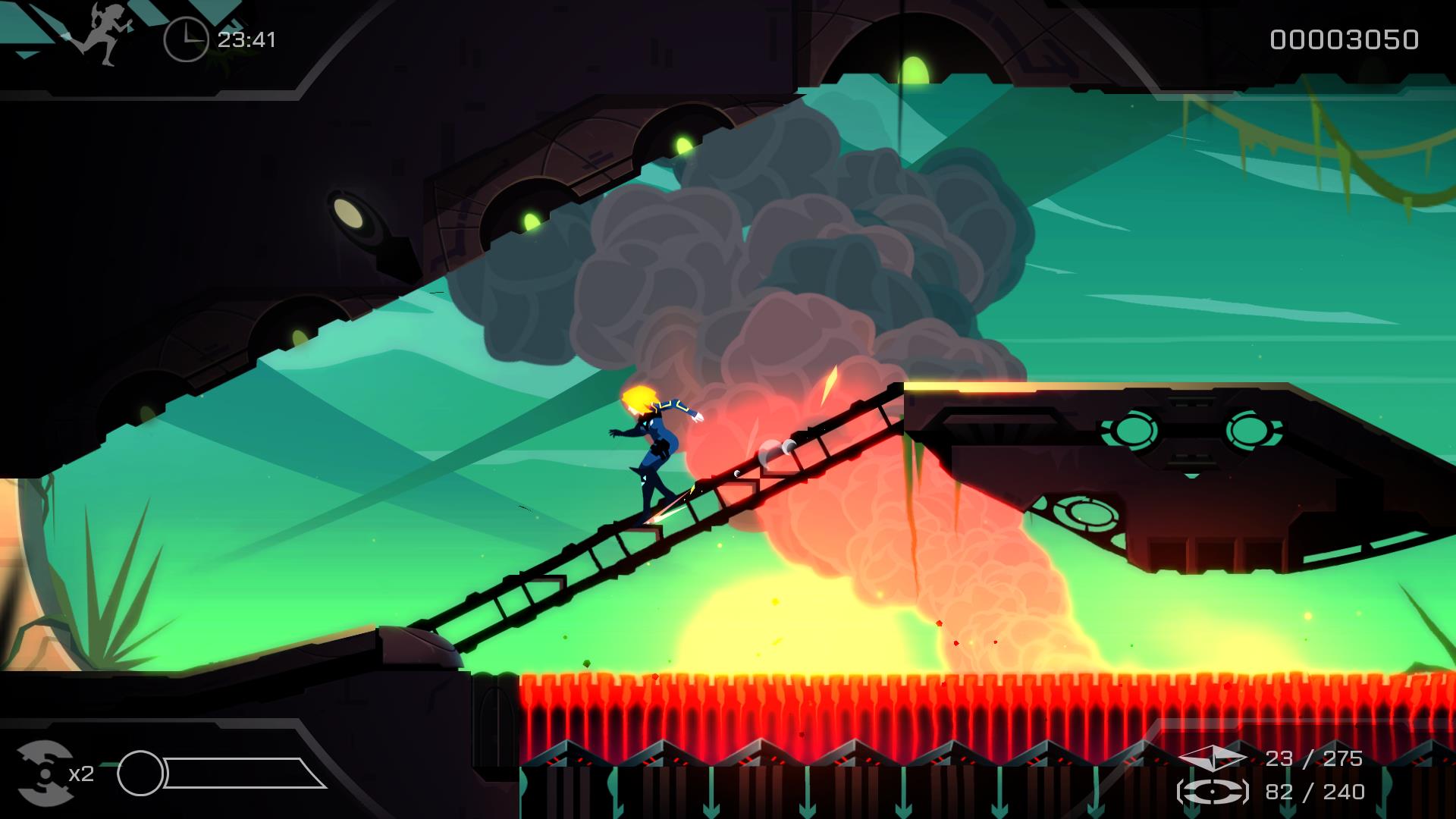
A game that does this particularly well is Velocity 2x, which keeps the player constantly learning and never slows down the action. The creators, Futurlab, designed their levels around these concepts and they wrote an excellently insightful blog post on it here.
Empowering the player
Another way you can ensure your game stays fun is to empower the player. The way you do this is simple: by ensuring their actions have consequence on the game world.
Another way you can ensure your game stays fun is to empower the player. The way you do this is simple: by ensuring their actions have consequence on the game world.
This is something that one mobile game does particularly well. You may even have heard of it… it’s called Angry Birds.
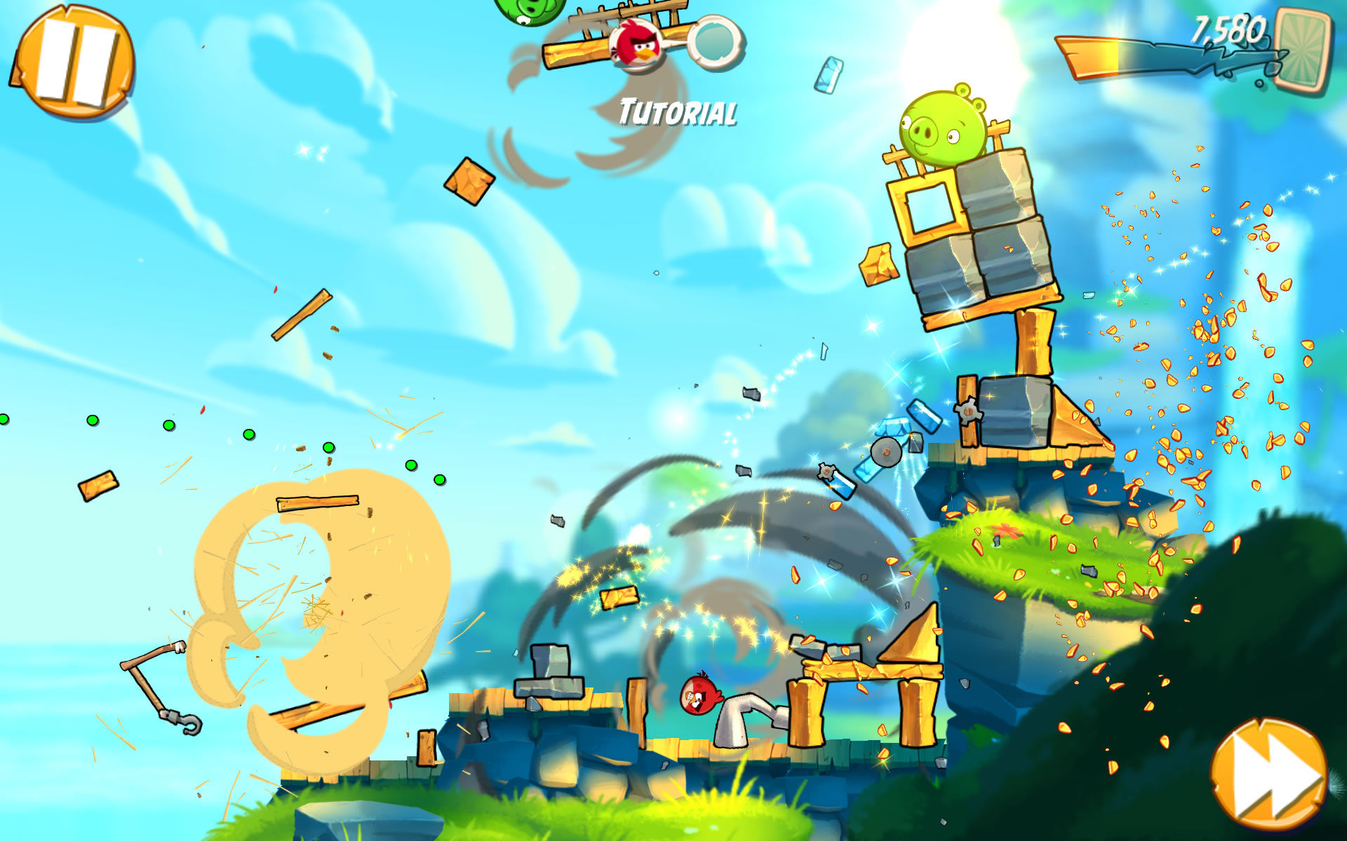
The whole premise behind Angry Birds is that you need to destroy large structures using relatively believable physics. You release your bird and as a result you get rewarded with a ton of smashing glass, collapsing bricks and exploding pigs. It’s immensely rewarding because you can see the visceral impact that you’re having on the world and you feel crazy powerful as a result. The realistic physics are key to making this work.
In the game I’m creating at the moment – Captain Dude Lasers – you have the ability to turn into a laser and zap across the screen. I found that my testers enjoyed the moments where this caused lots of destruction so I threw in a ton of glass panes and destructible furniture to make that form feel really powerful and hopefully more rewarding. Fortunately, Unity2D handled the physics for me!
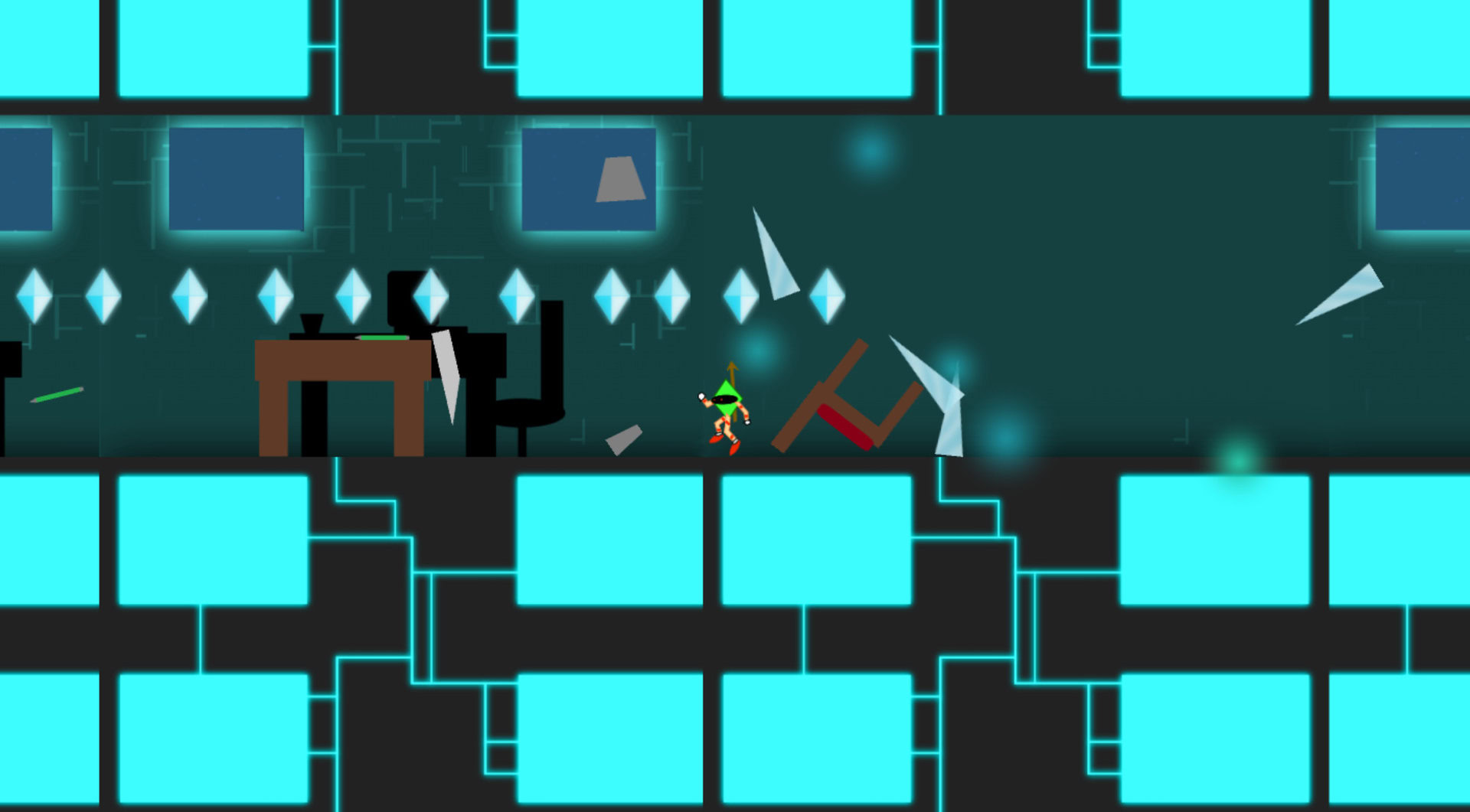
Physics also allow for something else: emergent gameplay. This is what happens when a bad guy accidentally strays into an area not intended for them and cause a ton of boxes to collapse which you can then run up to escape their gunfire. Emergent gameplay is when the physics, the game world and the player’s interaction allows for the creation of unique scenarios which allows the player to tell their own stories. This is the ultimate accomplishment of giving your player the ability to impact the world in a meaningful way.
This type of sandbox gameplay is something seen more often on consoles and PC than on mobiles however owing to limitations in the platform. Mobile games actually have unique potential to empower the player in other ways though thanks to the touch screen input and even the gyroscope controls. Smart Android developers have created games that connect the player to the action by letting them reach out and touch the various in-game elements, taking full advantage of the medium.
The Room is one such excellent example. This series lets you interact with things like boxes, tables and doors by swiping, twisting and turning your phone as though it were that item. It adds an additional dimension to the puzzles but it also helps the player feel like they’re really making an impact on that world. Games like this are brilliant for their mobile-first sensibilities, rather than trying to ape successful mechanics from different gaming eras.
Atmosphere and exploration
There are exceptions however where empowering the player is not the aim of the game. Some games actually derive enjoyment from stripping the player of their power and thereby creating suspense. This is that feeling that you get when you’re down to your last health bar, or when you’re walking down a corridor in Resident Evil waiting for those darn dogs to come smashing through the window.

Creating atmosphere is great because it helps to transport the player to that place and gives them a sense of wonder and discovery. Conveying sense of place on a small screen with limited assets is a challenge but indie developers have come up with some fantastic ways of rising to that challenge. Often with minimalist approaches to their graphics.
Many games create a sense of place by using an almost impressionistic style – including just enough cues to suggest specific locations, times, weather etc. The soundscape is just as important here as the graphics. If you want to see a masterclass in this, then I highly recommend downloading Superbrothers: Sword & Sworcery EP which uses pixel art and surround sound to really capture a mood.
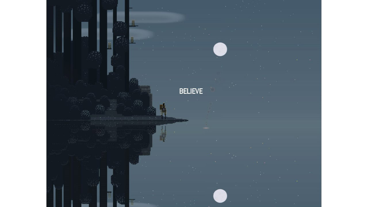
Discovering a new area filled with amazing sounds and a whole new aesthetic can work as an excellent reward and motivation to continue progressing through the game and is once again intrinsically tied to the reward centers of our brains.
This is also why it’s important to keep switching up the look and feel of your game to keep things interesting. As an indie developer, you’ll have limited time and resources for creating entire new sets of sprites but sometimes just changing the background for a level can make a big difference to the tone of the game so there’s no excuse to keep things samey all the way through.
An example is Pewdiepie: Legend of the Brofist (which is a surprisingly good game). In the below screenshot, you can see two levels that would be considered ‘snow levels’ and they even use some of the same textures and sprites. Despite this, they each have a completely different feel and vibe owing to changes in the background and the color scheme:
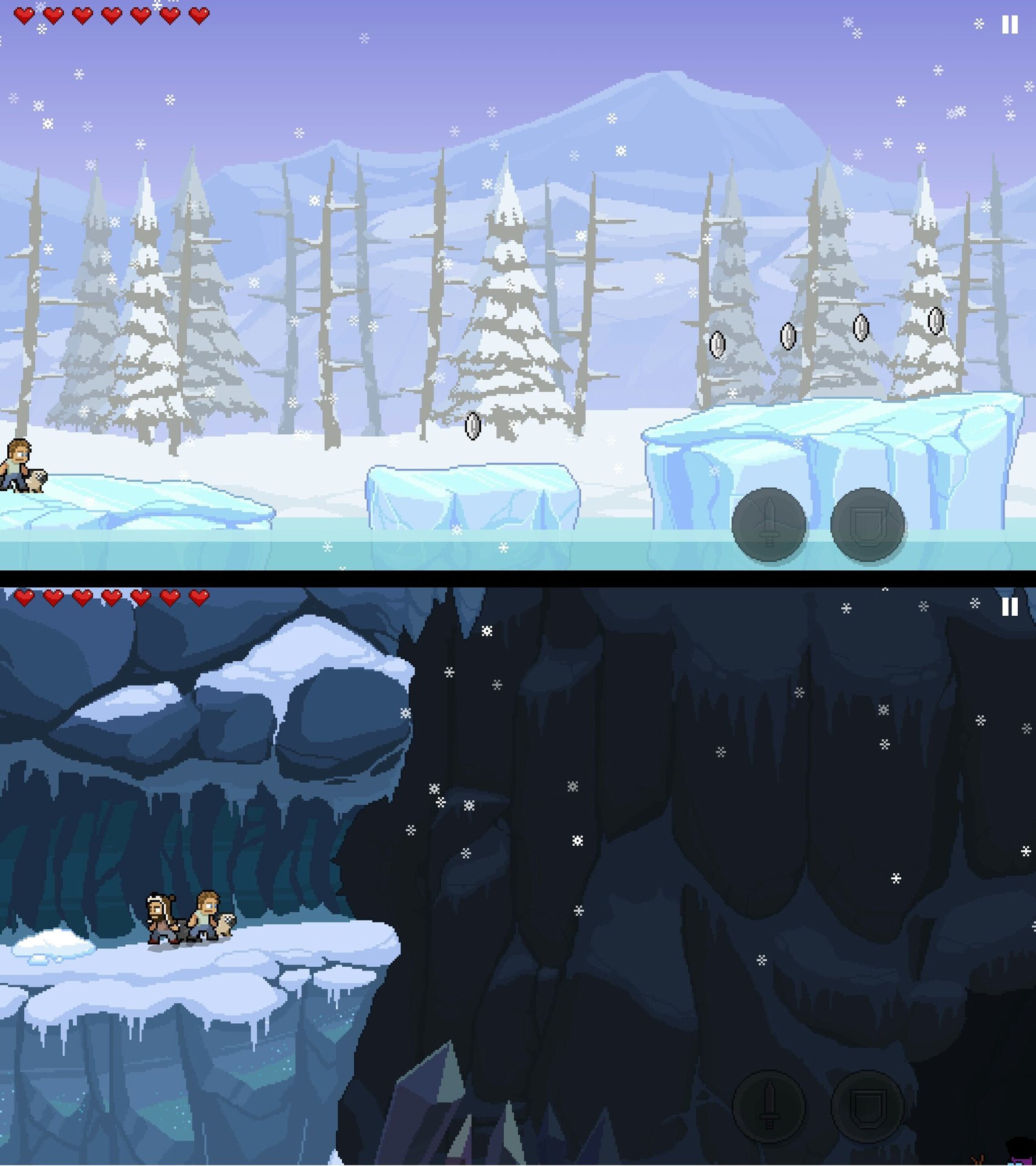
When you first enter the cave, it’s quite an atmospheric moment and it really helps to break up the action. Throughout the game things are kept amazingly varied and fresh with set pieces ranging from being chased by a dinosaur to leaping between car roofs on a motorway.
Just as you have to ensure you maintain the feeling of learning and improving, you also need to maintain that feeling of discovery, atmosphere and exploration.
Designing around the game engine
As a closing note, I also think it’s important to point out the role that your game engine will have in all this; which is why I feel every level designer should learn some basic coding skills.
Consider the aforementioned importance of physics with regards to empowering the player. Those physics aren’t determined by the designer – they’re determined by the engine and the coder. As a designer, you might notice an opportunity to make a moment even more fun by throwing in an exploding barrel, or making the barrel even more explosive. In order to accomplish this, you need to be able to add in those effects yourself, or speak to someone who can. Likewise, you need to know how many exploding barrels you can add before you’re going to start causing slow down.
There is a great amount of synergy between the way your game works and the way you design the levels.
Another example of this is the game camera. Remember how we noticed Mario’s camera at the start of World 1-1? That big open expanse to the right tells the player where they have to go. But what if your game moves left to right? In that case the camera needs to face the other way. Consider too how far out the camera needs to be – a faster paced game will need a camera with a wild FOV (field of view) to ensure that the player has time to react to oncoming hazards.
As an Android developer, you also need to keep in mind the variable size of your screen – zoom out too far and the character will be hard to see on smaller phones! Then there’s the small issue of fingers obstructing the screen in the bottom corners.
There are also subtle distinctions between cameras that follow the player exactly and cameras that allow the player to occasionally move independently. This latter solution can prevent nausea in games that involve a lot of jumping or darting left and right. These cameras often operate using a ‘camera window’ with the camera only moving when the protagonist steps outside that designated zone. The height and width of that window should correspond to the most common movements in the game, which in turn will correspond with the properties of elements in the levels (such as the heights of your platforms). Other games use entirely different mechanisms for their cameras – such as Super Mario World which would ‘snap’ the camera each time the player landed on a platform.

This image was taken from an article on Gamasutra that goes into massive depth regarding camera movement. You should definitely check it out.
The point I’m getting at here is that there is a great amount of synergy between the way your game works and the way you design the levels. To some extent, you’ll be designing your levels around the limitations of your engine but you should also occasionally adjust your engine to help you bring to life your more outlandish ideas. If you can learn some basic coding, this will help a great deal.
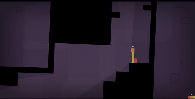
Even your business model will play some role in your design process – how long do you have to make this game? How big is your team? In a previous article I talked about the value of simplicity when creating apps if you actually want to profit from them anytime in the next decade. For your first game, I highly recommend designing something simple in terms of the necessary code and the number of assets. This way, you can come up with something fun and get a flavor for the process before you invest countless hours. Flappy Bird could probably be built in less than a day and yet it made Dong Nguyen rather wealthy! Simple doesn’t have to mean trite though either – just look at something like Thomas Was Alone. In that case, the simplicity is actually a selling point!
Conclusion
There are tons of small design decisions that you’ll need to make during the creation of an Android game and we’ve still only really scratched the surface. Make sure you give them some serious time and thought because they can make or break the experience.
Having a great idea and a lovable character isn’t enough. You need to think about how your camera is going to frame the action, how your players will gradually learn the mechanics of the game and how you’ll make them feel empowered and successful as they play.
I recommend checking out some of the games mentioned in this post and playing close attention to what they do well. It’s actually quite amazing how much care and attention goes into even the simplest endless runner.
Games not art? Pfff!