Affiliate links on Android Authority may earn us a commission. Learn more.
LG G5 impressions from a G3 veteran
April 20, 2016

While some love to upgrade their smartphones every year, many customers enter in to 24 month contracts that stretch out their upgrades. Others, myself included, stick with a phone they like for as long as possible and choose to skip a generation. I’ve been a long time LG G3 user myself, but I’ve had my hands on a pre-production LG G5 for over a week now, and thought I’d share some of my impressions about the phone and on skipping a generation.
If you’re new to the world of Android or if the G3 simply ducked under your radar, the handset boasted a number of cutting edge features for its day, including a QHD display and arguably one of the best cameras around. It’s clear that hardware has moved on since then, but let’s see just how much has really changed over the course of two LG generations.
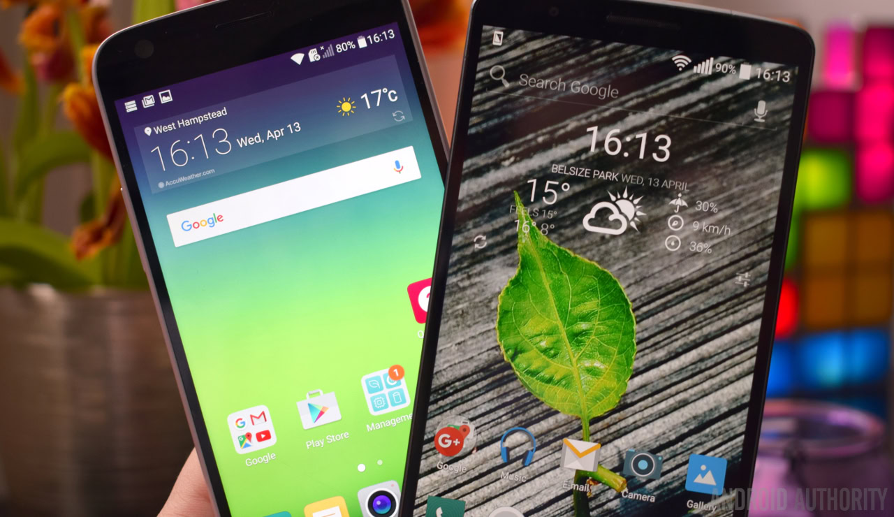
Right out of the gate the LG G5 strikes me as notably faster. Apps open instantly and there’s no lag while moving in and out of apps, even media heavy web pages open up that split second faster. While my G3 might be bogged down a greater library of apps, the upgrade to a Snapdragon 820 processor and more optimized Marshmallow OS are definitely the leading factors.
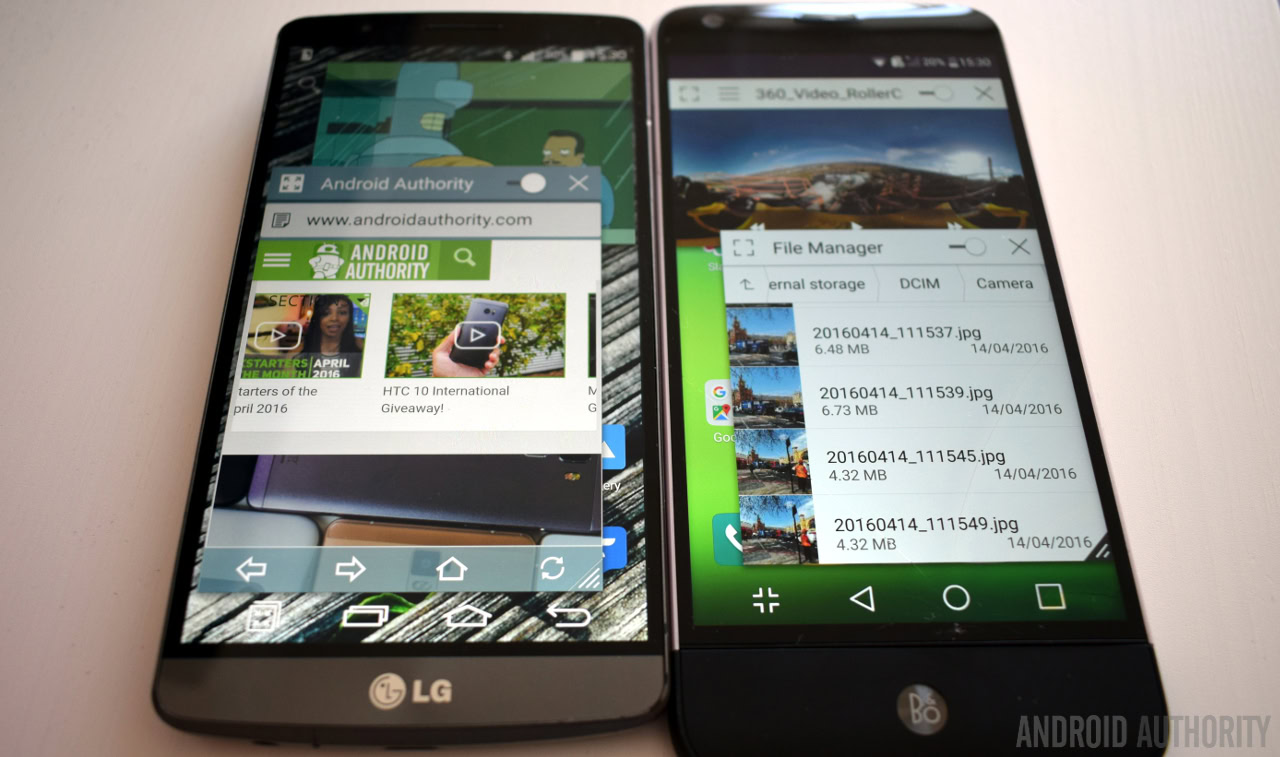
Speaking of software, the whole experience seems a little stripped back compared to the G3, which might appease fans of a more stock-like Android experience. Much to my disappointment, dual-window stacking seems to have disappeared and QSlide no longer works with a web browser, as Chrome is provided by default. In fact, there isn’t even an app drawer out of the box, which makes organization tougher, although this can be re-enabled after a software update.

To be fair to LG, many of the software changes have been made in the right places. Notification panel settings can be more easily accessed, and there are configurable optimizations to save battery when gaming and to automatically toggle wireless features based on if you’re at home or work, which is very neat. But you will need to dig about in the settings to find these options. Instead, it’s really the new hardware features that have left a greater impression on me.
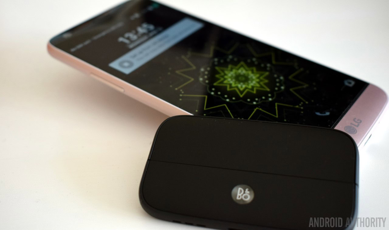
I never thought that Knock Code was an inconvenient way to unlock the screen, but the fingerprint scanner on the back is better in every way – once you’ve registered a couple of fingers. I’m almost surprised that Knock Code remains an option, I can’t see why anyone would use it any more. The always-on display is handy for quickly checking the time, but it does seem to have a notable negative impact on idle battery life. That said, the 2,800mAh cell is still enough to get a moderate user like me through the day without issue. I don’t have the LG CAM Plus, but the modular B&O DAC is also a step up if you’re an avid music listener. You can read my impressions of that in more detail here:

Camera technology has become an increasingly competitive selling point in the past couple of years, and LG has definitely made some advancement here, although they aren’t quite compelling as some of the handset’s other new features. The most notable improvement to the rear camera is color reproduction, the G5 really pops while the G3 seems positively washed out by comparison. The extra camera resolution also goes a little way to improving distant details, and the phone performs slightly better in low light than the G3.
This isn’t a serious camera shoot-out, but the pictures below hopefully demonstrate what I’m taking about. Images go G5 wide angle on the left, G5 regular in the middle, and the G3 on the right.
However, one of my bugbears about the G3’s camera remains, and is arguably worse with the G5 in some places, and that’s overly aggressive noise removal. This results in blurred out details and color smearing when the lighting conditions are less than ideal. As this seems to be a post-processing feature, I’m disappointed to see that this hasn’t been improved over the years.
This situation is most noticeable with the lower resolution 8 megapixel wide angled sensor on the G5. I do really like the option to take wide angled pictures, but the detail really doesn’t hold up on closer inspection and the low light performance is atrociously noisy. It’s a frustrating situation, and I think that I would have preferred the wide angle camera to feature the higher resolution sensor so that I could inspect the extra details in the wider shots. Or perhaps two sensors of closer quality would have been the better call.
Overall the G5’s camera is improved, but I expected a little more for two years of progress. Although, perhaps that’s a testament to the quality of the G3’s camera. I will say that the introduction of manual mode and the wide angle lens allows keen and adventurous photographers to explore a much wider range of shots with the new model, so overall the company’s latest flagship offers the more fleshed out camera experience.
While I’m certainly sold on many of the new hardware features packed into the LG G5, there’s one area that I don’t think manages to match the G3, and that’s design. The painted metal body of the G5 doesn’t feel any different to the G3’s brushed plastic to me and there’s a slight gap between the main body and the modular bottom half of the phone that just seems cheap. I’m certainly not suggesting that the G3 is the pinnacle of handset design, after all my model fell victim to the jack socket crack issue just like many others. But ergonomically there are so many things that the G3 does right which very few, if any, handsets have been able to surpass, including the G5.
What I really like about the G3 is that it doesn’t feel particularly large for a 5.5-inch handset, and that’s down to three things. The first is the way that the back of the handset is curved to fit the hand so well, while phones with a more rectangular edge, including the LG G5, are a little more bulky and feel larger as a result. Reaching for buttons is the second, and the absence of the rear volume rocker leaves me awkwardly sliding my fingers up the G5 in search of the buttons on the side. Fortunately the fingerprint scanner and lock button are still placed on the back in a very easy to reach spot.

The final one is bezels. The G3 and G5 are virtually the same width, but that’s with a 5.5-inch versus 5.3-inch display. Furthermore, the G5 is notably taller, by more than half an inch if you attach the B&O DAC module, and that makes it quite bulky when trying to fit it in your pocket.
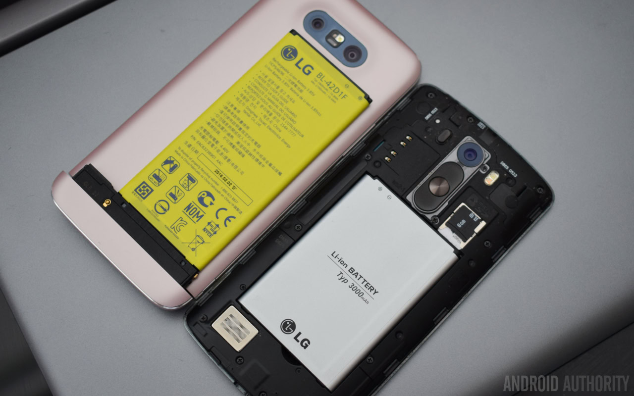
What I’ve come to realize in my time with the G5 is just how much of an impact the modular nature of the phone has had on what LG can do with the G5’s design. All of the electronics have had to be moved right up to the top of and down one side of the phone to connect up to the changeable modules at the bottom of the handset.
This seems to not only explain why the phone can’t be so thin at the edges, but it’s also likely behind the decision to remove the rear volume rocker and to move the headphone jack to the top. This also makes me wonder if LG couldn’t have included a larger second image sensor, improved the default audio circuit layout, or kept the audio jack more conveniently placed at the bottom of the phone had it not been modular. The picture below demonstrates how the layout inside the G5 and the battery have been altered to accommodate the modular design, compared with the ample room at the top and bottom of the G3.

Ok my little rant over, so do I like the LG G5? Absolutely. Oddly though, in many ways the handset doesn’t feel like a G series phone any more, as so much of it is clearly different from the G3, and the G4 for that matter. Although there are some familiar LG elements throughout the G5, these feel almost like left overs as the company moves on to a new vision for smartphones, but that’s just an observation rather than a criticism.
Modular is clearly LG’s preferred direction for the future. The entire handset is built around this feature, but none of the current accessories strike me as a must have handset seller. Part of me still prefers the G3’s slightly better feel in the hand and the simple but elegant design choices over the potential offered by the G5’s modular extensions, but I might just be shortsightedly favoring the familiar.
The LG G5 is certainly a worthwhile upgrade if you’re looking for extra performance and some more modern features, but the G3 still holds its own in many respects. Of course, there are other flagships that might be worth a look at as well.
[related_videos align=”center” type=”custom” videos=”684693,686764,679576,684612″]
Thank you for being part of our community. Read our Comment Policy before posting.